Download to read offline

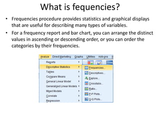
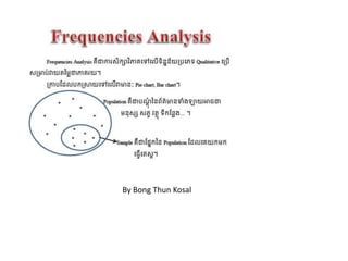
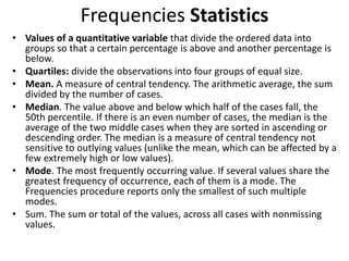
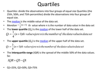
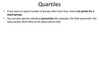
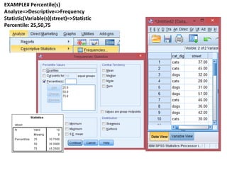
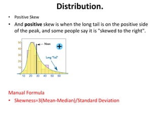
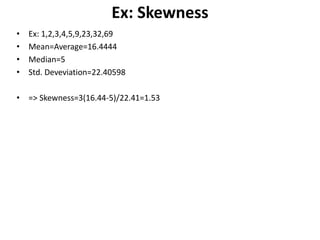
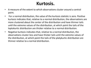
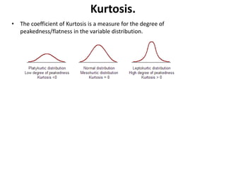

Frequencies provides statistics and graphical displays to describe variables. It can order values by ascending/descending order or frequency. Key outputs include mean, median, mode, quartiles, standard deviation, variance, skewness, and kurtosis. Quartiles divide data into four equal groups. Skewness measures asymmetry while kurtosis measures clustering around the mean. Charts like pie charts, bar charts, and histograms can visualize the data distribution. Crosstabs forms two-way and multi-way tables to analyze relationships between variables.