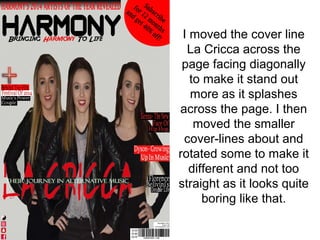
What I
changed
in my third
draft
I removed the red
box with the
promotion as I
thought it didn’t
make the
magazine look
professional
I changed the
background photo
because the three
girls looked to edited
as bits of the top of
their hair were left out
during the editing
process. In my third
draft I just edited a
few minor things and
placed the image in.
After I removed the red circle I
changed the length of the faded
rectangle and the font to stretch
across the top like a skyline. By
doing this it made it easier to read
and a lot more professional looking
which was my aim.
I moved the barcode and prices over to the
left hand side of the page. I then moved the
symbols to the right except for the H
Magazine logo, I made it bigger and placed
it beside the masthead and the issue
number and date was placed at the top
beside the skyline. I think this was a smart
move as it makes the front cover more eye-
catching.
I moved the cover line
La Cricca across the
page facing diagonally
to make it stand out
more as it splashes
across the page. I then
moved the smaller
cover-lines about and
rotated some to make it
different and not too
straight as it looks quite
boring like that.
Changes between Draft 2 and Draft 3

Changes between Draft 2 and Draft 3

  • 1.
  • 2.
    I removed thered box with the promotion as I thought it didn’t make the magazine look professional
  • 3.
    I changed the backgroundphoto because the three girls looked to edited as bits of the top of their hair were left out during the editing process. In my third draft I just edited a few minor things and placed the image in.
  • 4.
    After I removedthe red circle I changed the length of the faded rectangle and the font to stretch across the top like a skyline. By doing this it made it easier to read and a lot more professional looking which was my aim.
  • 5.
    I moved thebarcode and prices over to the left hand side of the page. I then moved the symbols to the right except for the H Magazine logo, I made it bigger and placed it beside the masthead and the issue number and date was placed at the top beside the skyline. I think this was a smart move as it makes the front cover more eye- catching.
  • 6.
    I moved thecover line La Cricca across the page facing diagonally to make it stand out more as it splashes across the page. I then moved the smaller cover-lines about and rotated some to make it different and not too straight as it looks quite boring like that.