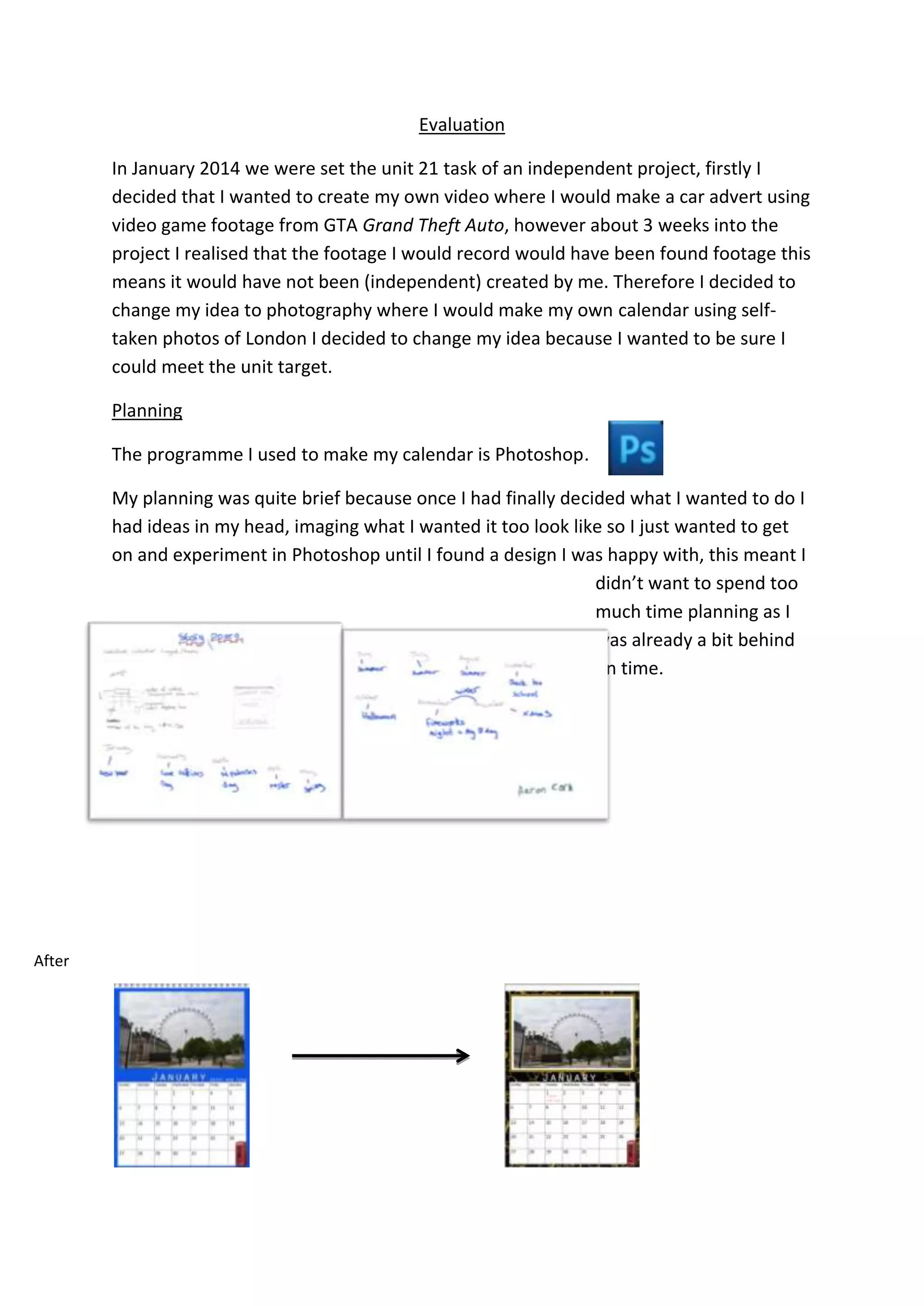
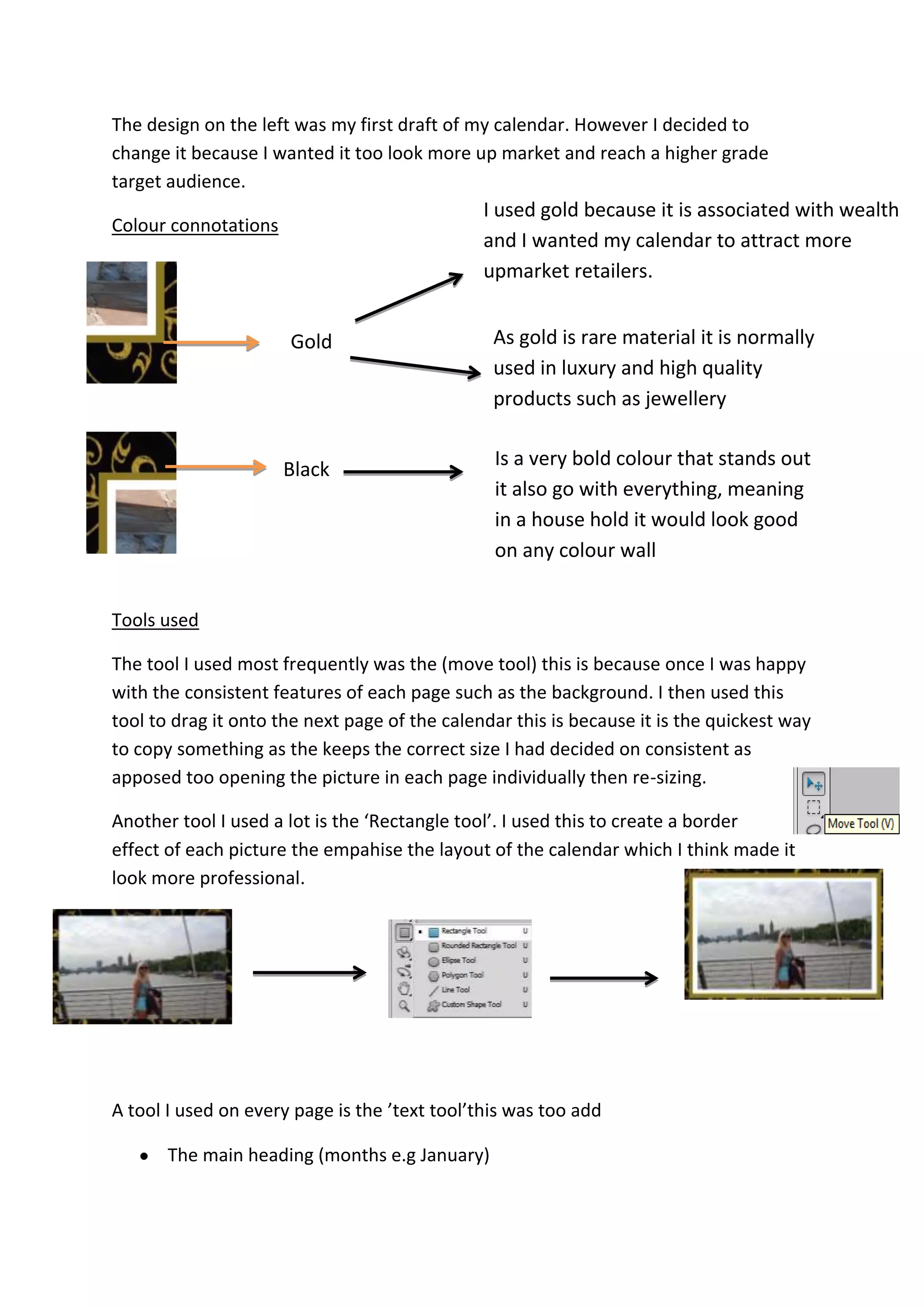
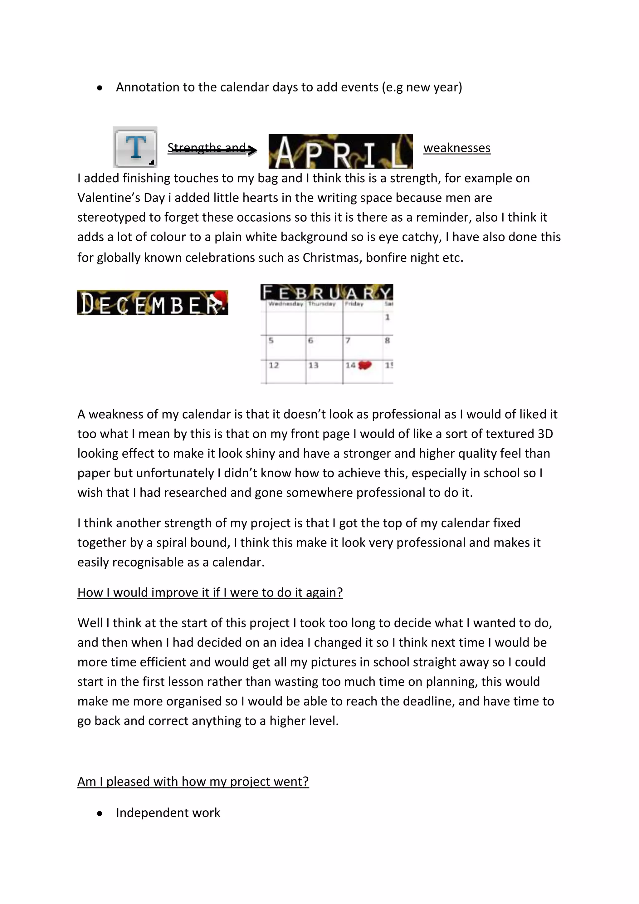
Evaluation
In January 2014 we were set the unit 21 task of an independent project, firstly I
decided that I wanted to create my own video where I would make a car advert using
video game footage from GTA Grand Theft Auto, however about 3 weeks into the
project I realised that the footage I would record would have been found footage this
means it would have not been (independent) created by me. Therefore I decided to
change my idea to photography where I would make my own calendar using self-
taken photos of London I decided to change my idea because I wanted to be sure I
could meet the unit target.
Planning
The programme I used to make my calendar is Photoshop.
My planning was quite brief because once I had finally decided what I wanted to do I
had ideas in my head, imaging what I wanted it too look like so I just wanted to get
on and experiment in Photoshop until I found a design I was happy with, this meant I
didn’t want to spend too
much time planning as I
was already a bit behind
on time.
After
The design on the left was my first draft of my calendar. However I decided to
change it because I wanted it too look more up market and reach a higher grade
target audience.
Colour connotations
Tools used
The tool I used most frequently was the (move tool) this is because once I was happy
with the consistent features of each page such as the background. I then used this
tool to drag it onto the next page of the calendar this is because it is the quickest way
to copy something as the keeps the correct size I had decided on consistent as
apposed too opening the picture in each page individually then re-sizing.
Another tool I used a lot is the ‘Rectangle tool’. I used this to create a border
effect of each picture the empahise the layout of the calendar which I think made it
look more professional.
A tool I used on every page is the ’text tool’this was too add
The main heading (months e.g January)
Gold
I used gold because it is associated with wealth
and I wanted my calendar to attract more
upmarket retailers.
As gold is rare material it is normally
used in luxury and high quality
products such as jewellery
Black
Is a very bold colour that stands out
it also go with everything, meaning
in a house hold it would look good
on any colour wall
Annotation to the calendar days to add events (e.g new year)
Strengths and weaknesses
I added finishing touches to my bag and I think this is a strength, for example on
Valentine’s Day i added little hearts in the writing space because men are
stereotyped to forget these occasions so this it is there as a reminder, also I think it
adds a lot of colour to a plain white background so is eye catchy, I have also done this
for globally known celebrations such as Christmas, bonfire night etc.
A weakness of my calendar is that it doesn’t look as professional as I would of liked it
too what I mean by this is that on my front page I would of like a sort of textured 3D
looking effect to make it look shiny and have a stronger and higher quality feel than
paper but unfortunately I didn’t know how to achieve this, especially in school so I
wish that I had researched and gone somewhere professional to do it.
I think another strength of my project is that I got the top of my calendar fixed
together by a spiral bound, I think this make it look very professional and makes it
easily recognisable as a calendar.
How I would improve it if I were to do it again?
Well I think at the start of this project I took too long to decide what I wanted to do,
and then when I had decided on an idea I changed it so I think next time I would be
more time efficient and would get all my pictures in school straight away so I could
start in the first lesson rather than wasting too much time on planning, this would
make me more organised so I would be able to reach the deadline, and have time to
go back and correct anything to a higher level.
Am I pleased with how my project went?
Independent work
This project was an independent topic meaning I didn’t have team mates to turn too
if I had any problems or if I was lacking creative ideas, this was difficult to adapt too
because usually in media we are working in groups meaning the work load is spread
out which definitely makes it easier to meet deadlines. However this project allowed
me to show off independent ideas that I would get all the credit for, whereas in
group work one person in the group always gets a harder job than others and will
end up getting less credit and marks for more work. I am pleased how I worked
independently because I think I stayed on task and if I had a problem I would learn a
way to resolve it rather than asking someone in a group to do it for you because
otherwise you may face that problem again and still not know how to resolve it, the
way I did it meant I was still learning editing tips, but still did my ideas for the overall
outcome.
The calendar
Personally I feel that my calendar has turned out well for two main reasons
Time – we were given a lot time to complete this project meaning I didn’t
have to rush any step and managed to get it just how I imagined it.
(Size) having the size A3 makes the calendar looks more professional and like a
prototype.
(Layout)I took inspiration from other calendars to influence my layout and took
features I liked from different ones and incorporated some ideas into mine, I also
think the spiral bound makes it look very calendar like and also makes it hangable.
Design

Calendar evaluation

  • 1.
    Evaluation In January 2014we were set the unit 21 task of an independent project, firstly I decided that I wanted to create my own video where I would make a car advert using video game footage from GTA Grand Theft Auto, however about 3 weeks into the project I realised that the footage I would record would have been found footage this means it would have not been (independent) created by me. Therefore I decided to change my idea to photography where I would make my own calendar using self- taken photos of London I decided to change my idea because I wanted to be sure I could meet the unit target. Planning The programme I used to make my calendar is Photoshop. My planning was quite brief because once I had finally decided what I wanted to do I had ideas in my head, imaging what I wanted it too look like so I just wanted to get on and experiment in Photoshop until I found a design I was happy with, this meant I didn’t want to spend too much time planning as I was already a bit behind on time. After
  • 2.
    The design onthe left was my first draft of my calendar. However I decided to change it because I wanted it too look more up market and reach a higher grade target audience. Colour connotations Tools used The tool I used most frequently was the (move tool) this is because once I was happy with the consistent features of each page such as the background. I then used this tool to drag it onto the next page of the calendar this is because it is the quickest way to copy something as the keeps the correct size I had decided on consistent as apposed too opening the picture in each page individually then re-sizing. Another tool I used a lot is the ‘Rectangle tool’. I used this to create a border effect of each picture the empahise the layout of the calendar which I think made it look more professional. A tool I used on every page is the ’text tool’this was too add The main heading (months e.g January) Gold I used gold because it is associated with wealth and I wanted my calendar to attract more upmarket retailers. As gold is rare material it is normally used in luxury and high quality products such as jewellery Black Is a very bold colour that stands out it also go with everything, meaning in a house hold it would look good on any colour wall
  • 3.
    Annotation to thecalendar days to add events (e.g new year) Strengths and weaknesses I added finishing touches to my bag and I think this is a strength, for example on Valentine’s Day i added little hearts in the writing space because men are stereotyped to forget these occasions so this it is there as a reminder, also I think it adds a lot of colour to a plain white background so is eye catchy, I have also done this for globally known celebrations such as Christmas, bonfire night etc. A weakness of my calendar is that it doesn’t look as professional as I would of liked it too what I mean by this is that on my front page I would of like a sort of textured 3D looking effect to make it look shiny and have a stronger and higher quality feel than paper but unfortunately I didn’t know how to achieve this, especially in school so I wish that I had researched and gone somewhere professional to do it. I think another strength of my project is that I got the top of my calendar fixed together by a spiral bound, I think this make it look very professional and makes it easily recognisable as a calendar. How I would improve it if I were to do it again? Well I think at the start of this project I took too long to decide what I wanted to do, and then when I had decided on an idea I changed it so I think next time I would be more time efficient and would get all my pictures in school straight away so I could start in the first lesson rather than wasting too much time on planning, this would make me more organised so I would be able to reach the deadline, and have time to go back and correct anything to a higher level. Am I pleased with how my project went? Independent work
  • 4.
    This project wasan independent topic meaning I didn’t have team mates to turn too if I had any problems or if I was lacking creative ideas, this was difficult to adapt too because usually in media we are working in groups meaning the work load is spread out which definitely makes it easier to meet deadlines. However this project allowed me to show off independent ideas that I would get all the credit for, whereas in group work one person in the group always gets a harder job than others and will end up getting less credit and marks for more work. I am pleased how I worked independently because I think I stayed on task and if I had a problem I would learn a way to resolve it rather than asking someone in a group to do it for you because otherwise you may face that problem again and still not know how to resolve it, the way I did it meant I was still learning editing tips, but still did my ideas for the overall outcome. The calendar Personally I feel that my calendar has turned out well for two main reasons Time – we were given a lot time to complete this project meaning I didn’t have to rush any step and managed to get it just how I imagined it. (Size) having the size A3 makes the calendar looks more professional and like a prototype. (Layout)I took inspiration from other calendars to influence my layout and took features I liked from different ones and incorporated some ideas into mine, I also think the spiral bound makes it look very calendar like and also makes it hangable. Design