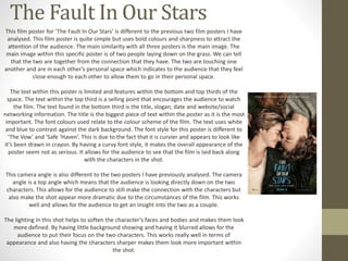
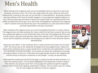
This document provides an analysis of various film posters and magazine covers. It examines elements like the main images, use of text, font styles, camera angles, lighting, and color schemes. For the film posters, it notes how the main images establish relationships between characters and draws attention. It also analyzes how text is organized and prioritized. Camera angles are discussed in relation to audience connection and perspective. Similar techniques are summarized for the magazine covers, focusing on features like mastheads, cover lines, model credits, and use of color and font to guide attention.