Anxiety film poster analysis
By Owen Maers
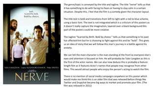
The genre/topic is conveyed by the title and tagline. The title “nerve” tells us that
it has something to do with facing his fears or having to stay calm in a certain
situation. Despite this, I feel that the film is a comedy given the character layout.
The title text is bold and transitions from left to right with a red to blue scheme,
using a basic font. The text is not integrated which is a criticism of this posters as
it doesn’t really capture the imagination, layered over a black background this
part of the posters could be more creative.
The tagline “Scarred by Birth. Bold by choice.” tells us that something in his past
has affected him but he is choosing to fight against this and be “bold”. This gives
us an idea of story that we will follow this man’s journey in a battle against his
anxiety.
We can tell the main character is the man standing at the front as everyone else’s
eyes and attention is focused on him. He will probably be Tyler Langdon as this is
the first of the actor names. We can also now deduce this is probably a feature
length film as it features Actor’s names that people may recognise from other
films. This would attract people who enjoy the person’s acting to watch the film.
There is no mention of social media campaigns anywhere on this poster which
would make me think this is an older film that was released before things like
Twitter and Snapchat became big ways to market and promote your film. (The
film was released in 2011)
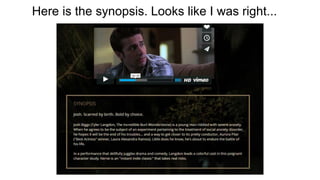
Here is the synopsis. Looks like I was right...
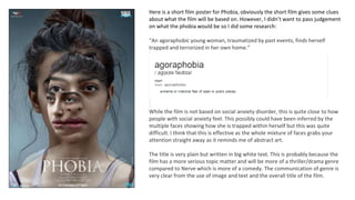
Here is a short film poster for Phobia, obviously the short film gives some clues
about what the film will be based on. However, I didn’t want to pass judgement
on what the phobia would be so I did some research:
“An agoraphobic young woman, traumatized by past events, finds herself
trapped and terrorized in her own home.”
While the film is not based on social anxiety disorder, this is quite close to how
people with social anxiety feel. This possibly could have been inferred by the
multiple faces showing how she is trapped within herself but this was quite
difficult. I think that this is effective as the whole mixture of faces grabs your
attention straight away as it reminds me of abstract art.
The title is very plain but written in big white text. This is probably because the
film has a more serious topic matter and will be more of a thriller/drama genre
compared to Nerve which is more of a comedy. The communication of genre is
very clear from the use of image and text and the overall title of the film.
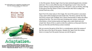
In this film poster, Nicolas Cage’s face has been photoshopped onto a broken
plant pot. This is a very effective way of integrating an actor’s face into the
poster without it being striking obviously. The plant is also an Orchid, referring
to the plot of the film which is that a screenwriter who fails to adapt The
Orchid Thief into a film.
Apart from this clever play on the image, the rest of the poster is very basic
using a plain white background and simple text. The fonts used for the title
and actors names look scribbled, this is done intentionally to reflect the office
setting of the film. The rest of the text including actor names, institutional
information, critical review quotes and logos uses a plain black text and
simple font. None of this is used to strike the audience as they want them to
focus on the title and the famous actors involved.
We can assume the genre of the film is a comedy given what the review of
the film says at the top of the poster. Despite this, apart from the review,
there is no way from the poster that you can tell the genre.
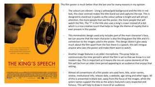
This film poster is much better than the last one for many reasons in my opinion:
- The colours are vibrant - Using a yellow/gold background and the title in red
text, this clear contrast makes the title stand out and captures the eye. This is
designed to stand out in public as the colour yellow is bright and will attract
attention, the more people that see the poster, the more people that will
watch the film. The “I” in the title also uses a king’s crown instead of a dot
which is a nice creative touch that helps to forge the theme of royalty that is
ever present in this poster.
- This minimalistic design used only includes part of the main character’s face,
we can assume that the main character is also the King given the title and it’s
connection to the images used in the poster. This design doesn’t give away
much about the film apart from the fact there is a speech, this will intrigue
anyone who sees the poster and make them want to watch.
- Another image features is an older microphone. This prop helps to
communicate the time period in which the film is set so that we know it is not
modern day. This is important as it means the mis-en-scene elements of the
film will be from an older time period appealing to an audience that enjoys that
setting.
- Almost all conventions of a film poster are used here, title, actor names,
review, institutional info, release date, a website, age rating and other logos. All
of this is presented in black text, away from the focus of the images, while the
actors names support the title as the actors featured a very respected and
famous. This will help to draw in more of an audience.

Anxiety film posters analysis

  • 1.
    Anxiety film posteranalysis By Owen Maers
  • 2.
    The genre/topic isconveyed by the title and tagline. The title “nerve” tells us that it has something to do with facing his fears or having to stay calm in a certain situation. Despite this, I feel that the film is a comedy given the character layout. The title text is bold and transitions from left to right with a red to blue scheme, using a basic font. The text is not integrated which is a criticism of this posters as it doesn’t really capture the imagination, layered over a black background this part of the posters could be more creative. The tagline “Scarred by Birth. Bold by choice.” tells us that something in his past has affected him but he is choosing to fight against this and be “bold”. This gives us an idea of story that we will follow this man’s journey in a battle against his anxiety. We can tell the main character is the man standing at the front as everyone else’s eyes and attention is focused on him. He will probably be Tyler Langdon as this is the first of the actor names. We can also now deduce this is probably a feature length film as it features Actor’s names that people may recognise from other films. This would attract people who enjoy the person’s acting to watch the film. There is no mention of social media campaigns anywhere on this poster which would make me think this is an older film that was released before things like Twitter and Snapchat became big ways to market and promote your film. (The film was released in 2011)
  • 3.
    Here is thesynopsis. Looks like I was right...
  • 4.
    Here is ashort film poster for Phobia, obviously the short film gives some clues about what the film will be based on. However, I didn’t want to pass judgement on what the phobia would be so I did some research: “An agoraphobic young woman, traumatized by past events, finds herself trapped and terrorized in her own home.” While the film is not based on social anxiety disorder, this is quite close to how people with social anxiety feel. This possibly could have been inferred by the multiple faces showing how she is trapped within herself but this was quite difficult. I think that this is effective as the whole mixture of faces grabs your attention straight away as it reminds me of abstract art. The title is very plain but written in big white text. This is probably because the film has a more serious topic matter and will be more of a thriller/drama genre compared to Nerve which is more of a comedy. The communication of genre is very clear from the use of image and text and the overall title of the film.
  • 5.
    In this filmposter, Nicolas Cage’s face has been photoshopped onto a broken plant pot. This is a very effective way of integrating an actor’s face into the poster without it being striking obviously. The plant is also an Orchid, referring to the plot of the film which is that a screenwriter who fails to adapt The Orchid Thief into a film. Apart from this clever play on the image, the rest of the poster is very basic using a plain white background and simple text. The fonts used for the title and actors names look scribbled, this is done intentionally to reflect the office setting of the film. The rest of the text including actor names, institutional information, critical review quotes and logos uses a plain black text and simple font. None of this is used to strike the audience as they want them to focus on the title and the famous actors involved. We can assume the genre of the film is a comedy given what the review of the film says at the top of the poster. Despite this, apart from the review, there is no way from the poster that you can tell the genre.
  • 6.
    This film posteris much better than the last one for many reasons in my opinion: - The colours are vibrant - Using a yellow/gold background and the title in red text, this clear contrast makes the title stand out and captures the eye. This is designed to stand out in public as the colour yellow is bright and will attract attention, the more people that see the poster, the more people that will watch the film. The “I” in the title also uses a king’s crown instead of a dot which is a nice creative touch that helps to forge the theme of royalty that is ever present in this poster. - This minimalistic design used only includes part of the main character’s face, we can assume that the main character is also the King given the title and it’s connection to the images used in the poster. This design doesn’t give away much about the film apart from the fact there is a speech, this will intrigue anyone who sees the poster and make them want to watch. - Another image features is an older microphone. This prop helps to communicate the time period in which the film is set so that we know it is not modern day. This is important as it means the mis-en-scene elements of the film will be from an older time period appealing to an audience that enjoys that setting. - Almost all conventions of a film poster are used here, title, actor names, review, institutional info, release date, a website, age rating and other logos. All of this is presented in black text, away from the focus of the images, while the actors names support the title as the actors featured a very respected and famous. This will help to draw in more of an audience.