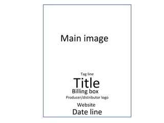
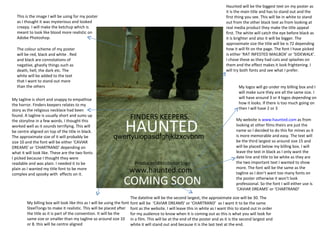
SlideShare a Scribd company logo
Poster Mock Up
Main image Tag line Title   Billing box Producer/distributor logo Date line Website
FINDERS KEEPERS. HAUNTED   qwertyuiopasdfghjklzxcvbnm Producer/distributor logo COMING SOON www.haunted.com  This is the image I will be using for my poster as I thought it was mysterious and looked creepy. I will make the ketchup which is meant to look like blood more realistic on Adobe Photoshop.  The colour scheme of my poster will be red, black and white . Red and black are connotations of negative, ghastly things such as death, hell, the dark etc. The white will be added to the text that I want to stand out more than the others My tagline is short and snappy to empathise the horror. Finders keepers relates to my story as the religious necklace had been found. A tagline is usually short and sums up the storyline in a few words. I thought this worked well as it sounds terrifying. This will be centre aligned on top of the title in black. The approximate size of it will probably be size 10 and the font will be either ‘CAVIAR DREAMS’ or ‘CHARTRAND’ depending on what it will look like. These are the two fonts I picked because I thought they were readable and was plain. I needed it to be plain as I wanted my title font to be more complex and spooky with  effects on it.  Haunted will be the biggest text on my poster as it is the main title and has to stand out and the first thing you see. This will be in white to stand out from the other black text as from looking at real media product they make the title appeal first. The white will catch the eye before black as it is brighter and also it will be bigger. The approximate size the title will be is 72 depending how it will fit on the page. The font I have picked is either ‘RAT INFESTED MAILBOX’ or ‘SIDEWALK’. I chose these as they had cuts and splashes on them and the effect makes it look frightening. I will try both fonts and see what I prefer.  My billing box will look like this as I will be using the font SteelTongs to make it realistic. This will be placed after the title as it is part of the convention. It will be the same size or smaller than my tagline so around size 10 or 8. this will be centre aligned My logos will go under my billing box and I will make sure they are all the same size. I will have around 3 or 4 logos depending on how it looks. If there is too much going on then I will have 2 or 3 My website is  www.haunted.com  as from looking at other films theirs are just the name so I decided to do this for mines as it is more memorable and easy. The text will be the third largest so around size 15 and will be placed below my billing box. I will leave the text in black as I only want the date line and title to be white as they are the two important text I wanted to show more. The font will be the same as the tagline as I don’t want too many fonts on the poster otherwise it won’t look professional. So the font I will either use is ‘CAVIAR DREAMS’ or ‘CHARTRAND’  The dateline will be the second largest, the approximate size will be 30. The font will be  ‘CAVIAR DREAMS’ or ‘CHARTRAND’  as I want it to be the same font as the website. I will leave this in white as I want this to stand out in order for my audience to know when it is coming out as this is what you will look for in a film. This will be at the end of the poster and as it is the second largest and white it will stand out and because it is the last text at the end.

More Related Content

Similar to Poster mock up

6. mockup of poster
6. mockup of poster6. mockup of poster
6. mockup of posterMaria Salib
 
LAYOUT DESIGN
LAYOUT DESIGNLAYOUT DESIGN
LAYOUT DESIGN
laurenhomer
 
FMP Week 11 Feedback
FMP Week 11 FeedbackFMP Week 11 Feedback
FMP Week 11 Feedback
Charlie Atkin
 
The poster for the film analysis a2
The poster for the film analysis a2The poster for the film analysis a2
The poster for the film analysis a2
ammz786
 
Layout for music mag 3 final
Layout for music mag 3 finalLayout for music mag 3 final
Layout for music mag 3 final
laurenhomer
 
Film poster planning ideas
Film poster planning ideasFilm poster planning ideas
Film poster planning ideasGayatriBhudia
 
Unit 14: Digital Magazine-pt.1
Unit 14: Digital Magazine-pt.1Unit 14: Digital Magazine-pt.1
Unit 14: Digital Magazine-pt.1
MayankKumar398
 
Sketch annotations.pptx
Sketch annotations.pptxSketch annotations.pptx
Sketch annotations.pptx
Jack40940
 
Task 7 Flat plans
Task 7 Flat plansTask 7 Flat plans
Task 7 Flat plansHatieBruton
 
5. pre production
5. pre production5. pre production
5. pre production
Jack Ward
 
Unit 51 alex nesbit
Unit 51 alex nesbitUnit 51 alex nesbit
Unit 51 alex nesbit
AlexNesbit
 
What information should i include on my magazine
What information should i include on my magazineWhat information should i include on my magazine
What information should i include on my magazinea2mn
 
5. pre production
5. pre production5. pre production
5. pre production
Jack Ward
 
FMP Initial Plans
FMP Initial Plans FMP Initial Plans
FMP Initial Plans
Alexander Sullivan-Cree
 

Similar to Poster mock up (20)

6. mockup of poster
6. mockup of poster6. mockup of poster
6. mockup of poster
 
LAYOUT DESIGN
LAYOUT DESIGNLAYOUT DESIGN
LAYOUT DESIGN
 
FMP Week 11 Feedback
FMP Week 11 FeedbackFMP Week 11 Feedback
FMP Week 11 Feedback
 
The poster for the film analysis a2
The poster for the film analysis a2The poster for the film analysis a2
The poster for the film analysis a2
 
Layout for music mag 3 final
Layout for music mag 3 finalLayout for music mag 3 final
Layout for music mag 3 final
 
Film poster planning ideas
Film poster planning ideasFilm poster planning ideas
Film poster planning ideas
 
Unit 14: Digital Magazine-pt.1
Unit 14: Digital Magazine-pt.1Unit 14: Digital Magazine-pt.1
Unit 14: Digital Magazine-pt.1
 
Sketch annotations.pptx
Sketch annotations.pptxSketch annotations.pptx
Sketch annotations.pptx
 
Task 7 Flat plans
Task 7 Flat plansTask 7 Flat plans
Task 7 Flat plans
 
Tests
TestsTests
Tests
 
5. pre production
5. pre production5. pre production
5. pre production
 
Media pitch
Media pitchMedia pitch
Media pitch
 
Media pitch
Media pitchMedia pitch
Media pitch
 
Unit 51 alex nesbit
Unit 51 alex nesbitUnit 51 alex nesbit
Unit 51 alex nesbit
 
poster.pptx
poster.pptxposter.pptx
poster.pptx
 
What information should i include on my magazine
What information should i include on my magazineWhat information should i include on my magazine
What information should i include on my magazine
 
5. pre production
5. pre production5. pre production
5. pre production
 
Posterpattytake
PosterpattytakePosterpattytake
Posterpattytake
 
FMP Initial Plans
FMP Initial Plans FMP Initial Plans
FMP Initial Plans
 
Question 2
Question 2 Question 2
Question 2
 

More from fatemajohara

Print screen of making my website
Print screen of making my websitePrint screen of making my website
Print screen of making my websitefatemajohara
 
Print screens of making my poster
Print screens of making my posterPrint screens of making my poster
Print screens of making my posterfatemajohara
 
Print screens for final cut pro
Print screens for final cut proPrint screens for final cut pro
Print screens for final cut profatemajohara
 
Coding my trailer within my website
Coding my trailer within my websiteCoding my trailer within my website
Coding my trailer within my websitefatemajohara
 
Print screens for motion
Print screens for motionPrint screens for motion
Print screens for motionfatemajohara
 
New haunted presentation
New haunted presentationNew haunted presentation
New haunted presentationfatemajohara
 
paranormal activity 2 trailer record sheet
paranormal activity 2 trailer record sheetparanormal activity 2 trailer record sheet
paranormal activity 2 trailer record sheetfatemajohara
 
Copy of project plan
Copy of project planCopy of project plan
Copy of project planfatemajohara
 
Paranormal activity 2 poster anaylsis
Paranormal activity 2 poster anaylsisParanormal activity 2 poster anaylsis
Paranormal activity 2 poster anaylsisfatemajohara
 
Blindness Poster Analysis
Blindness Poster AnalysisBlindness Poster Analysis
Blindness Poster Analysisfatemajohara
 

More from fatemajohara (20)

Evaluation
EvaluationEvaluation
Evaluation
 
Shot log
Shot logShot log
Shot log
 
Print screen of making my website
Print screen of making my websitePrint screen of making my website
Print screen of making my website
 
Print screens of making my poster
Print screens of making my posterPrint screens of making my poster
Print screens of making my poster
 
Print screens for final cut pro
Print screens for final cut proPrint screens for final cut pro
Print screens for final cut pro
 
Coding my trailer within my website
Coding my trailer within my websiteCoding my trailer within my website
Coding my trailer within my website
 
Print screens for motion
Print screens for motionPrint screens for motion
Print screens for motion
 
New haunted presentation
New haunted presentationNew haunted presentation
New haunted presentation
 
paranormal activity 2 trailer record sheet
paranormal activity 2 trailer record sheetparanormal activity 2 trailer record sheet
paranormal activity 2 trailer record sheet
 
Copy of project plan
Copy of project planCopy of project plan
Copy of project plan
 
Camera shots
Camera shotsCamera shots
Camera shots
 
genre conventions
genre conventionsgenre conventions
genre conventions
 
Photo for poster
Photo for posterPhoto for poster
Photo for poster
 
Photo for poster
Photo for posterPhoto for poster
Photo for poster
 
Photoshoot plan
Photoshoot planPhotoshoot plan
Photoshoot plan
 
Paranormal activity 2 poster anaylsis
Paranormal activity 2 poster anaylsisParanormal activity 2 poster anaylsis
Paranormal activity 2 poster anaylsis
 
Camera shotlist
Camera shotlistCamera shotlist
Camera shotlist
 
Presentation
PresentationPresentation
Presentation
 
Presentation
PresentationPresentation
Presentation
 
Blindness Poster Analysis
Blindness Poster AnalysisBlindness Poster Analysis
Blindness Poster Analysis
 

Poster mock up

  • 2. Main image Tag line Title Billing box Producer/distributor logo Date line Website
  • 3. FINDERS KEEPERS. HAUNTED qwertyuiopasdfghjklzxcvbnm Producer/distributor logo COMING SOON www.haunted.com This is the image I will be using for my poster as I thought it was mysterious and looked creepy. I will make the ketchup which is meant to look like blood more realistic on Adobe Photoshop. The colour scheme of my poster will be red, black and white . Red and black are connotations of negative, ghastly things such as death, hell, the dark etc. The white will be added to the text that I want to stand out more than the others My tagline is short and snappy to empathise the horror. Finders keepers relates to my story as the religious necklace had been found. A tagline is usually short and sums up the storyline in a few words. I thought this worked well as it sounds terrifying. This will be centre aligned on top of the title in black. The approximate size of it will probably be size 10 and the font will be either ‘CAVIAR DREAMS’ or ‘CHARTRAND’ depending on what it will look like. These are the two fonts I picked because I thought they were readable and was plain. I needed it to be plain as I wanted my title font to be more complex and spooky with effects on it. Haunted will be the biggest text on my poster as it is the main title and has to stand out and the first thing you see. This will be in white to stand out from the other black text as from looking at real media product they make the title appeal first. The white will catch the eye before black as it is brighter and also it will be bigger. The approximate size the title will be is 72 depending how it will fit on the page. The font I have picked is either ‘RAT INFESTED MAILBOX’ or ‘SIDEWALK’. I chose these as they had cuts and splashes on them and the effect makes it look frightening. I will try both fonts and see what I prefer. My billing box will look like this as I will be using the font SteelTongs to make it realistic. This will be placed after the title as it is part of the convention. It will be the same size or smaller than my tagline so around size 10 or 8. this will be centre aligned My logos will go under my billing box and I will make sure they are all the same size. I will have around 3 or 4 logos depending on how it looks. If there is too much going on then I will have 2 or 3 My website is www.haunted.com as from looking at other films theirs are just the name so I decided to do this for mines as it is more memorable and easy. The text will be the third largest so around size 15 and will be placed below my billing box. I will leave the text in black as I only want the date line and title to be white as they are the two important text I wanted to show more. The font will be the same as the tagline as I don’t want too many fonts on the poster otherwise it won’t look professional. So the font I will either use is ‘CAVIAR DREAMS’ or ‘CHARTRAND’ The dateline will be the second largest, the approximate size will be 30. The font will be ‘CAVIAR DREAMS’ or ‘CHARTRAND’ as I want it to be the same font as the website. I will leave this in white as I want this to stand out in order for my audience to know when it is coming out as this is what you will look for in a film. This will be at the end of the poster and as it is the second largest and white it will stand out and because it is the last text at the end.