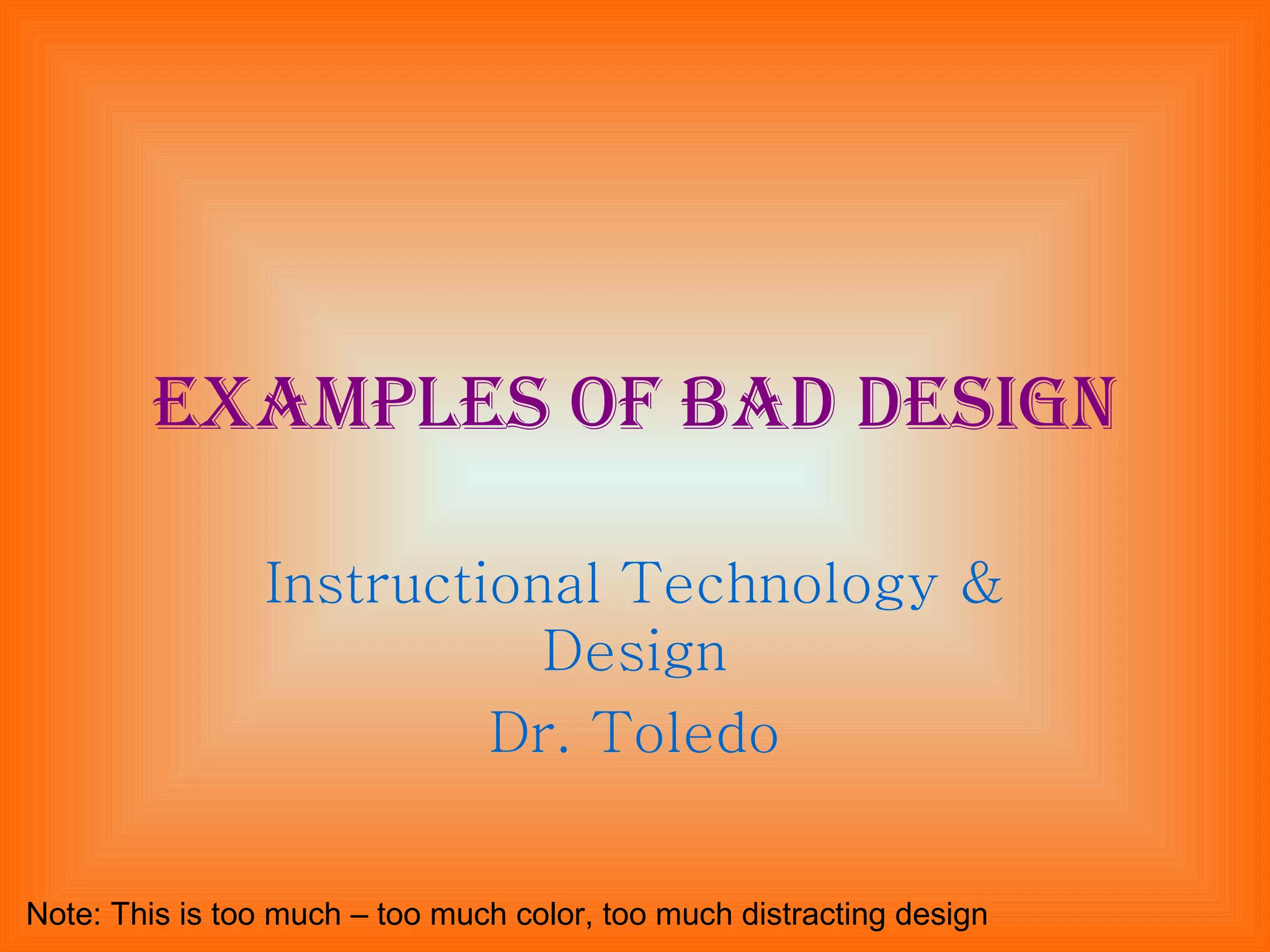
Examples of bad design Instructional Technology & Design Dr. Toledo Note: This is too much – too much color, too much distracting design
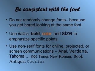
Be consistent with the font Do not randomly change fonts– because you get bored looking at the same font Use  italics ,  bold ,  color , and  size  to emphasize specific points Use non-serif fonts for online, projected, or screen communications – Arial,  Verdana ,  Tahoma  … not   Times New Roman ,   Book Antiqua ,  Courier
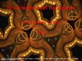
Be consistent with background Which is easier to read? THIS Note: This background is too busy – check the next slide to see how it can be muted
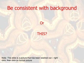
Be consistent with background Or THIS? Note: This slide is a picture that has been washed out – right click, then click on format picture
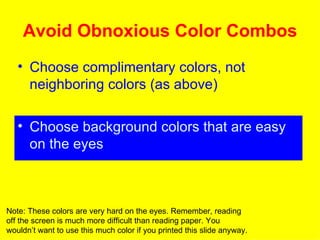
Avoid Obnoxious Color Combos Choose complimentary colors, not neighboring colors (as above) Choose background colors that are easy on the eyes Note: These colors are very hard on the eyes. Remember, reading off the screen is much more difficult than reading paper. You wouldn’t want to use this much color if you printed this slide anyway.
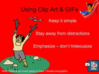
Using Clip Art & GIFs Keep it simple Stay away from distractions Emphasize – don’t hideousize Note: There is too much going on here. Choose one graphic.
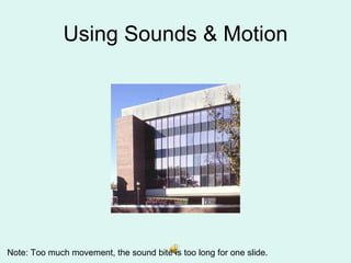
Using Sounds & Motion Note: Too much movement, the sound bite is too long for one slide.
Moral Keep it simple Make it appropriate for your audience

Bad Web Design

  • 1.
    Examples of baddesign Instructional Technology & Design Dr. Toledo Note: This is too much – too much color, too much distracting design
  • 2.
    Be consistent withthe font Do not randomly change fonts– because you get bored looking at the same font Use italics , bold , color , and size to emphasize specific points Use non-serif fonts for online, projected, or screen communications – Arial, Verdana , Tahoma … not Times New Roman , Book Antiqua , Courier
  • 3.
    Be consistent withbackground Which is easier to read? THIS Note: This background is too busy – check the next slide to see how it can be muted
  • 4.
    Be consistent withbackground Or THIS? Note: This slide is a picture that has been washed out – right click, then click on format picture
  • 5.
    Avoid Obnoxious ColorCombos Choose complimentary colors, not neighboring colors (as above) Choose background colors that are easy on the eyes Note: These colors are very hard on the eyes. Remember, reading off the screen is much more difficult than reading paper. You wouldn’t want to use this much color if you printed this slide anyway.
  • 6.
    Using Clip Art& GIFs Keep it simple Stay away from distractions Emphasize – don’t hideousize Note: There is too much going on here. Choose one graphic.
  • 7.
    Using Sounds &Motion Note: Too much movement, the sound bite is too long for one slide.
  • 8.
    Moral Keep itsimple Make it appropriate for your audience