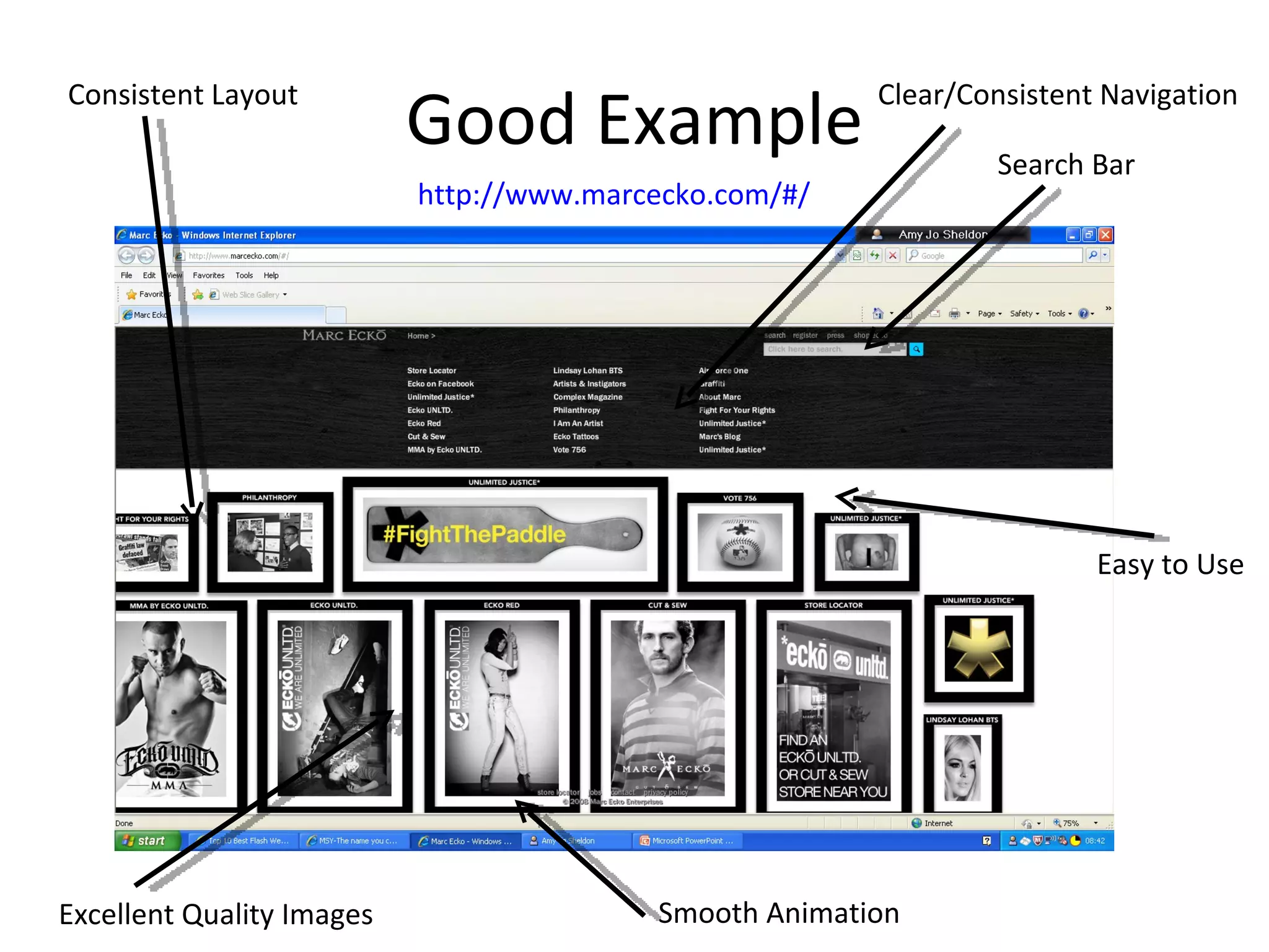
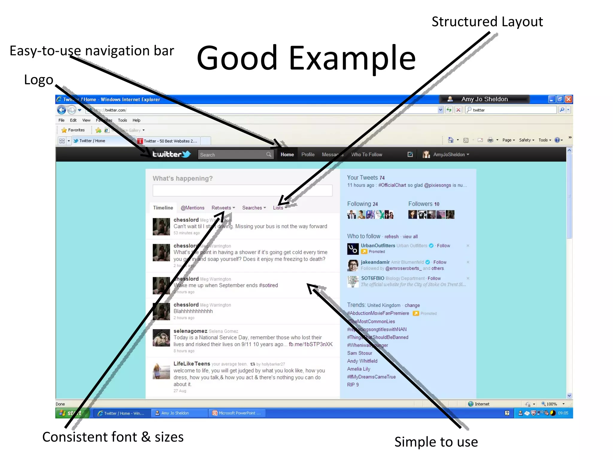
Bad & Good Examples of Websites By Amy Jo Sheldon
Good Example Clear Navigation Bar Consistent Picture Dimensions  Simple Search Criteria Advertisements “ Sign in” Option-Makes it personal to the user http://www.s1cars.com/cars-for-sale/results.cgi?area_search=Glasgow
Bad Example http://msy.com.au/   Bad Layout Over-sized Title/Logo Confusing Navigation Little/No Variation in the Colour Scheme Inconsistent Text Fonts/Sizes
Good Example http://www.marcecko.com/#/   Consistent Layout Clear/Consistent Navigation Search Bar Smooth Animation Excellent Quality Images Easy to Use
Bad Example Animated/Nauseating Background that has a waving motion Hard-to-Read Navigation Bar Overall cheap looking design Random Animations/Images with no relevance to the subject http://www.dokimos.org/ajff/
Good Example Basic/Tidy Layout Easy to read text Clear navigation Bar Great quality Image(s) Simple logo http://www.flickr.com/
Bad Example http://www.arngren.net/   Confusing/messy layout Irrelevant Animation No definitive subject/purpose No structure  Inconsistent text size/colour
Good Example Easy-to-use navigation bar Logo Structured Layout Consistent font & sizes Simple to use

Bad & good examples of websites creative media

  • 1.
    Bad & GoodExamples of Websites By Amy Jo Sheldon
  • 2.
    Good Example ClearNavigation Bar Consistent Picture Dimensions Simple Search Criteria Advertisements “ Sign in” Option-Makes it personal to the user http://www.s1cars.com/cars-for-sale/results.cgi?area_search=Glasgow
  • 3.
    Bad Example http://msy.com.au/ Bad Layout Over-sized Title/Logo Confusing Navigation Little/No Variation in the Colour Scheme Inconsistent Text Fonts/Sizes
  • 4.
    Good Example http://www.marcecko.com/#/ Consistent Layout Clear/Consistent Navigation Search Bar Smooth Animation Excellent Quality Images Easy to Use
  • 5.
    Bad Example Animated/NauseatingBackground that has a waving motion Hard-to-Read Navigation Bar Overall cheap looking design Random Animations/Images with no relevance to the subject http://www.dokimos.org/ajff/
  • 6.
    Good Example Basic/TidyLayout Easy to read text Clear navigation Bar Great quality Image(s) Simple logo http://www.flickr.com/
  • 7.
    Bad Example http://www.arngren.net/ Confusing/messy layout Irrelevant Animation No definitive subject/purpose No structure Inconsistent text size/colour
  • 8.
    Good Example Easy-to-usenavigation bar Logo Structured Layout Consistent font & sizes Simple to use