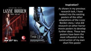
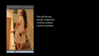
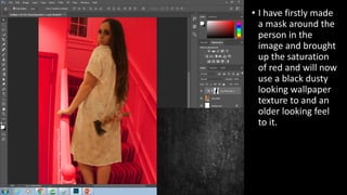
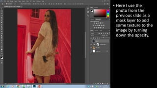
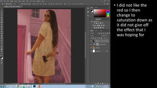
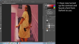
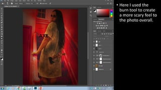
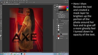
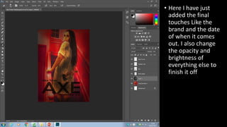
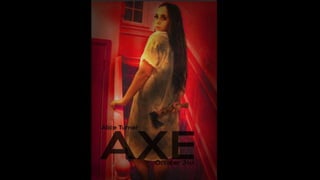
Axe Film Poster Edit
Construction Walkthrough
Eli Hussein
Inspiration?
As shown in my previous
research task, I have
looked into the existing
posters of the other
adaptations of the Lizzie
Borden story. I also did
research on other horror
movie posters to develop
further ideas. These two
posters have been the
most influential in the
construction of my own
short film poster
This will be the
starter image that
I will be using to
create my poster
• I have firstly made
a mask around the
person in the
image and brought
up the saturation
of red and will now
use a black dusty
looking wallpaper
texture to and an
older looking feel
to it.
• Here I use the
photo from the
previous slide as a
mask layer to add
some texture to the
image by turning
down the opacity.
• I did not like the
red so I then
change to
saturation down as
it did not give off
the effect that I
was hoping for
• I Have now turned
up the contrast and
found a font from
DaFont to use.
• Here I used the
burn tool to create
a more scary feel to
the photo overall.
• Here I then
Resized the text
and created a
mask layer to
brighten up the
portion of the
photo around her
face and to give off
a more ghostly feel
I turned down to
opacity of the text.
• Here I have just
added the final
touches Like the
brand and the date
of when it comes
out. I also change
the opacity and
brightness of
everything else to
finish it off
Final Product….
Axe film Poster Construction Walk Through

Axe film Poster Construction Walk Through

  • 1.
    Axe Film PosterEdit Construction Walkthrough Eli Hussein
  • 2.
    Inspiration? As shown inmy previous research task, I have looked into the existing posters of the other adaptations of the Lizzie Borden story. I also did research on other horror movie posters to develop further ideas. These two posters have been the most influential in the construction of my own short film poster
  • 3.
    This will bethe starter image that I will be using to create my poster
  • 4.
    • I havefirstly made a mask around the person in the image and brought up the saturation of red and will now use a black dusty looking wallpaper texture to and an older looking feel to it.
  • 5.
    • Here Iuse the photo from the previous slide as a mask layer to add some texture to the image by turning down the opacity.
  • 6.
    • I didnot like the red so I then change to saturation down as it did not give off the effect that I was hoping for
  • 7.
    • I Havenow turned up the contrast and found a font from DaFont to use.
  • 8.
    • Here Iused the burn tool to create a more scary feel to the photo overall.
  • 9.
    • Here Ithen Resized the text and created a mask layer to brighten up the portion of the photo around her face and to give off a more ghostly feel I turned down to opacity of the text.
  • 10.
    • Here Ihave just added the final touches Like the brand and the date of when it comes out. I also change the opacity and brightness of everything else to finish it off
  • 11.