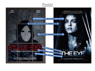
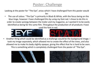
The poster uses conventions from the film "The Eye" including a blue tinge and positioning of title and tagline. It develops these conventions further by adding a wooden window frame around the image. It challenges conventions from "The Eye" through using red font for synergy, and a background of trees instead of black and white.
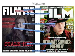
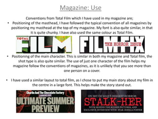
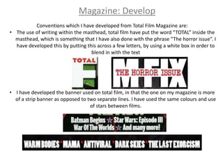
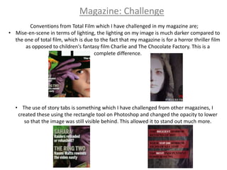
The magazine uses positioning of masthead, main character, and main story similarly to Total Film magazine. It develops the magazine further by adding writing to the masthead and a banner. It challenges conventions through darker lighting suited for a horror film and custom story tabs that stand out more.