
More Related Content
What's hot
What's hot (18)
Viewers also liked
Viewers also liked (17)
Similar to Audience research
Similar to Audience research (20)
Recently uploaded
Recently uploaded (20)
Audience research
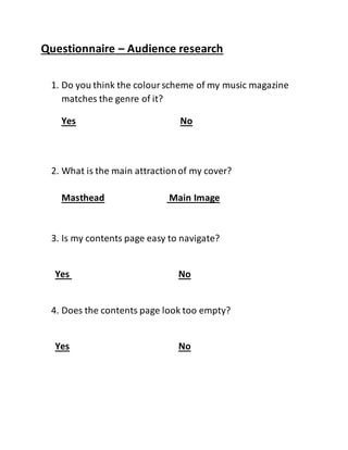
- 1. Questionnaire – Audience research 1. Do you think the colourscheme of my music magazine matches the genre of it? Yes No 2. What is the main attractionof my cover? Masthead Main Image 3. Is my contents page easy to navigate? Yes No 4. Does the contents page look too empty? Yes No
- 2. 5. Is the layout on my doublepage spread clean? Yes No 6. Is the font clear and easy to read on all my pages? Yes No 7. Do all three pages look like they’re in the same magazine? Yes No
- 3. Tally Question 1. 5/5 answered Yes Question 2. 5/5 answered main image Question 3. 4/5 answered yes, 1/5 answered no Question 4. 5/5 answered no Question 5. 3/5 answered yes, 2/5 answered no Question 6. 5/5 answered yes Question 7. 3/5 answered yes, 2/5 answered no
- 4. This tells me that I did a good job in choosing red and black as my main colour scheme as it clearly matched the metal/rock genre. This is also positive as it tells me that everyonewho I asked was mainly attracted to the main image, this is good because I think that the main image should be the thing that catches the consumers eyein the firstplace. 1. Do you think the colour scheme of my music magazine matches the genre of it? Yes No 2. What is the main attraction of my cover? Main Image Masthead
- 5. This shows methat the majority found my contents page easy to navigate however one person said that it wasn’t, this means I should’vemade the numbers and pictures link more closely. This is a very good result as it showed that no one thought that my contents page looked too empty, this is often a main problemwith contents pages as they should look busy and packed rather than lacking things like pictures and stories. 3. Is my contents page easy to navigate? Yes No 4. Does my contents page look empty? Yes No
- 6. This is another thing that I was wary of when creating my magazine, I was worried that my double page spread might not look massively clean and professional, however the majority did say that it did seem clean, a couple people said that it wasn’t, which makes me think that I should’veperhaps stuck moreto conventions when creating my Double Page Spread. 5. Is the layout on my Double Page Spread clean? Yes No
- 7. This is a good result again as font is a key aspectand needs to be easy to read, my results fromthis show me that people found it easy to read. This was a crucial partof the magazine, linking each of them and making them feel as though they are all fromthe same magazine, although the majority thought it looked as though they were fromthe same magazine, a couple said it didn’t, I think this is due to my double page spread primarily. 6. Is the font clear and easy to read on my pages? Yes No 7. Do all three pages look like they're from the same magazine? Yes No