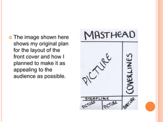
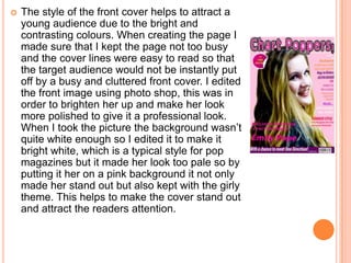
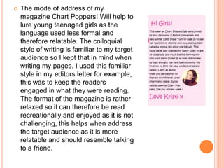
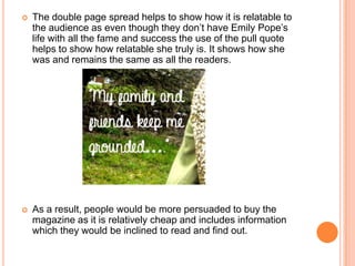
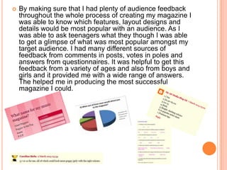
EVALUATION
By Kristi Hewitt
5) HOW DID YOU ATTRACT/ADDRESS
YOUR AUDIENCE?
   Due to the statistic that 70% of people buy their
    magazines on the spur of the moment, I created my
    magazine cover with this in mind. I put a lot of focus
    and effort into the front cover and it is the first thing
    a buyer would see and ultimately will help to decide
    whether they will buy it or not. This is why I used
    bright colours which will help to catch the eyes or
    the target audience and will help to attract their
    attention. By using Emily as the main image and
    focus of the magazine it clearly shows that the
    magazine features an exclusive interview with her,
    this will in turn help to encourage teenaged girls to
    buy it and read it as it is someone young like them
    and they will be interested in what she has to say.
   The image shown here
    shows my original plan
    for the layout of the
    front cover and how I
    planned to make it as
    appealing to the
    audience as possible.
   The style of the front cover helps to attract a
    young audience due to the bright and
    contrasting colours. When creating the page I
    made sure that I kept the page not too busy
    and the cover lines were easy to read so that
    the target audience would not be instantly put
    off by a busy and cluttered front cover. I edited
    the front image using photo shop, this was in
    order to brighten her up and make her look
    more polished to give it a professional look.
    When I took the picture the background wasn’t
    quite white enough so I edited it to make it
    bright white, which is a typical style for pop
    magazines but it made her look too pale so by
    putting it her on a pink background it not only
    made her stand out but also kept with the girly
    theme. This helps to make the cover stand out
    and attract the readers attention.
   The mode of address of my
    magazine Chart Poppers! Will help to
    lure young teenaged girls as the
    language used less formal and
    therefore relatable. The colloquial
    style of writing is familiar to my target
    audience so I kept that in mind when
    writing my pages. I used this familiar
    style in my editors letter for example,
    this was to keep the readers
    engaged in what they were reading.
    The format of the magazine is rather
    relaxed so it can therefore be read
    recreationally and enjoyed as it is not
    challenging, this helps when address
    the target audience as it is more
    relatable and should resemble talking
    to a friend.
   The double page spread helps to show how it is relatable to
    the audience as even though they don’t have Emily Pope’s
    life with all the fame and success the use of the pull quote
    helps to show how relatable she truly is. It shows how she
    was and remains the same as all the readers.


   As a result, people would be more persuaded to buy the
    magazine as it is relatively cheap and includes information
    which they would be inclined to read and find out.
   By making sure that I had plenty of audience feedback
    throughout the whole process of creating my magazine I
    was able to know which features, layout designs and
    details would be most popular with an audience. As I
    was able to ask teenagers what they though I was able
    to get a glimpse of what was most popular amongst my
    target audience. I had many different sources of
    feedback from comments in posts, votes in poles and
    answers from questionnaires. It was helpful to get this
    feedback from a variety of ages and also from boys and
    girls and it provided me with a wide range of answers.
    The helped me in producing the most successful
    magazine I could.

Evaluation qn 5

  • 1.
  • 2.
    5) HOW DIDYOU ATTRACT/ADDRESS YOUR AUDIENCE?
  • 3.
    Due to the statistic that 70% of people buy their magazines on the spur of the moment, I created my magazine cover with this in mind. I put a lot of focus and effort into the front cover and it is the first thing a buyer would see and ultimately will help to decide whether they will buy it or not. This is why I used bright colours which will help to catch the eyes or the target audience and will help to attract their attention. By using Emily as the main image and focus of the magazine it clearly shows that the magazine features an exclusive interview with her, this will in turn help to encourage teenaged girls to buy it and read it as it is someone young like them and they will be interested in what she has to say.
  • 4.
    The image shown here shows my original plan for the layout of the front cover and how I planned to make it as appealing to the audience as possible.
  • 5.
    The style of the front cover helps to attract a young audience due to the bright and contrasting colours. When creating the page I made sure that I kept the page not too busy and the cover lines were easy to read so that the target audience would not be instantly put off by a busy and cluttered front cover. I edited the front image using photo shop, this was in order to brighten her up and make her look more polished to give it a professional look. When I took the picture the background wasn’t quite white enough so I edited it to make it bright white, which is a typical style for pop magazines but it made her look too pale so by putting it her on a pink background it not only made her stand out but also kept with the girly theme. This helps to make the cover stand out and attract the readers attention.
  • 6.
    The mode of address of my magazine Chart Poppers! Will help to lure young teenaged girls as the language used less formal and therefore relatable. The colloquial style of writing is familiar to my target audience so I kept that in mind when writing my pages. I used this familiar style in my editors letter for example, this was to keep the readers engaged in what they were reading. The format of the magazine is rather relaxed so it can therefore be read recreationally and enjoyed as it is not challenging, this helps when address the target audience as it is more relatable and should resemble talking to a friend.
  • 7.
    The double page spread helps to show how it is relatable to the audience as even though they don’t have Emily Pope’s life with all the fame and success the use of the pull quote helps to show how relatable she truly is. It shows how she was and remains the same as all the readers.  As a result, people would be more persuaded to buy the magazine as it is relatively cheap and includes information which they would be inclined to read and find out.
  • 8.
    By making sure that I had plenty of audience feedback throughout the whole process of creating my magazine I was able to know which features, layout designs and details would be most popular with an audience. As I was able to ask teenagers what they though I was able to get a glimpse of what was most popular amongst my target audience. I had many different sources of feedback from comments in posts, votes in poles and answers from questionnaires. It was helpful to get this feedback from a variety of ages and also from boys and girls and it provided me with a wide range of answers. The helped me in producing the most successful magazine I could.