SlideShare a Scribd company logo
Evaluation
By Tony Mutombo. For my AS Level Media Studies coursework, I was to create my own, exclusive
music magazine. My task was to create my own new and exclusive music magazine that could
compete in the industry with all the other big names. With being able to set the magazine on a genre
of my choice, i completed my magazine; producing the front cover, double page spread and contents
page using Adobe Photoshop. In order to provide evidence of the reserach and planning that i
carried out, i was to make a blog. As i have finally finished the task that was set for me, i am now
able to evaluate the effectiveness of my work and to reflect on how much i have developed my
media skills and understanding.

Practical
My magazine is conventional in the sense that it uses similar colours and fonts to other existing hip
hop magazines. The colour scheme consists of red, white and black.
They are very rich colours that are used together to make them
clash and stand out. White is a pure, clean colour that indicates
perfection; whilst red is a rich colour that may be used by the upper
class to show their status and superiority. E.g. the roman soldiers
had red capes to show their superiority towards the other citizens.
Black is a very dark colour and stands out. This links with the artists
within the music genre. The white shows the artists perfection as
the males and women presented in these magazines are all good
looking and have great bodies. The red can also show their wealth
as most enjoy the luxuries in life, buying the big chains and flash
cars. Both these magazine front covers display these three colours.
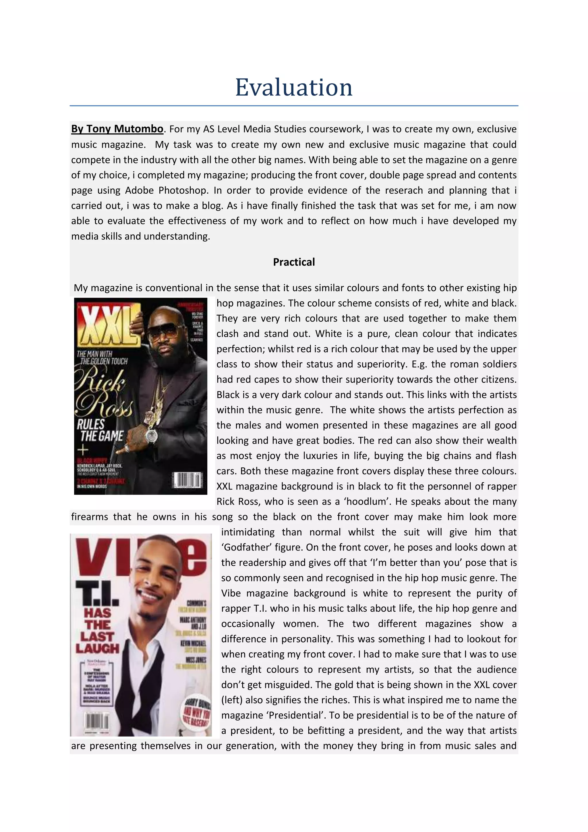
XXL magazine background is in black to fit the personnel of rapper
Rick Ross, who is seen as a ‘hoodlum’. He speaks about the many
firearms that he owns in his song so the black on the front cover may make him look more
intimidating than normal whilst the suit will give him that
‘Godfather’ figure. On the front cover, he poses and looks down at
the readership and gives off that ‘I’m better than you’ pose that is
so commonly seen and recognised in the hip hop music genre. The
Vibe magazine background is white to represent the purity of
rapper T.I. who in his music talks about life, the hip hop genre and
occasionally women. The two different magazines show a
difference in personality. This was something I had to lookout for
when creating my front cover. I had to make sure that I was to use
the right colours to represent my artists, so that the audience
don’t get misguided. The gold that is being shown in the XXL cover
(left) also signifies the riches. This is what inspired me to name the
magazine ‘Presidential’. To be presidential is to be of the nature of
a president, to be befitting a president, and the way that artists
are presenting themselves in our generation, with the money they bring in from music sales and
album launches, they might as well ‘shower in their gold’. Therefore to make the masthead gold was
my way of showing that not only is the word ‘Presidential’ magazine is prestigious, the magazine I
was to produce was to be prestigious too. It was to be different from other hip hop magazines, one
that focused solely on the music, and give the readership that presidential feeling when reading
their magazine. On the XXL front cover (top) we see hip hop rapper Rick Ross dressed in a black
designer suit, showing off his luxurious jewellery. This defeats the hip hop stereotype as most
rappers are normally seen in baggy clothing or vest tops, with their trousers worn ridiculously low,
posing on top of a car surrounded by beautiful women. Here the public sees the artist posing in a
suit, something rappers aren’t usually seen wearing. On the Vibe magazine, rapper T.I. is also
wearing a suit, but he has left his bow tie undone to make it look informal, casual and somewhat
cool. This front cover of XXL magazine and Vibe magazine is different to what the audience would
normally be used to seeing. Because of this, this front cover and certain others were sources I used
as inspiration for my magazine cover. As you may not notice much of the layout for the text and the
sizes of the different fonts and styles are closely mirrored in cover, this is to create an identity of a
general Hip Hop magazine. I used these two magazines as a lifeline; I studied their front covers and
made sure that when I was to create my front cover, that the outfits
that my artists would wear would once again match their
personalities. I didn’t want to make the artists wear formal clothing
because that is simply not of their nature. My artists’ were to wear
urban clothing that is so significantly seen being worn by teenagers
and young adults on the streets. This was because I wanted to show
that although they were musicians, they were still young adults that
liked and followed fashion trends. I learnt that the content of hip
hop magazines was mature and aimed at teenagers/adults, with
some swearing and a few references to sex and drugs. The target
audience of these magazines has to
be into the genre of the magazine
obviously, but also know some of
the hip hop slang or just even the
language used in production world, such as sampling. The magazine
all seemed to have a house style meaning that they use the same
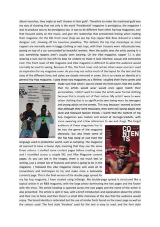
three colours. I studied some content pages before creating mine
and I stumbled across a couple XXL and Vibe Magazine content
pages. As you can see in the images, there is not much text or
writing, just a simple isle of features and what is going to be in the
magazine. I followed this vibe magazine closely and used all its
conventions and techniques to try and make mine a believable
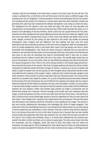
contents page. This is the final version of the double page spread for
my hip hop magazine, I have created using InDesign. My double-page spread is structured like a
typical article in an R&B magazine, with the large photo dominating the two pages and the footer
with the trivia. The article heading is spanned across the two pages and the name of the writer is
also presented. The article is split in two, with a brief introduction and explanation about the artists
and their rise to fame and then there’s a small little interview of the duo that the audience would
enjoy. The brand identity is reiterated but the use of similar fonts found on the cover page as well as
the colours used. The font style 'Verdana’ used for the text is easy to read, and the font style
‘Yemista’ used for the heading is the same that is used on the front cover for the sell line. This
creates a symbiotic link, as the fonts on the sell lines were to be the same on different pages. Also
creating some sort of recognition. Yemista provides a formal and professional look for the spread.
This compliments the article as it is based on a serious topic about the artist; therefore a flashy and
gimmicky font used may have hampered the delicate atmosphere I was trying to create the story.
The background for the spread is also very bold and large, this does not only describes the
characteristics and personalities of the two artists but also further helps illustrate the article, as it is
based on the upbringing of the two brothers, which is dark and not a good memory for the artist.
However the white background and natural lighting connotes that they two artists are ‘happier’ now
than they were before, having found success in their music they believe that better times are to
come. Happier moments for the artists are also captured in the article. My models are wearing
stereotypical ‘bold, arrogant and self righteous’ hip hop clothing and they carry the same
expressions that they readership would see on the front cover of magazines. Both are standing tall in
front of a blank background, which is also quite often used in hip hop posters and what is quite
favourable with photographers. This shows the artists innocence, although they are perceived as
hoodlums, the two boys had never been on the wrong side of the law, they prefer to live life the way
they want to and only do something that they’re uncomfortable with if they had no choice,
something that the audience would later find out in the article. This double page spread was my
source of inspiration. As you may notice, there are few differences between the style and theme for
this spread compared to mine. There is far more writing involved in this double page spread but I
have mirrored the layout of the spread. I feel that my target audience will enjoy the shorter articles
compared to traditional articles that seem to linger on forever. I carried out a survey on twitter and
asked a couple of people from my focus group on their thoughts about long articles and the results
concluded that the majority of the people I asked, preferred short articles that got straight to the
point; therefore I have created my article using fewer than one thousand words. The format of the
article for my spread is also simple for readers, it is a series of questions by the interviewer followed
by the answers from the interviewee, the use of bold font for questions and regular text for answers
helps the audience tell the difference between the two, artist Dee Blake’s answers are also written
in red text whilst Ortega is written in blue text so that the audience may be able to tell the difference
between the two speakers. Unlike most double page spreads my image is transparent and set
behind that writing, this is because I felt the message of the article was more important than the
image, so that the audience can focus on the text rather than the face of the artists. I also did this so
that I could put more on the double page spread so that the readership can find out more about the
two artists. I also thought that I would put the image behind the text because I felt that the article
was portraying to the audience should be connoted as more significant the images. The picture is
also very normal, defeating the stereotypes and challenging the cliché of rapper gangsters. The
artists don’t look very intimidating, they aren’t surrounded by half naked women nor are they posing
in front of expensive cars, helicopters or other vehicles. They don’t tend to show off their jewellery,
this is not because they aren’t as rich as the other musicians but is because they are two humble
human beings that appreciate what they have achieved. You can notice that the pose and attire of
the artist is very humble and streetwise, there is no flashy flash clothing that the working class
wouldn’t be able to afford, and there are no tattoos or gang signs. The dress sense shows that they
are nonchalant, and are renegades, which also links to their new album that the artists are
promoting. The large tag line “We’re breaking B.I.G” talks about how the artists are determined and
ready to overtake rap legend The Notorious B.I.G’s crown as the best ever rapper, and Ortega’s facial
expression shows how he doesn’t care about what the public think about his ability, he already
knows that he is good enough for the challenge. The huge tagline also further helps in capturing the
audience’s attention, the line also helps set the tone for the article. Therefore the readers know
what kind of story they are reading.

How does your media product represent the particular social groups?
Some groups that I think are represented through my magazine are Americans, American youth,
poor American suburbs, celebrities, African Americans, hip hop artists and hip hop culture and also
the British public. The duo ‘Trippy Blake’ that I created is American, and grew up from a small suburb
in Brooklyn, New York. Flatbush is a community which consists of several neighbourhoods and has a
high influx of Caribbean’s, Jewish, Asian immigrants and African Americans. The area is largely
diverse because of the mix of different ethnicity; dominated by small but effective gangs, crime rates
in Flatbush are significantly high. The quote “I’ve never left the States but I love England!” said by
Trippy Blake member Dee Blake can signify that the artist has had a difficult upbringing which is
typically stereotypical for African American rappers, and sounds a little patronising towards a said
British public. The target audience I was going for with my magazine was between the age groups of
15 to 25 year olds, particularly students attending sixth form or colleges. This is because that
particular age group usually have disposable income to purchase magazines, have the time to read it
and are normally mature enough to understand adult humour and some cases sexual innuendos that
may be put in the magazine for a comical effect. The language used in my magazine is a mixture of
formal and colloquial, mainly colloquial to meet the demands of a hip hop magazine. This is so the
target audience can relate to the articles; also music magazines in general tend to use this format of
language. Celebrities are mocked slightly in this magazine. Although I have no personal opinions on
celebrities, this magazine focuses on their faults and failures. Their bad dress sense or any blunder
made by them, not to embarrass the celebrities’ but to show the readership that they are also
human and do make mistakes. It can also entertain the readership as well as help them feel more
connected to their favourite artist. The feature artists representing my magazine is within the age
bracket of my target audience, with both of them being in their early twenties. This helps in gaining
interest by the niche market. The models focused on my front cover, contents page and double page
spread represent the teenage and young adult society and therefore is relatable. This article is
focused on a controversial topic of drugs, drug taking, heartbreak, motivation and peer pressure.
The two artists talk about their experiences and show the public that although their past may be
grey, it doesn’t mean that their future will not be as good as they want it to be. The article
communicates and educates the readers how life can turn around and get better. The artist preach
to the readership that if they have a talent, that they should use it to the best of their ability. This is
particularly important to the target audience who do not wish to be associated with generic
connotations of teenagers such as, drugs, alcohol, thuggery, sex and teenage pregnancy. By
identifying the target audience, I have represented my model accordingly, the clothing worn by the
model is not of a higher class, and it isn’t expensive and flashy. This helps the audience to relate to
the artist as they feel they are of the same level of class, therefore creating a ‘closer relationship’.
This helps how they react emotionally to the article, and what understanding they take from it. In
the article on the double page spread, the artist point out that although they have never been to
Britain, they have noticed how the British public can be so direct, and “in your face”. The British
media and public could also be considered to be obsessed with celebrities and their lives when
reading this magazine. The fact that most of the stories focus on the celebrities and not their music
shows a keen interest for gossip and news. Most of my representation comes from my contents
page.

What kind of media institution might distribute your media product and why?
I have searched online for various media distributors, particularly magazines. I felt the best was WH
Smith; they are a large and popular organisation and sell large number of music magazines day to
day. One of the ranges of music magazine sold in WH Smith is ‘Hip Hop Weekly’ magazine. This being
a Hip-Hop magazine suggests that my magazine will also fit on that shelf and therefore a reliable
source for magazine distribution. In addition, they sell a stationary item, which suggests that
students or any other members of my target audience will come in the store. My project would also
be found in newsagents and other corner shops as I believe the readership would be quite huge. The
magazine will also offer freebees for the target audience. The freebees would be handed out on
every edition, they would be spread out throughout the year, and this is to make those freebees
special and appreciated by the target audience. This would include small gifts such as a £15 iTunes
voucher or small accessories or even a smaller magazine that could focus on a small group of artists,
either to help promote them if they are new to the music scene or to help promote ticket sales to
their concert, and even help promote albums and mixtapes. The intended target audience for my
media product would most likely be teenagers and people in their early twenties; some topics
covered in articles might not be suitable or interesting to children younger than fourteen. My
magazine focuses mainly on hip hop, R&B and dependent on the time of year or occasion, Soul and
gospel music therefore people interested in these genres of music would be expected to read it. A
person who likes heavy metal, punk or rock is unlikely to read it.

Who would be the audience for your media product?
My target audience is of 15 to 26 year olds. Surveys held on twitter and on my focus group suggest
that hip hop magazines attract a particular audience. Results show that most of the people who
would read music magazines like the ‘Hip Hop Weekly’ are teenager’s ages between 16 and 18 years
old. The advantage of targeting teenagers is that they have disposable income that they usually
spend on clothes, footwear, food, transportation, days and nights out and magazines etc.

How did you attract/address your audience?
By studying my target audience I was able to understand what they were looking for in a hip hop
magazine. The people I interviewed in my focus group were listeners of the hip hop music genre.
They were all in the seventeen to twenty-two year old category; which proved by my questionnaire,
was the age group that consisted in having the most fans and hip-hop listeners. My target audience
admitted to be huge fans of the hip hop genre. When asked about their favourite artists, their
answers were quite split between the mainstream artists and underground artists. Therefore to
attract and address my audience I had to meet all these points. I made my two artists a mixture of
mainstream and underground, so that they are well known within the community of young adults
and teenagers in Britain, but haven’t blown or hit the charts with their music. This allows the target
audience to be optimistic and curious about the artists, are they going to become as big as they
promise? Are they going to blow in Britain and get a British number one in the charts? It allows the
target audience to ask all these questions. My target audience also revealed that they would rather
read a magazine that heavily focused on the music rather than the artists within the industry.
Although they said they preferred this, they still would like to read some interviews and articles
about up and coming musicians. One person said that they would definitely purchase the magazine if
the company let an artist take over the magazine as an issue special. It would include a double page
spread about the artist and how they became successful, an interview with them and a page that
would discuss their albums and what they’re planning to do in the future. I attracted and addressed
my target audience by making the magazine an artist take over so that they readership could get a
better knowledge about the two artists. The article on the double page spread doesn’t only educate
the readership about the lives of the duo but also their personalities and what type of people ‘Trippy
Blake’ is. The magazine is to be a bulk sixty page magazine that feature a grand amount of other
artists, so that if the readership do somewhat get bored of the duo they can flip pages and read
about other artists.

What have you learnt about technologies from the process of constructing this product?
I have learnt countless features of Photoshop and InDesign whilst constructing this magazine. I have
learnt how to install and use fonts downloaded of the internet. The ‘Revolution’ font style used in
magazine title was downloaded from, dafont.com. I also learnt how to remove a background from
an image and place the image on another new background. This was by the help of using the
magnetic marquee tool. I have also learnt how to use brushes, also downloaded off the internet. By
the use of InDesign, I have learnt how to wrap text around an image which was useful in the double
page spread where there was a lot of writing. I also was able to learn that the image quality can be
enhancing by the use of shading and lighting effects, also there was an option to produce a high
quality image by simply selecting it from the drop down menu. With Photoshop I was able to learn
how to make the headlines and titles more attractive. By using different stroke styles, lighting and
shading effects, I was able to create an attractive magazine title.

Looking back at your preliminary task, what do you feel you have learnt in the progression
from it to the full product?
In the transition from the preliminary task to this one, there have been significant improvements in
terms of quality and overall execution of this magazine. I am more
aware of the various tools and options that both Photoshop and
InDesign has to offer, further more working with these software’s
appear more simple and fluent to me. Looking back at the magazine I
made for the previous task, there are noticeable differences I the style
of design and appearance. Grade A magazine was the preliminary task
of creating a college/sixth form magazine with the target audience
being the students. The magazine focused on how to aid the student’s
school lives, and Grade A managed to be a student guide to helping
them survive in A level. There has been a direct change from the
preliminary task to the music magazine task. First of all, with the music
magazine I was allowed to look deeper and go into more depth about
the topic and I was allowed to explore and rather information and find out what people in m target
audience liked. There are significant improvements on the practical too. The fonts and images are
also better in the music magazine. The font styles in the music magazine appear more commercial
than the fonts used in the college magazine, although the age group intended for both magazines
were the same. This shows growth in terms of understanding what looks good, and what doesn’t. In
addition, the images used were far better and well suited or the commercial look and feel I wanted
for the music magazine. With the previous magazine, I can see now that the images used were not
perfect and gave the magazine a slightly formal appearance. I also was not aware in how to make
the image look better when creating the sixth form/college magazine. As you may have noticed with
the image in the front cover of the music magazine, I have added artificial shadow effect behind the
model, making the image appear in 3D, and making it appear more natural and not like a sticker
placed on a page. Another feature you may have noticed is the detail and how much more
information there is on the front cover. On the sixth form front cover hardy any writing was on it,
there was no puffs or cell lines, nor was there even a barcode, the music magazine looks more
professional and doesn’t looked rushed. Through the music magazine the writing is easy to read, the
masthead is all one colour and is repeated throughout the context page and double page spread to
make it more recognisable; the readership become familiar to it as if it was a logo.

More Related Content

What's hot

Evaluation by Malene Riise
Evaluation by Malene RiiseEvaluation by Malene Riise
Evaluation by Malene Riise
maleneriise
 
Evaluation of Music Magazine
Evaluation of Music MagazineEvaluation of Music Magazine
Evaluation of Music Magazine
maleneriise
 
1. In what ways does your media product use, develop or challenge forms and c...
1. In what ways does your media product use, develop or challenge forms and c...1. In what ways does your media product use, develop or challenge forms and c...
1. In what ways does your media product use, develop or challenge forms and c...caitlinhulse
 
Media music magazine evaluation
Media music magazine evaluationMedia music magazine evaluation
Media music magazine evaluationagreen1994
 
Media music magazine evaluation
Media music magazine evaluationMedia music magazine evaluation
Media music magazine evaluationMoulayMiziroj
 
Media evaluationnnnn
Media evaluationnnnnMedia evaluationnnnn
Media evaluationnnnnsharon_soomal
 
My evaluation rach
My evaluation rachMy evaluation rach
My evaluation rachrachaeltara
 
My evaluation rach
My evaluation rachMy evaluation rach
My evaluation rachrachaeltara
 
Media studies music mag evaluation
Media studies music mag evaluationMedia studies music mag evaluation
Media studies music mag evaluation
JessicaCampbell1994
 
Evaluation
EvaluationEvaluation
Evaluation
saraimediastudies
 
D:\Sarai\Evaluation
D:\Sarai\EvaluationD:\Sarai\Evaluation
D:\Sarai\Evaluation
saraimediastudies
 
Evaluation questions
Evaluation questionsEvaluation questions
Evaluation questionshasharsenal
 

What's hot (15)

Evaluation by Malene Riise
Evaluation by Malene RiiseEvaluation by Malene Riise
Evaluation by Malene Riise
 
Evaluation of Music Magazine
Evaluation of Music MagazineEvaluation of Music Magazine
Evaluation of Music Magazine
 
Evaluation pp.
Evaluation pp.Evaluation pp.
Evaluation pp.
 
1. In what ways does your media product use, develop or challenge forms and c...
1. In what ways does your media product use, develop or challenge forms and c...1. In what ways does your media product use, develop or challenge forms and c...
1. In what ways does your media product use, develop or challenge forms and c...
 
Media music magazine evaluation
Media music magazine evaluationMedia music magazine evaluation
Media music magazine evaluation
 
Media music magazine evaluation
Media music magazine evaluationMedia music magazine evaluation
Media music magazine evaluation
 
Media evaluationnnnn
Media evaluationnnnnMedia evaluationnnnn
Media evaluationnnnn
 
My evaluation rach
My evaluation rachMy evaluation rach
My evaluation rach
 
My evaluation rach
My evaluation rachMy evaluation rach
My evaluation rach
 
My evaluation rach
My evaluation rachMy evaluation rach
My evaluation rach
 
My evaluation rach
My evaluation rachMy evaluation rach
My evaluation rach
 
Media studies music mag evaluation
Media studies music mag evaluationMedia studies music mag evaluation
Media studies music mag evaluation
 
Evaluation
EvaluationEvaluation
Evaluation
 
D:\Sarai\Evaluation
D:\Sarai\EvaluationD:\Sarai\Evaluation
D:\Sarai\Evaluation
 
Evaluation questions
Evaluation questionsEvaluation questions
Evaluation questions
 

Viewers also liked

film trailer overview
film trailer overviewfilm trailer overview
film trailer overview
tonym17
 
Costume ideas
Costume ideasCostume ideas
Costume ideastonym17
 
Original brief
Original briefOriginal brief
Original brief
tonym17
 
Target audience profile
Target audience profileTarget audience profile
Target audience profile
tonym17
 
camera lighting and soundsc
camera lighting and soundsccamera lighting and soundsc
camera lighting and soundsc
tonym17
 
Evaluation part2
Evaluation  part2Evaluation  part2
Evaluation part2
tonym17
 
Horror film questionnaire
Horror film questionnaireHorror film questionnaire
Horror film questionnaire
tonym17
 
Focus group & questionnaire analysis
Focus group & questionnaire analysisFocus group & questionnaire analysis
Focus group & questionnaire analysistonym17
 
Mission statement & target audience profile
Mission statement & target audience profileMission statement & target audience profile
Mission statement & target audience profile
tonym17
 

Viewers also liked (9)

film trailer overview
film trailer overviewfilm trailer overview
film trailer overview
 
Costume ideas
Costume ideasCostume ideas
Costume ideas
 
Original brief
Original briefOriginal brief
Original brief
 
Target audience profile
Target audience profileTarget audience profile
Target audience profile
 
camera lighting and soundsc
camera lighting and soundsccamera lighting and soundsc
camera lighting and soundsc
 
Evaluation part2
Evaluation  part2Evaluation  part2
Evaluation part2
 
Horror film questionnaire
Horror film questionnaireHorror film questionnaire
Horror film questionnaire
 
Focus group & questionnaire analysis
Focus group & questionnaire analysisFocus group & questionnaire analysis
Focus group & questionnaire analysis
 
Mission statement & target audience profile
Mission statement & target audience profileMission statement & target audience profile
Mission statement & target audience profile
 

Similar to Evaluation

Magazine evaluation 3
Magazine evaluation 3Magazine evaluation 3
Magazine evaluation 3nayibsufi
 
Magazine media evaluation
Magazine media evaluationMagazine media evaluation
Magazine media evaluationmarie_kamara
 
Pre tainodgt xxx. 9623 (badboy)(badass)
Pre tainodgt xxx. 9623 (badboy)(badass)Pre tainodgt xxx. 9623 (badboy)(badass)
Pre tainodgt xxx. 9623 (badboy)(badass)
jay_jay24
 
Pre tainodgt xxx. 9623 (badboy)(badass)
Pre tainodgt xxx. 9623 (badboy)(badass)Pre tainodgt xxx. 9623 (badboy)(badass)
Pre tainodgt xxx. 9623 (badboy)(badass)
jay_jay24
 
R'n'B Magazine Plan Research & Evaluation
R'n'B Magazine Plan Research & EvaluationR'n'B Magazine Plan Research & Evaluation
R'n'B Magazine Plan Research & Evaluation
Diana
 
Evaluation for main task
Evaluation for main taskEvaluation for main task
Evaluation for main task
kenyaL
 
Evaluation for main task
Evaluation for main taskEvaluation for main task
Evaluation for main task
kenyaL
 
New music magazine evaul ryo panis
New music magazine evaul ryo panisNew music magazine evaul ryo panis
New music magazine evaul ryo panisryojordanpanis
 
Evaluation question 1
Evaluation question 1Evaluation question 1
Evaluation question 1
10marmir
 
How i challenged the norms and conventions of
How i challenged the norms and conventions ofHow i challenged the norms and conventions of
How i challenged the norms and conventions ofetaylorchs
 
How i challenged the norms and conventions of
How i challenged the norms and conventions ofHow i challenged the norms and conventions of
How i challenged the norms and conventions ofetaylorchs
 
How i challenged the norms and conventions of
How i challenged the norms and conventions ofHow i challenged the norms and conventions of
How i challenged the norms and conventions ofguest20b40d8
 
How i challenged the norms and conventions of the typical norms of a music ma...
How i challenged the norms and conventions of the typical norms of a music ma...How i challenged the norms and conventions of the typical norms of a music ma...
How i challenged the norms and conventions of the typical norms of a music ma...etaylorchs
 
Evaluation for media 1
Evaluation for media 1Evaluation for media 1
Evaluation for media 1ShaniRoss
 
Hip Hop magazine analysis
Hip Hop magazine analysisHip Hop magazine analysis
Hip Hop magazine analysis
JoeGriffiths
 
Magazine evaluation
Magazine evaluationMagazine evaluation
Magazine evaluationzoesmall
 
AS Media Final Evaluation
AS Media  Final EvaluationAS Media  Final Evaluation
AS Media Final Evaluation
Nav Man
 
Media coursework evaluation
Media coursework evaluationMedia coursework evaluation
Media coursework evaluationguesta6f7d5
 
Mag evaluation final
Mag evaluation finalMag evaluation final
Mag evaluation final
PatrycjaLaska
 
Notorious evaluation
Notorious evaluationNotorious evaluation
Notorious evaluationEllieSwan
 

Similar to Evaluation (20)

Magazine evaluation 3
Magazine evaluation 3Magazine evaluation 3
Magazine evaluation 3
 
Magazine media evaluation
Magazine media evaluationMagazine media evaluation
Magazine media evaluation
 
Pre tainodgt xxx. 9623 (badboy)(badass)
Pre tainodgt xxx. 9623 (badboy)(badass)Pre tainodgt xxx. 9623 (badboy)(badass)
Pre tainodgt xxx. 9623 (badboy)(badass)
 
Pre tainodgt xxx. 9623 (badboy)(badass)
Pre tainodgt xxx. 9623 (badboy)(badass)Pre tainodgt xxx. 9623 (badboy)(badass)
Pre tainodgt xxx. 9623 (badboy)(badass)
 
R'n'B Magazine Plan Research & Evaluation
R'n'B Magazine Plan Research & EvaluationR'n'B Magazine Plan Research & Evaluation
R'n'B Magazine Plan Research & Evaluation
 
Evaluation for main task
Evaluation for main taskEvaluation for main task
Evaluation for main task
 
Evaluation for main task
Evaluation for main taskEvaluation for main task
Evaluation for main task
 
New music magazine evaul ryo panis
New music magazine evaul ryo panisNew music magazine evaul ryo panis
New music magazine evaul ryo panis
 
Evaluation question 1
Evaluation question 1Evaluation question 1
Evaluation question 1
 
How i challenged the norms and conventions of
How i challenged the norms and conventions ofHow i challenged the norms and conventions of
How i challenged the norms and conventions of
 
How i challenged the norms and conventions of
How i challenged the norms and conventions ofHow i challenged the norms and conventions of
How i challenged the norms and conventions of
 
How i challenged the norms and conventions of
How i challenged the norms and conventions ofHow i challenged the norms and conventions of
How i challenged the norms and conventions of
 
How i challenged the norms and conventions of the typical norms of a music ma...
How i challenged the norms and conventions of the typical norms of a music ma...How i challenged the norms and conventions of the typical norms of a music ma...
How i challenged the norms and conventions of the typical norms of a music ma...
 
Evaluation for media 1
Evaluation for media 1Evaluation for media 1
Evaluation for media 1
 
Hip Hop magazine analysis
Hip Hop magazine analysisHip Hop magazine analysis
Hip Hop magazine analysis
 
Magazine evaluation
Magazine evaluationMagazine evaluation
Magazine evaluation
 
AS Media Final Evaluation
AS Media  Final EvaluationAS Media  Final Evaluation
AS Media Final Evaluation
 
Media coursework evaluation
Media coursework evaluationMedia coursework evaluation
Media coursework evaluation
 
Mag evaluation final
Mag evaluation finalMag evaluation final
Mag evaluation final
 
Notorious evaluation
Notorious evaluationNotorious evaluation
Notorious evaluation
 

More from tonym17

Grim tagline
Grim taglineGrim tagline
Grim tagline
tonym17
 
Call sheet
Call sheetCall sheet
Call sheet
tonym17
 
History of horror [recovered]
History of horror [recovered]History of horror [recovered]
History of horror [recovered]
tonym17
 
r plTrailer planning
r plTrailer planningr plTrailer planning
r plTrailer planning
tonym17
 
Slasher
SlasherSlasher
Slasher
tonym17
 
m Costume, hair & make up
m Costume, hair & make upm Costume, hair & make up
m Costume, hair & make up
tonym17
 
b genre research, slasherSlasher research
b genre research, slasherSlasher   researchb genre research, slasherSlasher   research
b genre research, slasherSlasher research
tonym17
 
Mood board
Mood boardMood board
Mood board
tonym17
 
Introduction to sub genres
Introduction to sub genresIntroduction to sub genres
Introduction to sub genres
tonym17
 
Pitch presentation
Pitch presentationPitch presentation
Pitch presentation
tonym17
 
Case study
Case studyCase study
Case study
tonym17
 
Director case study
Director case studyDirector case study
Director case study
tonym17
 
Analyse existing media texts
Analyse existing media textsAnalyse existing media texts
Analyse existing media texts
tonym17
 
Poster overview
Poster overviewPoster overview
Poster overview
tonym17
 
Magazine overview
Magazine overviewMagazine overview
Magazine overview
tonym17
 
Focus group presentation
Focus group presentationFocus group presentation
Focus group presentation
tonym17
 
Introduction to sub genres
Introduction to sub genresIntroduction to sub genres
Introduction to sub genrestonym17
 
Focus group presentation
Focus group presentationFocus group presentation
Focus group presentationtonym17
 
Mise en-scene analysis
Mise en-scene analysisMise en-scene analysis
Mise en-scene analysistonym17
 
Font analysis
Font analysisFont analysis
Font analysistonym17
 

More from tonym17 (20)

Grim tagline
Grim taglineGrim tagline
Grim tagline
 
Call sheet
Call sheetCall sheet
Call sheet
 
History of horror [recovered]
History of horror [recovered]History of horror [recovered]
History of horror [recovered]
 
r plTrailer planning
r plTrailer planningr plTrailer planning
r plTrailer planning
 
Slasher
SlasherSlasher
Slasher
 
m Costume, hair & make up
m Costume, hair & make upm Costume, hair & make up
m Costume, hair & make up
 
b genre research, slasherSlasher research
b genre research, slasherSlasher   researchb genre research, slasherSlasher   research
b genre research, slasherSlasher research
 
Mood board
Mood boardMood board
Mood board
 
Introduction to sub genres
Introduction to sub genresIntroduction to sub genres
Introduction to sub genres
 
Pitch presentation
Pitch presentationPitch presentation
Pitch presentation
 
Case study
Case studyCase study
Case study
 
Director case study
Director case studyDirector case study
Director case study
 
Analyse existing media texts
Analyse existing media textsAnalyse existing media texts
Analyse existing media texts
 
Poster overview
Poster overviewPoster overview
Poster overview
 
Magazine overview
Magazine overviewMagazine overview
Magazine overview
 
Focus group presentation
Focus group presentationFocus group presentation
Focus group presentation
 
Introduction to sub genres
Introduction to sub genresIntroduction to sub genres
Introduction to sub genres
 
Focus group presentation
Focus group presentationFocus group presentation
Focus group presentation
 
Mise en-scene analysis
Mise en-scene analysisMise en-scene analysis
Mise en-scene analysis
 
Font analysis
Font analysisFont analysis
Font analysis
 

Recently uploaded

How libraries can support authors with open access requirements for UKRI fund...
How libraries can support authors with open access requirements for UKRI fund...How libraries can support authors with open access requirements for UKRI fund...
How libraries can support authors with open access requirements for UKRI fund...
Jisc
 
Chapter 3 - Islamic Banking Products and Services.pptx
Chapter 3 - Islamic Banking Products and Services.pptxChapter 3 - Islamic Banking Products and Services.pptx
Chapter 3 - Islamic Banking Products and Services.pptx
Mohd Adib Abd Muin, Senior Lecturer at Universiti Utara Malaysia
 
Model Attribute Check Company Auto Property
Model Attribute  Check Company Auto PropertyModel Attribute  Check Company Auto Property
Model Attribute Check Company Auto Property
Celine George
 
Language Across the Curriculm LAC B.Ed.
Language Across the  Curriculm LAC B.Ed.Language Across the  Curriculm LAC B.Ed.
Language Across the Curriculm LAC B.Ed.
Atul Kumar Singh
 
Unit 2- Research Aptitude (UGC NET Paper I).pdf
Unit 2- Research Aptitude (UGC NET Paper I).pdfUnit 2- Research Aptitude (UGC NET Paper I).pdf
Unit 2- Research Aptitude (UGC NET Paper I).pdf
Thiyagu K
 
The Roman Empire A Historical Colossus.pdf
The Roman Empire A Historical Colossus.pdfThe Roman Empire A Historical Colossus.pdf
The Roman Empire A Historical Colossus.pdf
kaushalkr1407
 
Template Jadual Bertugas Kelas (Boleh Edit)
Template Jadual Bertugas Kelas (Boleh Edit)Template Jadual Bertugas Kelas (Boleh Edit)
Template Jadual Bertugas Kelas (Boleh Edit)
rosedainty
 
Instructions for Submissions thorugh G- Classroom.pptx
Instructions for Submissions thorugh G- Classroom.pptxInstructions for Submissions thorugh G- Classroom.pptx
Instructions for Submissions thorugh G- Classroom.pptx
Jheel Barad
 
Ethnobotany and Ethnopharmacology ......
Ethnobotany and Ethnopharmacology ......Ethnobotany and Ethnopharmacology ......
Ethnobotany and Ethnopharmacology ......
Ashokrao Mane college of Pharmacy Peth-Vadgaon
 
Welcome to TechSoup New Member Orientation and Q&A (May 2024).pdf
Welcome to TechSoup   New Member Orientation and Q&A (May 2024).pdfWelcome to TechSoup   New Member Orientation and Q&A (May 2024).pdf
Welcome to TechSoup New Member Orientation and Q&A (May 2024).pdf
TechSoup
 
Phrasal Verbs.XXXXXXXXXXXXXXXXXXXXXXXXXX
Phrasal Verbs.XXXXXXXXXXXXXXXXXXXXXXXXXXPhrasal Verbs.XXXXXXXXXXXXXXXXXXXXXXXXXX
Phrasal Verbs.XXXXXXXXXXXXXXXXXXXXXXXXXX
MIRIAMSALINAS13
 
Overview on Edible Vaccine: Pros & Cons with Mechanism
Overview on Edible Vaccine: Pros & Cons with MechanismOverview on Edible Vaccine: Pros & Cons with Mechanism
Overview on Edible Vaccine: Pros & Cons with Mechanism
DeeptiGupta154
 
MARUTI SUZUKI- A Successful Joint Venture in India.pptx
MARUTI SUZUKI- A Successful Joint Venture in India.pptxMARUTI SUZUKI- A Successful Joint Venture in India.pptx
MARUTI SUZUKI- A Successful Joint Venture in India.pptx
bennyroshan06
 
Additional Benefits for Employee Website.pdf
Additional Benefits for Employee Website.pdfAdditional Benefits for Employee Website.pdf
Additional Benefits for Employee Website.pdf
joachimlavalley1
 
The French Revolution Class 9 Study Material pdf free download
The French Revolution Class 9 Study Material pdf free downloadThe French Revolution Class 9 Study Material pdf free download
The French Revolution Class 9 Study Material pdf free download
Vivekanand Anglo Vedic Academy
 
Thesis Statement for students diagnonsed withADHD.ppt
Thesis Statement for students diagnonsed withADHD.pptThesis Statement for students diagnonsed withADHD.ppt
Thesis Statement for students diagnonsed withADHD.ppt
EverAndrsGuerraGuerr
 
Palestine last event orientationfvgnh .pptx
Palestine last event orientationfvgnh .pptxPalestine last event orientationfvgnh .pptx
Palestine last event orientationfvgnh .pptx
RaedMohamed3
 
special B.ed 2nd year old paper_20240531.pdf
special B.ed 2nd year old paper_20240531.pdfspecial B.ed 2nd year old paper_20240531.pdf
special B.ed 2nd year old paper_20240531.pdf
Special education needs
 
Fish and Chips - have they had their chips
Fish and Chips - have they had their chipsFish and Chips - have they had their chips
Fish and Chips - have they had their chips
GeoBlogs
 
PART A. Introduction to Costumer Service
PART A. Introduction to Costumer ServicePART A. Introduction to Costumer Service
PART A. Introduction to Costumer Service
PedroFerreira53928
 

Recently uploaded (20)

How libraries can support authors with open access requirements for UKRI fund...
How libraries can support authors with open access requirements for UKRI fund...How libraries can support authors with open access requirements for UKRI fund...
How libraries can support authors with open access requirements for UKRI fund...
 
Chapter 3 - Islamic Banking Products and Services.pptx
Chapter 3 - Islamic Banking Products and Services.pptxChapter 3 - Islamic Banking Products and Services.pptx
Chapter 3 - Islamic Banking Products and Services.pptx
 
Model Attribute Check Company Auto Property
Model Attribute  Check Company Auto PropertyModel Attribute  Check Company Auto Property
Model Attribute Check Company Auto Property
 
Language Across the Curriculm LAC B.Ed.
Language Across the  Curriculm LAC B.Ed.Language Across the  Curriculm LAC B.Ed.
Language Across the Curriculm LAC B.Ed.
 
Unit 2- Research Aptitude (UGC NET Paper I).pdf
Unit 2- Research Aptitude (UGC NET Paper I).pdfUnit 2- Research Aptitude (UGC NET Paper I).pdf
Unit 2- Research Aptitude (UGC NET Paper I).pdf
 
The Roman Empire A Historical Colossus.pdf
The Roman Empire A Historical Colossus.pdfThe Roman Empire A Historical Colossus.pdf
The Roman Empire A Historical Colossus.pdf
 
Template Jadual Bertugas Kelas (Boleh Edit)
Template Jadual Bertugas Kelas (Boleh Edit)Template Jadual Bertugas Kelas (Boleh Edit)
Template Jadual Bertugas Kelas (Boleh Edit)
 
Instructions for Submissions thorugh G- Classroom.pptx
Instructions for Submissions thorugh G- Classroom.pptxInstructions for Submissions thorugh G- Classroom.pptx
Instructions for Submissions thorugh G- Classroom.pptx
 
Ethnobotany and Ethnopharmacology ......
Ethnobotany and Ethnopharmacology ......Ethnobotany and Ethnopharmacology ......
Ethnobotany and Ethnopharmacology ......
 
Welcome to TechSoup New Member Orientation and Q&A (May 2024).pdf
Welcome to TechSoup   New Member Orientation and Q&A (May 2024).pdfWelcome to TechSoup   New Member Orientation and Q&A (May 2024).pdf
Welcome to TechSoup New Member Orientation and Q&A (May 2024).pdf
 
Phrasal Verbs.XXXXXXXXXXXXXXXXXXXXXXXXXX
Phrasal Verbs.XXXXXXXXXXXXXXXXXXXXXXXXXXPhrasal Verbs.XXXXXXXXXXXXXXXXXXXXXXXXXX
Phrasal Verbs.XXXXXXXXXXXXXXXXXXXXXXXXXX
 
Overview on Edible Vaccine: Pros & Cons with Mechanism
Overview on Edible Vaccine: Pros & Cons with MechanismOverview on Edible Vaccine: Pros & Cons with Mechanism
Overview on Edible Vaccine: Pros & Cons with Mechanism
 
MARUTI SUZUKI- A Successful Joint Venture in India.pptx
MARUTI SUZUKI- A Successful Joint Venture in India.pptxMARUTI SUZUKI- A Successful Joint Venture in India.pptx
MARUTI SUZUKI- A Successful Joint Venture in India.pptx
 
Additional Benefits for Employee Website.pdf
Additional Benefits for Employee Website.pdfAdditional Benefits for Employee Website.pdf
Additional Benefits for Employee Website.pdf
 
The French Revolution Class 9 Study Material pdf free download
The French Revolution Class 9 Study Material pdf free downloadThe French Revolution Class 9 Study Material pdf free download
The French Revolution Class 9 Study Material pdf free download
 
Thesis Statement for students diagnonsed withADHD.ppt
Thesis Statement for students diagnonsed withADHD.pptThesis Statement for students diagnonsed withADHD.ppt
Thesis Statement for students diagnonsed withADHD.ppt
 
Palestine last event orientationfvgnh .pptx
Palestine last event orientationfvgnh .pptxPalestine last event orientationfvgnh .pptx
Palestine last event orientationfvgnh .pptx
 
special B.ed 2nd year old paper_20240531.pdf
special B.ed 2nd year old paper_20240531.pdfspecial B.ed 2nd year old paper_20240531.pdf
special B.ed 2nd year old paper_20240531.pdf
 
Fish and Chips - have they had their chips
Fish and Chips - have they had their chipsFish and Chips - have they had their chips
Fish and Chips - have they had their chips
 
PART A. Introduction to Costumer Service
PART A. Introduction to Costumer ServicePART A. Introduction to Costumer Service
PART A. Introduction to Costumer Service
 

Evaluation

  • 1. Evaluation By Tony Mutombo. For my AS Level Media Studies coursework, I was to create my own, exclusive music magazine. My task was to create my own new and exclusive music magazine that could compete in the industry with all the other big names. With being able to set the magazine on a genre of my choice, i completed my magazine; producing the front cover, double page spread and contents page using Adobe Photoshop. In order to provide evidence of the reserach and planning that i carried out, i was to make a blog. As i have finally finished the task that was set for me, i am now able to evaluate the effectiveness of my work and to reflect on how much i have developed my media skills and understanding. Practical My magazine is conventional in the sense that it uses similar colours and fonts to other existing hip hop magazines. The colour scheme consists of red, white and black. They are very rich colours that are used together to make them clash and stand out. White is a pure, clean colour that indicates perfection; whilst red is a rich colour that may be used by the upper class to show their status and superiority. E.g. the roman soldiers had red capes to show their superiority towards the other citizens. Black is a very dark colour and stands out. This links with the artists within the music genre. The white shows the artists perfection as the males and women presented in these magazines are all good looking and have great bodies. The red can also show their wealth as most enjoy the luxuries in life, buying the big chains and flash cars. Both these magazine front covers display these three colours. XXL magazine background is in black to fit the personnel of rapper Rick Ross, who is seen as a ‘hoodlum’. He speaks about the many firearms that he owns in his song so the black on the front cover may make him look more intimidating than normal whilst the suit will give him that ‘Godfather’ figure. On the front cover, he poses and looks down at the readership and gives off that ‘I’m better than you’ pose that is so commonly seen and recognised in the hip hop music genre. The Vibe magazine background is white to represent the purity of rapper T.I. who in his music talks about life, the hip hop genre and occasionally women. The two different magazines show a difference in personality. This was something I had to lookout for when creating my front cover. I had to make sure that I was to use the right colours to represent my artists, so that the audience don’t get misguided. The gold that is being shown in the XXL cover (left) also signifies the riches. This is what inspired me to name the magazine ‘Presidential’. To be presidential is to be of the nature of a president, to be befitting a president, and the way that artists are presenting themselves in our generation, with the money they bring in from music sales and
  • 2. album launches, they might as well ‘shower in their gold’. Therefore to make the masthead gold was my way of showing that not only is the word ‘Presidential’ magazine is prestigious, the magazine I was to produce was to be prestigious too. It was to be different from other hip hop magazines, one that focused solely on the music, and give the readership that presidential feeling when reading their magazine. On the XXL front cover (top) we see hip hop rapper Rick Ross dressed in a black designer suit, showing off his luxurious jewellery. This defeats the hip hop stereotype as most rappers are normally seen in baggy clothing or vest tops, with their trousers worn ridiculously low, posing on top of a car surrounded by beautiful women. Here the public sees the artist posing in a suit, something rappers aren’t usually seen wearing. On the Vibe magazine, rapper T.I. is also wearing a suit, but he has left his bow tie undone to make it look informal, casual and somewhat cool. This front cover of XXL magazine and Vibe magazine is different to what the audience would normally be used to seeing. Because of this, this front cover and certain others were sources I used as inspiration for my magazine cover. As you may not notice much of the layout for the text and the sizes of the different fonts and styles are closely mirrored in cover, this is to create an identity of a general Hip Hop magazine. I used these two magazines as a lifeline; I studied their front covers and made sure that when I was to create my front cover, that the outfits that my artists would wear would once again match their personalities. I didn’t want to make the artists wear formal clothing because that is simply not of their nature. My artists’ were to wear urban clothing that is so significantly seen being worn by teenagers and young adults on the streets. This was because I wanted to show that although they were musicians, they were still young adults that liked and followed fashion trends. I learnt that the content of hip hop magazines was mature and aimed at teenagers/adults, with some swearing and a few references to sex and drugs. The target audience of these magazines has to be into the genre of the magazine obviously, but also know some of the hip hop slang or just even the language used in production world, such as sampling. The magazine all seemed to have a house style meaning that they use the same three colours. I studied some content pages before creating mine and I stumbled across a couple XXL and Vibe Magazine content pages. As you can see in the images, there is not much text or writing, just a simple isle of features and what is going to be in the magazine. I followed this vibe magazine closely and used all its conventions and techniques to try and make mine a believable contents page. This is the final version of the double page spread for my hip hop magazine, I have created using InDesign. My double-page spread is structured like a typical article in an R&B magazine, with the large photo dominating the two pages and the footer with the trivia. The article heading is spanned across the two pages and the name of the writer is also presented. The article is split in two, with a brief introduction and explanation about the artists and their rise to fame and then there’s a small little interview of the duo that the audience would enjoy. The brand identity is reiterated but the use of similar fonts found on the cover page as well as the colours used. The font style 'Verdana’ used for the text is easy to read, and the font style
  • 3. ‘Yemista’ used for the heading is the same that is used on the front cover for the sell line. This creates a symbiotic link, as the fonts on the sell lines were to be the same on different pages. Also creating some sort of recognition. Yemista provides a formal and professional look for the spread. This compliments the article as it is based on a serious topic about the artist; therefore a flashy and gimmicky font used may have hampered the delicate atmosphere I was trying to create the story. The background for the spread is also very bold and large, this does not only describes the characteristics and personalities of the two artists but also further helps illustrate the article, as it is based on the upbringing of the two brothers, which is dark and not a good memory for the artist. However the white background and natural lighting connotes that they two artists are ‘happier’ now than they were before, having found success in their music they believe that better times are to come. Happier moments for the artists are also captured in the article. My models are wearing stereotypical ‘bold, arrogant and self righteous’ hip hop clothing and they carry the same expressions that they readership would see on the front cover of magazines. Both are standing tall in front of a blank background, which is also quite often used in hip hop posters and what is quite favourable with photographers. This shows the artists innocence, although they are perceived as hoodlums, the two boys had never been on the wrong side of the law, they prefer to live life the way they want to and only do something that they’re uncomfortable with if they had no choice, something that the audience would later find out in the article. This double page spread was my source of inspiration. As you may notice, there are few differences between the style and theme for this spread compared to mine. There is far more writing involved in this double page spread but I have mirrored the layout of the spread. I feel that my target audience will enjoy the shorter articles compared to traditional articles that seem to linger on forever. I carried out a survey on twitter and asked a couple of people from my focus group on their thoughts about long articles and the results concluded that the majority of the people I asked, preferred short articles that got straight to the point; therefore I have created my article using fewer than one thousand words. The format of the article for my spread is also simple for readers, it is a series of questions by the interviewer followed by the answers from the interviewee, the use of bold font for questions and regular text for answers helps the audience tell the difference between the two, artist Dee Blake’s answers are also written in red text whilst Ortega is written in blue text so that the audience may be able to tell the difference between the two speakers. Unlike most double page spreads my image is transparent and set behind that writing, this is because I felt the message of the article was more important than the image, so that the audience can focus on the text rather than the face of the artists. I also did this so that I could put more on the double page spread so that the readership can find out more about the two artists. I also thought that I would put the image behind the text because I felt that the article was portraying to the audience should be connoted as more significant the images. The picture is also very normal, defeating the stereotypes and challenging the cliché of rapper gangsters. The artists don’t look very intimidating, they aren’t surrounded by half naked women nor are they posing in front of expensive cars, helicopters or other vehicles. They don’t tend to show off their jewellery, this is not because they aren’t as rich as the other musicians but is because they are two humble human beings that appreciate what they have achieved. You can notice that the pose and attire of the artist is very humble and streetwise, there is no flashy flash clothing that the working class wouldn’t be able to afford, and there are no tattoos or gang signs. The dress sense shows that they are nonchalant, and are renegades, which also links to their new album that the artists are promoting. The large tag line “We’re breaking B.I.G” talks about how the artists are determined and ready to overtake rap legend The Notorious B.I.G’s crown as the best ever rapper, and Ortega’s facial
  • 4. expression shows how he doesn’t care about what the public think about his ability, he already knows that he is good enough for the challenge. The huge tagline also further helps in capturing the audience’s attention, the line also helps set the tone for the article. Therefore the readers know what kind of story they are reading. How does your media product represent the particular social groups? Some groups that I think are represented through my magazine are Americans, American youth, poor American suburbs, celebrities, African Americans, hip hop artists and hip hop culture and also the British public. The duo ‘Trippy Blake’ that I created is American, and grew up from a small suburb in Brooklyn, New York. Flatbush is a community which consists of several neighbourhoods and has a high influx of Caribbean’s, Jewish, Asian immigrants and African Americans. The area is largely diverse because of the mix of different ethnicity; dominated by small but effective gangs, crime rates in Flatbush are significantly high. The quote “I’ve never left the States but I love England!” said by Trippy Blake member Dee Blake can signify that the artist has had a difficult upbringing which is typically stereotypical for African American rappers, and sounds a little patronising towards a said British public. The target audience I was going for with my magazine was between the age groups of 15 to 25 year olds, particularly students attending sixth form or colleges. This is because that particular age group usually have disposable income to purchase magazines, have the time to read it and are normally mature enough to understand adult humour and some cases sexual innuendos that may be put in the magazine for a comical effect. The language used in my magazine is a mixture of formal and colloquial, mainly colloquial to meet the demands of a hip hop magazine. This is so the target audience can relate to the articles; also music magazines in general tend to use this format of language. Celebrities are mocked slightly in this magazine. Although I have no personal opinions on celebrities, this magazine focuses on their faults and failures. Their bad dress sense or any blunder made by them, not to embarrass the celebrities’ but to show the readership that they are also human and do make mistakes. It can also entertain the readership as well as help them feel more connected to their favourite artist. The feature artists representing my magazine is within the age bracket of my target audience, with both of them being in their early twenties. This helps in gaining interest by the niche market. The models focused on my front cover, contents page and double page spread represent the teenage and young adult society and therefore is relatable. This article is focused on a controversial topic of drugs, drug taking, heartbreak, motivation and peer pressure. The two artists talk about their experiences and show the public that although their past may be grey, it doesn’t mean that their future will not be as good as they want it to be. The article communicates and educates the readers how life can turn around and get better. The artist preach to the readership that if they have a talent, that they should use it to the best of their ability. This is particularly important to the target audience who do not wish to be associated with generic connotations of teenagers such as, drugs, alcohol, thuggery, sex and teenage pregnancy. By identifying the target audience, I have represented my model accordingly, the clothing worn by the model is not of a higher class, and it isn’t expensive and flashy. This helps the audience to relate to the artist as they feel they are of the same level of class, therefore creating a ‘closer relationship’. This helps how they react emotionally to the article, and what understanding they take from it. In the article on the double page spread, the artist point out that although they have never been to Britain, they have noticed how the British public can be so direct, and “in your face”. The British media and public could also be considered to be obsessed with celebrities and their lives when
  • 5. reading this magazine. The fact that most of the stories focus on the celebrities and not their music shows a keen interest for gossip and news. Most of my representation comes from my contents page. What kind of media institution might distribute your media product and why? I have searched online for various media distributors, particularly magazines. I felt the best was WH Smith; they are a large and popular organisation and sell large number of music magazines day to day. One of the ranges of music magazine sold in WH Smith is ‘Hip Hop Weekly’ magazine. This being a Hip-Hop magazine suggests that my magazine will also fit on that shelf and therefore a reliable source for magazine distribution. In addition, they sell a stationary item, which suggests that students or any other members of my target audience will come in the store. My project would also be found in newsagents and other corner shops as I believe the readership would be quite huge. The magazine will also offer freebees for the target audience. The freebees would be handed out on every edition, they would be spread out throughout the year, and this is to make those freebees special and appreciated by the target audience. This would include small gifts such as a £15 iTunes voucher or small accessories or even a smaller magazine that could focus on a small group of artists, either to help promote them if they are new to the music scene or to help promote ticket sales to their concert, and even help promote albums and mixtapes. The intended target audience for my media product would most likely be teenagers and people in their early twenties; some topics covered in articles might not be suitable or interesting to children younger than fourteen. My magazine focuses mainly on hip hop, R&B and dependent on the time of year or occasion, Soul and gospel music therefore people interested in these genres of music would be expected to read it. A person who likes heavy metal, punk or rock is unlikely to read it. Who would be the audience for your media product? My target audience is of 15 to 26 year olds. Surveys held on twitter and on my focus group suggest that hip hop magazines attract a particular audience. Results show that most of the people who would read music magazines like the ‘Hip Hop Weekly’ are teenager’s ages between 16 and 18 years old. The advantage of targeting teenagers is that they have disposable income that they usually spend on clothes, footwear, food, transportation, days and nights out and magazines etc. How did you attract/address your audience? By studying my target audience I was able to understand what they were looking for in a hip hop magazine. The people I interviewed in my focus group were listeners of the hip hop music genre. They were all in the seventeen to twenty-two year old category; which proved by my questionnaire, was the age group that consisted in having the most fans and hip-hop listeners. My target audience admitted to be huge fans of the hip hop genre. When asked about their favourite artists, their answers were quite split between the mainstream artists and underground artists. Therefore to attract and address my audience I had to meet all these points. I made my two artists a mixture of mainstream and underground, so that they are well known within the community of young adults and teenagers in Britain, but haven’t blown or hit the charts with their music. This allows the target audience to be optimistic and curious about the artists, are they going to become as big as they promise? Are they going to blow in Britain and get a British number one in the charts? It allows the target audience to ask all these questions. My target audience also revealed that they would rather
  • 6. read a magazine that heavily focused on the music rather than the artists within the industry. Although they said they preferred this, they still would like to read some interviews and articles about up and coming musicians. One person said that they would definitely purchase the magazine if the company let an artist take over the magazine as an issue special. It would include a double page spread about the artist and how they became successful, an interview with them and a page that would discuss their albums and what they’re planning to do in the future. I attracted and addressed my target audience by making the magazine an artist take over so that they readership could get a better knowledge about the two artists. The article on the double page spread doesn’t only educate the readership about the lives of the duo but also their personalities and what type of people ‘Trippy Blake’ is. The magazine is to be a bulk sixty page magazine that feature a grand amount of other artists, so that if the readership do somewhat get bored of the duo they can flip pages and read about other artists. What have you learnt about technologies from the process of constructing this product? I have learnt countless features of Photoshop and InDesign whilst constructing this magazine. I have learnt how to install and use fonts downloaded of the internet. The ‘Revolution’ font style used in magazine title was downloaded from, dafont.com. I also learnt how to remove a background from an image and place the image on another new background. This was by the help of using the magnetic marquee tool. I have also learnt how to use brushes, also downloaded off the internet. By the use of InDesign, I have learnt how to wrap text around an image which was useful in the double page spread where there was a lot of writing. I also was able to learn that the image quality can be enhancing by the use of shading and lighting effects, also there was an option to produce a high quality image by simply selecting it from the drop down menu. With Photoshop I was able to learn how to make the headlines and titles more attractive. By using different stroke styles, lighting and shading effects, I was able to create an attractive magazine title. Looking back at your preliminary task, what do you feel you have learnt in the progression from it to the full product? In the transition from the preliminary task to this one, there have been significant improvements in terms of quality and overall execution of this magazine. I am more aware of the various tools and options that both Photoshop and InDesign has to offer, further more working with these software’s appear more simple and fluent to me. Looking back at the magazine I made for the previous task, there are noticeable differences I the style of design and appearance. Grade A magazine was the preliminary task of creating a college/sixth form magazine with the target audience being the students. The magazine focused on how to aid the student’s school lives, and Grade A managed to be a student guide to helping them survive in A level. There has been a direct change from the preliminary task to the music magazine task. First of all, with the music magazine I was allowed to look deeper and go into more depth about the topic and I was allowed to explore and rather information and find out what people in m target audience liked. There are significant improvements on the practical too. The fonts and images are also better in the music magazine. The font styles in the music magazine appear more commercial
  • 7. than the fonts used in the college magazine, although the age group intended for both magazines were the same. This shows growth in terms of understanding what looks good, and what doesn’t. In addition, the images used were far better and well suited or the commercial look and feel I wanted for the music magazine. With the previous magazine, I can see now that the images used were not perfect and gave the magazine a slightly formal appearance. I also was not aware in how to make the image look better when creating the sixth form/college magazine. As you may have noticed with the image in the front cover of the music magazine, I have added artificial shadow effect behind the model, making the image appear in 3D, and making it appear more natural and not like a sticker placed on a page. Another feature you may have noticed is the detail and how much more information there is on the front cover. On the sixth form front cover hardy any writing was on it, there was no puffs or cell lines, nor was there even a barcode, the music magazine looks more professional and doesn’t looked rushed. Through the music magazine the writing is easy to read, the masthead is all one colour and is repeated throughout the context page and double page spread to make it more recognisable; the readership become familiar to it as if it was a logo.