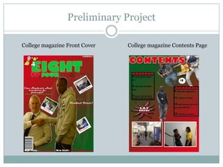
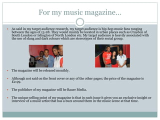
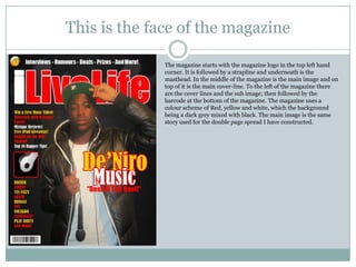
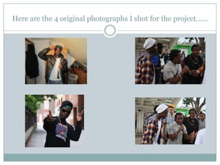
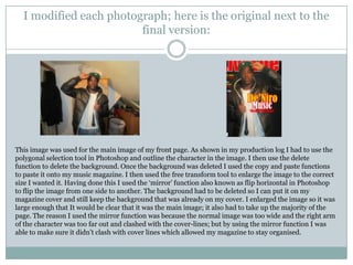
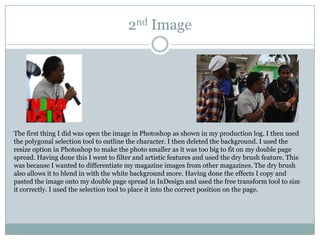
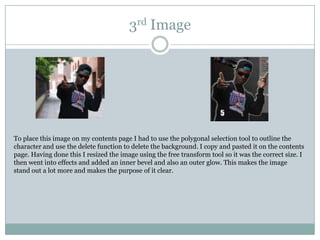
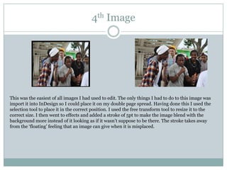
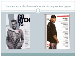
The document provides details about a student's preliminary project to create a magazine for their media studies course. It includes research on the target audience of 16-18 year old students, familiarization with design software like Photoshop and InDesign, planning pages for a magazine cover and contents page, taking photos to use for the magazine, and constructing a sample double-page spread. Reflections on the project note areas for improvement like cover lines, image positioning, and use of columns and grids.
Slides bij de quiz resultaten van Lucien van der Mooren. De grafiek geeft een overzicht van de gegeven antwoorden, tweetbird 'Larry' geeft het juiste antwoord. PROXSYS workshop; Security & Social Media - 24-11-2011
Slides bij presentatie van Niels van Tilborg over het meten van de effecten bij zakelijk gebruik van Social Media. PROXSYS workshop; Security & Social Media - 24-11-2011
Modern Radio Frequency Access Control Systems: The Key to Efficiency and SafetyAITIX LLC
Today's fast-paced environment worries companies of all sizes about efficiency and security. Businesses are constantly looking for new and better solutions to solve their problems, whether it's data security or facility access. RFID for access control technologies have revolutionized this.
Tom Selleck Net Worth: A Comprehensive Analysisgreendigital
Over several decades, Tom Selleck, a name synonymous with charisma. From his iconic role as Thomas Magnum in the television series "Magnum, P.I." to his enduring presence in "Blue Bloods," Selleck has captivated audiences with his versatility and charm. As a result, "Tom Selleck net worth" has become a topic of great interest among fans. and financial enthusiasts alike. This article delves deep into Tom Selleck's wealth, exploring his career, assets, endorsements. and business ventures that contribute to his impressive economic standing.
Follow us on: Pinterest
Early Life and Career Beginnings
The Foundation of Tom Selleck's Wealth
Born on January 29, 1945, in Detroit, Michigan, Tom Selleck grew up in Sherman Oaks, California. His journey towards building a large net worth began with humble origins. , Selleck pursued a business administration degree at the University of Southern California (USC) on a basketball scholarship. But, his interest shifted towards acting. leading him to study at the Hills Playhouse under Milton Katselas.
Minor roles in television and films marked Selleck's early career. He appeared in commercials and took on small parts in T.V. series such as "The Dating Game" and "Lancer." These initial steps, although modest. laid the groundwork for his future success and the growth of Tom Selleck net worth. Breakthrough with "Magnum, P.I."
The Role that Defined Tom Selleck's Career
Tom Selleck's breakthrough came with the role of Thomas Magnum in the CBS television series "Magnum, P.I." (1980-1988). This role made him a household name and boosted his net worth. The series' popularity resulted in Selleck earning large salaries. leading to financial stability and increased recognition in Hollywood.
"Magnum P.I." garnered high ratings and critical acclaim during its run. Selleck's portrayal of the charming and resourceful private investigator resonated with audiences. making him one of the most beloved television actors of the 1980s. The success of "Magnum P.I." played a pivotal role in shaping Tom Selleck net worth, establishing him as a major star.
Film Career and Diversification
Expanding Tom Selleck's Financial Portfolio
While "Magnum, P.I." was a cornerstone of Selleck's career, he did not limit himself to television. He ventured into films, further enhancing Tom Selleck net worth. His filmography includes notable movies such as "Three Men and a Baby" (1987). which became the highest-grossing film of the year, and its sequel, "Three Men and a Little Lady" (1990). These box office successes contributed to his wealth.
Selleck's versatility allowed him to transition between genres. from comedies like "Mr. Baseball" (1992) to westerns such as "Quigley Down Under" (1990). This diversification showcased his acting range. and provided many income streams, reinforcing Tom Selleck net worth.
Television Resurgence with "Blue Bloods"
Sustaining Wealth through Consistent Success
In 2010, Tom Selleck began starring as Frank Reagan i
From the Editor's Desk: 115th Father's day Celebration - When we see Father's day in Hindu context, Nanda Baba is the most vivid figure which comes to the mind. Nanda Baba who was the foster father of Lord Krishna is known to provide love, care and affection to Lord Krishna and Balarama along with his wife Yashoda; Letter’s to the Editor: Mother's Day - Mother is a precious life for their children. Mother is life breath for her children. Mother's lap is the world happiness whose debt can never be paid.
Meet Dinah Mattingly – Larry Bird’s Partner in Life and Loveget joys
Get an intimate look at Dinah Mattingly’s life alongside NBA icon Larry Bird. From their humble beginnings to their life today, discover the love and partnership that have defined their relationship.
Scandal! Teasers June 2024 on etv Forum.co.zaIsaac More
Monday, 3 June 2024
Episode 47
A friend is compelled to expose a manipulative scheme to prevent another from making a grave mistake. In a frantic bid to save Jojo, Phakamile agrees to a meeting that unbeknownst to her, will seal her fate.
Tuesday, 4 June 2024
Episode 48
A mother, with her son's best interests at heart, finds him unready to heed her advice. Motshabi finds herself in an unmanageable situation, sinking fast like in quicksand.
Wednesday, 5 June 2024
Episode 49
A woman fabricates a diabolical lie to cover up an indiscretion. Overwhelmed by guilt, she makes a spontaneous confession that could be devastating to another heart.
Thursday, 6 June 2024
Episode 50
Linda unwittingly discloses damning information. Nhlamulo and Vuvu try to guide their friend towards the right decision.
Friday, 7 June 2024
Episode 51
Jojo's life continues to spiral out of control. Dintle weaves a web of lies to conceal that she is not as successful as everyone believes.
Monday, 10 June 2024
Episode 52
A heated confrontation between lovers leads to a devastating admission of guilt. Dintle's desperation takes a new turn, leaving her with dwindling options.
Tuesday, 11 June 2024
Episode 53
Unable to resort to violence, Taps issues a verbal threat, leaving Mdala unsettled. A sister must explain her life choices to regain her brother's trust.
Wednesday, 12 June 2024
Episode 54
Winnie makes a very troubling discovery. Taps follows through on his threat, leaving a woman reeling. Layla, oblivious to the truth, offers an incentive.
Thursday, 13 June 2024
Episode 55
A nosy relative arrives just in time to thwart a man's fatal decision. Dintle manipulates Khanyi to tug at Mo's heartstrings and get what she wants.
Friday, 14 June 2024
Episode 56
Tlhogi is shocked by Mdala's reaction following the revelation of their indiscretion. Jojo is in disbelief when the punishment for his crime is revealed.
Monday, 17 June 2024
Episode 57
A woman reprimands another to stay in her lane, leading to a damning revelation. A man decides to leave his broken life behind.
Tuesday, 18 June 2024
Episode 58
Nhlamulo learns that due to his actions, his worst fears have come true. Caiphus' extravagant promises to suppliers get him into trouble with Ndu.
Wednesday, 19 June 2024
Episode 59
A woman manages to kill two birds with one stone. Business doom looms over Chillax. A sobering incident makes a woman realize how far she's fallen.
Thursday, 20 June 2024
Episode 60
Taps' offer to help Nhlamulo comes with hidden motives. Caiphus' new ideas for Chillax have MaHilda excited. A blast from the past recognizes Dintle, not for her newfound fame.
Friday, 21 June 2024
Episode 61
Taps is hungry for revenge and finds a rope to hang Mdala with. Chillax's new job opportunity elicits mixed reactions from the public. Roommates' initial meeting starts off on the wrong foot.
Monday, 24 June 2024
Episode 62
Taps seizes new information and recruits someone on the inside. Mary's new job
Experience the thrill of Progressive Puzzle Adventures, like Scavenger Hunt Games and Escape Room Activities combined Solve Treasure Hunt Puzzles online.
Young Tom Selleck: A Journey Through His Early Years and Rise to Stardomgreendigital
Introduction
When one thinks of Hollywood legends, Tom Selleck is a name that comes to mind. Known for his charming smile, rugged good looks. and the iconic mustache that has become synonymous with his persona. Tom Selleck has had a prolific career spanning decades. But, the journey of young Tom Selleck, from his early years to becoming a household name. is a story filled with determination, talent, and a touch of luck. This article delves into young Tom Selleck's life, background, early struggles. and pivotal moments that led to his rise in Hollywood.
Follow us on: Pinterest
Early Life and Background
Family Roots and Childhood
Thomas William Selleck was born in Detroit, Michigan, on January 29, 1945. He was the second of four children in a close-knit family. His father, Robert Dean Selleck, was a real estate investor and executive. while his mother, Martha Selleck, was a homemaker. The Selleck family relocated to Sherman Oaks, California. when Tom was a child, setting the stage for his future in the entertainment industry.
Education and Early Interests
Growing up, young Tom Selleck was an active and athletic child. He attended Grant High School in Van Nuys, California. where he excelled in sports, particularly basketball. His tall and athletic build made him a standout player, and he earned a basketball scholarship to the University of Southern California (U.S.C.). While at U.S.C., Selleck studied business administration. but his interests shifted toward acting.
Discovery of Acting Passion
Tom Selleck's journey into acting was serendipitous. During his time at U.S.C., a drama coach encouraged him to try acting. This nudge led him to join the Hills Playhouse, where he began honing his craft. Transitioning from an aspiring athlete to an actor took time. but young Tom Selleck became drawn to the performance world.
Early Career Struggles
Breaking Into the Industry
The path to stardom was a challenging one for young Tom Selleck. Like many aspiring actors, he faced many rejections and struggled to find steady work. A series of minor roles and guest appearances on television shows marked his early career. In 1965, he debuted on the syndicated show "The Dating Game." which gave him some exposure but did not lead to immediate success.
The Commercial Breakthrough
During the late 1960s and early 1970s, Selleck began appearing in television commercials. His rugged good looks and charismatic presence made him a popular brand choice. He starred in advertisements for Pepsi-Cola, Revlon, and Close-Up toothpaste. These commercials provided financial stability and helped him gain visibility in the industry.
Struggling Actor in Hollywood
Despite his success in commercials. breaking into large acting roles remained a challenge for young Tom Selleck. He auditioned and took on small parts in T.V. shows and movies. Some of his early television appearances included roles in popular series like Lancer, The F.B.I., and Bracken's World. But, it would take a
_7 OTT App Builders to Support the Development of Your Video Applications_.pdfMega P
Due to their ability to produce engaging content more quickly, over-the-top (OTT) app builders have made the process of creating video applications more accessible. The invitation to explore these platforms emphasizes how over-the-top (OTT) applications hold the potential to transform digital entertainment.
Hollywood Actress - The 250 hottest galleryZsolt Nemeth
Hollywood Actress amazon album eminent worldwide media, female-singer, actresses, alhletina-woman, 250 collection.
Highest and photoreal-print exclusive testament PC collage.
Focused television virtuality crime, novel.
The sheer afterlife of the work is activism-like hollywood-actresses point com.
173 Illustrate, 250 gallery, 154 blog, 120 TV serie logo, 17 TV president logo, 183 active hyperlink.
HD AI face enhancement 384 page plus Bowker ISBN, Congress LLCL or US Copyright.
Matt Rife Cancels Shows Due to Health Concerns, Reschedules Tour Dates.pdfAzura Everhart
Matt Rife's comedy tour took an unexpected turn. He had to cancel his Bloomington show due to a last-minute medical emergency. Fans in Chicago will also have to wait a bit longer for their laughs, as his shows there are postponed. Rife apologized and assured fans he'd be back on stage soon.
https://www.theurbancrews.com/celeb/matt-rife-cancels-bloomington-show/
240529_Teleprotection Global Market Report 2024.pdfMadhura TBRC
The teleprotection market size has grown
exponentially in recent years. It will grow from
$21.92 billion in 2023 to $28.11 billion in 2024 at a
compound annual growth rate (CAGR) of 28.2%. The
teleprotection market size is expected to see
exponential growth in the next few years. It will grow
to $70.77 billion in 2028 at a compound annual
growth rate (CAGR) of 26.0%.
Skeem Saam in June 2024 available on ForumIsaac More
Monday, June 3, 2024 - Episode 241: Sergeant Rathebe nabs a top scammer in Turfloop. Meikie is furious at her uncle's reaction to the truth about Ntswaki.
Tuesday, June 4, 2024 - Episode 242: Babeile uncovers the truth behind Rathebe’s latest actions. Leeto's announcement shocks his employees, and Ntswaki’s ordeal haunts her family.
Wednesday, June 5, 2024 - Episode 243: Rathebe blocks Babeile from investigating further. Melita warns Eunice to stay clear of Mr. Kgomo.
Thursday, June 6, 2024 - Episode 244: Tbose surrenders to the police while an intruder meddles in his affairs. Rathebe's secret mission faces a setback.
Friday, June 7, 2024 - Episode 245: Rathebe’s antics reach Kganyago. Tbose dodges a bullet, but a nightmare looms. Mr. Kgomo accuses Melita of witchcraft.
Monday, June 10, 2024 - Episode 246: Ntswaki struggles on her first day back at school. Babeile is stunned by Rathebe’s romance with Bullet Mabuza.
Tuesday, June 11, 2024 - Episode 247: An unexpected turn halts Rathebe’s investigation. The press discovers Mr. Kgomo’s affair with a young employee.
Wednesday, June 12, 2024 - Episode 248: Rathebe chases a criminal, resorting to gunfire. Turf High is rife with tension and transfer threats.
Thursday, June 13, 2024 - Episode 249: Rathebe traps Kganyago. John warns Toby to stop harassing Ntswaki.
Friday, June 14, 2024 - Episode 250: Babeile is cleared to investigate Rathebe. Melita gains Mr. Kgomo’s trust, and Jacobeth devises a financial solution.
Monday, June 17, 2024 - Episode 251: Rathebe feels the pressure as Babeile closes in. Mr. Kgomo and Eunice clash. Jacobeth risks her safety in pursuit of Kganyago.
Tuesday, June 18, 2024 - Episode 252: Bullet Mabuza retaliates against Jacobeth. Pitsi inadvertently reveals his parents’ plans. Nkosi is shocked by Khwezi’s decision on LJ’s future.
Wednesday, June 19, 2024 - Episode 253: Jacobeth is ensnared in deceit. Evelyn is stressed over Toby’s case, and Letetswe reveals shocking academic results.
Thursday, June 20, 2024 - Episode 254: Elizabeth learns Jacobeth is in Mpumalanga. Kganyago's past is exposed, and Lehasa discovers his son is in KZN.
Friday, June 21, 2024 - Episode 255: Elizabeth confirms Jacobeth’s dubious activities in Mpumalanga. Rathebe lies about her relationship with Bullet, and Jacobeth faces theft accusations.
Monday, June 24, 2024 - Episode 256: Rathebe spies on Kganyago. Lehasa plans to retrieve his son from KZN, fearing what awaits.
Tuesday, June 25, 2024 - Episode 257: MaNtuli fears for Kwaito’s safety in Mpumalanga. Mr. Kgomo and Melita reconcile.
Wednesday, June 26, 2024 - Episode 258: Kganyago makes a bold escape. Elizabeth receives a shocking message from Kwaito. Mrs. Khoza defends her husband against scam accusations.
Thursday, June 27, 2024 - Episode 259: Babeile's skillful arrest changes the game. Tbose and Kwaito face a hostage crisis.
Friday, June 28, 2024 - Episode 260: Two women face the reality of being scammed. Turf is rocked by breaking
At Digidev, we are working to be the leader in interactive streaming platforms of choice by smart device users worldwide.
Our goal is to become the ultimate distribution service of entertainment content. The Digidev application will offer the next generation television highway for users to discover and engage in a variety of content. While also providing a fresh and
innovative approach towards advertainment with vast revenue opportunities. Designed and developed by Joe Q. Bretz
3. Preliminary Project – Research & Planning
My target audience was teenagers/students aged 16 – 18. Preferably for students that attend St. Francis Xavier Sixth
form College; This meant I had to work around the image of the college and the preferences of the students. Examples of
this are having not using too many colours so the pages don‟t look childish, however using enough so the page doesn‟t
look too boring. I ranged between 2 main colours which were green & red, and used the neutral colours black & white
when I thought it was preferable. It also meant the text shouldn‟t be too difficult to read, but also not too easy as to not
patronise the audience. I had to make sure the language used in the magazine wasn‟t too colloquial but also wasn‟t too
complicated. This meant a middle-level form of register. I also had to make sure the text didn‟t look too boring as to not
discourage students from looking at/reading the magazine. This meant I had to put a fair amount of pictures comparing
to the amount of text on the page. I had to be careful when picking images also, as it was easy to choose pictures that fall
off topic with the genre of the magazine due to the many activities teenagers partake in. Taking images of the students
playing sports or recording music may have changed the idea of the magazine completely when looking at it, so I had to
make sure I chose images that tie in with the genre specifically, which meant taking pictures of students working and
socialising in college.
I was quite familiar with the use of Adobe Photoshop before the task, so the key points I learnt about Adobe Photoshop
are that there are easier ways of cutting out images than using the rubber tool, such as using the magnetic polygon tool.
The key points I learnt about Adobe InDesign is that it allows you to link your work from other programs into InDesign,
and that it is a way of sorting out grids and columns for pages that need them, such as a magazine page may need lines
across for text.
5. Reflections & Feedback
Next time I create a magazine cover and contents page, I would make sure there are more cover lines on the front page
and that they‟re more clear as now they‟re not sectioned correctly as I had trouble trying to find a space for them due to
the positioning of other images. I would make sure the cover-lines are either aligned to the left or right also to make it
look neater. I would also try to improve on the positioning on images and make the front page more blunt, in the sense
of making it more obvious that it is a student magazine. This would mean using more representations and features that
are related to the student magazine and appeal to the target audience. Furthermore I would like to create a more
interesting background instead of just using the gradient tool and creating a simple background as it would make my
magazine more effective.
The feedback I had got from my classmates made me realise that my main image was well done. However the cover-
lines and positioning of the image sand cover-lines were poor. I was told that I needed more cover-lines on my page and
also need to be sure of the images I am putting on the magazine. People felt that the sub-images were unnecessary and
poorly placed. However the colour-scheme and masthead were complimented many times so I knew these were strong
points of my magazine cover. The contents page also had the problem of images being placed in odd positions. I was
also told I could have used columns more effectively as some of the information doesn‟t follow the columns and grids.
I need to improve on the way I choose columns and rows in InDesign, and sticking to them when they‟re chosen/used,
as during the creation of my contents page I made columns & rows, yet for some aspects of the page I didn‟t follow
these, such as the text in the features boxes. Furthermore the use of effects in Photoshop could be used more effectively
instead of being used for the sake of it.
6. Music Magazine
The genre of my music magazine is hip-hop/rap. This genre consists of a majority of upbeat
songs with the usual topics being money, love, sex, parties and struggle. With this hip hop is
usually presented through dark colours surrounded by many bright things such as expensive
jewellery etc. Some celebrities that are known hip hop artists include: Kanye West, Lil Wayne,
Rick Ross, J. Cole, Big Sean, Meek Mill, Jay Z and many more. This is also a genre which tends
to use a lot of slang in their music making the language differentiate from normal. They use
more urban and street language and clothing which means my magazine should relate to this
culture.
The title of my music magazine is „I Live Life‟ which can be abbreviated into the word „ILL‟. The
reason I chose this title is because „ILL‟ is a slang term used by many hip hop artists and their
audience which makes a straight relation to the title through the abbreviation alone. The full
title „I Live Life‟ represents the extravagant and flashy lifestyle conveyed through the majority of
hip hop artists music and expensive appearance.
7. Music Magazine – Research & Planning
During my research I analysed many hip hop magazine‟s front pages, contents pages and
double page spreads. These are the first two covers I looked at when researching and planning.
8. What I learnt from this…
Cover Design. The magazine „Scratch‟ uses a dark background and the colour scheme of yellow, white
and blue writing which creates a contrast between dark and bright colours. On top of this the character in the main
image wears a majority of dark colours while the sub image is wearing bright colours which makes it easy on the eyes as
there is a good balance between dark and light colours. The magazine uses a strap line and a masthead in a cliché
fashion. However with the stroke around the masthead it serves it‟s purpose as it‟s clear what the title of the magazine
is. The use of the XXL logo in the strapline will immediately bring in XXL‟s audience which would make for more sales
which means the design is effective. The attraction to the audience is made clear through the representations shown
through the props the characters in the images are holding/using. The main image holds a microphone and the sub
image is using a DJ mixing/studio board which makes it clear the magazine is a music magazine; the use of props
effectively is something I learnt is an effective way to draw in your target audience. The main image is aligned slightly to
the right of the magazine and the sub image is on the left.
Cover Lines. The magazine has 8 cover lines and a main cover line. . The main cover lines vary between
all 3 main colours used on the page and it is clear these are the main cover lines as it is much larger than the over cover
lines. The cover lines keep cohesion on the page of both magazines as they use the same colour scheme as depicted in
the mastheads which is something I should make sure I do in my magazine as a way to keep organisation and
professionalism.
9. For my music magazine…
As said in my target audience research, my target audience is hip-hop music fans ranging
between the ages of 13-28. They would mainly be located in urban places such as Croydon of
South London or Islington of North London etc. My target audience is heavily associated with
the use of slang and dark colours which are stereotypes of their social group.
The magazine will be released monthly.
Although not said on the front cover or any of the other pages; the price of the magazine is
£2.99.
The publisher of my magazine will be Bauer Media.
The unique selling point of my magazine is that in each issue it gives you an exclusive insight or
interview of a music artist that has a buzz around them in the music scene at that time.
10. This is the face of the magazine
The magazine starts with the magazine logo in the top left hand
corner. It is followed by a strapline and underneath is the
masthead. In the middle of the magazine is the main image and on
top of it is the main cover-line. To the left of the magazine there
are the cover lines and the sub image; then followed by the
barcode at the bottom of the magazine. The magazine uses a
colour scheme of Red, yellow and white, which the background
being a dark grey mixed with black. The main image is the same
story used for the double page spread I have constructed.
11. Here are the 4 original photographs I shot for the project……
12. I modified each photograph; here is the original next to the
final version:
This image was used for the main image of my front page. As shown in my production log I had to use the
polygonal selection tool in Photoshop and outline the character in the image. I then use the delete
function to delete the background. Once the background was deleted I used the copy and paste functions
to paste it onto my music magazine. I then used the free transform tool to enlarge the image to the correct
size I wanted it. Having done this I used the „mirror‟ function also known as flip horizontal in Photoshop
to flip the image from one side to another. The background had to be deleted so I can put it on my
magazine cover and still keep the background that was already on my cover. I enlarged the image so it was
large enough that It would be clear that it was the main image; it also had to take up the majority of the
page. The reason I used the mirror function was because the normal image was too wide and the right arm
of the character was too far out and clashed with the cover-lines; but by using the mirror function I was
able to make sure it didn‟t clash with cover lines which allowed my magazine to stay organised.
13. 2nd Image
The first thing I did was open the image in Photoshop as shown in my production log. I then used
the polygonal selection tool to outline the character. I then deleted the background. I used the
resize option in Photoshop to make the photo smaller as it was too big to fit on my double page
spread. Having done this I went to filter and artistic features and used the dry brush feature. This
was because I wanted to differentiate my magazine images from other magazines. The dry brush
also allows it to blend in with the white background more. Having done the effects I copy and
pasted the image onto my double page spread in InDesign and used the free transform tool to size
it correctly. I used the selection tool to place it into the correct position on the page.
14. 3rd Image
To place this image on my contents page I had to use the polygonal selection tool to outline the
character and use the delete function to delete the background. I copy and pasted it on the contents
page. Having done this I resized the image using the free transform tool so it was the correct size. I
then went into effects and added an inner bevel and also an outer glow. This makes the image
stand out a lot more and makes the purpose of it clear.
15. 4th Image
This was the easiest of all images I had used to edit. The only things I had to do to this image was
import it into InDesign so I could place it on my double page spread. Having done this I used the
selection tool to place it in the correct position. I used the free transform tool to resize it to the
correct size. I then went to effects and added a stroke of 5pt to make the image blend with the
background more instead of it looking as if it wasn‟t suppose to be there. The stroke takes away
from the „floating‟ feeling that an image can give when it is misplaced.
16. Here are a couple of research models for my contents page
17. This is my contents page
The features column on the right of
the magazine presents all the
information that is held inside the
magazine
The images relate to the articles
inside the magazine
The colour scheme is the same as
the front cover without the use of
the cover yellow
Much like the front cover, there is a
word faded in the background. (In
the front cover it is „ILL‟. In the
contents it is „LIVE‟)
The background is the same as the
front cover
18. How does the contents page link back to the cover page?
My contents page links back to the cover page in many ways. One way in which it does this is
through the colour scheme. The colour scheme on the front page is red, yellow and white and this
is the same for the contents page except from the use of yellow. This was replaced with the use of
the colour black. This shows cohesion through the two pages. Another way my contents page links
back to the cover page is that they both use the same background which makes them look
extremely similar but without looking like the same product. Furthermore the use of fonts also
links back to the cover page as fonts such as „Impact‟ which was used for the masthead on the cover
page was also used for the text in the features part of the contents page.
19. Key points of contents page
I‟ve made the reader want to read on with the use of descriptions underneath the page
numbers. I made the descriptions sound as attractive to my target audience as possible with the
use of slang and features that will draw the audience in such as saying certain articles are
exclusive making it unique compared to other magazines.
The images are linked to the words as the words describing certain pages are about the
characters in the images. For example the image with the number „5‟ on it links to the features
description for page 5 which describes what the article is about.
The use of images determines the dominant stories. Using images makes these stories stand out
as they seem unique considering the rest of the stories don‟t have images to represent them.
This makes these articles seem more important.
The information on the page is in a column starting with a description of the lowest page going
to the highest.
20. How does the contents page flag up your double page spread?
The contents page flags up my double page spread as it gives a description in
the features section of what is to come on my double page spread. This allows
the audience to know what is in store before they read it; allowing them to be
more familiar with it as they are reading it.
22. This is why I think that double spread works
This double page spread works because the colour scheme is suitable. The use of only two colours
makes it easy to see for the human eye to see; also the use of a neutral colour complemented with a
bright colour makes it easier to read.
All information is arranged neatly in columns. They have used two columns for the first page and
one column for the second page making it easy to read as organisation is clear. The pull quote is
sectioned in the middle of the magazine making it differentiate from usual magazines.
There are two images, although it is not clear which one is the main image as the probable sub-
image is on the first page while the probably main image is on the 2nd page; they both complement
each other as they show two different sides of the artist that is being featured. This allows you to
find out a lot more information about the article before even reading it.
24. This is how my double page spread works
My double page spread is organised through the use of columns and grids. The
two columns make sure the text is always sectioned correctly which makes it easy
to read. The same effect is also shown by the colour scheme of the colours green,
red and black. The colours green and red are complementary colours which makes
this attract the audience automatically as they are also bright colours so they catch
the readers attention. The main images also show many representations of the
hip-hop drama such as wealth shown through jewellery and arrogance shown
through facial expressions. The use of props such as a microphone also reminds
the audience that this is a music magazine.
25. This is how all three components are linked together….
The use of the font „Impact‟ is on all three pages which creates cohesion of text
features.
The colour scheme is shared between all three pages as the colour red is a main
colour on all three pages.
Images of hip-hop artists create cohesion between the three pages. The main
image on the front page and one of the main images on the double page spread
are of the same character.
The contents page and front page show advertisements and information for the
story on the double page spread.
26. Key modifications to double spread from feedback
Feedback from my friends and classmates has made me realise a few things which
should have been modified. One of these things is the background. Many of my
classmates felt as if the background was too boring in comparison to the
background used on the front page and contents page. I was told “It would‟ve been
better to use a brightly coloured background as the two backgrounds on the other
two pages are dark. Although white is a lot brighter; there is not enough
happening in the text and images to make sure the background looks busy”.
27. Evaluation
You can find my blog here:
http://adotriches.blogspot.co.uk/
And
You can find my evaluation with responses to the 7
questions in the blog. It is in 3 parts.