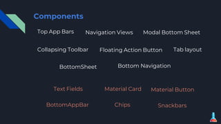
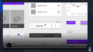
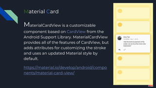
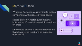
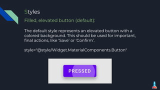
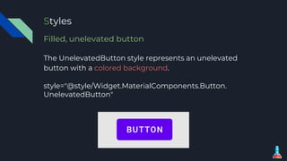
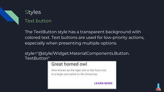
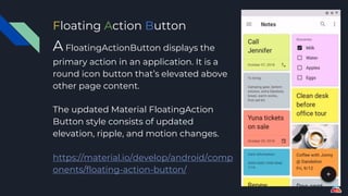
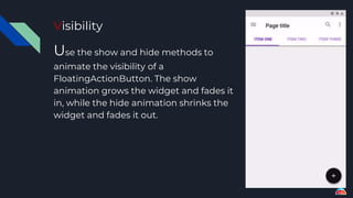
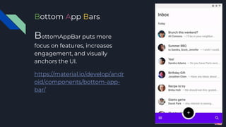
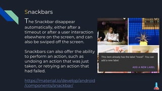
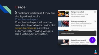
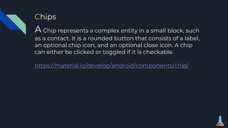
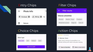
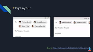
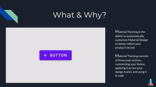
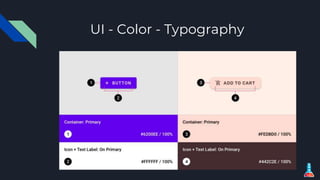
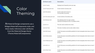
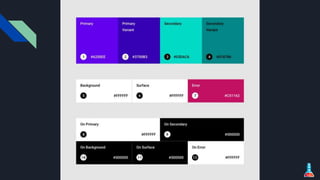
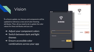
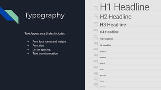
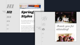
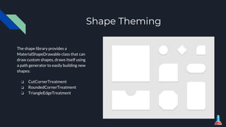
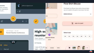
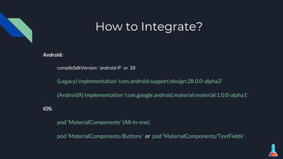
MDC introduced in Google I/O 18 event where is provides a comprehensive guidance to implement material design in any platforms including Android, iOS and Web which will give seamless user experience across all the platforms. Flutter also provides package to implement MDC components.
5. Material Card
MaterialCardView is a customizable
component based on CardView from the
Android Support Library. MaterialCardView
provides all of the features of CardView, but
adds attributes for customizing the stroke
and uses an updated Material style by
default.
https://material.io/develop/android/compo
nents/material-card-view/
6. Material Button
Material Button is a customizable button
component with updated visual styles.
Raised button: A rectangular material
button that lifts and displays ink reactions
on press
Unelevated button: A button made of ink
that displays ink reactions on press but
does not lift
7. Styles
Filled, elevated button (default):
The default style represents an elevated button with a
colored background. This should be used for important,
final actions, like ‘Save’ or ‘Confirm’.
style="@style/Widget.MaterialComponents.Button"
8. Styles
Filled, unelevated button
The UnelevatedButton style represents an unelevated
button with a colored background.
style="@style/Widget.MaterialComponents.Button.
UnelevatedButton"
9. Styles
Text button
The TextButton style has a transparent background with
colored text. Text buttons are used for low-priority actions,
especially when presenting multiple options.
style="@style/Widget.MaterialComponents.Button.
TextButton"
10. Floating Action Buttons
A FloatingActionButton displays the
primary action in an application. It is a
round icon button that’s elevated above
other page content.
The updated Material FloatingAction
Button style consists of updated
elevation, ripple, and motion changes.
https://material.io/develop/android/comp
onents/floating-action-button/
11. Visibility
Use the show and hide methods to
animate the visibility of a
FloatingActionButton. The show
animation grows the widget and fades it
in, while the hide animation shrinks the
widget and fades it out.
12. Bottom App Barss
BottomAppBar puts more
focus on features, increases
engagement, and visually
anchors the UI.
https://material.io/develop/andr
oid/components/bottom-app-
bar/
13. BottomAppBar Attributes
The placement of the FAB can be controlled by:
fabAlignmentMode
fabAttached
fabCradleMargin
fabCradleRoundedCornerRadius
fabCradleVerticalOffset.
14. Handling Menu Option
2 ways to handle menu
options:
1.setOnMenuItemClickListener
(OnMenuItemClickListener)
2. setSupportActionBar() on
the BottomAppBar. Handle
navigation item click by
checking if menu item id is
android.R.id.home.
15. Text Fields
s
TextInputLayout provides an implementation for Material
text fields. Used in conjunction with a TextInputEditText,
TextInputLayout makes it easy to include Material text
fields in your layouts.
https://material.io/develop/android/components/text-input-
layout/
16. Material Styles
Filled Box (Default)
Filled text fields have a solid
background color and draw
more attention. Apply the
following style to your
TextInputLayout
style="@style/Widget.Material
Components.TextInputLayout.
FilledBox"
17. Material Styles
Outline Box
Outline text fields have a stroked
border. Apply the following style
to your TextInputLayout
style="@style/Widget.MaterialCo
mponents.TextInputLayout.
OutlineBox"
18. Style Variations
1.Standard
2.Dense
In order to reduce the height of a text box, you can use a dense
style, which will reduce the vertical padding within the text box.
style="@style/Widget.MaterialComponents.TextInputLayout.
FilledBox.Dense"
style="@style/Widget.MaterialComponents.TextInputLayout.
OutlineBox.Dense"
19. Snackbars
The Snackbar disappear
automatically, either after a
timeout or after a user interaction
elsewhere on the screen, and can
also be swiped off the screen.
Snackbars can also offer the ability
to perform an action, such as
undoing an action that was just
taken, or retrying an action that
had failed.
https://material.io/develop/android
/components/snackbar/
20. Usage
Snackbars work best if they are
displayed inside of a
CoordinatorLayout.
CoordinatorLayout allows the
snackbar to enable behavior like
swipe-to-dismiss, as well as
automatically moving widgets
like FloatingActionButton.
21. Chips
A Chip represents a complex entity in a small block, such
as a contact. It is a rounded button that consists of a label,
an optional chip icon, and an optional close icon. A chip
can either be clicked or toggled if it is checkable.
https://material.io/develop/android/components/chip/
25. What & Why?
Material Theming is the
ability to systematically
customize Material Design
to better reflect your
product’s brand
Material Theming consists
of three main actions:
customizing your theme,
applying it across your
design mocks, and using it
in code
27. Color
Theming
All Material Design components use a
Widget.MaterialComponents style, and
these styles reference color attributes
from the Material Design theme
(Theme.MaterialComponents).
28.
29. Vision
In a future update, our themes and components will be
updated to reference a new set of color theming
attributes. Then, all you need to do is update the color
values for these attributes and you can:
➔ Adjust your component colors
➔ Switch between dark and light
themes
➔ Ensure accessible color
combinations across your app
32. Shape Theming
The shape library provides a
MaterialShapeDrawable class that can
draw custom shapes, draws itself using
a path generator to easily building new
shapes:
❏ CutCornerTreatment
❏ RoundedCornerTreatment
❏ TriangleEdgeTreatment
33.
34. How to Integrate?
Android:
compileSdkVersion 'android-P' or 28
(Legacy) implementation 'com.android.support:design:28.0.0-alpha3'
(AndroidX) implementation 'com.google.android.material:material:1.0.0-alpha1'
iOS:
pod 'MaterialComponents’ (All-in-one)
pod 'MaterialComponents/Buttons' or pod 'MaterialComponents/TextFields'