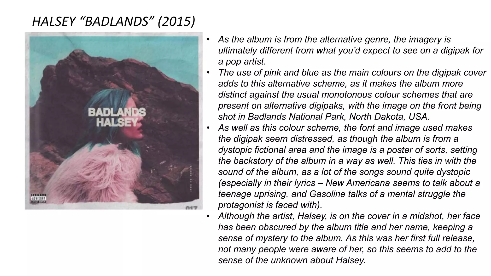
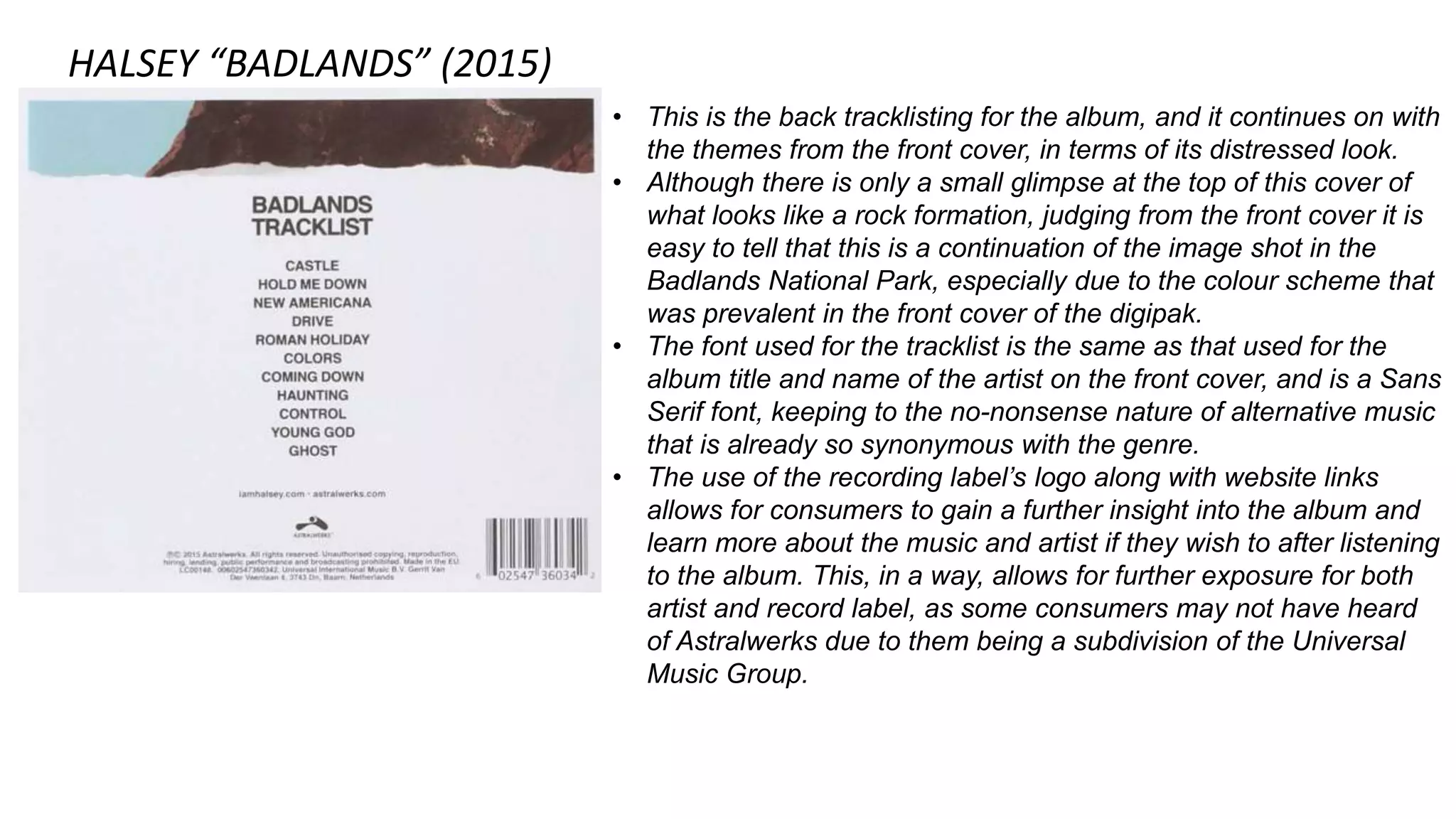
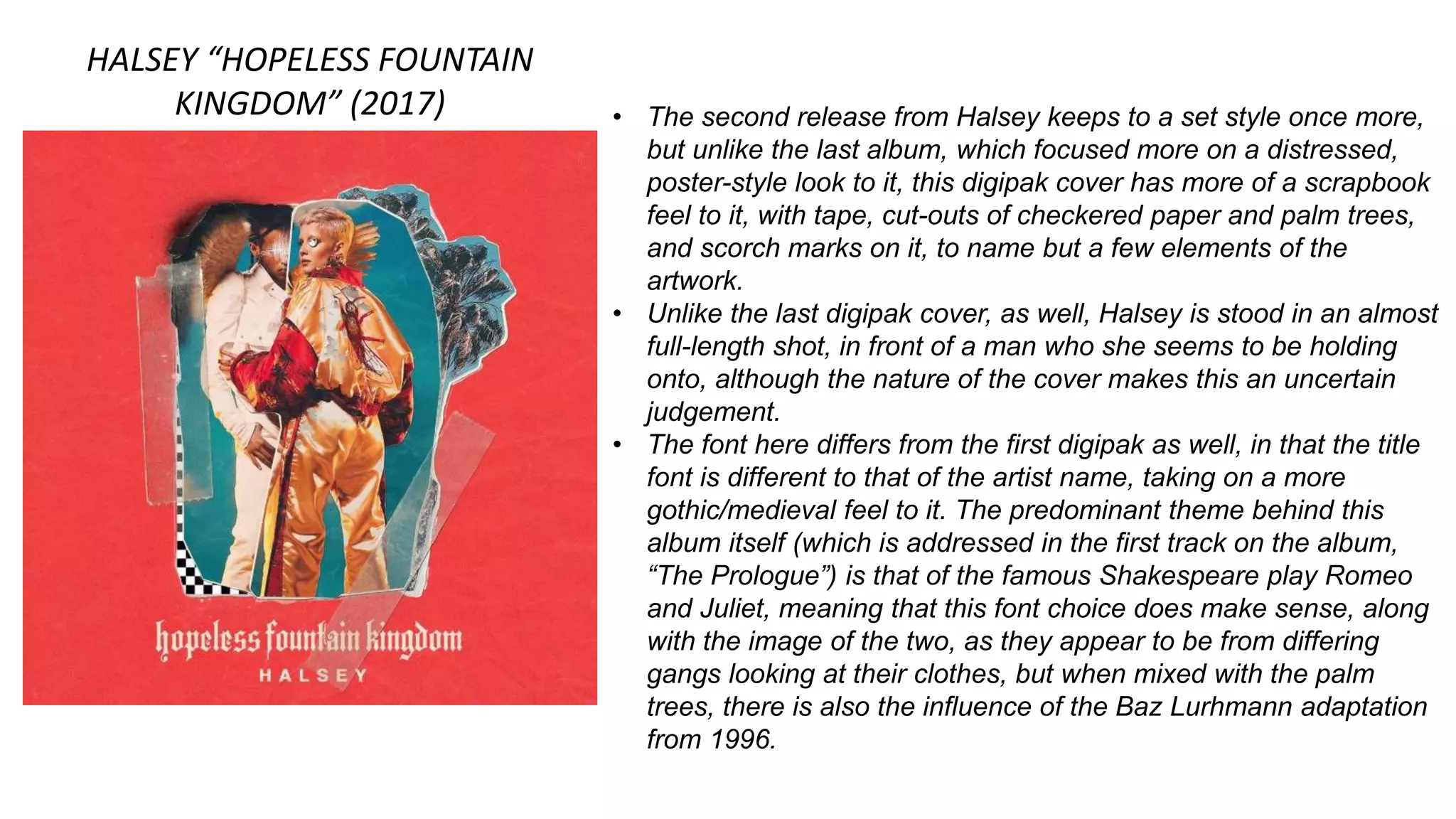
DIGIPAK ANALYSIS
Ellinor Jane Lennie (2472)
HALSEY “BADLANDS” (2015)
• As the album is from the alternative genre, the imagery is
ultimately different from what you’d expect to see on a digipak for
a pop artist.
• The use of pink and blue as the main colours on the digipak cover
adds to this alternative scheme, as it makes the album more
distinct against the usual monotonous colour schemes that are
present on alternative digipaks, with the image on the front being
shot in Badlands National Park, North Dakota, USA.
• As well as this colour scheme, the font and image used makes
the digipak seem distressed, as though the album is from a
dystopic fictional area and the image is a poster of sorts, setting
the backstory of the album in a way as well. This ties in with the
sound of the album, as a lot of the songs sound quite dystopic
(especially in their lyrics – New Americana seems to talk about a
teenage uprising, and Gasoline talks of a mental struggle the
protagonist is faced with).
• Although the artist, Halsey, is on the cover in a midshot, her face
has been obscured by the album title and her name, keeping a
sense of mystery to the album. As this was her first full release,
not many people were aware of her, so this seems to add to the
sense of the unknown about Halsey.
HALSEY “BADLANDS” (2015)
• This is the back tracklisting for the album, and it continues on with
the themes from the front cover, in terms of its distressed look.
• Although there is only a small glimpse at the top of this cover of
what looks like a rock formation, judging from the front cover it is
easy to tell that this is a continuation of the image shot in the
Badlands National Park, especially due to the colour scheme that
was prevalent in the front cover of the digipak.
• The font used for the tracklist is the same as that used for the
album title and name of the artist on the front cover, and is a Sans
Serif font, keeping to the no-nonsense nature of alternative music
that is already so synonymous with the genre.
• The use of the recording label’s logo along with website links
allows for consumers to gain a further insight into the album and
learn more about the music and artist if they wish to after listening
to the album. This, in a way, allows for further exposure for both
artist and record label, as some consumers may not have heard
of Astralwerks due to them being a subdivision of the Universal
Music Group.
HALSEY “HOPELESS FOUNTAIN
KINGDOM” (2017) • The second release from Halsey keeps to a set style once more,
but unlike the last album, which focused more on a distressed,
poster-style look to it, this digipak cover has more of a scrapbook
feel to it, with tape, cut-outs of checkered paper and palm trees,
and scorch marks on it, to name but a few elements of the
artwork.
• Unlike the last digipak cover, as well, Halsey is stood in an almost
full-length shot, in front of a man who she seems to be holding
onto, although the nature of the cover makes this an uncertain
judgement.
• The font here differs from the first digipak as well, in that the title
font is different to that of the artist name, taking on a more
gothic/medieval feel to it. The predominant theme behind this
album itself (which is addressed in the first track on the album,
“The Prologue”) is that of the famous Shakespeare play Romeo
and Juliet, meaning that this font choice does make sense, along
with the image of the two, as they appear to be from differing
gangs looking at their clothes, but when mixed with the palm
trees, there is also the influence of the Baz Lurhmann adaptation
from 1996.
HALSEY “HOPELESS FOUNTAIN
KINGDOM” (2017) • The tracklist continues with this scrapbooked theme, featuring
more of the checkered paper, along with a filtered-looking blue
sky, suggesting again the retro link to the album and themes
brought up in it.
• This album, although based heavily off Shakespeare’s Romeo
and Juliet (along with the Lurhmann depiction mentioned in the
slide before), also features LGBT+ themes in its songs: Bad At
Love talks about a relationship between the protagonist and both
“a boy back home in Michigan” and “a girl with California eyes”,
and Strangers (featuring openly bisexual artist Lauren Jauregui of
Fifth Harmony fame) uses female pronouns to describe a
relationship that has fallen apart, but allows for more LGBT+
representation to take place.
• The font used on the tracklisting is the same as the artist font, but
the title does make another appearance on this page, even
though it is slightly obscured by the tracklisting.
DEMI LOVATO “CONFIDENT”
(2015) • This is an example of a pop music artist’s album, and shows an
air of simplicity to its design: we can see Lovato in an almost full-
length shot, in a seductive pose, catering to Mulvey’s male gaze
theory. Her outfit is black, and her eye makeup is bold, which,
when set against a plain white background as is done here, is
striking and immediately draws attention to the album cover.
• The font used is sans serif, usually synonymous with an
alternative style. As Lovato has created more releases, her
digipak covers have also changed; this latest digipak, in
comparison to her first release in 2008, is a lot more simplistic,
and does not repeat the title of the album in a messy scrawl like
“Don’t Forget” did. This change sets her apart from her Disney
days, and shows that she is less about the rock scene than she
was back then.
• Another thing that is interesting to note about Lovato’s
appearance is the fact that her hair has been slicked back and
appears to have a wet look to it, which once again caters to
Mulvey’s male gaze theory through the appearance of water and
how often this can appear in music videos.
DEMI LOVATO “CONFIDENT”
(2015) • The back cover, once again, features Lovato in a seductive pose,
catering for male audiences in terms of the element of sexuality.
Lovato is also seen to be wearing Christian Louboutin high heels,
the red of which connotes lust and passion, once again catering
to male audiences.
• The text ranges from white to black depending on positioning in
front of Lovato, allowing for song titles to be easily visible to the
audience.
• Something interesting to note on this back cover which is different
to the HFK back cover is the appearance of logos again, and
websites, which we already saw on the Badlands cover. This,
once more, allows audiences to stay in touch with the artist and
record labels, also allowing for cross promotion to take place and
newer artists to be introduced in this way. Hollywood Records and
Island Records are already quite well-known, but the use of their
logo and websites allows people to find out more about them if
they choose to.

Digipak Analysis

  • 1.
  • 2.
    HALSEY “BADLANDS” (2015) •As the album is from the alternative genre, the imagery is ultimately different from what you’d expect to see on a digipak for a pop artist. • The use of pink and blue as the main colours on the digipak cover adds to this alternative scheme, as it makes the album more distinct against the usual monotonous colour schemes that are present on alternative digipaks, with the image on the front being shot in Badlands National Park, North Dakota, USA. • As well as this colour scheme, the font and image used makes the digipak seem distressed, as though the album is from a dystopic fictional area and the image is a poster of sorts, setting the backstory of the album in a way as well. This ties in with the sound of the album, as a lot of the songs sound quite dystopic (especially in their lyrics – New Americana seems to talk about a teenage uprising, and Gasoline talks of a mental struggle the protagonist is faced with). • Although the artist, Halsey, is on the cover in a midshot, her face has been obscured by the album title and her name, keeping a sense of mystery to the album. As this was her first full release, not many people were aware of her, so this seems to add to the sense of the unknown about Halsey.
  • 3.
    HALSEY “BADLANDS” (2015) •This is the back tracklisting for the album, and it continues on with the themes from the front cover, in terms of its distressed look. • Although there is only a small glimpse at the top of this cover of what looks like a rock formation, judging from the front cover it is easy to tell that this is a continuation of the image shot in the Badlands National Park, especially due to the colour scheme that was prevalent in the front cover of the digipak. • The font used for the tracklist is the same as that used for the album title and name of the artist on the front cover, and is a Sans Serif font, keeping to the no-nonsense nature of alternative music that is already so synonymous with the genre. • The use of the recording label’s logo along with website links allows for consumers to gain a further insight into the album and learn more about the music and artist if they wish to after listening to the album. This, in a way, allows for further exposure for both artist and record label, as some consumers may not have heard of Astralwerks due to them being a subdivision of the Universal Music Group.
  • 4.
    HALSEY “HOPELESS FOUNTAIN KINGDOM”(2017) • The second release from Halsey keeps to a set style once more, but unlike the last album, which focused more on a distressed, poster-style look to it, this digipak cover has more of a scrapbook feel to it, with tape, cut-outs of checkered paper and palm trees, and scorch marks on it, to name but a few elements of the artwork. • Unlike the last digipak cover, as well, Halsey is stood in an almost full-length shot, in front of a man who she seems to be holding onto, although the nature of the cover makes this an uncertain judgement. • The font here differs from the first digipak as well, in that the title font is different to that of the artist name, taking on a more gothic/medieval feel to it. The predominant theme behind this album itself (which is addressed in the first track on the album, “The Prologue”) is that of the famous Shakespeare play Romeo and Juliet, meaning that this font choice does make sense, along with the image of the two, as they appear to be from differing gangs looking at their clothes, but when mixed with the palm trees, there is also the influence of the Baz Lurhmann adaptation from 1996.
  • 5.
    HALSEY “HOPELESS FOUNTAIN KINGDOM”(2017) • The tracklist continues with this scrapbooked theme, featuring more of the checkered paper, along with a filtered-looking blue sky, suggesting again the retro link to the album and themes brought up in it. • This album, although based heavily off Shakespeare’s Romeo and Juliet (along with the Lurhmann depiction mentioned in the slide before), also features LGBT+ themes in its songs: Bad At Love talks about a relationship between the protagonist and both “a boy back home in Michigan” and “a girl with California eyes”, and Strangers (featuring openly bisexual artist Lauren Jauregui of Fifth Harmony fame) uses female pronouns to describe a relationship that has fallen apart, but allows for more LGBT+ representation to take place. • The font used on the tracklisting is the same as the artist font, but the title does make another appearance on this page, even though it is slightly obscured by the tracklisting.
  • 6.
    DEMI LOVATO “CONFIDENT” (2015)• This is an example of a pop music artist’s album, and shows an air of simplicity to its design: we can see Lovato in an almost full- length shot, in a seductive pose, catering to Mulvey’s male gaze theory. Her outfit is black, and her eye makeup is bold, which, when set against a plain white background as is done here, is striking and immediately draws attention to the album cover. • The font used is sans serif, usually synonymous with an alternative style. As Lovato has created more releases, her digipak covers have also changed; this latest digipak, in comparison to her first release in 2008, is a lot more simplistic, and does not repeat the title of the album in a messy scrawl like “Don’t Forget” did. This change sets her apart from her Disney days, and shows that she is less about the rock scene than she was back then. • Another thing that is interesting to note about Lovato’s appearance is the fact that her hair has been slicked back and appears to have a wet look to it, which once again caters to Mulvey’s male gaze theory through the appearance of water and how often this can appear in music videos.
  • 7.
    DEMI LOVATO “CONFIDENT” (2015)• The back cover, once again, features Lovato in a seductive pose, catering for male audiences in terms of the element of sexuality. Lovato is also seen to be wearing Christian Louboutin high heels, the red of which connotes lust and passion, once again catering to male audiences. • The text ranges from white to black depending on positioning in front of Lovato, allowing for song titles to be easily visible to the audience. • Something interesting to note on this back cover which is different to the HFK back cover is the appearance of logos again, and websites, which we already saw on the Badlands cover. This, once more, allows audiences to stay in touch with the artist and record labels, also allowing for cross promotion to take place and newer artists to be introduced in this way. Hollywood Records and Island Records are already quite well-known, but the use of their logo and websites allows people to find out more about them if they choose to.