Embracing GenAI - A Strategic ImperativePeter Windle
Artificial Intelligence (AI) technologies such as Generative AI, Image Generators and Large Language Models have had a dramatic impact on teaching, learning and assessment over the past 18 months. The most immediate threat AI posed was to Academic Integrity with Higher Education Institutes (HEIs) focusing their efforts on combating the use of GenAI in assessment. Guidelines were developed for staff and students, policies put in place too. Innovative educators have forged paths in the use of Generative AI for teaching, learning and assessments leading to pockets of transformation springing up across HEIs, often with little or no top-down guidance, support or direction.
This Gasta posits a strategic approach to integrating AI into HEIs to prepare staff, students and the curriculum for an evolving world and workplace. We will highlight the advantages of working with these technologies beyond the realm of teaching, learning and assessment by considering prompt engineering skills, industry impact, curriculum changes, and the need for staff upskilling. In contrast, not engaging strategically with Generative AI poses risks, including falling behind peers, missed opportunities and failing to ensure our graduates remain employable. The rapid evolution of AI technologies necessitates a proactive and strategic approach if we are to remain relevant.
Instructions for Submissions thorugh G- Classroom.pptxJheel Barad
This presentation provides a briefing on how to upload submissions and documents in Google Classroom. It was prepared as part of an orientation for new Sainik School in-service teacher trainees. As a training officer, my goal is to ensure that you are comfortable and proficient with this essential tool for managing assignments and fostering student engagement.
Unit 8 - Information and Communication Technology (Paper I).pdfThiyagu K
This slides describes the basic concepts of ICT, basics of Email, Emerging Technology and Digital Initiatives in Education. This presentations aligns with the UGC Paper I syllabus.
Synthetic Fiber Construction in lab .pptxPavel ( NSTU)
Synthetic fiber production is a fascinating and complex field that blends chemistry, engineering, and environmental science. By understanding these aspects, students can gain a comprehensive view of synthetic fiber production, its impact on society and the environment, and the potential for future innovations. Synthetic fibers play a crucial role in modern society, impacting various aspects of daily life, industry, and the environment. ynthetic fibers are integral to modern life, offering a range of benefits from cost-effectiveness and versatility to innovative applications and performance characteristics. While they pose environmental challenges, ongoing research and development aim to create more sustainable and eco-friendly alternatives. Understanding the importance of synthetic fibers helps in appreciating their role in the economy, industry, and daily life, while also emphasizing the need for sustainable practices and innovation.
Acetabularia Information For Class 9 .docxvaibhavrinwa19
Acetabularia acetabulum is a single-celled green alga that in its vegetative state is morphologically differentiated into a basal rhizoid and an axially elongated stalk, which bears whorls of branching hairs. The single diploid nucleus resides in the rhizoid.
How libraries can support authors with open access requirements for UKRI fund...
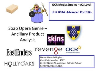
Ancillary product poster - analysis task
1. Soap Opera Genre –
Ancillary Product
Analysis
OCR Media Studies – A2 Level
Unit G324: Advanced Portfolio
Name: Hannah Hughes
Candidate Number: 4067
Center Name: St. Andrew’s Catholic School
Center Number: 64135
2. Image: This image has be manipulated in several ways. This includes a red tint being put on the image. This
connotes death and danger, and suggests that something big is going to happen. The image also has a sharp
and grainy feel, which could be from the Vignette style put on the image. The Vignette gives the image black
edges and draws the attention into the main part of the poster.
The image is of ‘Lucy’ looking to the right with a suspicious looking facial expression. This connotes that
something bad if either going to happen to her or she is going to do something bad. This draws in the attention
of the reader in and makes them want to watch ‘EastEnders’ so they can find out why she looks suspicious.
Synergy with social media: The soap could be trying to
appeal to a younger audience. The hashtag allows viewers
to comment on the show through social media and allows
the show to see what viewers think.
Institution Logo: This is for brand recognize. It allows the
audience to know what channel this show is going to be
on. It is also displayed in very small font. This could
connote that the institute is very well known and don’t
need to big themselves up.
Tagline: This tagline
draws in the attention
of the reader. This is
because the words
‘Walford will be
changed. Forever’
suggest that
something that has
never happened on
‘EastEnders’ before
will happen. This
makes people want to
watch the show, so
that they can find out
what will happen.
3. Analysis of EastEnders Poster
• I would ‘repeat’ (Steve Neale - 1980):
– The tagline being very simple font. This ensures
that it doesn’t draw away from the main image,
which is the most important part of the poster.
– Having someone not look directly at the camera.
This gives the impression that they have done
something bad or are guilty of something.
– The Vignette style round the edge of the poster.
This adds emphasis on the main image and draws
in the attention from the viewer.
4. Image: There has been a fiery or burning manipulation on the image.
From this we can denote that there will be a fire on Hollyoaks. We can
connote that the people in the poster may be killed or injured in this fire.
Or they could be the people who started the fire. All together this image
connotes that these characters lives will be affected by the fire. The fact
that none of them are looking into the camera could connote that they
are all guilty of something. This leads me to believe that the fire isn’t an
accident. In this image you can also see that the eyes are the only part
that hasn’t been manipulated. This could connote that the eyes are
important to this story, maybe the characters all saw something that
they shouldn’t have.
Tagline: The tagline denotes that
Hollyoaks will change forever. This
could connote that characters are
going to be leaving the show
through the fire. The use of the
specific date could connote that
they want viewers to watch all
week but especially Fridays
episode. Institution
Logo: This is
for brand
recognize. It
allows the
audience to
know what
channel this
show is going
to be on. It is
also displayed
in a very big
font. This could
connote that
the institute is
very well
known and the
show want to
show off that
they are on that
instituted
channel.
Date: The
date is
displayed on
the poster.
This suggests
that viewers
should ensure
that they
need to
ensure that
they are free
and able to
watch the
show on the
specific date.
5. Analysis of Hollyoaks Poster
• I would ‘repeat’ (Steve Neale - 1980):
– The use of manipulation on the image. This really
draws the viewer in, and will entice them to watch to
show.
– The big brand logo. This ensures that all viewers know
what channel the show will be on. This will also
ensure that more people come and watch the show.
– The specific date of the show. My soap opera will be a
new soap and I could put the date that my soap opera
first airs on the poster.
6. This poster is for inspiration but isn’t from a Soap Opera
Main image: There is only one
image in this poster. This is
because the poster is only
about ‘Skins’. The use of 3
characters in the main image
draws the attention of the
audience. This is because they
could be the characters that
this weeks story is based
around. Another point about
the main image is that they
are playing teenager. This
could draw the attention of a
younger audience, as they feel
they can relate to the actors in
the image.
Logo: This is for brand
recognize. It allows the
audience to know what
channel this show is going
to be on. It is also displayed
as a ‘sticker’. This could be
to connote that this is for a
younger audience.
Use of the colour red: In this
point of call, the boy on the
right is wearing a red jacket.
This is probable because red
connotes lust and danger. They
are 2 main themes of a TV
show.
Font: This is a fun and childish
font. This could connote that the
show is for a younger audience.
This is backed up by the young
actors in the main image and the
sticker affect on the channels
logo.
Series 3: This is a very typical
convention for a TV series to
have. This is because it makes
people want to go and watch
the show. As skins is on its
third series, this could suggest
that the show is popular or
very good. This displays to the
audience who don’t watch the
show that they should. This
overall enlarges the shows
audience.
Use of the colour gold: In this point of call, the girl is wearing a
gold necklace. This is probable because gold connotes luxury,
triumph and prestige. In shows aimed at teenagers, there is
typically a female character that thinks highly of herself and
beliefs that she is a luxury and that a prize to be won.
7. Analysis of Skins Poster
• I would ‘repeat’ (Steve Neale - 1980):
– The font being appropriate for the target
audience. For a soap opera it is important to
ensure that all conventions display and appeal to
the target audience.
– Having lots of different colours that follow the
connotations, for example red for lust/danger.
8. Infinity: In this poster the
g of Revenge is actually
the infinity symbol. This
could be a theme from
within the show, and
connote that the women
will not fail or let anyone
else win.
Use of the colour red: In this poster,
the women is surrounded by a thick
red sky. This is probable because red
connotes lust and danger. They are 2
main themes of a TV show.
This poster is for inspiration but isn’t from a Soap Opera
Font is white: The text on this
poster is white. This connotes
innocents and purity. This could
connote that the women has be
wrong done and feels that she
needs to get revenge on the
people who hurt her or her
family. This ties in with the
infinity symbol and could imply
that she wont give up until the
people who wronged her have
paid for what they did.
Sunday: The use of Sunday in
big fonts is to draw in the
attention of the audience. This
will make the audience what to
see what’s on Sunday. Once
they have looked at the poster
they may feel inclined to watch
the show.
Gold Skin and Hair: The use of the
colour gold on the characters body
and hair could connote that she is
wealthy. It could also mean that she
will be triumphant. She is typically a
female character that thinks highly
of herself.
Black: There are many reasons why
they would use the colour black. This
colours connotes elegance, power,
death and danger. This backs up the
characteristics of the actress.
Thorns: When researching this
show I discovered that the
characters name is ‘Emily
Thorn’. The use of thorns on
the black dress could be a play
on her name. It could also
connote that she is strong and
willing to fight.
Tag Line: In this poster the tag
line is ‘Her Next Move’. This
connotes that she is the one
seeking revenge on people and
that she is about to attack her
next victim. The tag line
successfully draws in the viewer
and makes them what to find out
what her next move will be.
Premieres: In this poster the use of
the word Premiere could be seen as
the producers of Revenge trying to
make an event of the show. When you
think of a premiere you think of
glamour and elegance (which ties in to
the black dress).
ABC Channel: The use of the TV
channel it will be aired on is a good way
to promote the show. This is because
the audience will see that the show is
on ABC and can then may what to
watch it because it is on a popular
channel.
9. Analysis of Revenge Poster
• I would ‘repeat’ (Steve Neale - 1980):
– Use of the TV channel on the poster. This could
add brand recognition because people will
recognise the channel and may want to watch the
show.
– Having lots of different colours that follow the
connotations. E.g. red for lust/danger
10. Student Exemplar Work – Textual Analysis
Image: There has been a black and white manipulation put on the image. We can connote through the use
of a wedding dress in the poster that the main story involves either two married people or two people
getting married. The fact that only the toys and one shirt are in colour connotes that a child will be involved
in the soap opera, and that they are very important to the story. The use of the red shirt could connote that
someone is in danger or that the story involves lust. There is also the fact that the man isn’t looking at the
camera could connote that either he is guilty of something or has been betrayed. This leads me to believe
that the woman has had an affair and that she has know become pregnant.
Synergy with
social media: The
soap could be
trying to appeal
to a younger
audience. The
hashtag allows
viewers to
comment on the
show through
social media and
allows the show
to see what
viewers think.
Synergy with
social media: The
soap could be
trying to appeal
to a younger
audience. The
hashtag allows
viewers to
comment on the
show through
social media and
allows the show
to see what
viewers think.
Date: The date is
displayed on the
poster. This suggests
that viewers should
ensure that they
need to ensure that
they are free and
able to watch the
show on the specific
date.
11. Analysis of Student Exemplar Poster
• I would ‘repeat’ (Steve Neale - 1980):
– Having the date the show airs on the poster. My soap
opera will be a new soap and I could put the date that
my soap opera first airs on the poster.
– Having lots of different colours that follow the
connotations. E.g. red for lust/danger, black for
danger or death
– The big brand logo. This ensures that all viewers know
what channel the show will be on. This will also
ensure that more people come and watch the show.