SlideShare a Scribd company logo
1 of 4
Mast Head: It’s visible but not clear
                     enough for the reader to recognise
                     immediately where and what the mast
                     head was. The different font of each                                                               Layout: The
                     letter is very un-presentable but they                                                             design on the
                     could also represent the messy font                                                                page is portrait
                     that young children have. Therefore                                                                and the page is
                     this must a primary school.              The ripped paper on the outside                           from a text
                                                              portrays the learning of young children                   book. This
                                                              and the stages of learning and drawing.                   shows that it’s
                                                                                                                        a school and it
                                                                                                                        could also
                                                                                                                        represent that
                                                                                                                        it’s a child’s
                                                                                                                        school because
                                                                                                                        as an older
                                                                                                                        person we
                                                                                                                        know that we
                                                                                                                        no longer use
                                                                                                                        lined paper.
                                                                                                                        This make the
                                                                                                                        front of the
                                                                                                                        magazine look
                                                                                                                        young and
                                                                                                                        childish.


                                                                                                        Long shot show the whole
                                                                                                        school. All three images re
                                                                                                        slanted and the colour
The border of                                                                                           contract and brightness are all
the outside of                                                                                          different. This makes the
the image is                                                                                            magazine look messy, not
the same as                                                                                             clear and poor.
the
masthead.


 What does this badge represent? A
 student? The school? It’s unclear and
 small therefore we don’t know why
 there’s a logo in the middle of the page
 and what the name of the school is.


                                                                                       The date has just been randomly placed on
                                                                                      the page. How would a reader, reading this in
                                                                                      2009 know that this magazine was from 2008.

More Related Content

What's hot

Analysis of front cover, contents page and dps
Analysis of front cover, contents page and dpsAnalysis of front cover, contents page and dps
Analysis of front cover, contents page and dpsJodiieeeeeeeeee
 
Analysing magazine cover
Analysing  magazine coverAnalysing  magazine cover
Analysing magazine coverasmediae12
 
Analysis of magazine covers
Analysis of magazine coversAnalysis of magazine covers
Analysis of magazine coversasmediae12
 
Resaearch
ResaearchResaearch
ResaearchEvo11
 
Double page spread analysis
Double page spread analysisDouble page spread analysis
Double page spread analysisrebeccabowles
 
Double page analysis
Double page analysisDouble page analysis
Double page analysisShaniRoss
 

What's hot (6)

Analysis of front cover, contents page and dps
Analysis of front cover, contents page and dpsAnalysis of front cover, contents page and dps
Analysis of front cover, contents page and dps
 
Analysing magazine cover
Analysing  magazine coverAnalysing  magazine cover
Analysing magazine cover
 
Analysis of magazine covers
Analysis of magazine coversAnalysis of magazine covers
Analysis of magazine covers
 
Resaearch
ResaearchResaearch
Resaearch
 
Double page spread analysis
Double page spread analysisDouble page spread analysis
Double page spread analysis
 
Double page analysis
Double page analysisDouble page analysis
Double page analysis
 

Viewers also liked

Viewers also liked (19)

Image analysis mise en-scene
Image analysis mise en-sceneImage analysis mise en-scene
Image analysis mise en-scene
 
Double page spread analysis
Double page spread analysisDouble page spread analysis
Double page spread analysis
 
Image analysis of pictures you took
Image analysis of pictures you tookImage analysis of pictures you took
Image analysis of pictures you took
 
Front cover print screens & plan
Front cover print screens & planFront cover print screens & plan
Front cover print screens & plan
 
Analysis of dps
Analysis of dpsAnalysis of dps
Analysis of dps
 
Contents page print screens & plan
Contents page print screens & planContents page print screens & plan
Contents page print screens & plan
 
6 Social Media Certifications That Will Be High Demand in 2014
6 Social Media Certifications That Will Be High Demand in 20146 Social Media Certifications That Will Be High Demand in 2014
6 Social Media Certifications That Will Be High Demand in 2014
 
Making my music magazine front page
Making my music magazine front pageMaking my music magazine front page
Making my music magazine front page
 
Survey media
Survey mediaSurvey media
Survey media
 
Social media 101 pinterest for your business
Social media 101 pinterest for your businessSocial media 101 pinterest for your business
Social media 101 pinterest for your business
 
Storyboards for my music video
Storyboards for my music videoStoryboards for my music video
Storyboards for my music video
 
Analysis school magazine covers 1
Analysis school magazine covers 1Analysis school magazine covers 1
Analysis school magazine covers 1
 
Analysing 5 music videos (1)
Analysing 5 music videos (1)Analysing 5 music videos (1)
Analysing 5 music videos (1)
 
Making my double page spread
Making my double page spreadMaking my double page spread
Making my double page spread
 
Trafik sunum
Trafik sunumTrafik sunum
Trafik sunum
 
Making my contents page
Making my contents pageMaking my contents page
Making my contents page
 
Evaluation 2
Evaluation 2Evaluation 2
Evaluation 2
 
Evaluation
EvaluationEvaluation
Evaluation
 
School mag powepoint makes my thing easy
School mag powepoint makes my thing easySchool mag powepoint makes my thing easy
School mag powepoint makes my thing easy
 

Similar to Analysis school magazine covers

School Magazine Analysis
School Magazine AnalysisSchool Magazine Analysis
School Magazine Analysiskpnpensby
 
Analysis of college magazines
Analysis of college magazinesAnalysis of college magazines
Analysis of college magazinesmarwasaroya
 
Presentation for resit of media
Presentation for resit of mediaPresentation for resit of media
Presentation for resit of mediasophieroberts
 
Presentation for resit of mediaaaaaaaaa
Presentation for resit of mediaaaaaaaaaPresentation for resit of mediaaaaaaaaa
Presentation for resit of mediaaaaaaaaasophieroberts
 
Media presentation
Media presentation Media presentation
Media presentation poppysm
 
Resaearch
ResaearchResaearch
ResaearchEvo11
 
My magazine annotation
My magazine annotationMy magazine annotation
My magazine annotationErnestBlogging
 
Preliminary task
Preliminary taskPreliminary task
Preliminary taskAnitahoxha
 
Magazine cover analysis worksheet the big cheese
Magazine cover analysis worksheet  the big cheeseMagazine cover analysis worksheet  the big cheese
Magazine cover analysis worksheet the big cheeseadamtimms22
 
Double page spread deconstructions
Double page spread deconstructionsDouble page spread deconstructions
Double page spread deconstructionsErinMattinson
 
Other school magazine's
Other school magazine'sOther school magazine's
Other school magazine'shhunjan07
 
Cover image analysis
Cover image analysisCover image analysis
Cover image analysisFreddieTaylor
 
Magazine analysis of college magazine
Magazine analysis of college magazineMagazine analysis of college magazine
Magazine analysis of college magazinePhillLecorgne
 
Preliminary task2
Preliminary task2Preliminary task2
Preliminary task2tauream
 
3 School Magazine annotations
3 School Magazine annotations3 School Magazine annotations
3 School Magazine annotationsernestwork
 

Similar to Analysis school magazine covers (20)

School Magazine Analysis
School Magazine AnalysisSchool Magazine Analysis
School Magazine Analysis
 
Analysis of college magazines
Analysis of college magazinesAnalysis of college magazines
Analysis of college magazines
 
Presentation for resit of media
Presentation for resit of mediaPresentation for resit of media
Presentation for resit of media
 
Presentation for resit of mediaaaaaaaaa
Presentation for resit of mediaaaaaaaaaPresentation for resit of mediaaaaaaaaa
Presentation for resit of mediaaaaaaaaa
 
Media presentation
Media presentation Media presentation
Media presentation
 
Resaearch
ResaearchResaearch
Resaearch
 
My magazine annotation
My magazine annotationMy magazine annotation
My magazine annotation
 
Image analysis
Image analysisImage analysis
Image analysis
 
Preliminary task
Preliminary taskPreliminary task
Preliminary task
 
Magazine research
Magazine researchMagazine research
Magazine research
 
Magazine cover analysis worksheet the big cheese
Magazine cover analysis worksheet  the big cheeseMagazine cover analysis worksheet  the big cheese
Magazine cover analysis worksheet the big cheese
 
Media
MediaMedia
Media
 
Double page spread deconstructions
Double page spread deconstructionsDouble page spread deconstructions
Double page spread deconstructions
 
Other school magazine's
Other school magazine'sOther school magazine's
Other school magazine's
 
Cover image analysis
Cover image analysisCover image analysis
Cover image analysis
 
Presentation mag cover 6th form
Presentation mag cover 6th formPresentation mag cover 6th form
Presentation mag cover 6th form
 
Kerang analysis1
Kerang analysis1Kerang analysis1
Kerang analysis1
 
Magazine analysis of college magazine
Magazine analysis of college magazineMagazine analysis of college magazine
Magazine analysis of college magazine
 
Preliminary task2
Preliminary task2Preliminary task2
Preliminary task2
 
3 School Magazine annotations
3 School Magazine annotations3 School Magazine annotations
3 School Magazine annotations
 

More from Carolina Bazzarelli Dos Santos

More from Carolina Bazzarelli Dos Santos (20)

Double page print screens & plan
Double page print screens & planDouble page print screens & plan
Double page print screens & plan
 
Drawn design
Drawn designDrawn design
Drawn design
 
Double page spread analysis
Double page spread analysisDouble page spread analysis
Double page spread analysis
 
Double page spread analysis
Double page spread analysisDouble page spread analysis
Double page spread analysis
 
Powerfpoint
PowerfpointPowerfpoint
Powerfpoint
 
4 final things
4 final things4 final things
4 final things
 
Print screen of table of contents
Print screen of table of contentsPrint screen of table of contents
Print screen of table of contents
 
Print screen of advert
Print screen of advertPrint screen of advert
Print screen of advert
 
New microsoft office word document (2)
New microsoft office word document (2)New microsoft office word document (2)
New microsoft office word document (2)
 
Print screen of double page spread
Print screen of double page spreadPrint screen of double page spread
Print screen of double page spread
 
New microsoft office word document
New microsoft office word documentNew microsoft office word document
New microsoft office word document
 
Toc moodboard
Toc moodboardToc moodboard
Toc moodboard
 
Toc moodboard
Toc moodboardToc moodboard
Toc moodboard
 
Toc images photoshoot( planning and taking pictures)
Toc images photoshoot( planning and taking pictures)Toc images photoshoot( planning and taking pictures)
Toc images photoshoot( planning and taking pictures)
 
Front magazine
Front magazineFront magazine
Front magazine
 
Frist draft
Frist draftFrist draft
Frist draft
 
Frist draft
Frist draftFrist draft
Frist draft
 
Photo shoot document
Photo shoot documentPhoto shoot document
Photo shoot document
 
Double page spread interviews and research
Double page spread interviews and researchDouble page spread interviews and research
Double page spread interviews and research
 
Drawn design of double page spread
Drawn design of double page spreadDrawn design of double page spread
Drawn design of double page spread
 

Analysis school magazine covers

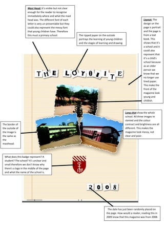
  • 1. Mast Head: It’s visible but not clear enough for the reader to recognise immediately where and what the mast head was. The different font of each Layout: The letter is very un-presentable but they design on the could also represent the messy font page is portrait that young children have. Therefore and the page is this must a primary school. The ripped paper on the outside from a text portrays the learning of young children book. This and the stages of learning and drawing. shows that it’s a school and it could also represent that it’s a child’s school because as an older person we know that we no longer use lined paper. This make the front of the magazine look young and childish. Long shot show the whole school. All three images re slanted and the colour The border of contract and brightness are all the outside of different. This makes the the image is magazine look messy, not the same as clear and poor. the masthead. What does this badge represent? A student? The school? It’s unclear and small therefore we don’t know why there’s a logo in the middle of the page and what the name of the school is. The date has just been randomly placed on the page. How would a reader, reading this in 2009 know that this magazine was from 2008.
  • 2. Mast Head: It’s visible but not clear enough for the reader to recognise immediately where and what the mast head was. The different font of each Layout: The letter is very un-presentable but they design on the could also represent the messy font page is portrait that young children have. Therefore and the page is this must a primary school. The ripped paper on the outside from a text portrays the learning of young children book. This and the stages of learning and drawing. shows that it’s a school and it could also represent that it’s a child’s school because as an older person we know that we no longer use lined paper. This make the front of the magazine look young and childish. Long shot show the whole school. All three images re slanted and the colour The border of contract and brightness are all the outside of different. This makes the the image is magazine look messy, not the same as clear and poor. the masthead. What does this badge represent? A student? The school? It’s unclear and small therefore we don’t know why there’s a logo in the middle of the page and what the name of the school is. The date has just been randomly placed on the page. How would a reader, reading this in 2009 know that this magazine was from 2008.
  • 3. Mast Head: It’s visible but not clear enough for the reader to recognise immediately where and what the mast head was. The different font of each Layout: The letter is very un-presentable but they design on the could also represent the messy font page is portrait that young children have. Therefore and the page is this must a primary school. The ripped paper on the outside from a text portrays the learning of young children book. This and the stages of learning and drawing. shows that it’s a school and it could also represent that it’s a child’s school because as an older person we know that we no longer use lined paper. This make the front of the magazine look young and childish. Long shot show the whole school. All three images re slanted and the colour The border of contract and brightness are all the outside of different. This makes the the image is magazine look messy, not the same as clear and poor. the masthead. What does this badge represent? A student? The school? It’s unclear and small therefore we don’t know why there’s a logo in the middle of the page and what the name of the school is. The date has just been randomly placed on the page. How would a reader, reading this in 2009 know that this magazine was from 2008.
  • 4. Mast Head: It’s visible but not clear enough for the reader to recognise immediately where and what the mast head was. The different font of each Layout: The letter is very un-presentable but they design on the could also represent the messy font page is portrait that young children have. Therefore and the page is this must a primary school. The ripped paper on the outside from a text portrays the learning of young children book. This and the stages of learning and drawing. shows that it’s a school and it could also represent that it’s a child’s school because as an older person we know that we no longer use lined paper. This make the front of the magazine look young and childish. Long shot show the whole school. All three images re slanted and the colour The border of contract and brightness are all the outside of different. This makes the the image is magazine look messy, not the same as clear and poor. the masthead. What does this badge represent? A student? The school? It’s unclear and small therefore we don’t know why there’s a logo in the middle of the page and what the name of the school is. The date has just been randomly placed on the page. How would a reader, reading this in 2009 know that this magazine was from 2008.