Russian Escort Service in Delhi 11k Hotel Foreigner Russian Call Girls in Delhi
Presentation mag cover 6th form
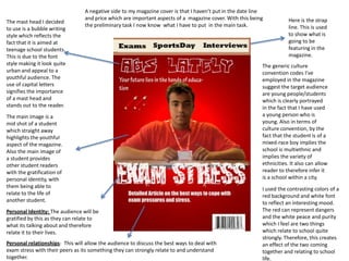
1. A negative side to my magazine cover is that I haven’t put in the date line
and price which are important aspects of a magazine cover. With this being Here is the strap
The mast head I decided
the preliminary task I now know what I have to put in the main task. line. This is used
to use is a bubble writing
style which reflects the to show what is
fact that it is aimed at going to be
teenage school students. featuring in the
This is due to the font magazine.
style making it look quite The generic culture
urban and appeal to a convention codes I’ve
youthful audience. The employed in the magazine
use of capital letters suggest the target audience
signifies the importance are young people/students
of a mast head and which is clearly portrayed
stands out to the reader. in the fact that I have used
The main image is a a young person who is
mid shot of a student young. Also in terms of
which straight away culture convention, by the
highlights the youthful fact that the student is of a
aspect of the magazine. mixed-race boy implies the
Also the main image of school is multiethnic and
a student provides implies the variety of
other student readers ethnicities. It also can allow
with the gratification of reader to therefore infer it
personal identity, with is a school within a city.
them being able to I used the contrasting colors of a
relate to the life of red background and white font
another student. to reflect an interesting mood.
Personal Identity: The audience will be The red can represent dangers
gratified by this as they can relate to and the white peace and purity
what its talking about and therefore which I feel are two things
relate it to their lives. which relate to school quite
strongly. Therefore, this creates
Personal relationships: This will allow the audience to discuss the best ways to deal with an effect of the two coming
exam stress with their peers as its something they can strongly relate to and understand together and relating to school
together. life.
2. I have used the
contrasting colors of
red and white to keep
a consistent theme In my contents page I have
with the magazine used a very minimalistic
cover. colour scheme which
suggests that the generic
culture is appealing to a very
simple and laid back
audience.
I tried to make sure the
layout and design of my
contents page was
coherent to therefore Diversion; An interview with
make it more professional someone famous gratifies the
and intriguing. audience and will allow them to
escape from everyday life.
It will also gratify them with
When reading this magazine
personal identity as it is someone
the audience will gain the
who they can be inspired by and
gratification of surveillance
therefore relate their lives to
with them finding out new
theirs.
information. Furthermore, it
may also gratify them with
diversion allowing them to
come away from everyday
life and focus on what they
are reading, with things
going on in the school.
The genre, mode of address and layout and design of the magazine suggests a mainstream audience. This is
witnessed on the contents page with the image of the urban artist Akala, who has an interview with the
school magazine.