The document discusses magazine layout conventions. Most music magazines feature large images that dominate one side of the page, usually top right or bottom left, with body text on the opposite or underneath side. Images are never centered with text around them. Fonts are simple and effective in black or white to allow the image to stand out. The research informed the author's first draft layout, which places a large image top right with body text surrounding it, following typical magazine conventions.
Music Magazine Layout Research Guides First Draft Design
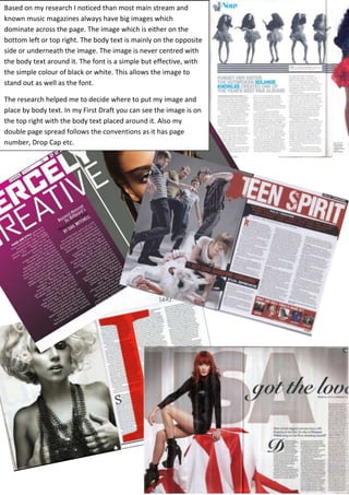
1. Based on my research I noticed than most main stream and
known music magazines always have big images which
dominate across the page. The image which is either on the
bottom left or top right. The body text is mainly on the opposite
side or underneath the image. The image is never centred with
the body text around it. The font is a simple but effective, with
the simple colour of black or white. This allows the image to
stand out as well as the font.
The research helped me to decide where to put my image and
place by body text. In my First Draft you can see the image is on
the top right with the body text placed around it. Also my
double page spread follows the conventions as it has page
number, Drop Cap etc.