Analysis of Motionless In White - Infamous album cover
Analysis of Metallica - St Anger promotional poster
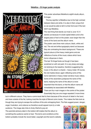
1. Metallica – St Anger poster analysis
This poster advertises Metallica’s eighth studio album,
St Anger.
The key signifier is Metallica due to the high contrast
between black and white. It is also in their unique font
so we would be able to tell it is their font even if the text
didn’t say Metallica.
The next thing that stands out most is June 10. It
stands out because it is bold capital letters and is the
largest piece of text on the poster; even larger than the
name of the band and the album name.
The poster uses three main colours; black, white and
red. The red and white typography stand out because
they are contrasting the black background. These are
typical colours of the heavy metal genre and are
reflective of some of the music videos which have
horror influences in them.
The text ‘St Anger’looks as though it has been
scratched on with red paint. It is very sharp and edgy;
not sticking to the baseline, therefore suggesting the
music in the album is chaotic – heavy metal. Of course,
the red implies blood, again reflecting some of the
horror elements in heavy metal narrative music videos.
Some of the ascenders juxtapose the name of the
band, implying the name of the album is more
important than the band, or that the album name will
immediately be associated with Metallica.
There are four main images in the centre of the poster.
Essentially they are one image repeated 3 more times
but in different colours. They have a comic-book feel to them because of the amount of detail in the hand
and lines outside of the fist, looking most like the style of Marvel comic books. This makes the fists look as
though they are trying to escape the confines of the wire entrapping them. The fists suggest power, danger,
angst, frustration, and violence so therefore would appeal more to a male
audience. The image also links to Andy Warhol’s pop art.
The parental advisory label in the bottom left implies that the album is
something the audience wants to hear. The terms and conditions at the
bottom probably include the record label, copyright and the band’s website.
2. This is important and a vital code/convention of a poster advertising an album.