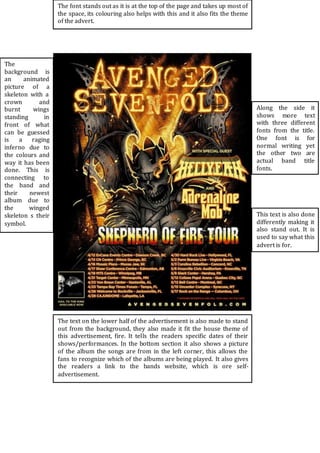
1. The font stands out as it is at the top of the page and takes up most of
the space, its colouring also helps with this and it also fits the theme
of the advert.
Along the side it
shows more text
with three different
fonts from the title.
One font is for
normal writing yet
the other two are
actual band title
fonts.
The
background is
an animated
picture of a
skeleton with a
crown and
burnt wings
standing in
front of what
can be guessed
is a raging
inferno due to
the colours and
way it has been
done. This is
connecting to
the band and
their newest
album due to
the winged
skeleton s their
symbol.
This text is also done
differently making it
also stand out. It is
used to say what this
advert is for.
The text on the lower half of the advertisement is also made to stand
out from the background, they also made it fit the house theme of
this advertisement, fire. It tells the readers specific dates of their
shows/performances. In the bottom section it also shows a picture
of the album the songs are from in the left corner, this allows the
fans to recognize which of the albums are being played. It also gives
the readers a link to the bands website, which is ore self-advertisement.
2. The band name is in Bold Text making it
stand out and grab the reader’s
attention.
One of the singles
names is shown
underneath the
bands name, this
is suggesting that
this single is the
main one of the
album. Also the
texts font can
suggest that this
song isn’t that
happy. They’ve
kept the same
colour as the
titles text before.
This is the
original artwork
of the album itself
and I believe
they’ve used this
so that readers
and consumers
would be able to
recognise the
album upon
release. The
appearance of the
person on the
front suggests
that it is a rock
band due to the
stereotypical
appearance that
everyone
connects to the
rock genre.
This is showing
artwork for
released albums
and albums/cd’s.
the use of the black
background help
make the text stand
out due to its
colour. The texts
titles are in red
showing their
importance and the
white text is a
small description.
This gives a brief
description of the
album, the songs
it contains and
what it includes.
It also keeps to
their colour
scheme from the
album “American
Idiot” in which
the main single
was first revealed
to the public and
it also shows an
image of the
album at the
bottom of the
page.