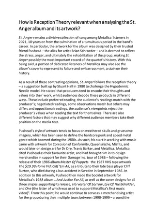
Howis ReceptionTheoryrelevantwhenanalysingtheSt.
Angeralbumanditsartwork?
St. Anger remains a divisivecollection of song among Metallica listeners in
2021, 18 years on fromthe culmination of a tumultuous period in the band’s
career. In particular, the artwork for the album was designed by their trusted
friend Pushead – the alias for artist Brian Schroeder – and is deemed to reflect
the stress, anger, and ultimately the rehabilitation of the group, making St.
Anger possibly themost important record of the quartet’s history. With this
being said, a portion of dedicated listeners of Metallica may also see the
album’s cover to represent its failure and embarrassment, a stain on their
history.
As a resultof these contrasting opinions, St. Anger follows the reception theory
– a suggestion built up by Stuart Hall in 1980 to challenge the Hypodermic
Needle model. He stated that producers tend to encode their thoughts and
values into their work, whilstaudiences decode these products in different
ways. Theseinclude preferred reading, the audience’s readings match with the
producer’s; negotiated readings, some observations match but others may
differ; and oppositional readings, the audience’s viewpoints reject the
producer’s values when reading the text for themselves. There are also
different factors that may suggestwhy differentaudience members take their
position on the media text.
Pushead’s styleof artwork tends to focus on weathered skulls and gruesome
imagery, which has been seen to define the hardcorepunk and speed metal
genre which boomed during the 1980s. As such, his startin working with music
came with artwork for Corrosion of Conformity, Queensrÿche, Misfits, and
would later on design art for Dr Dre, Travis Barker, and Metallica. Metallica
cited Pushead as their favourite artist, and had broughthim in to design
merchandisein supportfor their DamageInc. tour of 1986 – following the
release of their 1986 album Master Of Puppets. the 1987 VHS tapeartwork
The $19.98 Home Vid: Cliff ‘Em All, as a tribute to their late bass player Cliff
Burton, who died during a bus accident in Sweden in September 1986. In
addition to this artwork, Pushead then made the booklet artwork for
Metallica’s 1988 album …And Justice For All, as well as the cover designs for all
three singles supporting its release, Harvester Of Sorrow, Eye Of The Beholder,
and One (the latter of which was used to support Metallica’s first music
video)2
. Fromthis point, he would continue to serveas a merchandising artist
for the group during their multiple tours between 1990-1999 –around the
time the band hit worldwidepopularity following their 1991 Black Album.
Metallica’s music in the 90s had shown a change in direction from their 80s
thrash metal work. The Black Album had shown a mixture of the fastthrash
metal existing fans had become accustomed to, as well as a slower, more
structured heavy metal sound that had been spearheaded by bands such as
Led Zeppelin and Black Sabbath beforehand. Alongsidethe expert-levels of
production fromBob Rock, it remains Metallica’s most successfulalbum
commercially, as well as one of the most successfulalbums of all time – selling
31 million physicalcopies worldwidethroughoutits history. Their follow up
albums Load and ReLoad would, once again, shiftMetallica’s sound to hard
rock and prog metal, which led to fans and critics still feeling divided to this day
due to their stylistic change, although both albums still sold very well above 8
million copies together7
. 2000 would spark a period of toxicity within the band.
Ulrich spearheaded a lawsuit againstfile-sharing website, Napster, for
copyrightinfringement of Metallica’s music, leading to fan backlash. Burton’s
replacement bassist, Jason Newsted, later left in January 2001, after 15 years
of playing bass for Metallica, citing the resentment that the other three had
against him for (basically) not being Cliff, as well as Hetfield – the de facto
“leader” of the group – not supporting his ambitions to join Echobrain as a side
projectduring their hiatus in autumn 20003
. Theremaining trio asked their
producer Bob Rock to performbass guitar for their next album, with sessions
beginning in April 2001, and was halted in July when Hetfield admitted himself
into drug rehabilitation for alcoholism, leaving Ulrich, Hammett, and Rock to
drift their own separate ways until James regrouped with them in April 20024
.
Their productivity between each other would improve once more, despite
some psychologicaldifferences still occurring, the band selected former
Suicidal Tendencies and Ozzy Osbournebass player RobertTrujillo as their new
bassist, and St. Anger was released to mixed reviews, with reviewers criticising
the lack of guitar solos and “steelish” drum sounds, buthighlighting the
passionateand aggressivelyricalthemes. Ulrich himself noted it was important
to release an album that broughtabout “aggressivemusic that didn’t involve
negative energy”, whilst also defending his drum sounds8
.
Lyrically speaking, the album followed the idea and themes of aggression, as
well as recovery – matching with the atmosphere of the time within the group.
Despite Pushead’s years of working with the band, St. Anger would mark the
firsttime he had made artwork for an entire Metallica album, including the
frontcover, and it was his aim to achieve a front cover capable matching these
themes. At a literal glance, the frontappears as a clenched fist, rendered in a
solid, cardinal shade of red, that is being restrained from attacking by a rope
wrapped around the wrist, and the background being a flame orangecolour,
which is disrupted by the brown-ish shaded explosion effect. The work is kept
to a cel-shaded art-style, a style of artmost used in comic books as well as
Pushead’s previous artworks,which is somewhatdifferentto whathad been
used for Metallica’s previous albums – Load and ReLoad both used abstract art
for their covers. Notonly does this depart from what Metallica themselves are
used to with their typical album artwork, butit also somewhatforetells the
shift in musical sound for St. Anger specifically (which has a more presenceof
nu-metal within it, such as the heavier, simpler chords and riffs used, a more
structured musicalpattern, and the lack of extensive guitar solos). The colour
scheme being dominated by the red and orange tends to be a sign of fiery
temper – particularly in comic books wherecharacters typically get a red face
as a means to display their frustration – consequentially, this could imply the
figure of the cover is trying to release their anger, however the ropebeing tied
around their wristand restraining them could be holding them back from
doing so, keeping with the themes of the album and the mentality within the
band at the time. This idea also lends itself to the question of whatmay be the
right thing to do between; do they release themselves from the rope and let
their anxieties out into the open? Or do they keep themselves confined with
the ropearound them and hold their issues inside? This theme is most
prevalent in the song lyrics for The Unnamed Feeling, wherein the second
verse, the lyricists describe a moment wherethey cannot keep the anxiety
within them and so they head back into the social world, only to realise the
worries and issues will eventually creep back into their system: “Cross my
heart, hope not to die; Swallow evil, ride the sky; I losemyself in a crowded
room; You fool, you fool, it’ll be here soon”5
. Also relating to these lyrics is
particular is the artwork of the St. Anger single release – notably featuring a
fallen angel-like figure, which is disfigured, and its wings and arms are wrapped
up by rope. This makes implications to the idea of one’s freedom when their
mind is suffering fromanxiety and addiction being restricted, and that no
matter how hard they try to break free from this mindset, the anxieties always
find a way to creep back. To back up this point, despite Hetfield’s rehab in
2001 being successful, and following a straight-edgelifestyle (avoiding
consumption of alcohol, drugs, and smoking) for years after, he would
eventually relapse and consequently go back into rehab in 2019 following
concerts with the San Francisco Symphony orchestra, and thereforecancelling
future tour dates in Australia and New Zealand9
. The frontcover itself notably
lacks any sortof copy on certain region-specific copies of the album, which is
quite often a break of trend for many musicians, as well as being a firstfor a
Metallica album that has not been repeated since, suggesting that it had a
reliance on symbolismwith something that could not only represent the album
and the lyrical themes of it, but also being able to represent Metallica at a
broader, moregeneral level as they toured in supportfor the album. The
clenched fist, as well as the skullthat is present on the back cover (as is
tradition with Pushead) werelater used as assets for the settings menu screen
and “song completed” screen in Guitar Hero: Metallica, therefore the artwork
somewhatsucceeded in representing the band at a general level1
. The band
did also introducea new logo – a sharp fontstyle with a flame-like outline – of
which itself, as well as the album name, feature on the spineof the case, so
they’renot entirely absent fromthe artwork itself.
As with any kind of music, the combination of lyrics, artwork, and their
semantics will always lead to discussion among fans regarding how they can
relate to the songs. StuartHall would argue that other fans may decode this
interpretation of St. Anger, the album artwork, and The Unnamed Feeling
differently than I have, and by proxy, differently than the lyricists had originally
encoded, becauseof their own life experiences, age, and even how they view
Metallica themselves. Regarding The Unnamed Feeling, although Hetfield
wrotethe lyrics specifically based on his own experiences – with anxiety,
alcohol consumption, and rehab – he did accept that the lyrics are loose
enough for fans to apply it to their own emotional reactions and life
experiences. Whilst it is generally accepted that the clenched fist on the album
cover is meant to represent the struggleto set one’s anger free, it could also
be argued that a clenched fist can suggestshowing one’s senseof personal
pride and triumph – therefore leading to an interpretation that St. Anger was
an emotional triumph for Metallica, which it indeed was considering the year-
long strugglewithin the band prior to its release. Contrastingly, given the
criticism the album received upon release, as well as Metallica’s uneasy
relationship with their fans following the Napster court case, most fans may
have an oppositionalreading the album cover, as they tend to see it symbolise
a period of the band failing to live up to their high expectations, or failing to
appease their fans that may have moved on from them by that point.
Consequently, and in more recent times, the album itself has become a meme
throughoutthe metal music community online. Whether it comes in the form
of photoshopping the album artwork itself, or making jokes of the drum
sounds and lack of guitar solos, St. Anger is generally treated as a
laughingstock throughoutthe internet, although in retrospect, there are some
more preferred readings of it today with fans understanding the trials and
tribulations Metallica went through to get to the finished product, shown in
the Some Kind Of Monster documentary, which was heavily praised upon
release6
. A negotiated reading may not care so much for Metallica, their music,
or their personalbeliefs, but may appreciate this specific segment of their
career that is represented by the clenching fistbeing tied by a rope on the
frontcover, even going to the extent that they wereintroduced to the band
through this album and became a fan due to the lyrical content,
instrumentation, or artwork thatcame from this emotional period, or perhaps
vice-versa, wherethey follow Metallica extensively, except for this one album,
possibly falling out of favour with their content ever since.
When it comes to this artwork relating to my FMP, which is set to be
promotional artwork for an album concept, I’d like to think that my artwork
would have some formof anchorageto the lyricalthemes that would appear in
the liner notes – the booklet that appears inside of the case. I don’t think the
art style will be cel-shaded, nor will it feature skull typical of Pushead’s
artwork, nor do I intend to include the colour scheme specifically attributed for
the St. Anger album cover, but I do think that it may involve darker colours that
is used in the St. Anger singleversion, as well as Schroeder’s other artwork,
namely his earlier album pieces, which feature darker shades of red mixed with
black, and a few shades of grey. I’d like some aspects of the album’s artwork to
feature the artist, and their name, which is once again a slightdeparture from
the St. Anger album cover, though the band’s name does indeed feature on the
single cover, which would mean creating a logo specific for the artist is a key
aspect of the FMP.
To conclude this investigation, the lyrical concepts, instrumentation, and
artwork for St. Anger by Metallica is relevant to the Reception Theory in that it
leads to multiple different perspectives on how Metallica’s fans and the band
themselves perceive the album – both at the time and in retrospect. The
oppositional readings of its context led to the album’s reputation being a
laughingstock for the years to come, although in retrospect there has been
more acceptance and appreciation towards whatthe album as a whole
represents, as it somewhatreinvigorated the band to feeling more together in
future, and saw the continuation of Pushead’s artwork being showcased
throughoutthe realms of the music industry.
Bibliography:
1. Activision (2009) Guitar Hero: Metallica. Available:
https://dwsk.proboards.com/thread/1381/guitar-hero-metallica-theme-27.
2. Anon. (2021). The Album Artof Pushead. Available:
https://rateyourmusic.com/list/monocle/the_album_art_of_pushead__bria
n_schroeder_/. Lastaccessed 10th Dec 2021.
3. Berlinger, J & Milner, G (2004). Metallica: This Monster Lives: The Inside
Story of Some Kind of Monster. New York: St. Martin's Press. p1-338.
4. Berlinger, J & Sinofsky, B(2004) Metallica: Some Kind of Monster
5. Hammett, K, Hetfield, J, Rock, B, & Ulrich, L. (2003). The Unnamed
Feeling. Metallica. St. Anger. [CD] USA: Elektra Records.
6. Harris, B. (2020). In Defence Of: Metallica’s ‘St. Anger’. Available:
https://musicfeeds.com.au/features/in-defence-of-metallicas-st-anger/.
Last accessed 17th Dec 2021.
7. Perry, A (2013). Metallica interview: 'We can drive this train into a wall if we
want'. Available:
https://www.telegraph.co.uk/culture/music/rockandpopfeatures/1031902
9/Metallica-interview-We-can-drive-this-train-into-a-wall-if-we-want.html.
8. Reilly, N. (2020). Metallica’sLarsUlrich defends‘StAnger’ snare sound: “I
stand behind it 100%”. Available:
https://www.nme.com/news/music/metallicas-lars-ulrich-defends-st-
anger-snare-sound-i-stand-behind-it-a-hundred-percent-2718309. Last
accessed 22nd Oct2021.
9. Robb-Dover, K. (2019). Metallica Star JamesHetfield SeeksHelp for
Alcoholism and Addiction. Available: https://fherehab.com/learning/james-
hetfield-seeks-help/. Last accessed 10th Dec 2021.

Personal Study - St. Anger reception

  • 1.
    Howis ReceptionTheoryrelevantwhenanalysingtheSt. Angeralbumanditsartwork? St. Angerremains a divisivecollection of song among Metallica listeners in 2021, 18 years on fromthe culmination of a tumultuous period in the band’s career. In particular, the artwork for the album was designed by their trusted friend Pushead – the alias for artist Brian Schroeder – and is deemed to reflect the stress, anger, and ultimately the rehabilitation of the group, making St. Anger possibly themost important record of the quartet’s history. With this being said, a portion of dedicated listeners of Metallica may also see the album’s cover to represent its failure and embarrassment, a stain on their history. As a resultof these contrasting opinions, St. Anger follows the reception theory – a suggestion built up by Stuart Hall in 1980 to challenge the Hypodermic Needle model. He stated that producers tend to encode their thoughts and values into their work, whilstaudiences decode these products in different ways. Theseinclude preferred reading, the audience’s readings match with the producer’s; negotiated readings, some observations match but others may differ; and oppositional readings, the audience’s viewpoints reject the producer’s values when reading the text for themselves. There are also different factors that may suggestwhy differentaudience members take their position on the media text. Pushead’s styleof artwork tends to focus on weathered skulls and gruesome imagery, which has been seen to define the hardcorepunk and speed metal genre which boomed during the 1980s. As such, his startin working with music came with artwork for Corrosion of Conformity, Queensrÿche, Misfits, and would later on design art for Dr Dre, Travis Barker, and Metallica. Metallica cited Pushead as their favourite artist, and had broughthim in to design merchandisein supportfor their DamageInc. tour of 1986 – following the release of their 1986 album Master Of Puppets. the 1987 VHS tapeartwork The $19.98 Home Vid: Cliff ‘Em All, as a tribute to their late bass player Cliff Burton, who died during a bus accident in Sweden in September 1986. In addition to this artwork, Pushead then made the booklet artwork for Metallica’s 1988 album …And Justice For All, as well as the cover designs for all three singles supporting its release, Harvester Of Sorrow, Eye Of The Beholder, and One (the latter of which was used to support Metallica’s first music video)2 . Fromthis point, he would continue to serveas a merchandising artist for the group during their multiple tours between 1990-1999 –around the
  • 2.
    time the bandhit worldwidepopularity following their 1991 Black Album. Metallica’s music in the 90s had shown a change in direction from their 80s thrash metal work. The Black Album had shown a mixture of the fastthrash metal existing fans had become accustomed to, as well as a slower, more structured heavy metal sound that had been spearheaded by bands such as Led Zeppelin and Black Sabbath beforehand. Alongsidethe expert-levels of production fromBob Rock, it remains Metallica’s most successfulalbum commercially, as well as one of the most successfulalbums of all time – selling 31 million physicalcopies worldwidethroughoutits history. Their follow up albums Load and ReLoad would, once again, shiftMetallica’s sound to hard rock and prog metal, which led to fans and critics still feeling divided to this day due to their stylistic change, although both albums still sold very well above 8 million copies together7 . 2000 would spark a period of toxicity within the band. Ulrich spearheaded a lawsuit againstfile-sharing website, Napster, for copyrightinfringement of Metallica’s music, leading to fan backlash. Burton’s replacement bassist, Jason Newsted, later left in January 2001, after 15 years of playing bass for Metallica, citing the resentment that the other three had against him for (basically) not being Cliff, as well as Hetfield – the de facto “leader” of the group – not supporting his ambitions to join Echobrain as a side projectduring their hiatus in autumn 20003 . Theremaining trio asked their producer Bob Rock to performbass guitar for their next album, with sessions beginning in April 2001, and was halted in July when Hetfield admitted himself into drug rehabilitation for alcoholism, leaving Ulrich, Hammett, and Rock to drift their own separate ways until James regrouped with them in April 20024 . Their productivity between each other would improve once more, despite some psychologicaldifferences still occurring, the band selected former Suicidal Tendencies and Ozzy Osbournebass player RobertTrujillo as their new bassist, and St. Anger was released to mixed reviews, with reviewers criticising the lack of guitar solos and “steelish” drum sounds, buthighlighting the passionateand aggressivelyricalthemes. Ulrich himself noted it was important to release an album that broughtabout “aggressivemusic that didn’t involve negative energy”, whilst also defending his drum sounds8 . Lyrically speaking, the album followed the idea and themes of aggression, as well as recovery – matching with the atmosphere of the time within the group. Despite Pushead’s years of working with the band, St. Anger would mark the firsttime he had made artwork for an entire Metallica album, including the frontcover, and it was his aim to achieve a front cover capable matching these themes. At a literal glance, the frontappears as a clenched fist, rendered in a solid, cardinal shade of red, that is being restrained from attacking by a rope
  • 3.
    wrapped around thewrist, and the background being a flame orangecolour, which is disrupted by the brown-ish shaded explosion effect. The work is kept to a cel-shaded art-style, a style of artmost used in comic books as well as Pushead’s previous artworks,which is somewhatdifferentto whathad been used for Metallica’s previous albums – Load and ReLoad both used abstract art for their covers. Notonly does this depart from what Metallica themselves are used to with their typical album artwork, butit also somewhatforetells the shift in musical sound for St. Anger specifically (which has a more presenceof nu-metal within it, such as the heavier, simpler chords and riffs used, a more structured musicalpattern, and the lack of extensive guitar solos). The colour scheme being dominated by the red and orange tends to be a sign of fiery temper – particularly in comic books wherecharacters typically get a red face as a means to display their frustration – consequentially, this could imply the figure of the cover is trying to release their anger, however the ropebeing tied around their wristand restraining them could be holding them back from doing so, keeping with the themes of the album and the mentality within the band at the time. This idea also lends itself to the question of whatmay be the right thing to do between; do they release themselves from the rope and let their anxieties out into the open? Or do they keep themselves confined with the ropearound them and hold their issues inside? This theme is most prevalent in the song lyrics for The Unnamed Feeling, wherein the second verse, the lyricists describe a moment wherethey cannot keep the anxiety within them and so they head back into the social world, only to realise the worries and issues will eventually creep back into their system: “Cross my heart, hope not to die; Swallow evil, ride the sky; I losemyself in a crowded room; You fool, you fool, it’ll be here soon”5 . Also relating to these lyrics is particular is the artwork of the St. Anger single release – notably featuring a fallen angel-like figure, which is disfigured, and its wings and arms are wrapped up by rope. This makes implications to the idea of one’s freedom when their mind is suffering fromanxiety and addiction being restricted, and that no matter how hard they try to break free from this mindset, the anxieties always find a way to creep back. To back up this point, despite Hetfield’s rehab in 2001 being successful, and following a straight-edgelifestyle (avoiding consumption of alcohol, drugs, and smoking) for years after, he would eventually relapse and consequently go back into rehab in 2019 following concerts with the San Francisco Symphony orchestra, and thereforecancelling future tour dates in Australia and New Zealand9 . The frontcover itself notably lacks any sortof copy on certain region-specific copies of the album, which is quite often a break of trend for many musicians, as well as being a firstfor a Metallica album that has not been repeated since, suggesting that it had a
  • 4.
    reliance on symbolismwithsomething that could not only represent the album and the lyrical themes of it, but also being able to represent Metallica at a broader, moregeneral level as they toured in supportfor the album. The clenched fist, as well as the skullthat is present on the back cover (as is tradition with Pushead) werelater used as assets for the settings menu screen and “song completed” screen in Guitar Hero: Metallica, therefore the artwork somewhatsucceeded in representing the band at a general level1 . The band did also introducea new logo – a sharp fontstyle with a flame-like outline – of which itself, as well as the album name, feature on the spineof the case, so they’renot entirely absent fromthe artwork itself. As with any kind of music, the combination of lyrics, artwork, and their semantics will always lead to discussion among fans regarding how they can relate to the songs. StuartHall would argue that other fans may decode this interpretation of St. Anger, the album artwork, and The Unnamed Feeling differently than I have, and by proxy, differently than the lyricists had originally encoded, becauseof their own life experiences, age, and even how they view Metallica themselves. Regarding The Unnamed Feeling, although Hetfield wrotethe lyrics specifically based on his own experiences – with anxiety, alcohol consumption, and rehab – he did accept that the lyrics are loose enough for fans to apply it to their own emotional reactions and life experiences. Whilst it is generally accepted that the clenched fist on the album cover is meant to represent the struggleto set one’s anger free, it could also be argued that a clenched fist can suggestshowing one’s senseof personal pride and triumph – therefore leading to an interpretation that St. Anger was an emotional triumph for Metallica, which it indeed was considering the year- long strugglewithin the band prior to its release. Contrastingly, given the criticism the album received upon release, as well as Metallica’s uneasy relationship with their fans following the Napster court case, most fans may have an oppositionalreading the album cover, as they tend to see it symbolise a period of the band failing to live up to their high expectations, or failing to appease their fans that may have moved on from them by that point. Consequently, and in more recent times, the album itself has become a meme throughoutthe metal music community online. Whether it comes in the form of photoshopping the album artwork itself, or making jokes of the drum sounds and lack of guitar solos, St. Anger is generally treated as a laughingstock throughoutthe internet, although in retrospect, there are some more preferred readings of it today with fans understanding the trials and tribulations Metallica went through to get to the finished product, shown in the Some Kind Of Monster documentary, which was heavily praised upon
  • 5.
    release6 . A negotiatedreading may not care so much for Metallica, their music, or their personalbeliefs, but may appreciate this specific segment of their career that is represented by the clenching fistbeing tied by a rope on the frontcover, even going to the extent that they wereintroduced to the band through this album and became a fan due to the lyrical content, instrumentation, or artwork thatcame from this emotional period, or perhaps vice-versa, wherethey follow Metallica extensively, except for this one album, possibly falling out of favour with their content ever since. When it comes to this artwork relating to my FMP, which is set to be promotional artwork for an album concept, I’d like to think that my artwork would have some formof anchorageto the lyricalthemes that would appear in the liner notes – the booklet that appears inside of the case. I don’t think the art style will be cel-shaded, nor will it feature skull typical of Pushead’s artwork, nor do I intend to include the colour scheme specifically attributed for the St. Anger album cover, but I do think that it may involve darker colours that is used in the St. Anger singleversion, as well as Schroeder’s other artwork, namely his earlier album pieces, which feature darker shades of red mixed with black, and a few shades of grey. I’d like some aspects of the album’s artwork to feature the artist, and their name, which is once again a slightdeparture from the St. Anger album cover, though the band’s name does indeed feature on the single cover, which would mean creating a logo specific for the artist is a key aspect of the FMP. To conclude this investigation, the lyrical concepts, instrumentation, and artwork for St. Anger by Metallica is relevant to the Reception Theory in that it leads to multiple different perspectives on how Metallica’s fans and the band themselves perceive the album – both at the time and in retrospect. The oppositional readings of its context led to the album’s reputation being a laughingstock for the years to come, although in retrospect there has been more acceptance and appreciation towards whatthe album as a whole represents, as it somewhatreinvigorated the band to feeling more together in future, and saw the continuation of Pushead’s artwork being showcased throughoutthe realms of the music industry.
  • 6.
    Bibliography: 1. Activision (2009)Guitar Hero: Metallica. Available: https://dwsk.proboards.com/thread/1381/guitar-hero-metallica-theme-27. 2. Anon. (2021). The Album Artof Pushead. Available: https://rateyourmusic.com/list/monocle/the_album_art_of_pushead__bria n_schroeder_/. Lastaccessed 10th Dec 2021. 3. Berlinger, J & Milner, G (2004). Metallica: This Monster Lives: The Inside Story of Some Kind of Monster. New York: St. Martin's Press. p1-338. 4. Berlinger, J & Sinofsky, B(2004) Metallica: Some Kind of Monster 5. Hammett, K, Hetfield, J, Rock, B, & Ulrich, L. (2003). The Unnamed Feeling. Metallica. St. Anger. [CD] USA: Elektra Records. 6. Harris, B. (2020). In Defence Of: Metallica’s ‘St. Anger’. Available: https://musicfeeds.com.au/features/in-defence-of-metallicas-st-anger/. Last accessed 17th Dec 2021. 7. Perry, A (2013). Metallica interview: 'We can drive this train into a wall if we want'. Available: https://www.telegraph.co.uk/culture/music/rockandpopfeatures/1031902 9/Metallica-interview-We-can-drive-this-train-into-a-wall-if-we-want.html. 8. Reilly, N. (2020). Metallica’sLarsUlrich defends‘StAnger’ snare sound: “I stand behind it 100%”. Available: https://www.nme.com/news/music/metallicas-lars-ulrich-defends-st- anger-snare-sound-i-stand-behind-it-a-hundred-percent-2718309. Last accessed 22nd Oct2021. 9. Robb-Dover, K. (2019). Metallica Star JamesHetfield SeeksHelp for Alcoholism and Addiction. Available: https://fherehab.com/learning/james- hetfield-seeks-help/. Last accessed 10th Dec 2021.