
Recommended
More Related Content
What's hot
What's hot (19)
Viewers also liked
Viewers also liked (20)
Similar to Iron Maiden Final Frontier Poster Analysis
Similar to Iron Maiden Final Frontier Poster Analysis (20)
More from HCochrane11
More from HCochrane11 (20)
Iron Maiden Final Frontier Poster Analysis
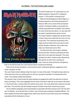
- 1. Iron Maiden – The Final Frontier poster analysis The Final Frontier is the 15th studio album by Iron Maiden released in August 2010. It peaked to number 1 in 28 countries, including the UK. Eddie the Head (designed by Derek Riggs) is a character featured on all of their albumssince 8th February 1980, and on most of their promotional material. The design of Eddie is very prolific and instantly associated with Iron Maiden. Even without the name of the band and album, it is very clear that the poster is advertising their genre of music. The image of Eddie’s mangled skull would be linked to heavy metal music rather than the music of a rap or pop artist. This is because the goriness of the image would be linked to the horror genre and as Andrew Goodwin mentioned, many metal music videos are influenced by horror films. The right hand side of the image is relatively smooth and clean, therefore contrasting the other side which is torn apart and dissected. This could symbolise the album contains songs influenced by other genres as well as their usual type of music.There are what look like thin red lightning bolts on the left hand side; this could imply the album is exciting and shocking. There are lots of reds and glows on and around the skull, including the lightning, suggesting a more ‘brutal’ sub-genre of metal. The use of direct mode of address draws the viewer in to look at the poster. The bright red eyes stand out of the skull and so look very striking when you look at it, giving the impression it is looking back at the viewer. This instantly catches their attention. The semantic code is used through the space background suggests the poster has elements of science fiction and fantasy. This is also suggested with the name of the album itself asit can be linked to Star Wars V: The Final Frontier, a science fiction film with the same name. This could attract other audiences who like Star Wars. The skull also looks like Predator because of Eddie’s sharp teeth and piercing red eyes. The Iron Maiden typography would automatically be associated with them because even if the text didn’t say ‘Iron Maiden’, we would still know it is theirs, even if the text says something completely different. The block capitals and sharp serifs suggest heavy metal music and the red and white colours are immediately associated with the metal genre of music.
- 2. The key signifierof the poster is the skull, and interestingly the name of the album is at the bottom of the poster, hereby suggesting the album name is not as important. This is because this album is the band’s first release since 2006 and the audience won’t care about the name of the album, they will only care that the band is back something new. Right at the very bottom of the poster are logos, probably the record label’s logo and website address. These conventions are vital to the construction of a poster advertising an album as the audience will want to know the record company so they can use them to look for other bands of the same genres of music.