
Recommended
More Related Content
What's hot
What's hot (16)
Viewers also liked
Similar to Analysis of double page spread
Similar to Analysis of double page spread (20)
More from DanielaRodellaPMS
More from DanielaRodellaPMS (18)
Recently uploaded
Recently uploaded (13)
Analysis of double page spread
- 1. Daniela Rodella – 29/11/2013 ANALYSIS OF DOUBLE PAGE SPREAD:
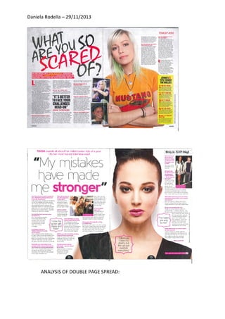
- 2. Daniela Rodella – 29/11/2013 1) Images: the picture shows a beautiful and attractive woman. Her hair is tied up and she wears a lot of make up. She’s staring at the camera, at the audience, with a serious facial expression: she’s looking at us; she’s talking to us. The woman shows beauty, elegance and youth. Actually the genre of music that is represented is probably pop music. You can understand it also looking at the innocence and the simplicity, the naturalness and clarity of her face. Positioning: there’s the big title at the top left, where there’s the optical centre: the spot the eye hits first on page. It is used as a focal point, an orientation centre for placing elements in the layout. The medium shot is positioned on the right page, on the second point of the page the reader hits, and it has to attract the audience. The interesting thing is the presence of some phrases in first person, which make the reader more absorbed. Font styles and text sizes: the title is huge and the colours used are all bright and eye catching: fuchsia, black and white are perfect for a pop music magazine: they are the same colours I will use for my magazine. Language, tone and register: the language and the register are informal. Actually the magazine is addressed to young people. I think an informal register makes the magazine more interesting and attractive because it uses our language as if it’s talking directly to us. The tone is engaging and absorbing,
- 3. Daniela Rodella – 29/11/2013 especially looking at the masthead, which gives us some information about something that we don’t know and that makes us curious. Uses and gratification: -Surveillance: because we want to know what’s going on. - Personal identity: looking at the image which shows a beautiful and attractive woman, audience wants to imitate her. In this magazine the woman is represented in relation to the feminist theory of Laura Mulvey and the stereotypes, in which women are represented to give pleasure to men. 2) Images: the main photograph shows a young girl, who is wearing an orange and red t-shirt. She has blond and green hair and she has a piercing and some necklaces. She doesn’t wear make-up and probably the genre of music represented is indie: the girl is in a casual and relaxed posture and looking at her face, it shows carefree. Positioning: the main photograph is on the right page and it’s a big medium shot, because it has to attract the attention of the reader. Following the movement of the audience’s eye, in the optical centre, which is the first point the eye hits, there’s the big title that makes the reader curious and absorbed.There’s also a phrase in first person in the middle of the left page to make the audience more interested in reading the article. Font styles and text sizes: the colours most used are red, yellow, black, white and orange. There are some images that has connotation to describe what the images are and also the text is been shown little in black but it is shown in a good informative way to talk about the topic on the magazine. Language, tone and register: the language and the register of the magazine are informal because the target audience is young guys. The tone is engaging: the title consists actually of a question that makes the reader interested.
- 4. Daniela Rodella – 29/11/2013 Uses and gratification: -Diversion: the magazine uses media to distract you from your life. -Surveillance: the reader wants to find out what’s going on. The image is rejecting the stereotype of Mulvey’s view. The genre is not interesting in appearance but only in music.