
More Related Content
What's hot
What's hot (20)
Similar to Analysis of contents page
Similar to Analysis of contents page (20)
Recently uploaded
Recently uploaded (20)
Analysis of contents page
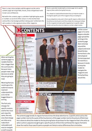
- 1. There is a key colour palette used throughout out the entire contents page derivingof Reds, blacks,,blues and gold each with its own uses and features. Red within the contents page is used when highlightingkey words or numbers as out of all of the colours itis the one that best contrastthe silver background thatis beingused. Furthermore the red is used as it is the signaturecolour of the magazine. Black is used when borderingthe contents page intoits specific regions (that andthe faint grey) linesalso. This allows for clearlydefined borders that canhelpthe reader in finding the specific part ofthe magazine theyare looking for. Blues andgoldare onlyusedinthere specific regions unlike redand blackthat canbe found inallof the articles this is because it allows for the magazine to break upthe magazine byits specific subject matter and use the colour to relate to a certain subject matter. Unlike acover page or to some degree adouble page spreadthe writingonthe contentspage doesnotwrap aroundthe subjectandnever breakthe box formatthat is the stereotypical formatexpected for textthisis because itneeds to helpthe readerto navigate the magazine and findwhatthey wouldlike. Whenwritingthe contentspage itis notable thatthe title isbiggerthan the summarythis because many people make snap decisiononwhat theyare goingto read. Meaningthat you needtogive the audience easyto readand understandtitle as to not be boggeddownin writing. The font only changesfor specificreasons and forthe most part staysthe same,the only onesthat change are titles asto make them noticeable and easyto navigate as well asquote The contentspage breaksits regularformatat timesthe draw attentionto a specificartistsuchas the page numbernexttothe quote of the Courteeners of the page numbernexttothe picture of NickCave thisisdone to directthe readerto the keydrivingfactorof purchase forthe magazine thatisthe artist so whena artistis popularenoughtogeta specificpicture of themthenwillbreakthe regularformatto draw the readto those specificpartsas people are likelytonotice differencesthansimilarities.