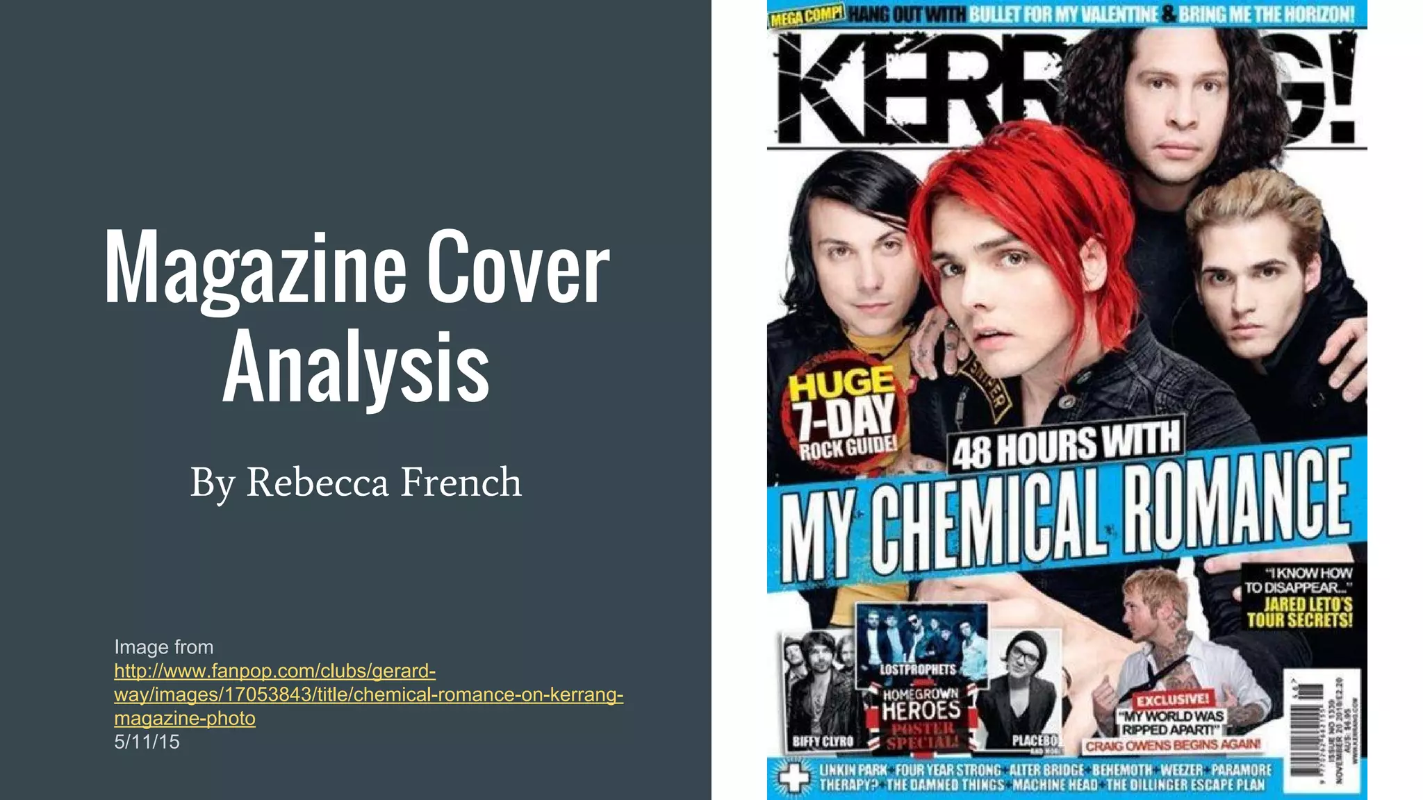
Magazine Cover
Analysis
By Rebecca French
Image from
http://www.fanpop.com/clubs/gerard-
way/images/17053843/title/chemical-romance-on-kerrang-
magazine-photo
5/11/15
Image
The main focus of the magazine is the members
of My Chemical Romance across the front of the
magazine, covering the masthead, and having
their band name in big bold letters across the
front. This grabs the attention of fans of the band
(aka Killjoys) so they will buy the magazine
because it contains their favourite artists.
Other, smaller photographs of different artists
and bands are at the bottom advertising the
posters that are included in the magazine.
Text
The typography is big and bold so it grabs attention
of the readers and matches the overall theme of the
magazine.
The colour of the text is white throughout the front
cover apart from the title and words the magazine
wants to highlight. This matches the background
behind the main image.
The background to the band's name is an electric
blue it is distributed evenly on the cover using it for
the top, middle title, and bottom.
To interest anyone even more who has picked up
the magazine they include buzzwords like
“EXCLUSIVE” for an interview with Craig Owens
featured in the magazine "My World Was Ripped
Apart"
Layout
The magazine layout is very packed and there
isn't any empty space. They have done this by
having the photo of My Chemical Romance
cover the whole of the magazine front. Their
faces are the most important part so you can see
who they are. The clothes aren't as important so
they have covered it with the band's name and
other smaller photos and titles of what else is
featured in the magazine.
The layout isn't very even it is quite heavy with
information towards the bottom of the magazine
with loads of photos and titles. The top part is
just the masthead and the photo of the band.
Summary
I have learnt that the Kerrang! magazine has
a lot of features that focus on getting the
attention of potential buyers. Using things like
specific typography and colours that tie into
the overall theme of the cover and different
buzzwords that help entice readers further
once the magazine has been picked up.
I will use these features in my magazine
cover to make it look authentic and pleasing
to the eye.

A Grade Media Studies Magazine Cover Analysis

  • 1.
    Magazine Cover Analysis By RebeccaFrench Image from http://www.fanpop.com/clubs/gerard- way/images/17053843/title/chemical-romance-on-kerrang- magazine-photo 5/11/15
  • 2.
    Image The main focusof the magazine is the members of My Chemical Romance across the front of the magazine, covering the masthead, and having their band name in big bold letters across the front. This grabs the attention of fans of the band (aka Killjoys) so they will buy the magazine because it contains their favourite artists. Other, smaller photographs of different artists and bands are at the bottom advertising the posters that are included in the magazine.
  • 3.
    Text The typography isbig and bold so it grabs attention of the readers and matches the overall theme of the magazine. The colour of the text is white throughout the front cover apart from the title and words the magazine wants to highlight. This matches the background behind the main image. The background to the band's name is an electric blue it is distributed evenly on the cover using it for the top, middle title, and bottom. To interest anyone even more who has picked up the magazine they include buzzwords like “EXCLUSIVE” for an interview with Craig Owens featured in the magazine "My World Was Ripped Apart"
  • 4.
    Layout The magazine layoutis very packed and there isn't any empty space. They have done this by having the photo of My Chemical Romance cover the whole of the magazine front. Their faces are the most important part so you can see who they are. The clothes aren't as important so they have covered it with the band's name and other smaller photos and titles of what else is featured in the magazine. The layout isn't very even it is quite heavy with information towards the bottom of the magazine with loads of photos and titles. The top part is just the masthead and the photo of the band.
  • 5.
    Summary I have learntthat the Kerrang! magazine has a lot of features that focus on getting the attention of potential buyers. Using things like specific typography and colours that tie into the overall theme of the cover and different buzzwords that help entice readers further once the magazine has been picked up. I will use these features in my magazine cover to make it look authentic and pleasing to the eye.