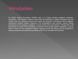
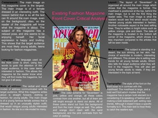
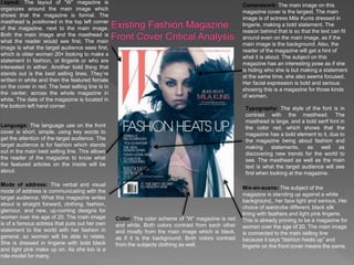
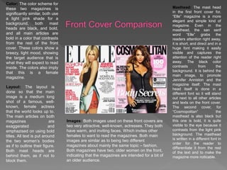
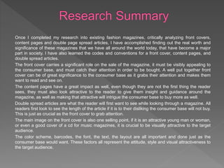
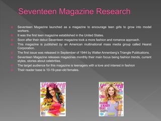
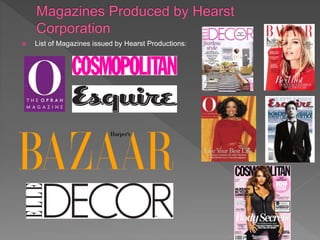
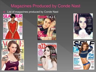
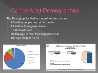
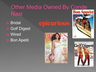
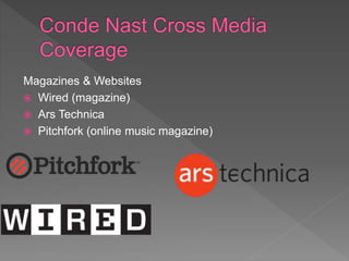
SlideShare a Scribd company logo
Petra Divac
 My Media Studies Foundation Portfolio task is to inquire existing magazine production
companies. I will research magazine goods that are broadcast by related companies that are
similar to the one I intend to compose and design. By doing this I will discover which magazine
associations produce fashion magazines, the demographics they provide, various medias
possessed by the company, examples of cross media union and division. Through this I will
accomplish an insight of the production companies which publish fashion magazines. I will be
able to create my own prosperous fashion magazine which will belong with the publications
existing companies are publishing, by taking notes of their broadcast and methods.
Camerawork: The main image on
this magazine cover is the largest.
The main image is of a female
dressed in an interesting outfit. The
reason behind that is so all the text
can fit around the main image, even
on the background. Also, so the
reader of the magazine will know
what the magazine is about. The
subject of this magazine has a
relaxed pose, and she seems to be
enjoying herself. Her facial
expression is happy and inviting.
This shows that the target audience
are most likely young adults, teens
looking for fashion magazines.
Language: The language used on
the front cover is short, using key
words to grab the attention of the
target audience, in this case teens
interested in fashion. This allows the
magazine let the reader know what
they will find inside the magazine, but
not give it all away.
Layout: The layout of “Seventeen” is
organized all around the main image which
shows that the magazine is formal. The
masthead is positioned at the top, behind the
main image, but is not the first thing the
reader sees. The main image is what the
readers would see first which would mostly
interest young adults interested in fashion.
Another noticeable aspect is the best selling
lines. They’re written in bright colors such as
yellow, orange, pink and black. The date of
the magazine is located in the bottom left
corner of the magazine, which shows it is
less important compared to the articles that
will be seen inside.
Color: The color scheme for “Seventeen” is
pink, yellow and orange, all these colors
contrast from one another, but all of them are
still bright enough to stand out alone. All of
these colors stand out from the background
and from the main image as well. The yellow
and orange don’t clash with the sand
background, and the pink contrasts from her
color of clothing.
Mode of address: The verbal and visual
modes of address communicated with the
target audience. What this magazine writes
about is straight forward, clothing or
fashion, for young adults. The main image
is of a young famous female actress that is
dressed up in an unusually stylish outfit,
that would intrigue young adults interested
in fashion. As she is a role-model for many.
Mis-en-scene: The subject is standing in a
desert, the sun shining on her skin, her
choice of wardrobe is modern, interesting
and different. This shows she is setting new
trends for all young female adults. Which
also tells the target audience what they will
find in the magazine. This will also get
young female adults to relate, if they are
interested in the topic at hand.
Typography: The style of the font on the
front cover Is in contrast with the
masthead. The masthead is large, and a
bold serif font which implies that the
magazine has a certain bold element to it,
considering it Is speaking of fashion and
making a bold statement with setting new
trends. Although it doesn’t have a specific
formality to it. The main text is most likely
to catch the readers eye.
Layout: The layout of “W” magazine is
organizes around the main image which
shows that the magazine is formal. The
masthead is positioned in the top left corner
of the magazine, next to the main image.
Both the main image and the masthead is
what the reader would see first. The main
image is what the target audience sees first,
which is older woman 20+ looking to make a
statement in fashion, or lingerie or who are
interested in either. Another bold thing that
stands out is the best selling lines. They’re
written in white and then the featured female
on the cover in red. The best selling line is in
the center, across the whole magazine in
white. The date of the magazine is located in
the bottom left hand corner.
Language: The language use on the front
cover is short, simple, using key words to
get the attention of the target audience. The
target audience is for fashion which stands
out in the main best selling line. This allows
the reader of the magazine to know what
the featured articles on the inside will be
about.
Mode of address: The verbal and visual
mode of address is communicating with the
target audience. What this magazine writes
about is straight forward, clothing, fashion,
glamour, and new, up-coming designs for
women over the age of 20. The main image
is of a famous actress that puts out her own
statement to the world with her fashion in
general, so women will be able to relate.
She is dressed in lingerie with bold black
and light pink make up on. As she too is a
role-model for many.
Camerawork: The main image on this
magazine cover is the largest. The main
image is of actress Mila Kunis dressed in
lingerie, making a bold statement. The
reason behind that is so that the text can fit
around even on the main image, as if the
main image is the background. Also, the
reader of the magazine will get a hint of
what it is about. The subject on this
magazine has an interesting pose as if she
is hiding who she is but making a statement
at the same time, she also seems focused.
Her facial expression is bold and serious
showing this is a magazine for those kinds
of women.
Color: The color scheme of “W” magazine is red
and white. Both colors contrast from each other
and mostly from the main image which is black,
as if it is the background. Both colors contrast
from the subjects clothing as well.
Typography: The style of the font is in
contrast with the masthead. The
masthead is large, and a bold serif font in
the color red, which shows that the
magazine has a bold element to it, due to
the magazine being about fashion and
making statements, as well as
discovering new trends for the world to
see. The masthead as well as the main
text is what the target audience will see
first when looking at the magazine.
Mis-en-scene: The subject of the
magazine is standing up against a white
background,, her face light and serious. Her
choice of wardrobe different, black silk
lining with feathers and light pink lingerie.
This is already proving to be a magazine for
women over the age of 20. The main image
is connected to the main selling line
because it says “fashion heats up” and
lingerie on the front cover means the same.
Color: The color scheme for
these two magazines is
significantly similar, both use
a light pink shade for a
background, both mast
heads are black, and bold,
and all main articles are
bold in a color that contrasts
from the rest of the front
cover. These colors show a
breezy, light mood, showing
the target audience that is
what they will expect to read
inside. The colors also imply
that this is a female
magazine.
Layout: The layout is
done so that the main
image is a medium long
shot of a famous, well-
known, female actress
that the world looks up to.
The main articles on both
magazines are
exaggerated and
emphazised on using bold
titles. All text is put around
the two women’s bodies
as if to outline their figure.
Both mast heads are
behind them, as if not to
block them.
Images: Both images used on these front covers are
two very attractive, well-known, actresses. They both
have warm, and inviting faces. Which invites other
females to want to read the magazines. Both main
images are similar as to being two different
magazines about mainly the same topic – fashion.
Both magazines have two, older women on the front,
indicating that the magazines are intended for a bit of
an older audience.
Masthead: The mast head
in the first front cover for,
“Elle” magazine is a more
elegant and simple kind of
magazine. Even in the
masthead, the san serif
word “Elle” grabs the
readers attention right away,
it is short, and direct and in a
huge font making it easily
visible and captures the
attention of the reader right
away. The black color
contrasts from the
background. It is behind the
main image, to promote
Jennifer Anniston and the
magazine itself. The mast
head itself is done in a
different font so it will stand
out next to all other articles
and texts on the front cover.
The second cover, for
“Cosmopolitan” the
masthead is also black but
this one is bold, it is quite
visible to the eye because it
contrasts from the light pink
background. The masthead
is written in a different font in
order for the reader to
differentiate it from the rest
of the text and to make the
magazine more noticable.
Front Cover Design Tips
• An attractive and intriguing front cover page should make potential consumer purchase the magazine. A
good front cover is the main sales figure driver for the magazine.
• In order for the potential consumers to be engaged with the front cover and buy it, the front cover model
should look straight into the camera as eye contact is very important.
• Exaggeration and experimentation is allowed however its important to stick to a certain style and concept.
• Headline needs to be eye-catching so the consumer would be drawn in at first sight. The headline needs to
pop out in size as choosing a larger font makes it more visible and easier to read, color, as a strong and
striking color such as red makes it noticeable and attitude, where a recognizable font ad design must be
chosen but kept readable.
• The cover page needs to have a main focus point to captivate the potential consumers, which is usually
the model in the image but it could also be the headline.
• It is preferable to divide the cover into three section, one big with main cover line, a smaller one with
several smaller cover lines and another small one with even more cover lines.
• You can use any color as long as it looks good but people tend to avoid certain colors such as green and
orange as they are difficult to blend and mix. The most popular color used are red, black and white as they
are easy to put into most backgrounds and are eye-catching as they can easily work with most colors.
• In order to prevent confusion a different main color should be used than the previous issue so the
consumer wouldn’t think they had already bought it.
• The bigger cover line should use colors to attract the audience. Smaller color lines should usually go with
black text or white text if the background is black.
• Photography is preferred over illustrations on the front cover as it tends to sell better.
• The masthead can be moved around the cover if it achieves a greater effect. It can be moved to a lower
position to include a cover line over it.
• It also depends on how the country sells its magazines in order to choose location of the masthead to
make it visible according to the placement location.
Cover Line Design Tips
•Simple wordplay that the reader can immediately understand is encouraged, you should not use
hard wordplay that will confuse them.
•Question cover lines must contain answers, unless they were rhetorical questions.
•The biggest cover line does not necessarily have too be the biggest feature in the magazine
issue.
•The biggest cover line should target your largest audience and what they like the most.
Examples are for women it can be about dating, love and shopping and for men it can be about
cars, weapons and sex.
•Sex should not be overused as it can have the opposite effect and deter customer from buying
the magazine.
•Using numbers and contemporary language also attracts many readers. Numbers are often a
great selling point.
•You can repeat your old cover lines from time to time.
•Readers love lists so you can sometimes replace a cover line with one.
•Use descriptive words to spark the readers curiosity about the article.
•You should avoid the same color and font for every cover line to prevent monotony.
•They should disrupt the main image but should be visible around it.
•There must be a main cover line that should stand out from the rest by using a different font or
font size.
Camerawork: The main images on this
content page are food, a sports girl, a clip
from a movie, as well as a girl looking
surprised. These pictures give an idea to the
reader as to what they might find later on in
the magazine. The photos range from
medium long shots, to medium close up
shots, to a close up shot. These images
show the different varieties in topic choices,
as well as the different people featured in the
magazine.
Language: The language on this content
page is appropriate for the target
audience, it catches their attention with the
different colors that are used. It is all quite
easy to read because it is all categorized.
You can easily find you way around the
content page because it is well organized,
it also intrigues you to read more.
Typography: On this cover all the font is
the same, it gives the whole page a
uniform look, it does not change
throughout the whole page. Everything is
in order and only the headings stick out.
The banners are in various colors to be
able to differentiate the headings, text, and
the subheadings.
Color: The colors on this content page are
light green, red, orange, yellow and pink.
The background is white so it all contrasts
from the background. All of these colors
contrast from each other as well. The
headings are bold and in a serif font, the
colors used are also there to catch the
target audiences eye.
Mis-en-scene: The colors of this content
page all stand out, bringing attention to the
audience. The colorful headings show you
what the magazine is about and help with
what a reader might be searching for. The
way everything is places indicates that the
magazine is formal.
Mode of Address: This content page
reflects what is on the inside of this
magazine, young females, successful
females, movies, sports, etc. This page is
quite helpful with helping the target
audience finding what they are looking
for.
Layout: The layout of this page is very
organized and set in a way so that the
pictures math the given text on the side.
Also, so that all pictures can fit as well as
the text. There is no main image, all the
images support what the text says next to
it. There is no main image on this page,
there are three main images, all three are
female and have a welcoming and inviting
facial expression.
Camerawork: The main image on the
content page is a stylish woman with a
50s hair style, in a leather shirt, with a
bold pose. This picture shows the
reader that this is a bold and stylish
magazine. Also, what they will see if
they decide to read on. This photo is a
medium long shot, enclosing on
everything around the main
protagonist and the chair.
Language: The language is appropriate
for the target audience as it is
sophisticated and simple. It is direct and
catches their attention. It is all done in
black, a bold color that stands out on a
white surface. It is not difficult to read
because it is very organized and
simplistic. This may intrigue the reader
more.
Typography: This cover page is done
differently than most. The typography
is on one side of the magazine, on the
right, the headings are specific, as to
“what”, “where”, “why”, etc. If the
reader may need any of the given
questions answered they will find their
way easy. The color is black because
it contrasts best from the white
background as well as the colors used
in the main image. Everything is in
order, the banners, the text, the image.
The subheadings are in an italic black
so that the reader can differentiate.
Color: There is not much to be said about
the choice of color on this content page. A
simplistic black on white is used, and only
the main image is different on this page. It
contains color as a light brown, orange,
turquoise, and dark red chair, and green
lamp. These colors contrast from the black
and white, making in the most visible thing
on the content page. Layout: The layout of this page is
very organized, and set in a way so
that the main image and text are
distinctly separate. The text being
on the right side in a column gives
the page a sense of formality. The
main image is a bold woman
standing, in a room, by herself. She
has a serious expression, intrigues
the reader as to why.
Mode of Address: This content page
gives the reader an example of what the
magazine will look like on the inside. Bold,
fashionable, women. From this content
page you can tell this is a fashion
magazine. The page can be of assist to
the reader with the text on the right side.
Mis-en-scene: The colors are
simple and bold, they even bring
attention to the audience how
simple it is. As it is said, “Less is
more.” The headings show what
you will find in the magazine and if
help is needed. The placing of
everything on this content page
indicates that it is a bold, simple,
and chic, mature magazine.
Content Page Design Tips
• Content is regards to design needs to correspond to magazine front cover and included
articles.
• The design of the content page need to be eye-catching and functional.
• Table of contents must be arranged in such a way so its easy to navigate and understand.
Therefore text, image and page number need to be uniformed to fulfill design criteria.
• Essential element in content page design is use of color. For text or background which will
make page interesting and engaging.
• Carefully selected images add interest to the page and they can be used as a quick content
preview.
• Choice of fonts and size is essential to highlight brief summary of the article included in the
magazine.
• In order to break monotony and to achieve layout balance of the content page a
combination of font, color and images must be mixed in a complimentary scheme.
• Graphics and text are not supposed to compete for attention but should work together to
create a visually appealing and easy to read layout.
• Images used can be defined into a box and can be in different sizes in order to create a
pleasing collage effect.
• Primary objective in content page design is to communicate information clearly and
effectively to the reader.
• The easiest way to ensure the content page has balance is to use a grid system.
• Grid system gives sense of order and provides a clear structural reference to the content
page.
• It is essential to use a headline or quotes from the article.
• Use of hierarchy will give sense or order and structure.
Color: The content pages to both
magazines differ right away. One is
more serious, using dull colors. The
font is script, very elegantly
organized all on the right hand side,
and the colors on the picture dull
shades of pink, red, and grey. The
color of the text is all in black, the
background white, and the picture
being the only color on the page.
However, on the other content
page, there are many different
colors. Red, yellow, orange, light
pink showing this magazine is more
laid back, for a younger audience.
Even the text boxes are in different
colors such as purple and red.
Images: The images on these two
content pages drastically contrast from
one another. The first content page has
one photo, using dulls pictures with a
woman in a bold stance with a chair.
While in the other one, there are various
photos, three of people, one of food, one
of a couple even. Although, Rihanna,
being the bold figure in society today,
she is the only picture that is in black
causing the reader to think she is of
some importance in the magazine as
well. She contrasts from all other colors.
This magazine seems more inviting and
for a younger audience.
Layout: The two layouts contrast from each
other. The first one is very formal, all text is on
one side. There is a simple picture existing on
the left hand side and the month of the issue
in the top left hand corner. On the other
content page there are articles on all sides of
the magazines in various colors, the pictures
don’t have a certain order but they still go with
the colored group of text they belong to.
Masthead: The masthead
in the first table of
contents is in the top left
hand corner written in a
serif font. It is simple and
elegant just like the rest of
the table of contents. On
the other hand, in the
other table of contents
there is no masthead due
to there being a different
title for every other group
with a different color. All
these various colors are
quite visible, would be
even in passing. They are
bold, contrast to the rest of
the text and all have a
color to their certain
categories in the
magazine.
Language: The language in this
article is simple yet complex, showing
it is a magazine for bold and
sophisticated women. The text is long,
showing someone would have to be
interested in the article. It is done in
black, showing a simplicity. It is not
difficult to read because it is
organized.
Color: The color choice is different
than other magazines. The text
color is black and then appears a
giants letter “L” that covers the
whole page in red. This can catch
the readers attention and intrigue
them to find out what this is about.
The main image is black and white
even faded sepia. It contrasts from
the red and the black on the other
page.
Mode of Address: These two
pages give the reader an
example of just how bold but
simple this magazine really is.
Also, how the magazine is
about bold, successful, and
famous women. You can also
tell that the magazine is a
fashion magazine. The text
may suit some to be read and
not many. The picture is quite
revealing and may even be
appaling to some.
Camerawork: The main image
on this double spread page is a
different woman, she appears to
be acting as a bold symbol for
other women. The image shows
the reader that it is not difficult to
be something else, different than
society and you can stand for
yourself. The reader will also be
interested in the article because
of the image that contrasts from
the red letter in the middle of the
other page. This photo is a
medium long shot, enclosing
specifically on her head and
upper chest.
Typography: This double spread article differs from most. The
typography is on one side of the magazine, the right, and then
there is big red letter in the middle of the page. The heading is
on the top right, right page for this article, showing who it is
written about. The color is red to catch the attention of the
reader, black to be bold and sophisticated.
Layout: The layout is very
organized, and set in the way so
that the main image is the main
focus as well as the letter in the
middle of the next page to show
you who it is about and to tell you
it may be an important article.
The text being on the right makes
it stylish and organized, while her
hair in the picture is not. The text
and picture themselves contrast
each other. The main image
doesn’t have much on and is
supporting herself with her hands.
She also has a interesting, and
bold facial expression.
Mis-en-scene: The colors are simple and
are brought to the attention of the reader
with the help of the letter and bold photo.
The heading is small indicating that the
photo has “said it all” to the readers. Also
indicating that the reader and most of the
world know who this is. When all of the
factors are put together, the image and the
typography and the color we get a bold,
chic, and sophisticated magazine.
Color: The color in both double
spreads are the same. Both are
black text on a white background.
In the first magazine double spread,
talking about Lady Gaga, there is
an unusual red “L” in the middle of
the page. People who are fans and
followers of hers would know that
because it is unusual it goes with
the kind of character she is. While
in the second double spread it is
black on white text, with the only
color being the pictures of females
with make-up on posing or doing
their make-up and the brushes on
display.
Layout: The layout in these two
double spread pages contrast one
from the other. In the first one, with
Lady Gaga the whole left side is her
picture, while on the right there is only
text with the unique red letter “L” in
the middle of the page. While on the
other one the mast head of the article
is across the top half of the left side,
there is text and a photo. While on the
right hand side the top half of the
page is a photo of brushes, a photo of
two girls and text going around it,
quite simple.
Images: The first image we see is
the one of singer Lady Gaga in the
first double spread. It is a black and
white, provocative picture of her.
Around her neck she has chains, her
hair is tussled and she is covering her
breasts with her hands. This shows
that the magazine is for an older
target audience, above the age of 18
maybe even 20. In the second there
are three images, the first seen is of
two girls taking a picture, the second
is of 5 big make-up brushes across
the whole half of the page indicating
what the article is about. The fourth
picture is of two girls with brushes in
hand. This double spread is more
inviting, and can be seen as an article
for all ages.
Masthead: In the top front cover, the masthead is located on the
second page, on the top right-hand corner. It is simple in a serif font,
and is visible to the reader. This also indicates that the magazine is
more formal, classy, and elegant. The masthead in the other double
spread is across the page on the left-hand side easily visible to the
reader and quite inviting. It is done in a san serif, bold black font.
Double Spread Article Design Tips
• Magazine double spread consist of two pages next to each other.
• In regards to design these two pages are considered as one unit.
• As magazines are smaller to other print publications therefore magazine double spreads
can be viewed at normal viewing distance.
• The most visible area is the outer part of the right page as it is more exposed to readers
eye.
• The best content of the article needs to be placed on the outside parts of the spread in this
area most provocative images and words are placed. Most valuable areas of double page
spread are top left and top right parts.
• Bottom part of the spread in the corner and near the gutter are less important. Designers
usually place footnotes and some credits in those parts of the spread.
• Most readers focus on the top part of the spread article as the readers eye will stop when
they skim though pages. Therefore this is most natural design and convention starting
point.
• Image and the headline are most important eye stoppers. The layout of the text must
follow natural way of reading the story. In regards to the story everything need to flow from
meaningful top left and then continue to the bottom to create a perfect harmony.
• Order of design should be followed by headline, intro copy, then the main copy.
• Big blocks of text should not be broken up as the flow of the text columns needs to be tidy
and even.
• The design should be simplified by aligning the columns at the top and placing images
above them, the point is to make the layout engaging and easily read.
• Left pages are usually used for editorial content however this is not a strict rule.
Masthead- It is the title of the magazine, usually presented in a very unique and recognizable font and a large
font size. It is supposed to attract the readers and be eye-catching.
Headline- Is the title of the article it represents. It is large and easy to read so the readers know what they are
looking at and what the article contains.
Selling line/strapline-Is the introduction headline placed below the masthead to promote the magazine.
Contents- A page that describes what articles can be found within the magazine and on what page.
Pugs- Are the price, logo and freebies of the magazine that are positioned at the top so they can be easily
seen.
Splash/Lead Story- Main article of the front cover that is usually accompanied by an image and headline.
Secondary Lead/Sub-Stories- Are short previews of other important and intriguing articles within the
magazine.
Side-bar- A box next to the main feature of the magazine.
Strand first/Strapline- Is a sentence under the headline that attracts the consumers by giving them insight into
the article.
Tag/Lure- Engaging words that bring out the readers curiosity and attract them to buy the magazine.
Pull quote- A quote from the article that gives some insight to the readers.
Box-out- A colored box behind the masthead to make it stand out more or become more visually pleasing.
By-line/Credits- Name of the reporter of photographer that contributed to the article.
Caption- Text that explains the image next to it.
Crosshead- A sub-heading that foreshadows what the next paragraph is going to talk about.
Typography- The type of fonts used, serif or sans-serif.
Main Image-A photograph or picture that is the main focus of the issue.
Barcode/Issue Number/Dateline and Price- Are information that need to be ion the front cover however they
are usually in presented in a small font as they are not a selling point of a magazine.
Top and Bottom Strip- are strips above and below the masthead that give additional information about what
can be found in the magazine.
Once I completed my research into existing fashion magazines, critically analyzing front covers,
content pages and double page spread articles, I have accomplished finding out the real worth and
significance of these magazines that we have all around the world today, that have become a major
part in society. I have also learned the codes and conventions for a front cover, content pages, and
double spread articles.
The front cover carries a significant role on the sale of the magazine, it must be visibly appealing to
the consumer base, and must catch their attention in order to be bought. A well put together front
cover can be of great significance to the consumer base as it grabs their attention and makes them
want to read and see on.
The content pages have a great impact as well, even though they are not the first thing the reader
sees, they must also look attractive to the reader to give them insight and guidance around the
magazine, as well as making that attractive will intrigue the consumer base to buy more as well.
Double spread articles are what the reader will first want to see while looking through a magazine. All
readers first look to see the length of the article if it is to their disliking the consumer base will not buy.
This is just as crucial as the front cover to grab attention.
The main image on the front cover is also one selling point, if it is an attractive young man or woman,
or even a good cover of a cd for music magazines, it is crucial to be visually attractive to the target
audience.
The color scheme, barcodes, the font, the text, the layout are all important and done just as the
consumer base would want. These factors all represent the attitude, style and visual attractiveness to
the target audience.
 My Media Studies Foundation Portfolio Preproduction Task
is to research existing magazine producing companies. I
will research magazine products that are published by
relevant companies, also research products that are
similar to a magazine I aim to compose and produce.
Throughout doing this research I am to discover what
companies produce fashion magazines, the
demographics, and various other medias owned by
companies. Doing this I will accomplish a comprehension
of companies and corporations that publish and sell
fashion magazines. Once I finish this research it will aid
me in being able to produce and design my own fashion
magazine.
 Seventeen Magazine launched as a magazine to encourage teen girls to grow into model
workers.
 It was the first teen magazine established in the United States.
 Soon after their debut Seventeen magazine took a more fashion and romance approach.
 This magazine is published by an American multinational mass media group called Hearst
Corporation.
 The first issue was released in September of 1944 by Walter Annenberg’s Triangle Publications.
 Seventeen Magazine releases magazines monthly their main focus being fashion trends, current
styles, stories about celebrities.
 The target audience for this magazine is teenagers with a love and interest in fashion
 Their reader base is 10-19-year-old females.
 List of Magazines issued by Hearst Productions:
The demographics that Seventeen magazine caters for are:
 28 billion (to the USA)
 14 billion (to the UK)
 18 billion (to Europe, Middle East and Africa)
 9 billion (to Asia)
• The San Francisco Chronicle
• Greenwhich Time
• The New York Times
• The Advocate
• Connecticut Post
Television and Cable Companies
 Esquire Network (joint venture with NBC Universal)
 A + E Networks (owns 50%; share joint venture with The Walt
Disney Company)
 ESPN Inc. (owns 20%; also shared with Disney, which owns the
other 80%)
Television & Digital Companies
• Answerology
• Awesomeness TV (25%;
Shared joint venture with
DreamWorks who owns
majority)
• Kaboodle
 Hearst Magazine is a subsidiary of Hearst Corporations
which owns various other types of media such as:
 Hearst Television
 CDS Global
 First DataBank
 ICrossing
 King Features Syndicate
 W Magazine is an American-European fashion Magazine. Created by the publisher
of sister magazine “Women’s Wear Daily”.
 Their first issue was published in 1972 by Fairchild Media .
 W Magazine releases monthly issues of their main focus the subject of controversy.
W Magazine has featured stories and covers which have provoked mixed responses
from its intended audience.
 The target audience is older woman that are interested in fashion, and the lives of
other famous women.
 The company that publishes the magazine now is Conde Nast.
 List of magazines produced by Conde Nast
The Demographics that W magazine caters for are:
 1.2 million people buy printed copies
 1.2 million Average Audience
 5 million followers
 Median Age to read their magazine is 40
 The Age range is 18-46
 Bridal
 Golf Digest
 Wired
 Bon Apetit
Magazines & Websites
 Wired (magazine)
 Ars Technica
 Pitchfork (online music magazine)
Advance Publications own various subsidiaries some of them being:
 POP
 Religion News Service
 Advance Net
 Advance Publication Magazines / Advance Magazine Publishers
 Conde Nast
 Through doing my research into existing media publications I have
come to the realization that global corporations such as, Advanced
Publications and Hearst Corporation publish, create and own a wide
variety of media products. They appeal to many different target
audiences either on a large market scale or specific niche market.
Both companies produce publishing products that are aimed at the
same audience demographics as well as the same audience –
teenagers. Both publishing companies would be great to collaborate
with in the making of my fashion magazine, as they both have the
power and resources to successfully publish and market any type of
magazine. Advance corporation is one of the biggest privately owned
companies in the world, they produced the most successful magazine
in todays marker, such as Vogue and GQ. Their magazines are
popular and are high in demand showing they know how to be visibly
attractive to their consumer base. I would love to work with both
publishing companies, as they both publish and create successful
teenager fashion magazines.

More Related Content

What's hot

School magazine analysis
School magazine analysisSchool magazine analysis
School magazine analysis
Klarasa098
 
Pop music magazine
Pop music magazinePop music magazine
Pop music magazine
Klarasa098
 
Analysis of cover page
Analysis of cover pageAnalysis of cover page
Analysis of cover page
Klarasa098
 
How my magazine appeals to the target audience
How my magazine appeals to the target audienceHow my magazine appeals to the target audience
How my magazine appeals to the target audienceJoshd96
 
Magazine Cover Analysis
Magazine Cover AnalysisMagazine Cover Analysis
Magazine Cover AnalysisSianLynes
 
Music magazine research
Music magazine researchMusic magazine research
Music magazine researchbroganlan
 
Task Two - Detailed Analysis of Music Magazine
Task Two - Detailed Analysis of Music MagazineTask Two - Detailed Analysis of Music Magazine
Task Two - Detailed Analysis of Music Magazine
louisangus
 
Magazine analysis
Magazine analysisMagazine analysis
Magazine analysis
toni lough
 
Magazine analysis
Magazine analysisMagazine analysis
Magazine analysis
Toni Lough
 
Magazine Analyses
Magazine AnalysesMagazine Analyses
Magazine Analyses
Nathaniel Smith
 
Media research
Media researchMedia research
Media research
alwebley1707
 
Front cover research
Front cover researchFront cover research
Front cover researchnakiyahbhaiji
 
Gossip Magazine Cover Analysis
Gossip Magazine Cover Analysis Gossip Magazine Cover Analysis
Gossip Magazine Cover Analysis
JoynesEllie
 
Task 5 – deciding which genre and style
Task 5 – deciding which genre and styleTask 5 – deciding which genre and style
Task 5 – deciding which genre and style
AS Media Column D
 
Question 1
Question 1Question 1
Question 18210_SK
 
Magazine front cover chosen genre
Magazine front cover chosen genreMagazine front cover chosen genre
Magazine front cover chosen genre
Mollie Owen
 
Magazine analysis
Magazine analysisMagazine analysis
Magazine analysisJake Kemp
 
Magazine Research - AS Media Studies
Magazine Research - AS Media StudiesMagazine Research - AS Media Studies
Magazine Research - AS Media StudiesStephStafford01
 

What's hot (20)

School magazine analysis
School magazine analysisSchool magazine analysis
School magazine analysis
 
DPS
DPSDPS
DPS
 
Pop music magazine
Pop music magazinePop music magazine
Pop music magazine
 
Analysis of cover page
Analysis of cover pageAnalysis of cover page
Analysis of cover page
 
How my magazine appeals to the target audience
How my magazine appeals to the target audienceHow my magazine appeals to the target audience
How my magazine appeals to the target audience
 
Magazine Cover Analysis
Magazine Cover AnalysisMagazine Cover Analysis
Magazine Cover Analysis
 
Music magazine research
Music magazine researchMusic magazine research
Music magazine research
 
Task Two - Detailed Analysis of Music Magazine
Task Two - Detailed Analysis of Music MagazineTask Two - Detailed Analysis of Music Magazine
Task Two - Detailed Analysis of Music Magazine
 
Magazine analysis
Magazine analysisMagazine analysis
Magazine analysis
 
Magazine analysis
Magazine analysisMagazine analysis
Magazine analysis
 
Magazine Analyses
Magazine AnalysesMagazine Analyses
Magazine Analyses
 
Media research
Media researchMedia research
Media research
 
Front cover research
Front cover researchFront cover research
Front cover research
 
NME Analysis
NME AnalysisNME Analysis
NME Analysis
 
Gossip Magazine Cover Analysis
Gossip Magazine Cover Analysis Gossip Magazine Cover Analysis
Gossip Magazine Cover Analysis
 
Task 5 – deciding which genre and style
Task 5 – deciding which genre and styleTask 5 – deciding which genre and style
Task 5 – deciding which genre and style
 
Question 1
Question 1Question 1
Question 1
 
Magazine front cover chosen genre
Magazine front cover chosen genreMagazine front cover chosen genre
Magazine front cover chosen genre
 
Magazine analysis
Magazine analysisMagazine analysis
Magazine analysis
 
Magazine Research - AS Media Studies
Magazine Research - AS Media StudiesMagazine Research - AS Media Studies
Magazine Research - AS Media Studies
 

Viewers also liked

Penguat transistor
Penguat transistorPenguat transistor
Penguat transistor
Malik Abdul
 
Analisis sinyal kecil
Analisis sinyal kecilAnalisis sinyal kecil
Analisis sinyal kecil
Malik Abdul
 
проект виконала учениця 7 класу
проект виконала учениця 7 класупроект виконала учениця 7 класу
проект виконала учениця 7 класу
servisosvita
 
Final ppp slide show
Final ppp slide showFinal ppp slide show
Final ppp slide show
Darryl Bonner
 
Face care tips
Face care tips Face care tips
Face care tips
nguyenthaihonglam
 
Wessex AHSN stakeholder survey - full report
Wessex AHSN stakeholder survey - full reportWessex AHSN stakeholder survey - full report
Wessex AHSN stakeholder survey - full report
Health Innovation Wessex
 
Bab 2
Bab 2Bab 2
ezekiel2 CURRICULUM VITAE houses
ezekiel2 CURRICULUM VITAE housesezekiel2 CURRICULUM VITAE houses
ezekiel2 CURRICULUM VITAE housesEzekiel Bohope
 
Penguat transistor syarifudin
Penguat transistor syarifudinPenguat transistor syarifudin
Penguat transistor syarifudin
Syarifudin86
 
я гражданин
я гражданиня гражданин
я гражданин
vr883
 
EVI-LINHD
EVI-LINHD EVI-LINHD
Access control basics-1
Access control basics-1Access control basics-1
Access control basics-1
grantlerc
 
Service Innovation - UHS Pharmacy an Opportunity to Increase the Coverage of ...
Service Innovation - UHS Pharmacy an Opportunity to Increase the Coverage of ...Service Innovation - UHS Pharmacy an Opportunity to Increase the Coverage of ...
Service Innovation - UHS Pharmacy an Opportunity to Increase the Coverage of ...
Health Innovation Wessex
 
Researchers’ perceptions of DH trends and topics
Researchers’ perceptions of DH trends and topicsResearchers’ perceptions of DH trends and topics
Researchers’ perceptions of DH trends and topics
Uned Laboratorio de Innovación en Humanidades
 

Viewers also liked (20)

Penguat transistor
Penguat transistorPenguat transistor
Penguat transistor
 
Analisis sinyal kecil
Analisis sinyal kecilAnalisis sinyal kecil
Analisis sinyal kecil
 
проект виконала учениця 7 класу
проект виконала учениця 7 класупроект виконала учениця 7 класу
проект виконала учениця 7 класу
 
Final ppp slide show
Final ppp slide showFinal ppp slide show
Final ppp slide show
 
Face care tips
Face care tips Face care tips
Face care tips
 
Wessex AHSN stakeholder survey - full report
Wessex AHSN stakeholder survey - full reportWessex AHSN stakeholder survey - full report
Wessex AHSN stakeholder survey - full report
 
портфоліо школа
портфоліо школапортфоліо школа
портфоліо школа
 
Bab 2
Bab 2Bab 2
Bab 2
 
ezekiel2 CURRICULUM VITAE houses
ezekiel2 CURRICULUM VITAE housesezekiel2 CURRICULUM VITAE houses
ezekiel2 CURRICULUM VITAE houses
 
IAN DALORAN
IAN DALORANIAN DALORAN
IAN DALORAN
 
Penguat transistor syarifudin
Penguat transistor syarifudinPenguat transistor syarifudin
Penguat transistor syarifudin
 
350x290_web-2
350x290_web-2350x290_web-2
350x290_web-2
 
я гражданин
я гражданиня гражданин
я гражданин
 
Portfolio_Sakkas
Portfolio_SakkasPortfolio_Sakkas
Portfolio_Sakkas
 
EVI-LINHD
EVI-LINHD EVI-LINHD
EVI-LINHD
 
MY_CV-updated
MY_CV-updatedMY_CV-updated
MY_CV-updated
 
Access control basics-1
Access control basics-1Access control basics-1
Access control basics-1
 
Service Innovation - UHS Pharmacy an Opportunity to Increase the Coverage of ...
Service Innovation - UHS Pharmacy an Opportunity to Increase the Coverage of ...Service Innovation - UHS Pharmacy an Opportunity to Increase the Coverage of ...
Service Innovation - UHS Pharmacy an Opportunity to Increase the Coverage of ...
 
Researchers’ perceptions of DH trends and topics
Researchers’ perceptions of DH trends and topicsResearchers’ perceptions of DH trends and topics
Researchers’ perceptions of DH trends and topics
 
EDWARD UYCOCO CV(v 2) (1)
EDWARD UYCOCO CV(v 2) (1)EDWARD UYCOCO CV(v 2) (1)
EDWARD UYCOCO CV(v 2) (1)
 

Similar to AS Media Main Task Front Cover Research

As media foundation research into existing magazine products
As media foundation research into existing magazine productsAs media foundation research into existing magazine products
As media foundation research into existing magazine products
GeorginaMediaStudies
 
Detailed annotation of a music magazine
Detailed annotation of a music magazineDetailed annotation of a music magazine
Detailed annotation of a music magazinecloosky
 
Magazine analysis
Magazine analysisMagazine analysis
Magazine analysisMarte Kyte
 
Research Into Similar Products
Research Into Similar ProductsResearch Into Similar Products
Research Into Similar Products
jwab14
 
Mojo magazine
Mojo magazineMojo magazine
Mojo magazine
Salma-Elsayed
 
Appealing to the audience
Appealing to the audienceAppealing to the audience
Appealing to the audienceOliviaBolt
 
Evaluation music magazine
Evaluation music magazineEvaluation music magazine
Evaluation music magazine
Joe Wilson
 
Codes and conventions of magazines
Codes and conventions of magazinesCodes and conventions of magazines
Codes and conventions of magazines
SophiaaRosee
 
Magazine anaylisis
Magazine anaylisisMagazine anaylisis
Magazine anaylisis
katiemarieedwards001
 
Magazine anaylisis
Magazine anaylisisMagazine anaylisis
Magazine anaylisis
katiemarieedwards23
 
Media Evaluation
Media EvaluationMedia Evaluation
Media Evaluationfitton92
 
Evaluation question 1
Evaluation question 1Evaluation question 1
Evaluation question 1
10afrmal
 
AS Level Media Fashion Magazine Production Treatment
AS Level Media Fashion Magazine Production TreatmentAS Level Media Fashion Magazine Production Treatment
AS Level Media Fashion Magazine Production Treatment
Petramediastudies
 
Analysis of Front Cover Music Magazine
Analysis of Front Cover Music MagazineAnalysis of Front Cover Music Magazine
Analysis of Front Cover Music Magazine
courteneyblack
 
Media q1
Media q1Media q1
Media q1
zainyc4
 
Research
ResearchResearch
Research
EllieJones40
 
Front covers, contents pages, double page spreads #5
Front covers, contents pages, double page spreads #5Front covers, contents pages, double page spreads #5
Front covers, contents pages, double page spreads #5
QureshiSohail
 
Front covers, contents pages, double page spreads #5
Front covers, contents pages, double page spreads #5Front covers, contents pages, double page spreads #5
Front covers, contents pages, double page spreads #5
QureshiSohail
 

Similar to AS Media Main Task Front Cover Research (20)

As media foundation research into existing magazine products
As media foundation research into existing magazine productsAs media foundation research into existing magazine products
As media foundation research into existing magazine products
 
Detailed annotation of a music magazine
Detailed annotation of a music magazineDetailed annotation of a music magazine
Detailed annotation of a music magazine
 
Magazine analysis
Magazine analysisMagazine analysis
Magazine analysis
 
Research Into Similar Products
Research Into Similar ProductsResearch Into Similar Products
Research Into Similar Products
 
Mojo magazine
Mojo magazineMojo magazine
Mojo magazine
 
Appealing to the audience
Appealing to the audienceAppealing to the audience
Appealing to the audience
 
Evaluation music magazine
Evaluation music magazineEvaluation music magazine
Evaluation music magazine
 
1
11
1
 
1
11
1
 
Codes and conventions of magazines
Codes and conventions of magazinesCodes and conventions of magazines
Codes and conventions of magazines
 
Magazine anaylisis
Magazine anaylisisMagazine anaylisis
Magazine anaylisis
 
Magazine anaylisis
Magazine anaylisisMagazine anaylisis
Magazine anaylisis
 
Media Evaluation
Media EvaluationMedia Evaluation
Media Evaluation
 
Evaluation question 1
Evaluation question 1Evaluation question 1
Evaluation question 1
 
AS Level Media Fashion Magazine Production Treatment
AS Level Media Fashion Magazine Production TreatmentAS Level Media Fashion Magazine Production Treatment
AS Level Media Fashion Magazine Production Treatment
 
Analysis of Front Cover Music Magazine
Analysis of Front Cover Music MagazineAnalysis of Front Cover Music Magazine
Analysis of Front Cover Music Magazine
 
Media q1
Media q1Media q1
Media q1
 
Research
ResearchResearch
Research
 
Front covers, contents pages, double page spreads #5
Front covers, contents pages, double page spreads #5Front covers, contents pages, double page spreads #5
Front covers, contents pages, double page spreads #5
 
Front covers, contents pages, double page spreads #5
Front covers, contents pages, double page spreads #5Front covers, contents pages, double page spreads #5
Front covers, contents pages, double page spreads #5
 

Recently uploaded

Operation Blue Star - Saka Neela Tara
Operation Blue Star   -  Saka Neela TaraOperation Blue Star   -  Saka Neela Tara
Operation Blue Star - Saka Neela Tara
Balvir Singh
 
Chapter 3 - Islamic Banking Products and Services.pptx
Chapter 3 - Islamic Banking Products and Services.pptxChapter 3 - Islamic Banking Products and Services.pptx
Chapter 3 - Islamic Banking Products and Services.pptx
Mohd Adib Abd Muin, Senior Lecturer at Universiti Utara Malaysia
 
The Challenger.pdf DNHS Official Publication
The Challenger.pdf DNHS Official PublicationThe Challenger.pdf DNHS Official Publication
The Challenger.pdf DNHS Official Publication
Delapenabediema
 
How libraries can support authors with open access requirements for UKRI fund...
How libraries can support authors with open access requirements for UKRI fund...How libraries can support authors with open access requirements for UKRI fund...
How libraries can support authors with open access requirements for UKRI fund...
Jisc
 
aaaaaaaaaaaaaaaaaaaaaaaaaaaaaaaaaaaaaaaaa
aaaaaaaaaaaaaaaaaaaaaaaaaaaaaaaaaaaaaaaaaaaaaaaaaaaaaaaaaaaaaaaaaaaaaaaaaaaaaaaaaa
aaaaaaaaaaaaaaaaaaaaaaaaaaaaaaaaaaaaaaaaa
siemaillard
 
June 3, 2024 Anti-Semitism Letter Sent to MIT President Kornbluth and MIT Cor...
June 3, 2024 Anti-Semitism Letter Sent to MIT President Kornbluth and MIT Cor...June 3, 2024 Anti-Semitism Letter Sent to MIT President Kornbluth and MIT Cor...
June 3, 2024 Anti-Semitism Letter Sent to MIT President Kornbluth and MIT Cor...
Levi Shapiro
 
Palestine last event orientationfvgnh .pptx
Palestine last event orientationfvgnh .pptxPalestine last event orientationfvgnh .pptx
Palestine last event orientationfvgnh .pptx
RaedMohamed3
 
Sha'Carri Richardson Presentation 202345
Sha'Carri Richardson Presentation 202345Sha'Carri Richardson Presentation 202345
Sha'Carri Richardson Presentation 202345
beazzy04
 
Mule 4.6 & Java 17 Upgrade | MuleSoft Mysore Meetup #46
Mule 4.6 & Java 17 Upgrade | MuleSoft Mysore Meetup #46Mule 4.6 & Java 17 Upgrade | MuleSoft Mysore Meetup #46
Mule 4.6 & Java 17 Upgrade | MuleSoft Mysore Meetup #46
MysoreMuleSoftMeetup
 
Supporting (UKRI) OA monographs at Salford.pptx
Supporting (UKRI) OA monographs at Salford.pptxSupporting (UKRI) OA monographs at Salford.pptx
Supporting (UKRI) OA monographs at Salford.pptx
Jisc
 
Phrasal Verbs.XXXXXXXXXXXXXXXXXXXXXXXXXX
Phrasal Verbs.XXXXXXXXXXXXXXXXXXXXXXXXXXPhrasal Verbs.XXXXXXXXXXXXXXXXXXXXXXXXXX
Phrasal Verbs.XXXXXXXXXXXXXXXXXXXXXXXXXX
MIRIAMSALINAS13
 
The Roman Empire A Historical Colossus.pdf
The Roman Empire A Historical Colossus.pdfThe Roman Empire A Historical Colossus.pdf
The Roman Empire A Historical Colossus.pdf
kaushalkr1407
 
Polish students' mobility in the Czech Republic
Polish students' mobility in the Czech RepublicPolish students' mobility in the Czech Republic
Polish students' mobility in the Czech Republic
Anna Sz.
 
TESDA TM1 REVIEWER FOR NATIONAL ASSESSMENT WRITTEN AND ORAL QUESTIONS WITH A...
TESDA TM1 REVIEWER  FOR NATIONAL ASSESSMENT WRITTEN AND ORAL QUESTIONS WITH A...TESDA TM1 REVIEWER  FOR NATIONAL ASSESSMENT WRITTEN AND ORAL QUESTIONS WITH A...
TESDA TM1 REVIEWER FOR NATIONAL ASSESSMENT WRITTEN AND ORAL QUESTIONS WITH A...
EugeneSaldivar
 
CACJapan - GROUP Presentation 1- Wk 4.pdf
CACJapan - GROUP Presentation 1- Wk 4.pdfCACJapan - GROUP Presentation 1- Wk 4.pdf
CACJapan - GROUP Presentation 1- Wk 4.pdf
camakaiclarkmusic
 
Home assignment II on Spectroscopy 2024 Answers.pdf
Home assignment II on Spectroscopy 2024 Answers.pdfHome assignment II on Spectroscopy 2024 Answers.pdf
Home assignment II on Spectroscopy 2024 Answers.pdf
Tamralipta Mahavidyalaya
 
Instructions for Submissions thorugh G- Classroom.pptx
Instructions for Submissions thorugh G- Classroom.pptxInstructions for Submissions thorugh G- Classroom.pptx
Instructions for Submissions thorugh G- Classroom.pptx
Jheel Barad
 
Embracing GenAI - A Strategic Imperative
Embracing GenAI - A Strategic ImperativeEmbracing GenAI - A Strategic Imperative
Embracing GenAI - A Strategic Imperative
Peter Windle
 
Welcome to TechSoup New Member Orientation and Q&A (May 2024).pdf
Welcome to TechSoup   New Member Orientation and Q&A (May 2024).pdfWelcome to TechSoup   New Member Orientation and Q&A (May 2024).pdf
Welcome to TechSoup New Member Orientation and Q&A (May 2024).pdf
TechSoup
 
Francesca Gottschalk - How can education support child empowerment.pptx
Francesca Gottschalk - How can education support child empowerment.pptxFrancesca Gottschalk - How can education support child empowerment.pptx
Francesca Gottschalk - How can education support child empowerment.pptx
EduSkills OECD
 

Recently uploaded (20)

Operation Blue Star - Saka Neela Tara
Operation Blue Star   -  Saka Neela TaraOperation Blue Star   -  Saka Neela Tara
Operation Blue Star - Saka Neela Tara
 
Chapter 3 - Islamic Banking Products and Services.pptx
Chapter 3 - Islamic Banking Products and Services.pptxChapter 3 - Islamic Banking Products and Services.pptx
Chapter 3 - Islamic Banking Products and Services.pptx
 
The Challenger.pdf DNHS Official Publication
The Challenger.pdf DNHS Official PublicationThe Challenger.pdf DNHS Official Publication
The Challenger.pdf DNHS Official Publication
 
How libraries can support authors with open access requirements for UKRI fund...
How libraries can support authors with open access requirements for UKRI fund...How libraries can support authors with open access requirements for UKRI fund...
How libraries can support authors with open access requirements for UKRI fund...
 
aaaaaaaaaaaaaaaaaaaaaaaaaaaaaaaaaaaaaaaaa
aaaaaaaaaaaaaaaaaaaaaaaaaaaaaaaaaaaaaaaaaaaaaaaaaaaaaaaaaaaaaaaaaaaaaaaaaaaaaaaaaa
aaaaaaaaaaaaaaaaaaaaaaaaaaaaaaaaaaaaaaaaa
 
June 3, 2024 Anti-Semitism Letter Sent to MIT President Kornbluth and MIT Cor...
June 3, 2024 Anti-Semitism Letter Sent to MIT President Kornbluth and MIT Cor...June 3, 2024 Anti-Semitism Letter Sent to MIT President Kornbluth and MIT Cor...
June 3, 2024 Anti-Semitism Letter Sent to MIT President Kornbluth and MIT Cor...
 
Palestine last event orientationfvgnh .pptx
Palestine last event orientationfvgnh .pptxPalestine last event orientationfvgnh .pptx
Palestine last event orientationfvgnh .pptx
 
Sha'Carri Richardson Presentation 202345
Sha'Carri Richardson Presentation 202345Sha'Carri Richardson Presentation 202345
Sha'Carri Richardson Presentation 202345
 
Mule 4.6 & Java 17 Upgrade | MuleSoft Mysore Meetup #46
Mule 4.6 & Java 17 Upgrade | MuleSoft Mysore Meetup #46Mule 4.6 & Java 17 Upgrade | MuleSoft Mysore Meetup #46
Mule 4.6 & Java 17 Upgrade | MuleSoft Mysore Meetup #46
 
Supporting (UKRI) OA monographs at Salford.pptx
Supporting (UKRI) OA monographs at Salford.pptxSupporting (UKRI) OA monographs at Salford.pptx
Supporting (UKRI) OA monographs at Salford.pptx
 
Phrasal Verbs.XXXXXXXXXXXXXXXXXXXXXXXXXX
Phrasal Verbs.XXXXXXXXXXXXXXXXXXXXXXXXXXPhrasal Verbs.XXXXXXXXXXXXXXXXXXXXXXXXXX
Phrasal Verbs.XXXXXXXXXXXXXXXXXXXXXXXXXX
 
The Roman Empire A Historical Colossus.pdf
The Roman Empire A Historical Colossus.pdfThe Roman Empire A Historical Colossus.pdf
The Roman Empire A Historical Colossus.pdf
 
Polish students' mobility in the Czech Republic
Polish students' mobility in the Czech RepublicPolish students' mobility in the Czech Republic
Polish students' mobility in the Czech Republic
 
TESDA TM1 REVIEWER FOR NATIONAL ASSESSMENT WRITTEN AND ORAL QUESTIONS WITH A...
TESDA TM1 REVIEWER  FOR NATIONAL ASSESSMENT WRITTEN AND ORAL QUESTIONS WITH A...TESDA TM1 REVIEWER  FOR NATIONAL ASSESSMENT WRITTEN AND ORAL QUESTIONS WITH A...
TESDA TM1 REVIEWER FOR NATIONAL ASSESSMENT WRITTEN AND ORAL QUESTIONS WITH A...
 
CACJapan - GROUP Presentation 1- Wk 4.pdf
CACJapan - GROUP Presentation 1- Wk 4.pdfCACJapan - GROUP Presentation 1- Wk 4.pdf
CACJapan - GROUP Presentation 1- Wk 4.pdf
 
Home assignment II on Spectroscopy 2024 Answers.pdf
Home assignment II on Spectroscopy 2024 Answers.pdfHome assignment II on Spectroscopy 2024 Answers.pdf
Home assignment II on Spectroscopy 2024 Answers.pdf
 
Instructions for Submissions thorugh G- Classroom.pptx
Instructions for Submissions thorugh G- Classroom.pptxInstructions for Submissions thorugh G- Classroom.pptx
Instructions for Submissions thorugh G- Classroom.pptx
 
Embracing GenAI - A Strategic Imperative
Embracing GenAI - A Strategic ImperativeEmbracing GenAI - A Strategic Imperative
Embracing GenAI - A Strategic Imperative
 
Welcome to TechSoup New Member Orientation and Q&A (May 2024).pdf
Welcome to TechSoup   New Member Orientation and Q&A (May 2024).pdfWelcome to TechSoup   New Member Orientation and Q&A (May 2024).pdf
Welcome to TechSoup New Member Orientation and Q&A (May 2024).pdf
 
Francesca Gottschalk - How can education support child empowerment.pptx
Francesca Gottschalk - How can education support child empowerment.pptxFrancesca Gottschalk - How can education support child empowerment.pptx
Francesca Gottschalk - How can education support child empowerment.pptx
 

AS Media Main Task Front Cover Research

  • 2.  My Media Studies Foundation Portfolio task is to inquire existing magazine production companies. I will research magazine goods that are broadcast by related companies that are similar to the one I intend to compose and design. By doing this I will discover which magazine associations produce fashion magazines, the demographics they provide, various medias possessed by the company, examples of cross media union and division. Through this I will accomplish an insight of the production companies which publish fashion magazines. I will be able to create my own prosperous fashion magazine which will belong with the publications existing companies are publishing, by taking notes of their broadcast and methods.
  • 3. Camerawork: The main image on this magazine cover is the largest. The main image is of a female dressed in an interesting outfit. The reason behind that is so all the text can fit around the main image, even on the background. Also, so the reader of the magazine will know what the magazine is about. The subject of this magazine has a relaxed pose, and she seems to be enjoying herself. Her facial expression is happy and inviting. This shows that the target audience are most likely young adults, teens looking for fashion magazines. Language: The language used on the front cover is short, using key words to grab the attention of the target audience, in this case teens interested in fashion. This allows the magazine let the reader know what they will find inside the magazine, but not give it all away. Layout: The layout of “Seventeen” is organized all around the main image which shows that the magazine is formal. The masthead is positioned at the top, behind the main image, but is not the first thing the reader sees. The main image is what the readers would see first which would mostly interest young adults interested in fashion. Another noticeable aspect is the best selling lines. They’re written in bright colors such as yellow, orange, pink and black. The date of the magazine is located in the bottom left corner of the magazine, which shows it is less important compared to the articles that will be seen inside. Color: The color scheme for “Seventeen” is pink, yellow and orange, all these colors contrast from one another, but all of them are still bright enough to stand out alone. All of these colors stand out from the background and from the main image as well. The yellow and orange don’t clash with the sand background, and the pink contrasts from her color of clothing. Mode of address: The verbal and visual modes of address communicated with the target audience. What this magazine writes about is straight forward, clothing or fashion, for young adults. The main image is of a young famous female actress that is dressed up in an unusually stylish outfit, that would intrigue young adults interested in fashion. As she is a role-model for many. Mis-en-scene: The subject is standing in a desert, the sun shining on her skin, her choice of wardrobe is modern, interesting and different. This shows she is setting new trends for all young female adults. Which also tells the target audience what they will find in the magazine. This will also get young female adults to relate, if they are interested in the topic at hand. Typography: The style of the font on the front cover Is in contrast with the masthead. The masthead is large, and a bold serif font which implies that the magazine has a certain bold element to it, considering it Is speaking of fashion and making a bold statement with setting new trends. Although it doesn’t have a specific formality to it. The main text is most likely to catch the readers eye.
  • 4. Layout: The layout of “W” magazine is organizes around the main image which shows that the magazine is formal. The masthead is positioned in the top left corner of the magazine, next to the main image. Both the main image and the masthead is what the reader would see first. The main image is what the target audience sees first, which is older woman 20+ looking to make a statement in fashion, or lingerie or who are interested in either. Another bold thing that stands out is the best selling lines. They’re written in white and then the featured female on the cover in red. The best selling line is in the center, across the whole magazine in white. The date of the magazine is located in the bottom left hand corner. Language: The language use on the front cover is short, simple, using key words to get the attention of the target audience. The target audience is for fashion which stands out in the main best selling line. This allows the reader of the magazine to know what the featured articles on the inside will be about. Mode of address: The verbal and visual mode of address is communicating with the target audience. What this magazine writes about is straight forward, clothing, fashion, glamour, and new, up-coming designs for women over the age of 20. The main image is of a famous actress that puts out her own statement to the world with her fashion in general, so women will be able to relate. She is dressed in lingerie with bold black and light pink make up on. As she too is a role-model for many. Camerawork: The main image on this magazine cover is the largest. The main image is of actress Mila Kunis dressed in lingerie, making a bold statement. The reason behind that is so that the text can fit around even on the main image, as if the main image is the background. Also, the reader of the magazine will get a hint of what it is about. The subject on this magazine has an interesting pose as if she is hiding who she is but making a statement at the same time, she also seems focused. Her facial expression is bold and serious showing this is a magazine for those kinds of women. Color: The color scheme of “W” magazine is red and white. Both colors contrast from each other and mostly from the main image which is black, as if it is the background. Both colors contrast from the subjects clothing as well. Typography: The style of the font is in contrast with the masthead. The masthead is large, and a bold serif font in the color red, which shows that the magazine has a bold element to it, due to the magazine being about fashion and making statements, as well as discovering new trends for the world to see. The masthead as well as the main text is what the target audience will see first when looking at the magazine. Mis-en-scene: The subject of the magazine is standing up against a white background,, her face light and serious. Her choice of wardrobe different, black silk lining with feathers and light pink lingerie. This is already proving to be a magazine for women over the age of 20. The main image is connected to the main selling line because it says “fashion heats up” and lingerie on the front cover means the same.
  • 5. Color: The color scheme for these two magazines is significantly similar, both use a light pink shade for a background, both mast heads are black, and bold, and all main articles are bold in a color that contrasts from the rest of the front cover. These colors show a breezy, light mood, showing the target audience that is what they will expect to read inside. The colors also imply that this is a female magazine. Layout: The layout is done so that the main image is a medium long shot of a famous, well- known, female actress that the world looks up to. The main articles on both magazines are exaggerated and emphazised on using bold titles. All text is put around the two women’s bodies as if to outline their figure. Both mast heads are behind them, as if not to block them. Images: Both images used on these front covers are two very attractive, well-known, actresses. They both have warm, and inviting faces. Which invites other females to want to read the magazines. Both main images are similar as to being two different magazines about mainly the same topic – fashion. Both magazines have two, older women on the front, indicating that the magazines are intended for a bit of an older audience. Masthead: The mast head in the first front cover for, “Elle” magazine is a more elegant and simple kind of magazine. Even in the masthead, the san serif word “Elle” grabs the readers attention right away, it is short, and direct and in a huge font making it easily visible and captures the attention of the reader right away. The black color contrasts from the background. It is behind the main image, to promote Jennifer Anniston and the magazine itself. The mast head itself is done in a different font so it will stand out next to all other articles and texts on the front cover. The second cover, for “Cosmopolitan” the masthead is also black but this one is bold, it is quite visible to the eye because it contrasts from the light pink background. The masthead is written in a different font in order for the reader to differentiate it from the rest of the text and to make the magazine more noticable.
  • 6. Front Cover Design Tips • An attractive and intriguing front cover page should make potential consumer purchase the magazine. A good front cover is the main sales figure driver for the magazine. • In order for the potential consumers to be engaged with the front cover and buy it, the front cover model should look straight into the camera as eye contact is very important. • Exaggeration and experimentation is allowed however its important to stick to a certain style and concept. • Headline needs to be eye-catching so the consumer would be drawn in at first sight. The headline needs to pop out in size as choosing a larger font makes it more visible and easier to read, color, as a strong and striking color such as red makes it noticeable and attitude, where a recognizable font ad design must be chosen but kept readable. • The cover page needs to have a main focus point to captivate the potential consumers, which is usually the model in the image but it could also be the headline. • It is preferable to divide the cover into three section, one big with main cover line, a smaller one with several smaller cover lines and another small one with even more cover lines. • You can use any color as long as it looks good but people tend to avoid certain colors such as green and orange as they are difficult to blend and mix. The most popular color used are red, black and white as they are easy to put into most backgrounds and are eye-catching as they can easily work with most colors. • In order to prevent confusion a different main color should be used than the previous issue so the consumer wouldn’t think they had already bought it. • The bigger cover line should use colors to attract the audience. Smaller color lines should usually go with black text or white text if the background is black. • Photography is preferred over illustrations on the front cover as it tends to sell better. • The masthead can be moved around the cover if it achieves a greater effect. It can be moved to a lower position to include a cover line over it. • It also depends on how the country sells its magazines in order to choose location of the masthead to make it visible according to the placement location.
  • 7. Cover Line Design Tips •Simple wordplay that the reader can immediately understand is encouraged, you should not use hard wordplay that will confuse them. •Question cover lines must contain answers, unless they were rhetorical questions. •The biggest cover line does not necessarily have too be the biggest feature in the magazine issue. •The biggest cover line should target your largest audience and what they like the most. Examples are for women it can be about dating, love and shopping and for men it can be about cars, weapons and sex. •Sex should not be overused as it can have the opposite effect and deter customer from buying the magazine. •Using numbers and contemporary language also attracts many readers. Numbers are often a great selling point. •You can repeat your old cover lines from time to time. •Readers love lists so you can sometimes replace a cover line with one. •Use descriptive words to spark the readers curiosity about the article. •You should avoid the same color and font for every cover line to prevent monotony. •They should disrupt the main image but should be visible around it. •There must be a main cover line that should stand out from the rest by using a different font or font size.
  • 8. Camerawork: The main images on this content page are food, a sports girl, a clip from a movie, as well as a girl looking surprised. These pictures give an idea to the reader as to what they might find later on in the magazine. The photos range from medium long shots, to medium close up shots, to a close up shot. These images show the different varieties in topic choices, as well as the different people featured in the magazine. Language: The language on this content page is appropriate for the target audience, it catches their attention with the different colors that are used. It is all quite easy to read because it is all categorized. You can easily find you way around the content page because it is well organized, it also intrigues you to read more. Typography: On this cover all the font is the same, it gives the whole page a uniform look, it does not change throughout the whole page. Everything is in order and only the headings stick out. The banners are in various colors to be able to differentiate the headings, text, and the subheadings. Color: The colors on this content page are light green, red, orange, yellow and pink. The background is white so it all contrasts from the background. All of these colors contrast from each other as well. The headings are bold and in a serif font, the colors used are also there to catch the target audiences eye. Mis-en-scene: The colors of this content page all stand out, bringing attention to the audience. The colorful headings show you what the magazine is about and help with what a reader might be searching for. The way everything is places indicates that the magazine is formal. Mode of Address: This content page reflects what is on the inside of this magazine, young females, successful females, movies, sports, etc. This page is quite helpful with helping the target audience finding what they are looking for. Layout: The layout of this page is very organized and set in a way so that the pictures math the given text on the side. Also, so that all pictures can fit as well as the text. There is no main image, all the images support what the text says next to it. There is no main image on this page, there are three main images, all three are female and have a welcoming and inviting facial expression.
  • 9. Camerawork: The main image on the content page is a stylish woman with a 50s hair style, in a leather shirt, with a bold pose. This picture shows the reader that this is a bold and stylish magazine. Also, what they will see if they decide to read on. This photo is a medium long shot, enclosing on everything around the main protagonist and the chair. Language: The language is appropriate for the target audience as it is sophisticated and simple. It is direct and catches their attention. It is all done in black, a bold color that stands out on a white surface. It is not difficult to read because it is very organized and simplistic. This may intrigue the reader more. Typography: This cover page is done differently than most. The typography is on one side of the magazine, on the right, the headings are specific, as to “what”, “where”, “why”, etc. If the reader may need any of the given questions answered they will find their way easy. The color is black because it contrasts best from the white background as well as the colors used in the main image. Everything is in order, the banners, the text, the image. The subheadings are in an italic black so that the reader can differentiate. Color: There is not much to be said about the choice of color on this content page. A simplistic black on white is used, and only the main image is different on this page. It contains color as a light brown, orange, turquoise, and dark red chair, and green lamp. These colors contrast from the black and white, making in the most visible thing on the content page. Layout: The layout of this page is very organized, and set in a way so that the main image and text are distinctly separate. The text being on the right side in a column gives the page a sense of formality. The main image is a bold woman standing, in a room, by herself. She has a serious expression, intrigues the reader as to why. Mode of Address: This content page gives the reader an example of what the magazine will look like on the inside. Bold, fashionable, women. From this content page you can tell this is a fashion magazine. The page can be of assist to the reader with the text on the right side. Mis-en-scene: The colors are simple and bold, they even bring attention to the audience how simple it is. As it is said, “Less is more.” The headings show what you will find in the magazine and if help is needed. The placing of everything on this content page indicates that it is a bold, simple, and chic, mature magazine.
  • 10. Content Page Design Tips • Content is regards to design needs to correspond to magazine front cover and included articles. • The design of the content page need to be eye-catching and functional. • Table of contents must be arranged in such a way so its easy to navigate and understand. Therefore text, image and page number need to be uniformed to fulfill design criteria. • Essential element in content page design is use of color. For text or background which will make page interesting and engaging. • Carefully selected images add interest to the page and they can be used as a quick content preview. • Choice of fonts and size is essential to highlight brief summary of the article included in the magazine. • In order to break monotony and to achieve layout balance of the content page a combination of font, color and images must be mixed in a complimentary scheme. • Graphics and text are not supposed to compete for attention but should work together to create a visually appealing and easy to read layout. • Images used can be defined into a box and can be in different sizes in order to create a pleasing collage effect. • Primary objective in content page design is to communicate information clearly and effectively to the reader. • The easiest way to ensure the content page has balance is to use a grid system. • Grid system gives sense of order and provides a clear structural reference to the content page. • It is essential to use a headline or quotes from the article. • Use of hierarchy will give sense or order and structure.
  • 11. Color: The content pages to both magazines differ right away. One is more serious, using dull colors. The font is script, very elegantly organized all on the right hand side, and the colors on the picture dull shades of pink, red, and grey. The color of the text is all in black, the background white, and the picture being the only color on the page. However, on the other content page, there are many different colors. Red, yellow, orange, light pink showing this magazine is more laid back, for a younger audience. Even the text boxes are in different colors such as purple and red. Images: The images on these two content pages drastically contrast from one another. The first content page has one photo, using dulls pictures with a woman in a bold stance with a chair. While in the other one, there are various photos, three of people, one of food, one of a couple even. Although, Rihanna, being the bold figure in society today, she is the only picture that is in black causing the reader to think she is of some importance in the magazine as well. She contrasts from all other colors. This magazine seems more inviting and for a younger audience. Layout: The two layouts contrast from each other. The first one is very formal, all text is on one side. There is a simple picture existing on the left hand side and the month of the issue in the top left hand corner. On the other content page there are articles on all sides of the magazines in various colors, the pictures don’t have a certain order but they still go with the colored group of text they belong to. Masthead: The masthead in the first table of contents is in the top left hand corner written in a serif font. It is simple and elegant just like the rest of the table of contents. On the other hand, in the other table of contents there is no masthead due to there being a different title for every other group with a different color. All these various colors are quite visible, would be even in passing. They are bold, contrast to the rest of the text and all have a color to their certain categories in the magazine.
  • 12. Language: The language in this article is simple yet complex, showing it is a magazine for bold and sophisticated women. The text is long, showing someone would have to be interested in the article. It is done in black, showing a simplicity. It is not difficult to read because it is organized. Color: The color choice is different than other magazines. The text color is black and then appears a giants letter “L” that covers the whole page in red. This can catch the readers attention and intrigue them to find out what this is about. The main image is black and white even faded sepia. It contrasts from the red and the black on the other page. Mode of Address: These two pages give the reader an example of just how bold but simple this magazine really is. Also, how the magazine is about bold, successful, and famous women. You can also tell that the magazine is a fashion magazine. The text may suit some to be read and not many. The picture is quite revealing and may even be appaling to some. Camerawork: The main image on this double spread page is a different woman, she appears to be acting as a bold symbol for other women. The image shows the reader that it is not difficult to be something else, different than society and you can stand for yourself. The reader will also be interested in the article because of the image that contrasts from the red letter in the middle of the other page. This photo is a medium long shot, enclosing specifically on her head and upper chest. Typography: This double spread article differs from most. The typography is on one side of the magazine, the right, and then there is big red letter in the middle of the page. The heading is on the top right, right page for this article, showing who it is written about. The color is red to catch the attention of the reader, black to be bold and sophisticated. Layout: The layout is very organized, and set in the way so that the main image is the main focus as well as the letter in the middle of the next page to show you who it is about and to tell you it may be an important article. The text being on the right makes it stylish and organized, while her hair in the picture is not. The text and picture themselves contrast each other. The main image doesn’t have much on and is supporting herself with her hands. She also has a interesting, and bold facial expression. Mis-en-scene: The colors are simple and are brought to the attention of the reader with the help of the letter and bold photo. The heading is small indicating that the photo has “said it all” to the readers. Also indicating that the reader and most of the world know who this is. When all of the factors are put together, the image and the typography and the color we get a bold, chic, and sophisticated magazine.
  • 13. Color: The color in both double spreads are the same. Both are black text on a white background. In the first magazine double spread, talking about Lady Gaga, there is an unusual red “L” in the middle of the page. People who are fans and followers of hers would know that because it is unusual it goes with the kind of character she is. While in the second double spread it is black on white text, with the only color being the pictures of females with make-up on posing or doing their make-up and the brushes on display. Layout: The layout in these two double spread pages contrast one from the other. In the first one, with Lady Gaga the whole left side is her picture, while on the right there is only text with the unique red letter “L” in the middle of the page. While on the other one the mast head of the article is across the top half of the left side, there is text and a photo. While on the right hand side the top half of the page is a photo of brushes, a photo of two girls and text going around it, quite simple. Images: The first image we see is the one of singer Lady Gaga in the first double spread. It is a black and white, provocative picture of her. Around her neck she has chains, her hair is tussled and she is covering her breasts with her hands. This shows that the magazine is for an older target audience, above the age of 18 maybe even 20. In the second there are three images, the first seen is of two girls taking a picture, the second is of 5 big make-up brushes across the whole half of the page indicating what the article is about. The fourth picture is of two girls with brushes in hand. This double spread is more inviting, and can be seen as an article for all ages. Masthead: In the top front cover, the masthead is located on the second page, on the top right-hand corner. It is simple in a serif font, and is visible to the reader. This also indicates that the magazine is more formal, classy, and elegant. The masthead in the other double spread is across the page on the left-hand side easily visible to the reader and quite inviting. It is done in a san serif, bold black font.
  • 14. Double Spread Article Design Tips • Magazine double spread consist of two pages next to each other. • In regards to design these two pages are considered as one unit. • As magazines are smaller to other print publications therefore magazine double spreads can be viewed at normal viewing distance. • The most visible area is the outer part of the right page as it is more exposed to readers eye. • The best content of the article needs to be placed on the outside parts of the spread in this area most provocative images and words are placed. Most valuable areas of double page spread are top left and top right parts. • Bottom part of the spread in the corner and near the gutter are less important. Designers usually place footnotes and some credits in those parts of the spread. • Most readers focus on the top part of the spread article as the readers eye will stop when they skim though pages. Therefore this is most natural design and convention starting point. • Image and the headline are most important eye stoppers. The layout of the text must follow natural way of reading the story. In regards to the story everything need to flow from meaningful top left and then continue to the bottom to create a perfect harmony. • Order of design should be followed by headline, intro copy, then the main copy. • Big blocks of text should not be broken up as the flow of the text columns needs to be tidy and even. • The design should be simplified by aligning the columns at the top and placing images above them, the point is to make the layout engaging and easily read. • Left pages are usually used for editorial content however this is not a strict rule.
  • 15. Masthead- It is the title of the magazine, usually presented in a very unique and recognizable font and a large font size. It is supposed to attract the readers and be eye-catching. Headline- Is the title of the article it represents. It is large and easy to read so the readers know what they are looking at and what the article contains. Selling line/strapline-Is the introduction headline placed below the masthead to promote the magazine. Contents- A page that describes what articles can be found within the magazine and on what page. Pugs- Are the price, logo and freebies of the magazine that are positioned at the top so they can be easily seen. Splash/Lead Story- Main article of the front cover that is usually accompanied by an image and headline. Secondary Lead/Sub-Stories- Are short previews of other important and intriguing articles within the magazine. Side-bar- A box next to the main feature of the magazine. Strand first/Strapline- Is a sentence under the headline that attracts the consumers by giving them insight into the article. Tag/Lure- Engaging words that bring out the readers curiosity and attract them to buy the magazine. Pull quote- A quote from the article that gives some insight to the readers. Box-out- A colored box behind the masthead to make it stand out more or become more visually pleasing. By-line/Credits- Name of the reporter of photographer that contributed to the article. Caption- Text that explains the image next to it. Crosshead- A sub-heading that foreshadows what the next paragraph is going to talk about. Typography- The type of fonts used, serif or sans-serif. Main Image-A photograph or picture that is the main focus of the issue. Barcode/Issue Number/Dateline and Price- Are information that need to be ion the front cover however they are usually in presented in a small font as they are not a selling point of a magazine. Top and Bottom Strip- are strips above and below the masthead that give additional information about what can be found in the magazine.
  • 16. Once I completed my research into existing fashion magazines, critically analyzing front covers, content pages and double page spread articles, I have accomplished finding out the real worth and significance of these magazines that we have all around the world today, that have become a major part in society. I have also learned the codes and conventions for a front cover, content pages, and double spread articles. The front cover carries a significant role on the sale of the magazine, it must be visibly appealing to the consumer base, and must catch their attention in order to be bought. A well put together front cover can be of great significance to the consumer base as it grabs their attention and makes them want to read and see on. The content pages have a great impact as well, even though they are not the first thing the reader sees, they must also look attractive to the reader to give them insight and guidance around the magazine, as well as making that attractive will intrigue the consumer base to buy more as well. Double spread articles are what the reader will first want to see while looking through a magazine. All readers first look to see the length of the article if it is to their disliking the consumer base will not buy. This is just as crucial as the front cover to grab attention. The main image on the front cover is also one selling point, if it is an attractive young man or woman, or even a good cover of a cd for music magazines, it is crucial to be visually attractive to the target audience. The color scheme, barcodes, the font, the text, the layout are all important and done just as the consumer base would want. These factors all represent the attitude, style and visual attractiveness to the target audience.
  • 17.
  • 18.  My Media Studies Foundation Portfolio Preproduction Task is to research existing magazine producing companies. I will research magazine products that are published by relevant companies, also research products that are similar to a magazine I aim to compose and produce. Throughout doing this research I am to discover what companies produce fashion magazines, the demographics, and various other medias owned by companies. Doing this I will accomplish a comprehension of companies and corporations that publish and sell fashion magazines. Once I finish this research it will aid me in being able to produce and design my own fashion magazine.
  • 19.  Seventeen Magazine launched as a magazine to encourage teen girls to grow into model workers.  It was the first teen magazine established in the United States.  Soon after their debut Seventeen magazine took a more fashion and romance approach.  This magazine is published by an American multinational mass media group called Hearst Corporation.  The first issue was released in September of 1944 by Walter Annenberg’s Triangle Publications.  Seventeen Magazine releases magazines monthly their main focus being fashion trends, current styles, stories about celebrities.  The target audience for this magazine is teenagers with a love and interest in fashion  Their reader base is 10-19-year-old females.
  • 20.  List of Magazines issued by Hearst Productions:
  • 21. The demographics that Seventeen magazine caters for are:  28 billion (to the USA)  14 billion (to the UK)  18 billion (to Europe, Middle East and Africa)  9 billion (to Asia)
  • 22. • The San Francisco Chronicle • Greenwhich Time • The New York Times • The Advocate • Connecticut Post
  • 23. Television and Cable Companies  Esquire Network (joint venture with NBC Universal)  A + E Networks (owns 50%; share joint venture with The Walt Disney Company)  ESPN Inc. (owns 20%; also shared with Disney, which owns the other 80%) Television & Digital Companies • Answerology • Awesomeness TV (25%; Shared joint venture with DreamWorks who owns majority) • Kaboodle
  • 24.  Hearst Magazine is a subsidiary of Hearst Corporations which owns various other types of media such as:  Hearst Television  CDS Global  First DataBank  ICrossing  King Features Syndicate
  • 25.  W Magazine is an American-European fashion Magazine. Created by the publisher of sister magazine “Women’s Wear Daily”.  Their first issue was published in 1972 by Fairchild Media .  W Magazine releases monthly issues of their main focus the subject of controversy. W Magazine has featured stories and covers which have provoked mixed responses from its intended audience.  The target audience is older woman that are interested in fashion, and the lives of other famous women.  The company that publishes the magazine now is Conde Nast.
  • 26.  List of magazines produced by Conde Nast
  • 27. The Demographics that W magazine caters for are:  1.2 million people buy printed copies  1.2 million Average Audience  5 million followers  Median Age to read their magazine is 40  The Age range is 18-46
  • 28.  Bridal  Golf Digest  Wired  Bon Apetit
  • 29. Magazines & Websites  Wired (magazine)  Ars Technica  Pitchfork (online music magazine)
  • 30. Advance Publications own various subsidiaries some of them being:  POP  Religion News Service  Advance Net  Advance Publication Magazines / Advance Magazine Publishers  Conde Nast
  • 31.  Through doing my research into existing media publications I have come to the realization that global corporations such as, Advanced Publications and Hearst Corporation publish, create and own a wide variety of media products. They appeal to many different target audiences either on a large market scale or specific niche market. Both companies produce publishing products that are aimed at the same audience demographics as well as the same audience – teenagers. Both publishing companies would be great to collaborate with in the making of my fashion magazine, as they both have the power and resources to successfully publish and market any type of magazine. Advance corporation is one of the biggest privately owned companies in the world, they produced the most successful magazine in todays marker, such as Vogue and GQ. Their magazines are popular and are high in demand showing they know how to be visibly attractive to their consumer base. I would love to work with both publishing companies, as they both publish and create successful teenager fashion magazines.