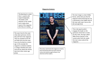
Magazine Analysis 
The Masthead is a bold 
blue in capitals with 
original typography. 
This draws in the 
attention of the reader 
and it makes them 
aware of the magazine 
that they are reading. 
The main image is a shot of Mike 
Posner, which tells you that the 
magazine will be featuring him. He 
is positioned in the middle third of 
the cover with cover lines on the 
left and right third. 
This is the tag line which 
engages the reader on the 
particular article that is inside. 
On this cover, the tag is about 
Mike Posner (picture in the 
centre) which tells the reader 
the main story inside of the 
magazine. 
The cover lines for this cover 
show what particular articles 
they will find in the magazine. 
They are situated on the left 
and right third also the cover 
lines are all aimed at a certain 
age. In this example the 
magazine is aimed at students 
in college, therefore the cover 
lines tell you about the articles 
that link to that certain age 
group. 
The colour scheme for the magazine is mainly 
blue and yellow which are quite calming 
colours but bold enough to draw in the 
attention of the readers.

Magazine analysis

  • 1.
    Magazine Analysis TheMasthead is a bold blue in capitals with original typography. This draws in the attention of the reader and it makes them aware of the magazine that they are reading. The main image is a shot of Mike Posner, which tells you that the magazine will be featuring him. He is positioned in the middle third of the cover with cover lines on the left and right third. This is the tag line which engages the reader on the particular article that is inside. On this cover, the tag is about Mike Posner (picture in the centre) which tells the reader the main story inside of the magazine. The cover lines for this cover show what particular articles they will find in the magazine. They are situated on the left and right third also the cover lines are all aimed at a certain age. In this example the magazine is aimed at students in college, therefore the cover lines tell you about the articles that link to that certain age group. The colour scheme for the magazine is mainly blue and yellow which are quite calming colours but bold enough to draw in the attention of the readers.