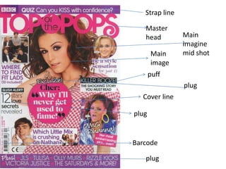
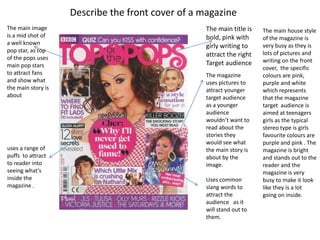
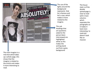
Strap line
Master
head
Main
image
puff
Cover line
plug
Barcode
plug
plug
Main
imagine
mid shot
Describe the front cover of a magazine
The main house style
of the magazine is
very busy as they is
lots of pictures and
writing on the front
cover, the specific
colours are pink,
purple and white
which represents
that the magazine
target audience is
aimed at teenagers
girls as the typical
stereo type is girls
favourite colours are
purple and pink . The
magazine is bright
and stands out to the
reader and the
magazine is very
busy to make it look
like they is a lot
going on inside.
The main title is
bold, pink with
girly writing to
attract the right
Target audience
The magazine
uses pictures to
attract younger
target audience
as a younger
audience
wouldn’t want to
read about the
stories they
would see what
the main story is
about by the
image.
Uses common
slang words to
attract the
audience as it
will stand out to
them.
The main image
is a mid shot of
a well known
pop star, as top
of the pops uses
main pop stars
to attract fans
and show what
the main story is
about
uses a range of
puffs to attract
to reader into
seeing what's
inside the
magazine .
The house style of
the contents page
is clear and tells
you a lot of
information about
what's inside. The
contents page has
four clear columns
and the main 3
colours are white,
red and black
which is simple but
effective as its
more clear to read.
They use a plain
white background
so the black and
red writing stands
out and isn't over
shadowed by a
busy background.
Has the name of the magazine in
bold large writing the stand out
to the reader to clearly show
what magazine they are reading.
The main selling point has a
large picture that dominates
that page to show more
about what the story is
about. The pictures also fit in
with the layout as the main
picture takes up two columns
and the small picture just
takes up one.
Uses red writing on the
main sub headings so the
reader will see it first and
quickly get a idea in
what’s inside.
The magazine uses
different font for the
numbers so its easier to
find without having to
read all the paragraphs.
The main
imagine
uses one
full page.
Mid
shot
well
known
famous
person
Use of grey
background
which relates
to the main
picture
different
colours
of font
Use clear
and bold
fonts to
stand
out.
Highlighted
the sub
headings
The house
style is of the
double
spread page is
clear to read
with 3 main
columns
which
separates the
paragraphs so
it makes it
look more
interesting to
read and
doesn't look
like on
massive
The use of the
lights around the
background
represents that
he is famous and
he’s a star, which
makes it more
related to the
imagine.
The main imagine is a
mid shot which takes
up a whole page, this
shows that the
imagine is related to
the article and makes
it more interesting to
read.
The sub
headings that
are questions
asked to the
person been
interviewed are
highlighted
white as this
makes the
writing stand
out from a grey
background

analyse front cover, contents page and two page spread

  • 1.
  • 2.
    Describe the frontcover of a magazine The main house style of the magazine is very busy as they is lots of pictures and writing on the front cover, the specific colours are pink, purple and white which represents that the magazine target audience is aimed at teenagers girls as the typical stereo type is girls favourite colours are purple and pink . The magazine is bright and stands out to the reader and the magazine is very busy to make it look like they is a lot going on inside. The main title is bold, pink with girly writing to attract the right Target audience The magazine uses pictures to attract younger target audience as a younger audience wouldn’t want to read about the stories they would see what the main story is about by the image. Uses common slang words to attract the audience as it will stand out to them. The main image is a mid shot of a well known pop star, as top of the pops uses main pop stars to attract fans and show what the main story is about uses a range of puffs to attract to reader into seeing what's inside the magazine .
  • 3.
    The house styleof the contents page is clear and tells you a lot of information about what's inside. The contents page has four clear columns and the main 3 colours are white, red and black which is simple but effective as its more clear to read. They use a plain white background so the black and red writing stands out and isn't over shadowed by a busy background. Has the name of the magazine in bold large writing the stand out to the reader to clearly show what magazine they are reading. The main selling point has a large picture that dominates that page to show more about what the story is about. The pictures also fit in with the layout as the main picture takes up two columns and the small picture just takes up one. Uses red writing on the main sub headings so the reader will see it first and quickly get a idea in what’s inside. The magazine uses different font for the numbers so its easier to find without having to read all the paragraphs.
  • 4.
    The main imagine uses one fullpage. Mid shot well known famous person Use of grey background which relates to the main picture different colours of font Use clear and bold fonts to stand out. Highlighted the sub headings
  • 5.
    The house style isof the double spread page is clear to read with 3 main columns which separates the paragraphs so it makes it look more interesting to read and doesn't look like on massive The use of the lights around the background represents that he is famous and he’s a star, which makes it more related to the imagine. The main imagine is a mid shot which takes up a whole page, this shows that the imagine is related to the article and makes it more interesting to read. The sub headings that are questions asked to the person been interviewed are highlighted white as this makes the writing stand out from a grey background