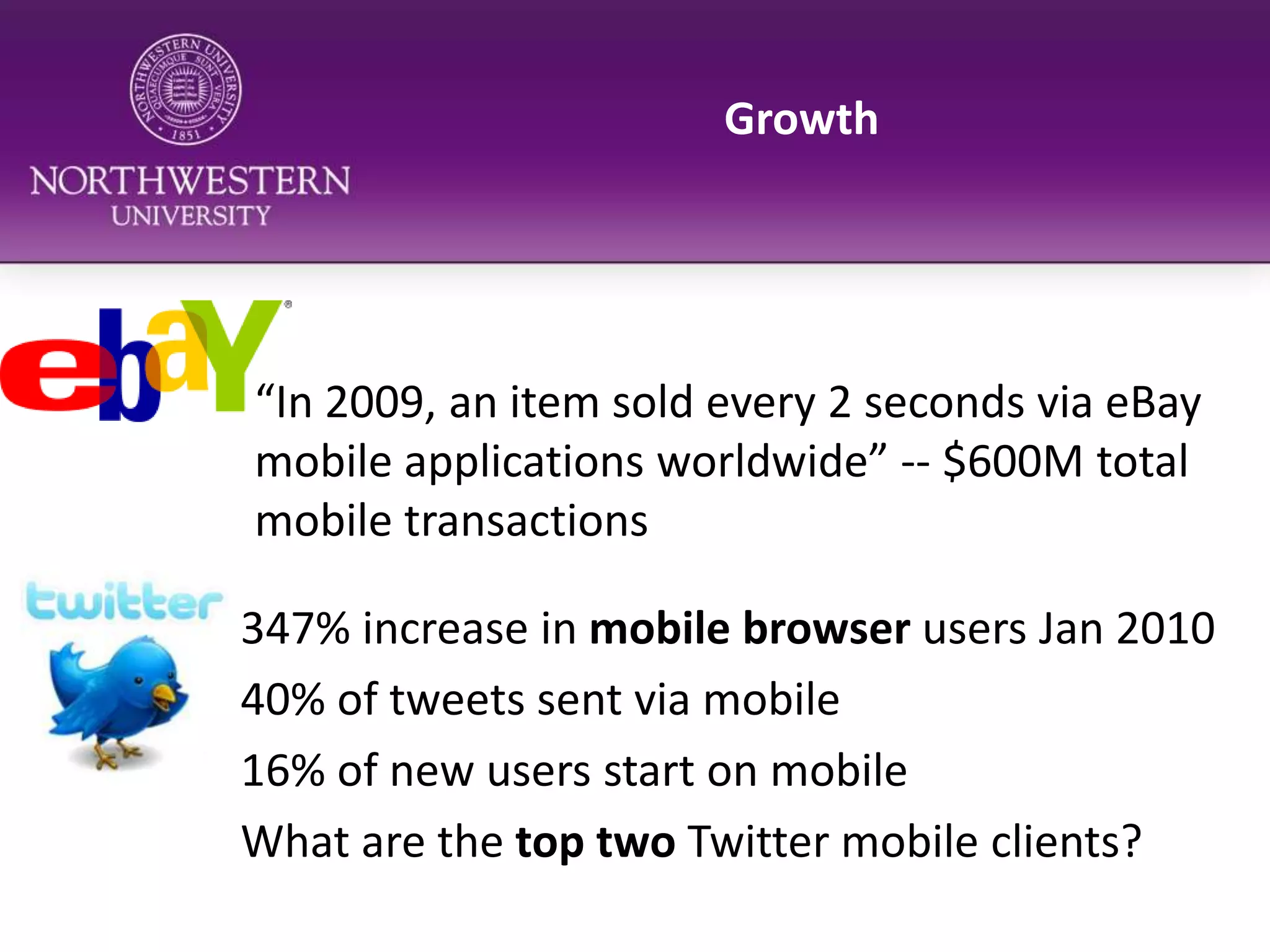
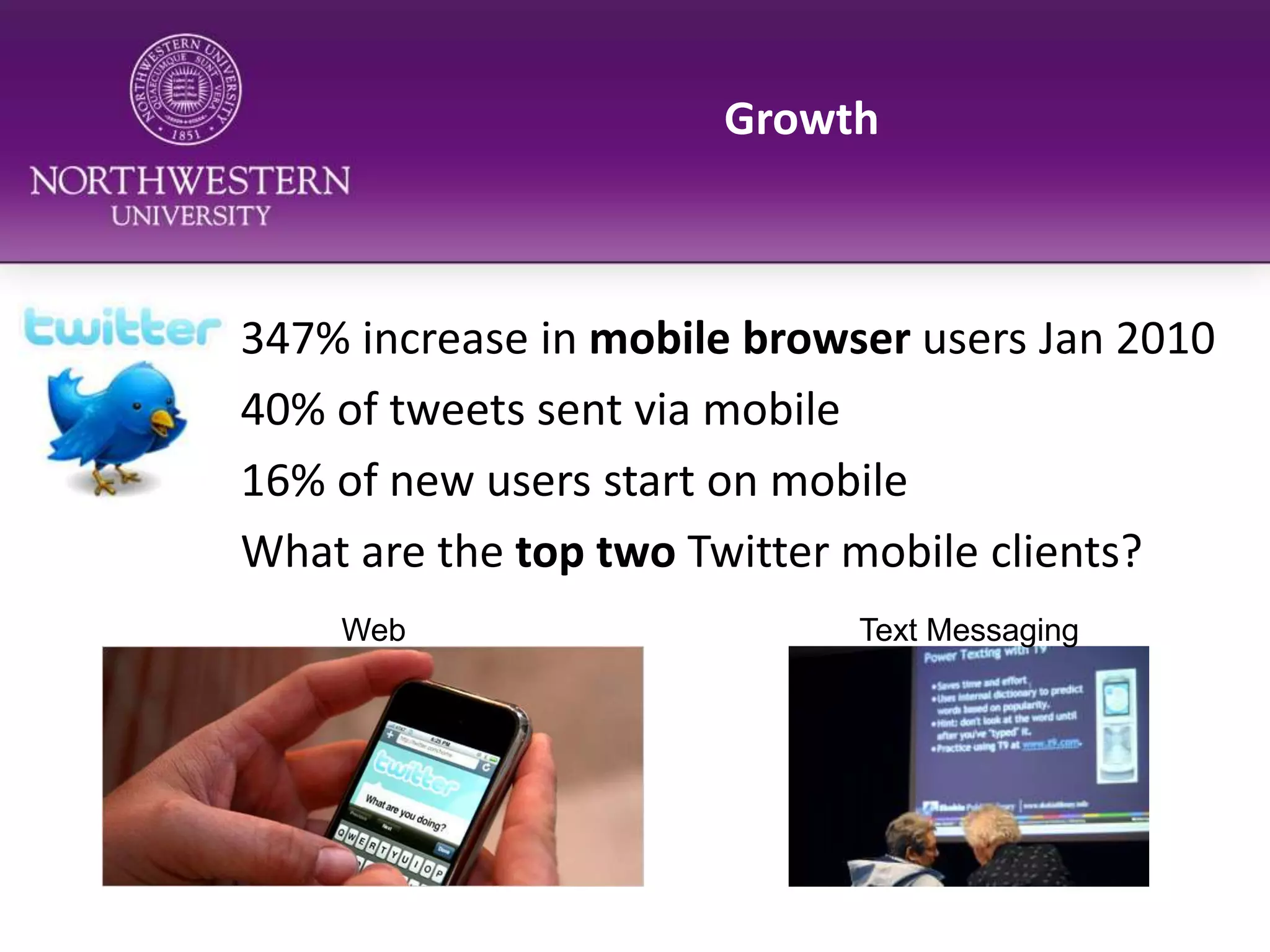
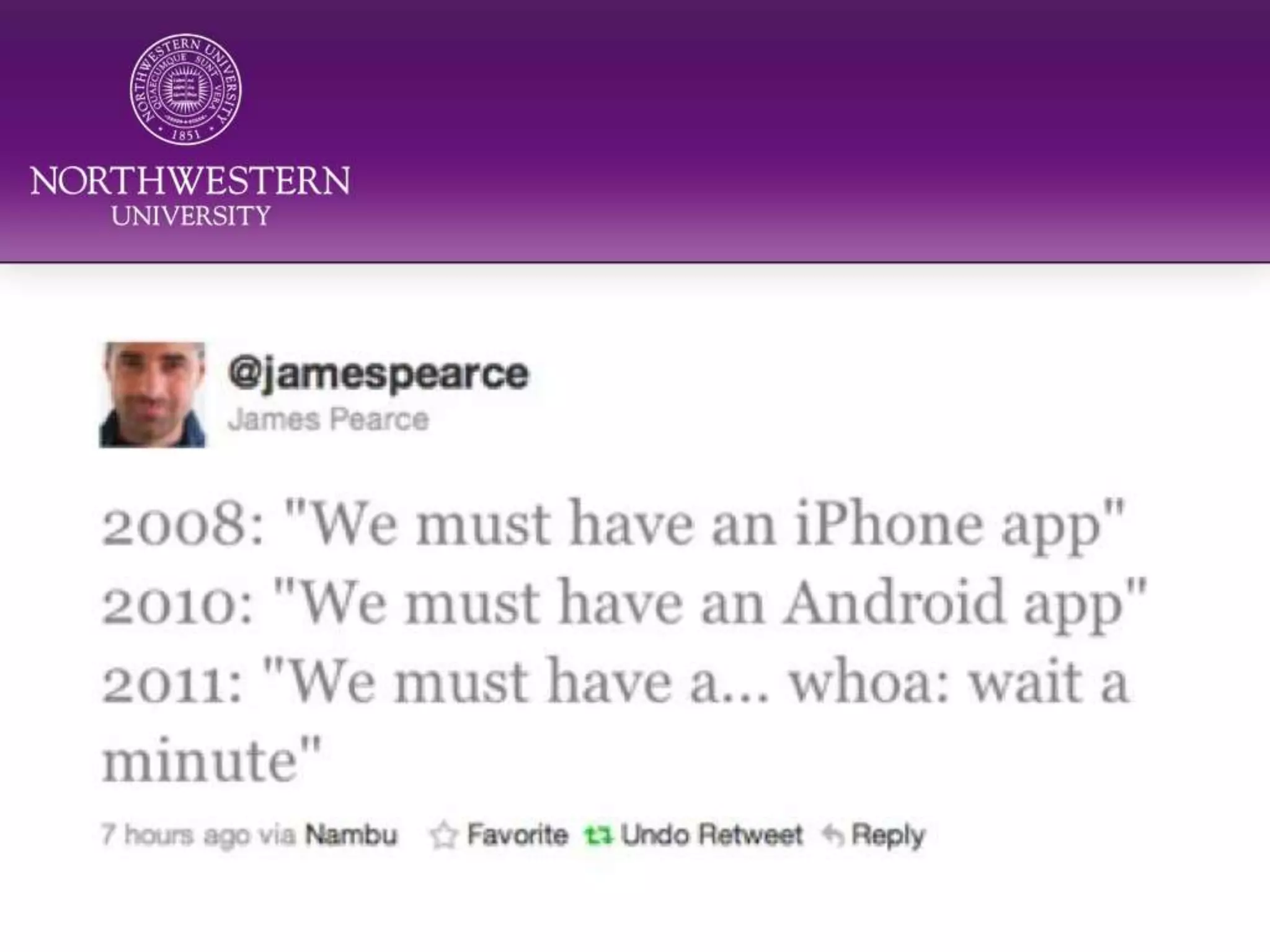
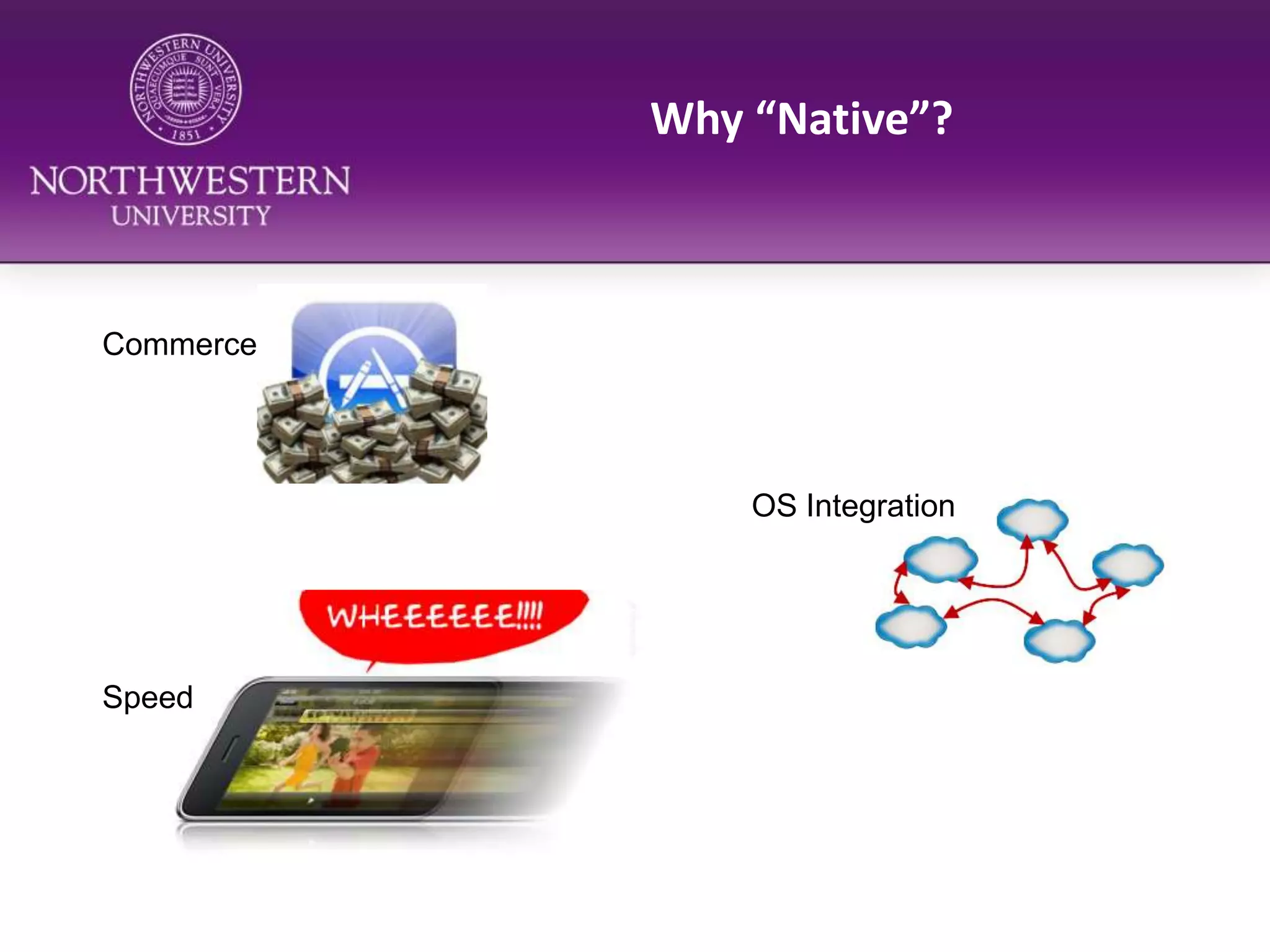
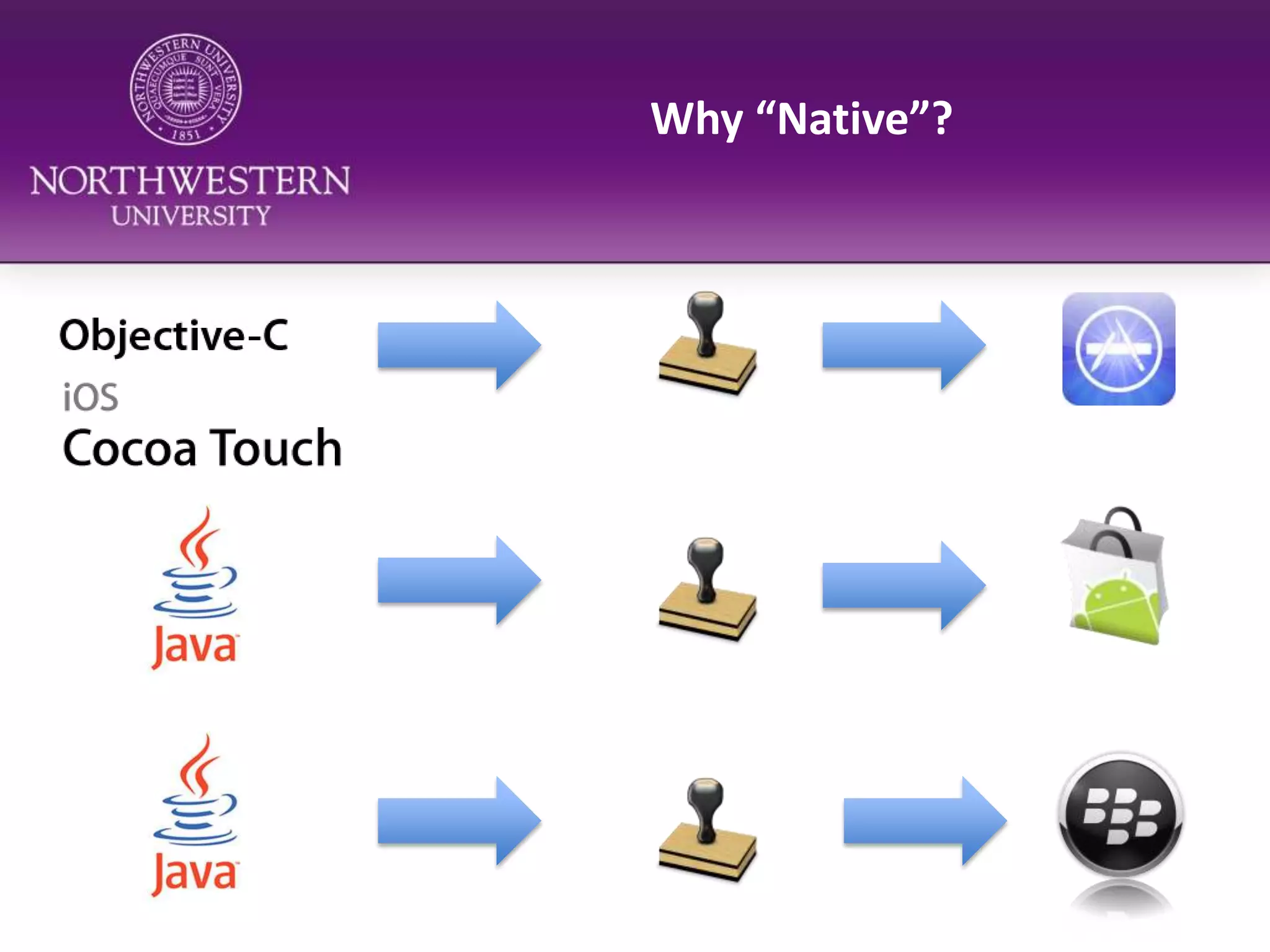
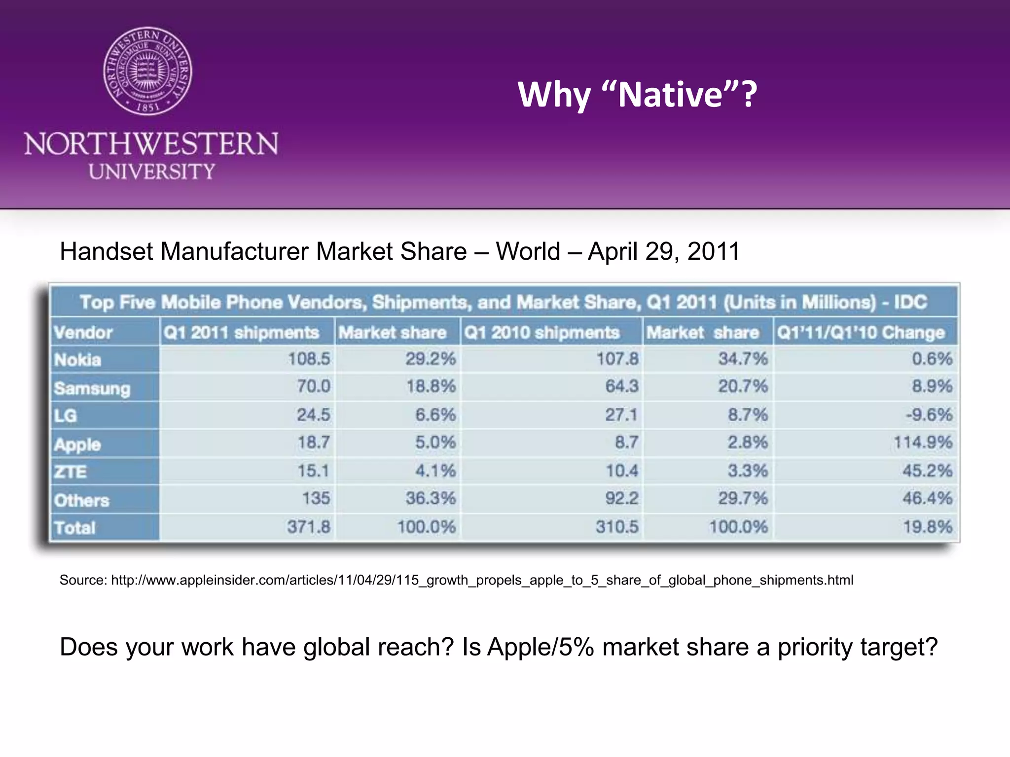
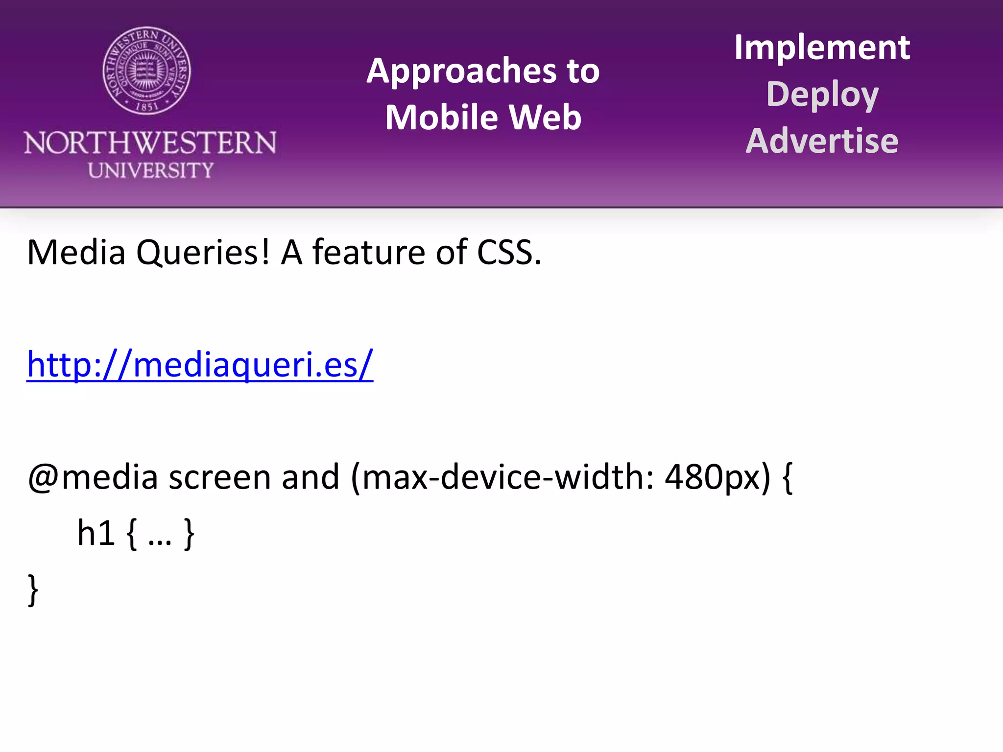
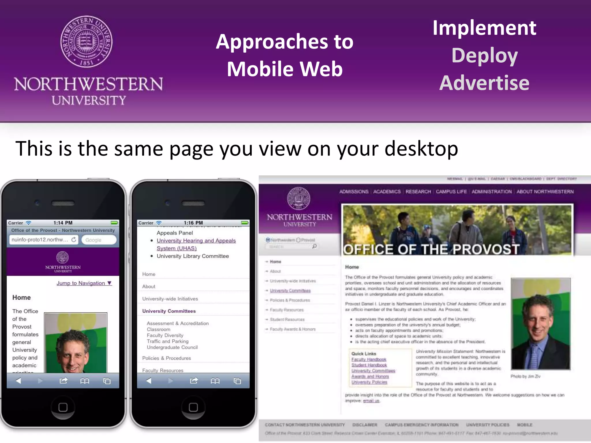
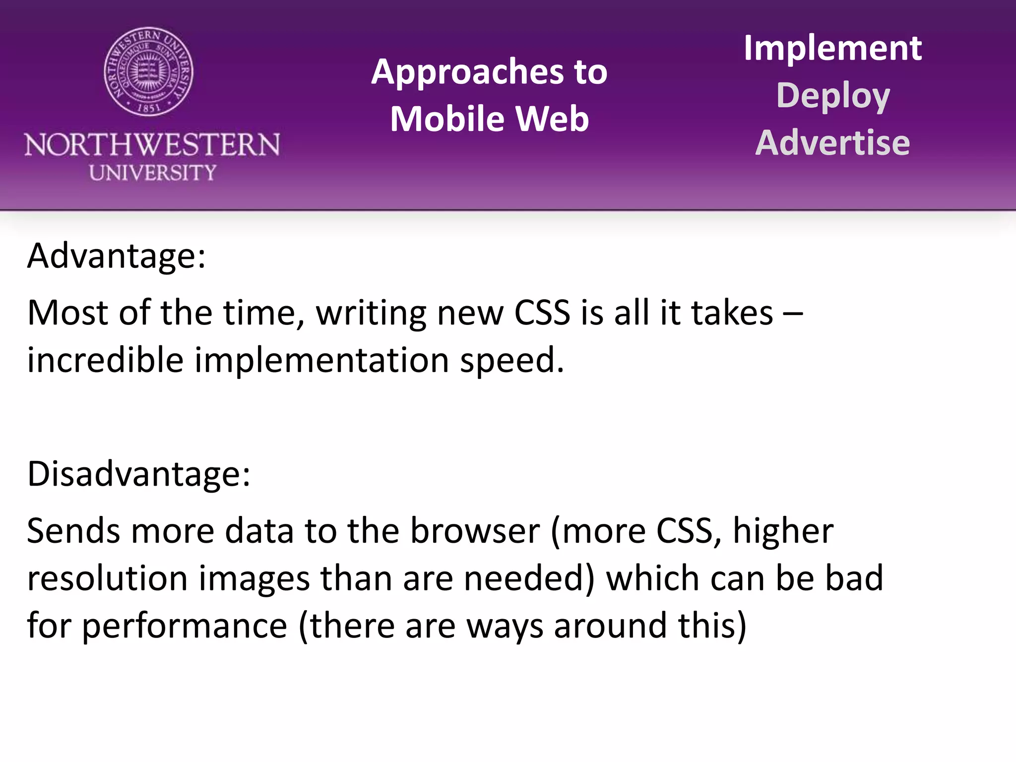
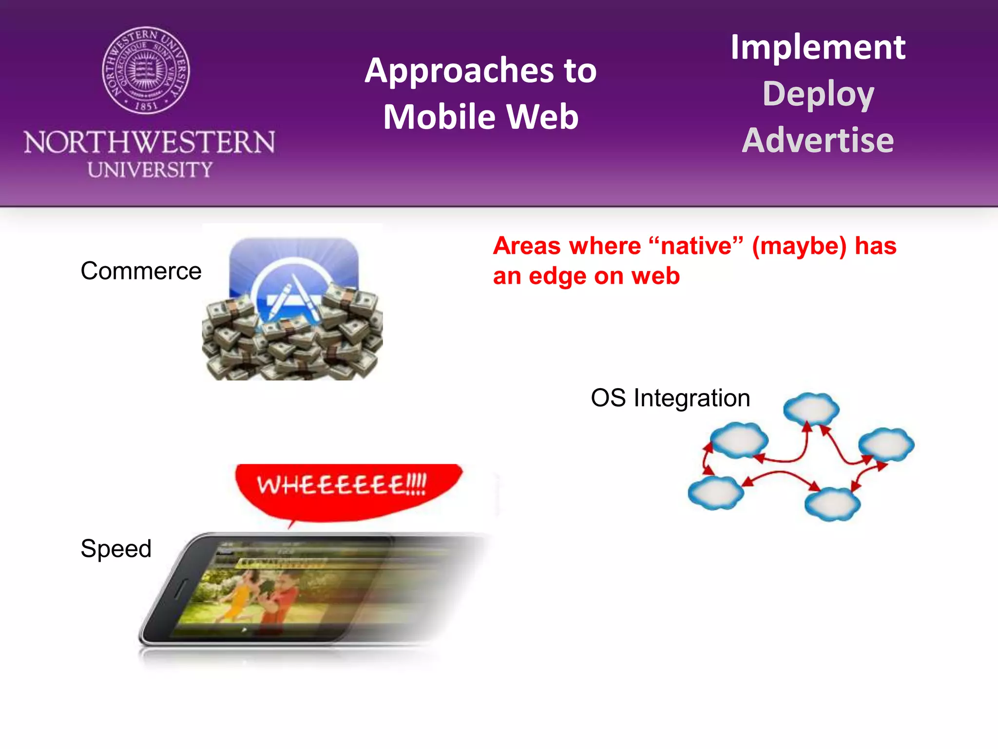
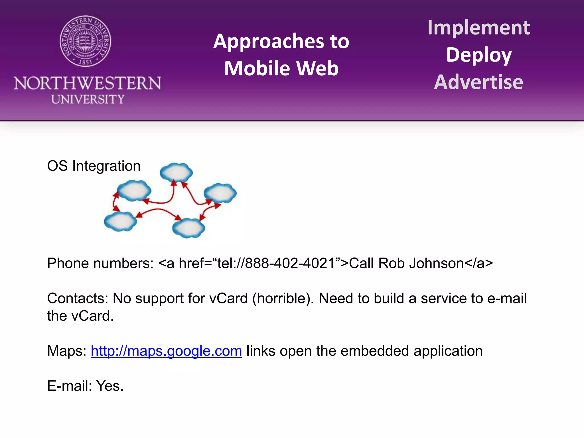
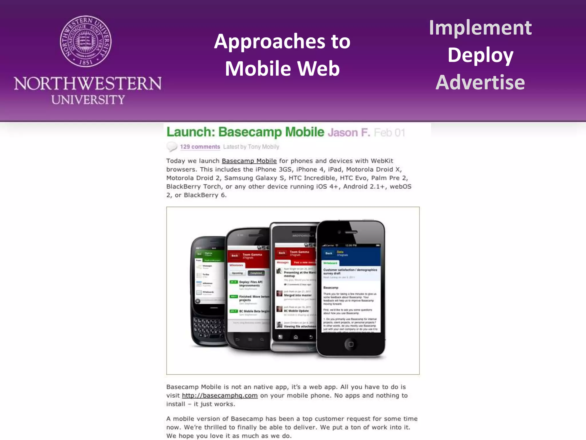
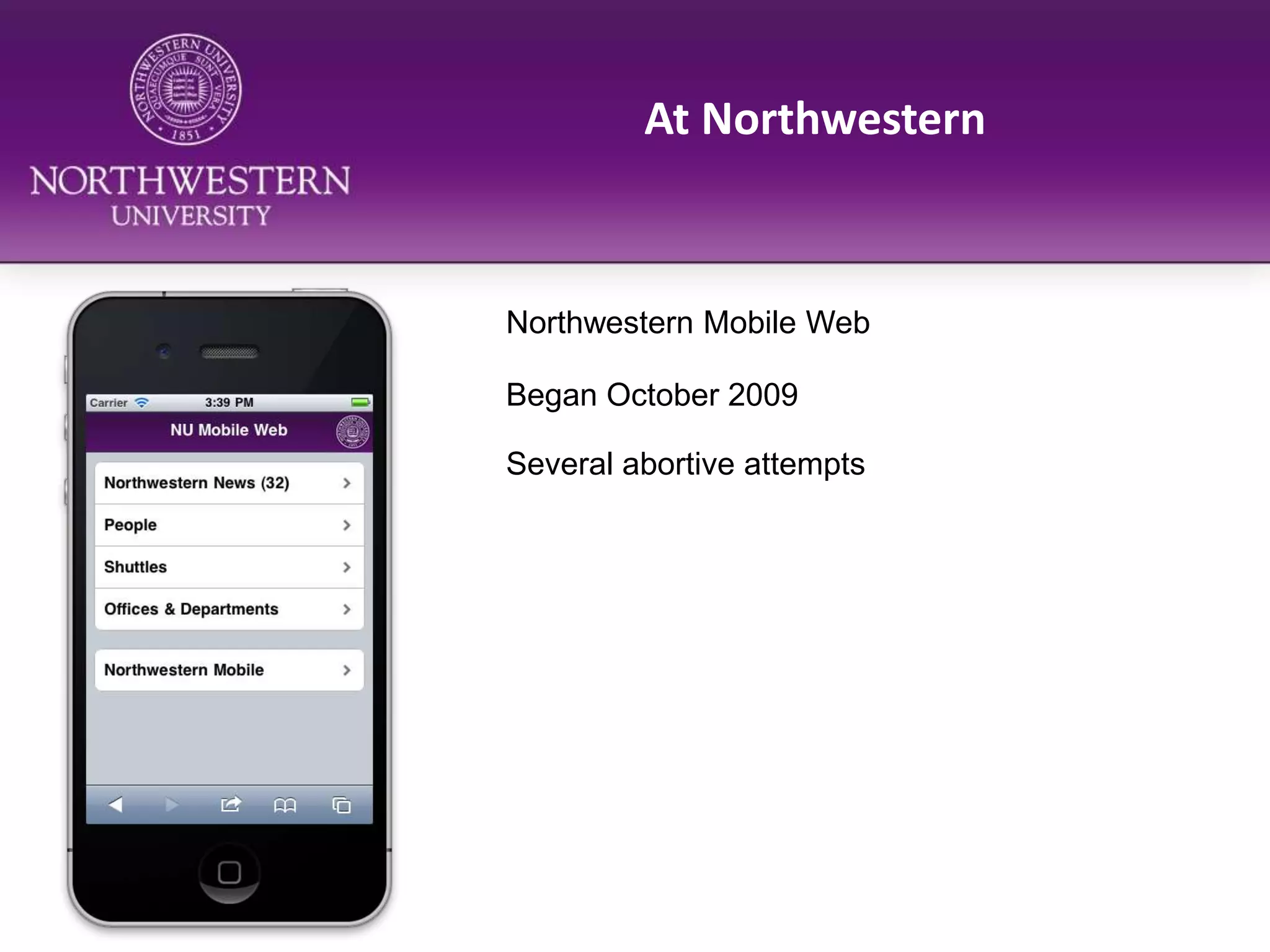
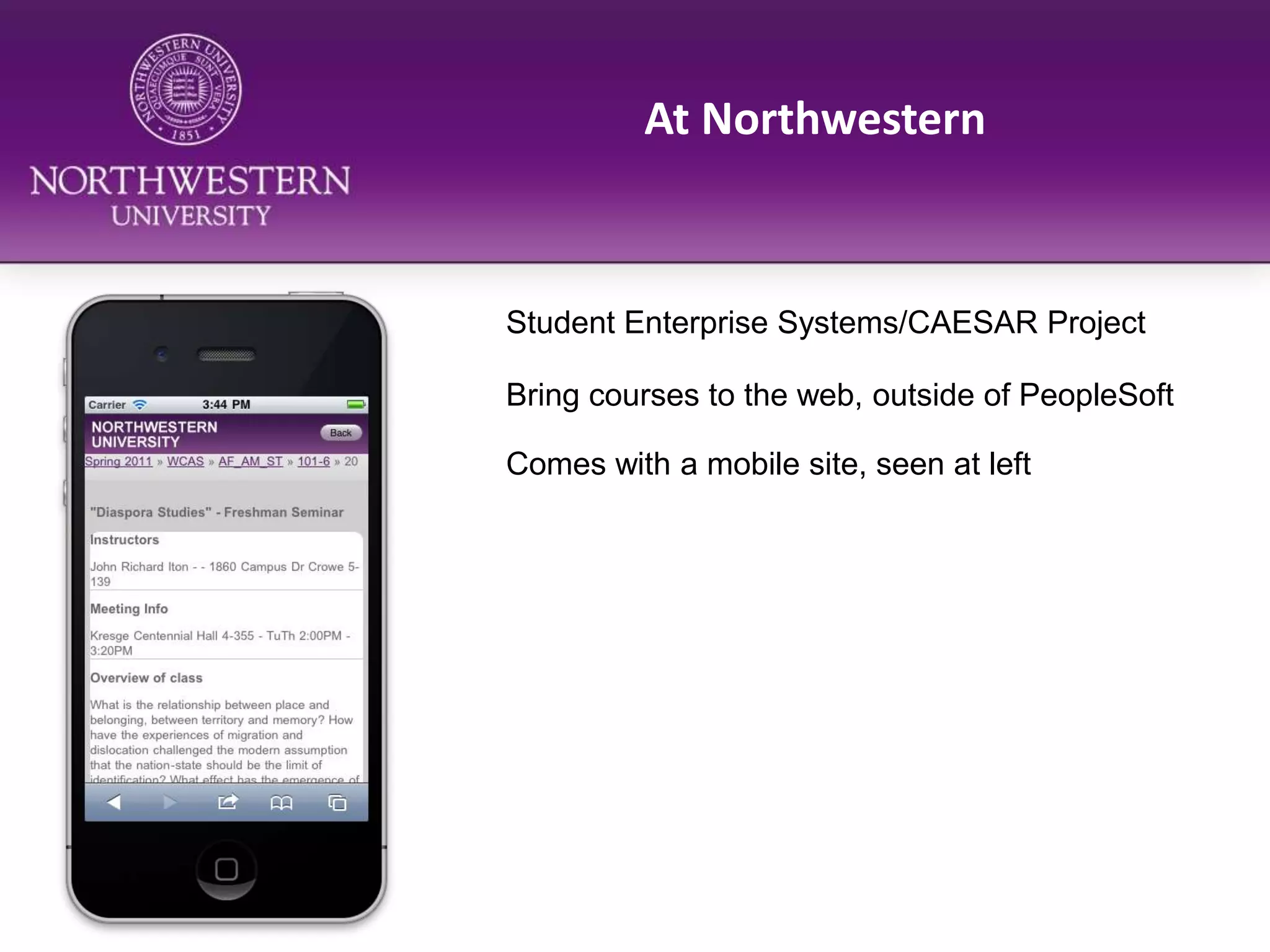
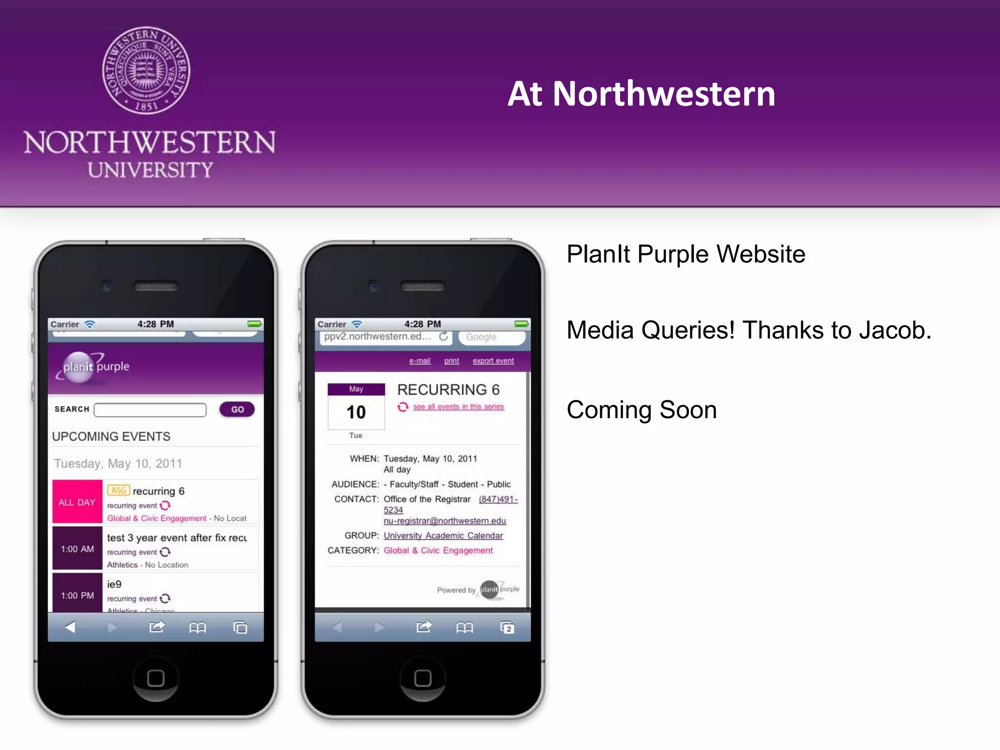
This document discusses mobile strategies and developments, including:
- Growth in mobile usage, with 40% of tweets sent via mobile and 16% of new users starting on mobile.
- Differences between native apps and mobile web, with native providing commerce, OS integration and speed advantages.
- Approaches to mobile web, including media queries to adapt existing sites or building separate mobile sites, with advantages in speed and implementation.
- Examples of mobile strategies at universities, including Northwestern's native and mobile web applications.
The document discusses the importance of mobile-first strategies and addresses common myths and barriers to their adoption. It advocates designing for mobile users first by working backwards from their needs, focusing content over extras, and ensuring solutions are fast across all devices to avoid excluding any users.
Going mobile edu web presentation - 2011Nathan Gerber
This document summarizes Nathan Gerber's presentation on mobile web strategies for higher education institutions. It discusses how mobile usage is growing rapidly, especially among students. It emphasizes that institutions need to shift from just making their sites work on mobile to designing for the unique needs of mobile users. The presentation provides recommendations on starting small with high priority content, using responsive design, leveraging content management systems, and testing on various devices. It also highlights tools like QR codes, analytics, and emulators to help institutions begin developing their mobile web presence.
Designing Websites With a Mobile First ApproachDan Moriarty
The document discusses the concept of "mobile first" design, which means prioritizing mobile users by starting the design process for any digital product or service with the smallest screens in mind. It outlines three common approaches to designing for mobile (native apps, separate mobile sites, and responsive web design) and their tradeoffs. The key to truly mobile-first design, it argues, is rethinking content, presentation, and performance with mobile constraints and capabilities top of mind to ensure usability, focus, and speed across all devices.
Developing a Progressive Mobile StrategyDave Olsen
My presentation given at HighEdWeb Rochester on June 27, 2011. It focuses on how universities should think about developing and building out their strategy for mobile devices. The future of mobile in higher ed is much larger than one app or one website. Numbers regarding adoption of mobile overall as well as at West Virginia University are included.
The document is a presentation about information architecture for mobile applications. It discusses key concepts of information architecture including structure, organization, labeling, and navigation. It also covers user analysis techniques like creating personas and card sorting to help design intuitive information architectures for mobile. The presentation provides examples of common information architecture patterns for mobile like hub-and-spoke and tabbed views. It emphasizes the importance of analyzing user needs and testing designs with users.
Why and How to Build a Mobile First Web StrategyTechBlocks
With the rise in mobile web browsing, there has been a shift in website design philosophies from responsive to mobile first. We'll tell you what this means for your business, what the benefits are and how you can implement your own mobile first web strategy.
Developing a Progressive Mobile Strategy (J. Boye edition)Dave Olsen
This document discusses developing a progressive mobile strategy. It begins by defining key terms like native apps, mobile web, and WebKit. It then discusses why mobile is important, noting statistics about smartphone usage and student/school expectations. The document outlines developing a strategy with three parts: audience strategy to understand user needs, platform strategy to determine the best technical solutions, and a progressive approach of iterating solutions over time. It provides examples of WVU's mobile projects.
The document discusses the importance of creating a mobile-optimized website. It notes that mobile internet usage is growing rapidly and desktop websites often have poor user experiences on mobile. The document provides statistics on mobile device ownership and usage to illustrate growing trends. It then gives 5 reasons for creating a mobile site, including improving the user experience, reaching more customers, staying competitive, capitalizing on mobile email usage, and improving customer satisfaction. Finally, it outlines a 5 step process for getting started that includes understanding the audience, determining site goals, creating a site map, considering mobile-friendly design, and optimizing content.
Progressive Mobile Strategy Redux: The Future Friendly EnterpriseDave Olsen
A common refrain from both management and clients alike today (still!) is, "We need an app...." Unfortunately, over the long-term, mobile solutions will need to be more diversified than a single app or even a single platform. Not only will your customers be affected by the rapid adoption of smartphones but also your workforce and business processes. From optimizing web content to developing unique experiences mobile will touch and transform your entire enterprise. Together we’ll look ahead to see what kind of changes an enterprise needs to make to be future friendly.
This talk was presented at the Huawei Mobile Information Revolution Think Tank on November 19, 2015.
The document discusses the concept of responsive design and mobile first approaches to web design. It notes that as mobile usage increases, web design needs to adapt to various screen sizes through flexible grids, flexible images, and media queries. A mobile first approach focuses on designing for the constraints of mobile devices first before expanding the design to larger screens, in order to prioritize usability on most common devices. This drives innovation through solutions that leverage capabilities unique to mobile like touch and location services.
Businesses and publications have been wrestling with “mobile publishing”
for a relatively short time. Apple’s iPhone was introduced in 2007, and
the iPad tablet in 2010. Other portable devices, like laptops, have been
around much longer. However, the modern smartphone/tablet phenomenon —
and the pressure created by the Bring Your Own Device (BYOD) trend — have
created a sense of urgency that’s hard for businesses to ignore.
This document discusses the differences between web apps and websites. It argues that while users are accustomed to native apps on mobile, web technologies can be used to create an app-like experience. Specifically, web apps should mimic the app lifecycle of downloading, installing, having a home screen icon, and taking the full screen. The document also covers key aspects of designing web apps, such as using single-page interfaces, viewport management for different screen sizes and orientations, and handling touch and click events consistently across platforms.
Earl's Hobby Shop is evolving to become more mobile-friendly. The document discusses how mobile and tablet usage has grown significantly and now impacts web design. It recommends that Earl's Hobby Shop stay away from extensive use of Flash, fixed layouts, and complex navigation on their website, to make the site accessible and usable for customers on all devices. References are provided on mobile design best practices and case studies of websites that work well on mobile.
1. Mobile devices have become the primary way people access media through smartphones, tablets, and other screens. Most media interactions are with mobile screens and smartphone ownership continues to rise rapidly.
2. Opportunities on mobile go beyond apps to considering how mobile usage has changed user behavior and discovering the paths users take to content across multiple devices. User research is key to understanding this.
3. Design for mobile must optimize for thumb and eyeball-only interactions, use touch targets large enough for fingers, and consider network limitations. Images should be optimized for recognition or description.
Websites are all about content. People can access your content many different ways and formats with mobile devices, iPads, phones, etc. The questions are: how can we maintain control over the display of our content and keep our brand consistent? How can we try to provide the best user experience on any platform? Enter Responsive Web Design. Many experts are not leaning on one static design but on structured content that adapts to its given environment. In this talk, we are going to take a look at responsive web design techniques out there including: progressive enhancement, flexible grids, media queries, flexible images & video, & other methods of implementation.
Mobile devices and tablets now account for nearly 7% of all web traffic, a percentage that is growing rapidly. This means web designers need to prioritize creating sites optimized for mobile with easy navigation, fewer clicks, and a single column layout. Technologies like responsive design using HTML5 and avoiding Flash can help create mobile-friendly sites. It is important for businesses to understand their customers and develop a plan to evaluate, test, and improve their site for the growing number of mobile users.
These are my slides for an April 13 presentation for the American Society of News Editors. Related blog posts: http://bit.ly/9nGFPV and http://bit.ly/6WnABX
This document discusses the complex mobile platform world. It describes the layers ("stack") of a mobile device as the browser, operating system, and physical device. It notes the variety of mobile browsers and operating systems that exist, including differences between browsers that are based on WebKit. The document also discusses proxy browsers and tips for setting up a diverse mobile device lab for testing purposes.
This document discusses the growth of mobile and tablet usage and the impact on web design. Over the past three years, 91% of the population uses a mobile device, with 56% owning a smartphone. Two billion mobile devices will ship in 2014. Websites need to be clean, simple, easy to search with less text and compact pages. Technologies like HTML5 and plugins can make websites accessible across devices. The document recommends designs like responsive web and readable fonts and content to make sites mobile friendly.
Workshop session A6: Building a Low Cost Mobile Web Presence Terminalfour
There's no escaping it, mobile web will be bigger than desktop by 2015. If mobile isn't on your 2012 web strategy, it needs to be and soon. This vendor-independent presentation will provide practical advice on how to prepare for your organisation's shift to mobile and, importantly, how to build a mobile presence without 'breaking the bank'. It will cover approaches that organisations can adopt to enable personalised web experiences for mobile devices. The presentation will outline the delivery methods available to make this step: adding mobile to web presence; add a mobile app or develop a mobile site.
Facilitator, Laura Murphy, TERMINALFOUR
#MobileInAction - iRecruitExpo June 2013, AmsterdamDave Martin
Dave has interviewed numerous recruitment leaders from around the world, mobile strategic experts, authors, founders and market analysts which are made available online through his 'Mobile in Action' videocast. In this fast pace session Dave will share a summary of learnings from the people he has talked to giving you example case studies, strategic advice and gotcha's to watch out for. The objective is to deliver information you need to take your next steps in a world filling up of handheld web devices (smartphones & tablets). If you are on the mobile journey already, there will an opportunity for a few to share their stories with the audience and Dave.
Why Progressive Web Apps will transform your websiteJason Grigsby
Progressive web apps (PWAs) can transform websites by making them more like native apps through the use of service workers, web app manifests, and other modern web capabilities. Some key benefits of PWAs include providing fast and reliable experiences even on slow mobile networks, working regardless of a network connection, and engaging users through web app banners and push notifications. Early results show that PWAs can significantly reduce data usage and increase user engagement, conversion rates, and sales compared to mobile websites. While PWAs work across browsers, including on iOS, their full capabilities are still progressively being adopted.
This document discusses mobile and tablet web design. It notes that mobile web usage has more than doubled since 2009 and is estimated to continue rising. This growth will impact design by requiring sites to be optimized for more mobile users. The document also lists PhoneGap, Appcelerator, and Weebly as active technologies for mobile/tablet development and provides examples of good and bad mobile design, concluding with references.
This document provides tips for developing effective mobile applications. It advises that mobile apps should not simply replicate web apps, but should be designed for mobile consumption. App developers are encouraged to focus on usability over graphics, limit user inputs, prioritize business value over technical excellence, and target the platform most relevant to their intended audience. Overall, the document emphasizes that mobile apps require a different design approach than web apps to avoid being ignored by users.
This is the story of how a small college with a department of 4 and a zero-based budget, developed a mobile solution that is affordable and provides vital information to future and current students, faculty, and staff.
Ikkyo Technology is a Kobe/Japan based startup focusing on Deep Learning and Machine Learning. Categorific is WebAPI that automatically connects and sorts out visual contents in the database based on their visual similarity.
Going mobile - Highed Web Presentation - 2011Nathan Gerber
Nathan Gerber is the Director of Web Development Services at Utah Valley University. He gave a presentation on mobile web strategies for higher education institutions. Some key points from his presentation include:
- Mobile internet usage is growing rapidly and will impact how institutions provide online content and services.
- When developing a mobile strategy, institutions should focus on key information and services for current students, start small, and be willing to iterate based on what works.
- Content management systems need to support multi-format publishing and content reuse across desktop and mobile. Mobile-specific templates and tagging can also help.
- QR codes, browser sniffing, analytics, and testing on emulators can help institutions test and improve their mobile offerings.
Mobile Web Overview https://www.edocr.com/v/k52p5vj4/Jack Zheng
This document provides an overview of mobile web development. It discusses trends in mobile usage, definitions of mobile web and applications, options for developing mobile content like native, web and hybrid apps. It also covers strategies for mobile websites like responsive design and considerations for mobile design like touch interfaces. Development tools, frameworks and best practices for mobile web are also mentioned.
The document discusses strategies for developing a mobile website or apps for a library. It covers identifying key content and tasks, designing for different devices with a focus on accessibility, deciding between building mobile sites versus apps, testing on emulators and devices, and promoting the mobile services. Vendors that can help with mobile development are also reviewed.
Interactive Mobile Applications in the Enterprise: Are You Ready?CITYTECH, Inc.
The interactive mobile application market is estimated to reach $15 billion by 2013. This presentation shows how to be prepared from an infrastructure, resource and strategy perspective. We'll explore the different types of mobile applications an enterprise may pursue, technologies used to develop them, and explore scalable backend architectures that can stand up to the higher demands of mobile computing.
Mobile is the new Godzilla July 2011 FCIPRZasadzinski
Mobile devices such as smartphones and tablets are increasingly becoming people's primary means of accessing the internet. By 2013, the number of mobile internet accessing devices is projected to surpass the number of personal computers. Websites and applications need to be optimized for mobile to provide good user experiences on small screens. Developers have options like responsive design, mobile websites, or native apps to create engaging mobile experiences for their audiences.
A presentation I did with my teammates: David Larson, Carrie Murphy, David Schwartz, and Ben Serio. Presentation for my MBA Management Marketing class, Arizona State University.
Driving Content to a Mobile Device. Are we Killing the Internet?Chris LaBelle
Dave King and Chris LaBelle from Oregon State University Outreach and Engagement discuss current user preferences in relation to the use of mobile device apps and how developing resources for proprietary mobile platforms has advantages and disadvantages. HTML5, jQuery, and CSS are offered as alternatives to current production approaches.
The document discusses strategies for developing a mobile website and apps for a library. It recommends focusing content on key tasks and making design accessible across all devices. It also addresses decisions around building mobile sites versus apps, content prioritization, and testing on emulators and devices to ensure compatibility. Vendor partnerships are presented as an option to outsource mobile development and maintenance.
The document discusses strategies for developing a mobile website and apps for a library. It recommends focusing content on key tasks and making design accessible across all devices. It also considers options like building apps in-house versus using a vendor, and testing on emulators and actual devices to ensure compatibility.
What do you need to consider before taking a business onto mobile ?Rapidsoft Technologies
It’s going to be an expensive move to take a business on mobile platform, particularly when it is done through a responsive mobile website or a native mobile application development. Because mobile is the next big thing in the online business world, a start-up that doesn’t think out about its presence on mobile today, it have more chances of being left in the dust tomorrow.
The challenges of building mobile HTML5 applications - FEEC Brazil 2012 - RecifeCaridy Patino
Caridy Patiño presented on the challenges of building mobile HTML5 applications. Some key challenges include browser fragmentation across devices, network failures, and the need to optimize applications for different runtime environments and adapt them for varying screen sizes and features. Patiño advocated writing applications using a single language, JavaScript, and customizing output per runtime and context while adapting the UI per form factor and feature detection. The goal is to build flexible applications that can run on multiple platforms.
These are the slides used for my presentation on library mobile websites for NJLA 2010. These slides will also be the basis for a similar presentation to be done, as a webinar, in June sponsored by CJRLC, HRLC, and infolinik
Is the buzz around Progressive Web Apps real or are they simply the latest fad? In this talk, you’ll learn exactly what Progressive Web Apps are, what problems they solve, and what new design challenges they present. Jason will show how organizations are using Progressive Web Apps to provide better and faster user experiences.
Hybrid mobile development vs. Native using ionicMohamed TAIEB
This document provides information about hybrid mobile app development and the Ionic Framework. It discusses the benefits of hybrid apps, including writing code once that can run on multiple platforms, leveraging existing web development talent, and providing a consistent user experience. It also compares hybrid and native development, highlighting hybrid's advantages around speed, cost savings, and future-proofing apps. The document shares testimonials from companies like MarketWatch and Nationwide that have successfully used Ionic for their hybrid mobile strategies. It invites the reader to discuss their hybrid app needs with an Ionic strategist.
A short presentation answering 3 main questions. Why we need Progressive Web Apps(PWA)? What is a progressive web app & it's features? and how a PWA works?
180 Degrees East - Insights into the Mobile Web in Asia, with a closer look on the market in Hong Kong and China, its infrastructure, different devices, OS fragmentation and what it means for Responsive Web Design, App Development as well as Performance & GeoPerformance.
Mobile tools and services continue to be a dominant force that is changing the way libraries and their users access and use information. Learn ways that libraries can improve their mobile connection with their users, from creating accessible information to loaning hotspots and more. Don’t disappoint your mobile users! Join Chad as he highlights at least 5 ways to provide stellar mobile library services today.
Key Architectural Aspects of a Enterprise Mobility Solutionroshanjk
This document highlights key considerations for building robust enterprise mobility applications. It discusses targeting multiple platforms like iOS, Android, Blackberry and Windows Mobile to achieve significant adoption. It also covers challenges like engineering costs, time to market, testing across many devices and platforms. The document emphasizes the importance of usability, security, enterprise integration, offline access, synchronization and supporting the applications. It stresses the need to go beyond a point solution and look at the larger ecosystem including analytics and testing.
Similar to Here Today, Here Tomorrow: Mobile Devices - Northwestern University Web Steering Committee (20)
Unlock the Future of Search with MongoDB Atlas_ Vector Search Unleashed.pdfMalak Abu Hammad
Discover how MongoDB Atlas and vector search technology can revolutionize your application's search capabilities. This comprehensive presentation covers:
* What is Vector Search?
* Importance and benefits of vector search
* Practical use cases across various industries
* Step-by-step implementation guide
* Live demos with code snippets
* Enhancing LLM capabilities with vector search
* Best practices and optimization strategies
Perfect for developers, AI enthusiasts, and tech leaders. Learn how to leverage MongoDB Atlas to deliver highly relevant, context-aware search results, transforming your data retrieval process. Stay ahead in tech innovation and maximize the potential of your applications.
#MongoDB #VectorSearch #AI #SemanticSearch #TechInnovation #DataScience #LLM #MachineLearning #SearchTechnology
Unlocking Productivity: Leveraging the Potential of Copilot in Microsoft 365, a presentation by Christoforos Vlachos, Senior Solutions Manager – Modern Workplace, Uni Systems
Essentials of Automations: The Art of Triggers and Actions in FMESafe Software
In this second installment of our Essentials of Automations webinar series, we’ll explore the landscape of triggers and actions, guiding you through the nuances of authoring and adapting workspaces for seamless automations. Gain an understanding of the full spectrum of triggers and actions available in FME, empowering you to enhance your workspaces for efficient automation.
We’ll kick things off by showcasing the most commonly used event-based triggers, introducing you to various automation workflows like manual triggers, schedules, directory watchers, and more. Plus, see how these elements play out in real scenarios.
Whether you’re tweaking your current setup or building from the ground up, this session will arm you with the tools and insights needed to transform your FME usage into a powerhouse of productivity. Join us to discover effective strategies that simplify complex processes, enhancing your productivity and transforming your data management practices with FME. Let’s turn complexity into clarity and make your workspaces work wonders!
TrustArc Webinar - 2024 Global Privacy SurveyTrustArc
How does your privacy program stack up against your peers? What challenges are privacy teams tackling and prioritizing in 2024?
In the fifth annual Global Privacy Benchmarks Survey, we asked over 1,800 global privacy professionals and business executives to share their perspectives on the current state of privacy inside and outside of their organizations. This year’s report focused on emerging areas of importance for privacy and compliance professionals, including considerations and implications of Artificial Intelligence (AI) technologies, building brand trust, and different approaches for achieving higher privacy competence scores.
See how organizational priorities and strategic approaches to data security and privacy are evolving around the globe.
This webinar will review:
- The top 10 privacy insights from the fifth annual Global Privacy Benchmarks Survey
- The top challenges for privacy leaders, practitioners, and organizations in 2024
- Key themes to consider in developing and maintaining your privacy program
Driving Business Innovation: Latest Generative AI Advancements & Success StorySafe Software
Are you ready to revolutionize how you handle data? Join us for a webinar where we’ll bring you up to speed with the latest advancements in Generative AI technology and discover how leveraging FME with tools from giants like Google Gemini, Amazon, and Microsoft OpenAI can supercharge your workflow efficiency.
During the hour, we’ll take you through:
Guest Speaker Segment with Hannah Barrington: Dive into the world of dynamic real estate marketing with Hannah, the Marketing Manager at Workspace Group. Hear firsthand how their team generates engaging descriptions for thousands of office units by integrating diverse data sources—from PDF floorplans to web pages—using FME transformers, like OpenAIVisionConnector and AnthropicVisionConnector. This use case will show you how GenAI can streamline content creation for marketing across the board.
Ollama Use Case: Learn how Scenario Specialist Dmitri Bagh has utilized Ollama within FME to input data, create custom models, and enhance security protocols. This segment will include demos to illustrate the full capabilities of FME in AI-driven processes.
Custom AI Models: Discover how to leverage FME to build personalized AI models using your data. Whether it’s populating a model with local data for added security or integrating public AI tools, find out how FME facilitates a versatile and secure approach to AI.
We’ll wrap up with a live Q&A session where you can engage with our experts on your specific use cases, and learn more about optimizing your data workflows with AI.
This webinar is ideal for professionals seeking to harness the power of AI within their data management systems while ensuring high levels of customization and security. Whether you're a novice or an expert, gain actionable insights and strategies to elevate your data processes. Join us to see how FME and AI can revolutionize how you work with data!
Why You Should Replace Windows 11 with Nitrux Linux 3.5.0 for enhanced perfor...SOFTTECHHUB
The choice of an operating system plays a pivotal role in shaping our computing experience. For decades, Microsoft's Windows has dominated the market, offering a familiar and widely adopted platform for personal and professional use. However, as technological advancements continue to push the boundaries of innovation, alternative operating systems have emerged, challenging the status quo and offering users a fresh perspective on computing.
One such alternative that has garnered significant attention and acclaim is Nitrux Linux 3.5.0, a sleek, powerful, and user-friendly Linux distribution that promises to redefine the way we interact with our devices. With its focus on performance, security, and customization, Nitrux Linux presents a compelling case for those seeking to break free from the constraints of proprietary software and embrace the freedom and flexibility of open-source computing.
Building Production Ready Search Pipelines with Spark and MilvusZilliz
Spark is the widely used ETL tool for processing, indexing and ingesting data to serving stack for search. Milvus is the production-ready open-source vector database. In this talk we will show how to use Spark to process unstructured data to extract vector representations, and push the vectors to Milvus vector database for search serving.
Threats to mobile devices are more prevalent and increasing in scope and complexity. Users of mobile devices desire to take full advantage of the features
available on those devices, but many of the features provide convenience and capability but sacrifice security. This best practices guide outlines steps the users can take to better protect personal devices and information.
For the full video of this presentation, please visit: https://www.edge-ai-vision.com/2024/06/building-and-scaling-ai-applications-with-the-nx-ai-manager-a-presentation-from-network-optix/
Robin van Emden, Senior Director of Data Science at Network Optix, presents the “Building and Scaling AI Applications with the Nx AI Manager,” tutorial at the May 2024 Embedded Vision Summit.
In this presentation, van Emden covers the basics of scaling edge AI solutions using the Nx tool kit. He emphasizes the process of developing AI models and deploying them globally. He also showcases the conversion of AI models and the creation of effective edge AI pipelines, with a focus on pre-processing, model conversion, selecting the appropriate inference engine for the target hardware and post-processing.
van Emden shows how Nx can simplify the developer’s life and facilitate a rapid transition from concept to production-ready applications.He provides valuable insights into developing scalable and efficient edge AI solutions, with a strong focus on practical implementation.
GraphRAG for Life Science to increase LLM accuracyTomaz Bratanic
GraphRAG for life science domain, where you retriever information from biomedical knowledge graphs using LLMs to increase the accuracy and performance of generated answers
UiPath Test Automation using UiPath Test Suite series, part 6DianaGray10
Welcome to UiPath Test Automation using UiPath Test Suite series part 6. In this session, we will cover Test Automation with generative AI and Open AI.
UiPath Test Automation with generative AI and Open AI webinar offers an in-depth exploration of leveraging cutting-edge technologies for test automation within the UiPath platform. Attendees will delve into the integration of generative AI, a test automation solution, with Open AI advanced natural language processing capabilities.
Throughout the session, participants will discover how this synergy empowers testers to automate repetitive tasks, enhance testing accuracy, and expedite the software testing life cycle. Topics covered include the seamless integration process, practical use cases, and the benefits of harnessing AI-driven automation for UiPath testing initiatives. By attending this webinar, testers, and automation professionals can gain valuable insights into harnessing the power of AI to optimize their test automation workflows within the UiPath ecosystem, ultimately driving efficiency and quality in software development processes.
What will you get from this session?
1. Insights into integrating generative AI.
2. Understanding how this integration enhances test automation within the UiPath platform
3. Practical demonstrations
4. Exploration of real-world use cases illustrating the benefits of AI-driven test automation for UiPath
Topics covered:
What is generative AI
Test Automation with generative AI and Open AI.
UiPath integration with generative AI
Speaker:
Deepak Rai, Automation Practice Lead, Boundaryless Group and UiPath MVP
Cosa hanno in comune un mattoncino Lego e la backdoor XZ?Speck&Tech
ABSTRACT: A prima vista, un mattoncino Lego e la backdoor XZ potrebbero avere in comune il fatto di essere entrambi blocchi di costruzione, o dipendenze di progetti creativi e software. La realtà è che un mattoncino Lego e il caso della backdoor XZ hanno molto di più di tutto ciò in comune.
Partecipate alla presentazione per immergervi in una storia di interoperabilità, standard e formati aperti, per poi discutere del ruolo importante che i contributori hanno in una comunità open source sostenibile.
BIO: Sostenitrice del software libero e dei formati standard e aperti. È stata un membro attivo dei progetti Fedora e openSUSE e ha co-fondato l'Associazione LibreItalia dove è stata coinvolta in diversi eventi, migrazioni e formazione relativi a LibreOffice. In precedenza ha lavorato a migrazioni e corsi di formazione su LibreOffice per diverse amministrazioni pubbliche e privati. Da gennaio 2020 lavora in SUSE come Software Release Engineer per Uyuni e SUSE Manager e quando non segue la sua passione per i computer e per Geeko coltiva la sua curiosità per l'astronomia (da cui deriva il suo nickname deneb_alpha).
HCL Notes und Domino Lizenzkostenreduzierung in der Welt von DLAUpanagenda
Webinar Recording: https://www.panagenda.com/webinars/hcl-notes-und-domino-lizenzkostenreduzierung-in-der-welt-von-dlau/
DLAU und die Lizenzen nach dem CCB- und CCX-Modell sind für viele in der HCL-Community seit letztem Jahr ein heißes Thema. Als Notes- oder Domino-Kunde haben Sie vielleicht mit unerwartet hohen Benutzerzahlen und Lizenzgebühren zu kämpfen. Sie fragen sich vielleicht, wie diese neue Art der Lizenzierung funktioniert und welchen Nutzen sie Ihnen bringt. Vor allem wollen Sie sicherlich Ihr Budget einhalten und Kosten sparen, wo immer möglich. Das verstehen wir und wir möchten Ihnen dabei helfen!
Wir erklären Ihnen, wie Sie häufige Konfigurationsprobleme lösen können, die dazu führen können, dass mehr Benutzer gezählt werden als nötig, und wie Sie überflüssige oder ungenutzte Konten identifizieren und entfernen können, um Geld zu sparen. Es gibt auch einige Ansätze, die zu unnötigen Ausgaben führen können, z. B. wenn ein Personendokument anstelle eines Mail-Ins für geteilte Mailboxen verwendet wird. Wir zeigen Ihnen solche Fälle und deren Lösungen. Und natürlich erklären wir Ihnen das neue Lizenzmodell.
Nehmen Sie an diesem Webinar teil, bei dem HCL-Ambassador Marc Thomas und Gastredner Franz Walder Ihnen diese neue Welt näherbringen. Es vermittelt Ihnen die Tools und das Know-how, um den Überblick zu bewahren. Sie werden in der Lage sein, Ihre Kosten durch eine optimierte Domino-Konfiguration zu reduzieren und auch in Zukunft gering zu halten.
Diese Themen werden behandelt
- Reduzierung der Lizenzkosten durch Auffinden und Beheben von Fehlkonfigurationen und überflüssigen Konten
- Wie funktionieren CCB- und CCX-Lizenzen wirklich?
- Verstehen des DLAU-Tools und wie man es am besten nutzt
- Tipps für häufige Problembereiche, wie z. B. Team-Postfächer, Funktions-/Testbenutzer usw.
- Praxisbeispiele und Best Practices zum sofortigen Umsetzen
Let's Integrate MuleSoft RPA, COMPOSER, APM with AWS IDP along with Slackshyamraj55
Discover the seamless integration of RPA (Robotic Process Automation), COMPOSER, and APM with AWS IDP enhanced with Slack notifications. Explore how these technologies converge to streamline workflows, optimize performance, and ensure secure access, all while leveraging the power of AWS IDP and real-time communication via Slack notifications.
How to Get CNIC Information System with Paksim Ga.pptxdanishmna97
Pakdata Cf is a groundbreaking system designed to streamline and facilitate access to CNIC information. This innovative platform leverages advanced technology to provide users with efficient and secure access to their CNIC details.
GraphSummit Singapore | The Future of Agility: Supercharging Digital Transfor...Neo4j
Leonard Jayamohan, Partner & Generative AI Lead, Deloitte
This keynote will reveal how Deloitte leverages Neo4j’s graph power for groundbreaking digital twin solutions, achieving a staggering 100x performance boost. Discover the essential role knowledge graphs play in successful generative AI implementations. Plus, get an exclusive look at an innovative Neo4j + Generative AI solution Deloitte is developing in-house.
UiPath Test Automation using UiPath Test Suite series, part 5DianaGray10
Welcome to UiPath Test Automation using UiPath Test Suite series part 5. In this session, we will cover CI/CD with devops.
Topics covered:
CI/CD with in UiPath
End-to-end overview of CI/CD pipeline with Azure devops
Speaker:
Lyndsey Byblow, Test Suite Sales Engineer @ UiPath, Inc.
3. Growth “In 2009, an item sold every 2 seconds via eBay mobile applications worldwide” -- $600M total mobile transactions 347% increase in mobile browser users Jan 2010 40% of tweets sent via mobile 16% of new users start on mobile What are the top two Twitter mobile clients?
4. Growth 347% increase in mobile browser users Jan 2010 40% of tweets sent via mobile 16% of new users start on mobile What are the top two Twitter mobile clients? Web Text Messaging
5. Native “vs” Web Who installs a University’s application? Do prospective students install the app? Do their parents install the app? Do they install any apps!? Who installs applications and why?
6. Use Cases You’re a visitor in Durham, NC for a campus event at Duke, but you forgot where or when exactly it is.
7. Use Cases You’re a visitor in Durham, NC for a campus event at Duke, but you forgot where or when exactly it is. DO YOU OR /
8. Use Cases Other scenarios: "I wonder if they provide tours on campus?", "I want to know what kind of cutting-edge research is going on", "I'm looking for a good University, where campus life is vibrant, student achievement is great, and academics are top-notch." OR
9. Use Cases To the App Store, Android Market, BlackBerry App World, HP App Catalog…! Show of hands?
22. Why “Native”? Handset Manufacturer Market Share – World – April 29, 2011 Source: http://www.appleinsider.com/articles/11/04/29/115_growth_propels_apple_to_5_share_of_global_phone_shipments.html Does your work have global reach? Is Apple/5% market share a priority target?
23. Why “Native”? Testing. The truest way of testing a native application is to have the devices in your hand.
24. Why “Native”? Testing. For SOME platforms, you need more than just the target device. iOS developer tools only work on Mac OS.
28. Why “Mobile Web”? Going back to mobile web… Where will the maximum benefit be achieved? Probably where most of the eyeballs are. And, in my opinion, that’s not the app stores.
30. Approaches to Mobile Web Implement Deploy Advertise One way: build a completely new site. Create new graphics, create new layout HTML, create new CSS, find a way to get your content management system to re-publish all of the content into this layout with these components to a new server.
31. Approaches to Mobile Web Implement Deploy Advertise Another way: build a completely new site. a mobile version. Create new graphics, create new layout HTML, create new CSS, find a way to get your content management system to re-publish all of the content into this layout with these components to a new server.
32. Approaches to Mobile Web Implement Deploy Advertise Media Queries! A feature of CSS. http://mediaqueri.es/ @media screen and (max-device-width: 480px) { h1 { … } }
33. Approaches to Mobile Web Implement Deploy Advertise Media Queries! This is the same page you view on your desktop
34. Approaches to Mobile Web Implement Deploy Advertise This is the same page you view on your desktop
35. Approaches to Mobile Web Implement Deploy Advertise Advantage: Most of the time, writing new CSS is all it takes – incredible implementation speed. Disadvantage: Sends more data to the browser (more CSS, higher resolution images than are needed) which can be bad for performance (there are ways around this)
36. Approaches to Mobile Web Implement Deploy Advertise Areas where “native” (maybe) has an edge on web Commerce OS Integration Speed
37. Approaches to Mobile Web Implement Deploy Advertise Commerce Forget it. Uses the same model as the web – advertising.
38. Approaches to Mobile Web Implement Deploy Advertise Speed localStorage, webCache, WebGL (graphics chip powered visuals in-browser)… Way too much to cover today. http://diveintohtml5.org/
39. Approaches to Mobile Web Implement Deploy Advertise OS Integration Phone numbers: <a href=“tel://888-402-4021”>Call Rob Johnson</a> Contacts: No support for vCard (horrible). Need to build a service to e-mail the vCard. Maps: http://maps.google.com links open the embedded application E-mail: Yes.
41. Approaches to Mobile Web Implement Deploy Advertise How do I tell people my mobile page exists!? Traditional advertising, yes. A guessable hostname (m.domain.com) helps too. (with media queries on your pages, you don’t have to) “To auto-detect, or not to auto-detect, that is the question” Even if you don’t make the full commitment, you can still use media queries to advertise the existence of your mobile site by making a hidden element appear if the client is on a small screen.
42. Approaches to Mobile Web Implement Deploy Advertise “To auto-detect, or not to auto-detect, that is the question” “How do I let users get back to the desktop/regular site?” If you’re asking this question, your mobile site has mechanical defects! You have failed to create a working mobile site. Why could anyone needing to pull the eject lever on your work be considered a good thing?
44. Hybrids Hybrids PhoneGap is a suite, a free cross-compiler that takes HTML and Javascript language and compiles it to several different target devices. University Relations hasn’t tried it. At present we are focused on one native project, Northwestern Mobile.
45. At Northwestern Northwestern Mobile, a partnership with Blackboard. Available on Android, BlackBerry, and iOS No two versions have the same features and modules The Transit module, a bus tracking system, is a web application at http://maps.northwestern.edu/mobile/shuttles/
50. Summary “Cheat Sheet” of terms to stay up to date on: Media Queries Responsive Design HTML5 Webkit Development People (their blogs and twitter): Jeremy Keith Ethan Marcotte Peter-Paul Koch (Quirksmode) Andy Clarke (320 & up, also animatable) Thank You
Editor's Notes
aka “you can’t ignore small screen devices”
It’s also a well-established trend that every mobile prediction established has been broken well before its predicted point in time.Is the mobile device the flying car & jetpack of the 2000s?! =)Most of the world experiences the web via mobile devices (handset phones)
$19,108 for a 23-foot deck boat.$10,025 for 250 grams of pure gold bullion.$10,000 for a Boston grand piano made bySteinway.$3,888 for a Hermes Kelly bag.$770 for a Jean Paul Gaultierwoolandleather coat.$600 for a pair of Christian Louboutin camel colored patent leather pumps.
Image right from Skokie Public Library’s Flickr account.I am sure the women in the picture are discussing the finer points of how they can use “Power Texting” to reconnect with their grandchildren.
Hint: the right answer doesn’t require you to remember your iTunes password.
The fact of the matter is, some people, even if they knew you had an app, just wouldn’t want it installed anyway.
The question is, where are users most likely to discover your content?
This is Signal Hill, Los Angeles, 1932. The “rigs” here were so close together that their leg structures would sometimes inter-twine.This is the same thing that is happening in popular “app markets” – thousands of companies vying for your dashboard space.But Mobile Devices aren’t frontier America, you’re not Jed Clampett, you didn’t buy a swamp for $1 that will turn into a plentiful oil field. You aren’t “buying” into the mindshare of people, you’re only renting space on their dashboard using continued interest as currency.The problem is exacerbated by iOS app “groups”, now you can group apps you don’t care much about together into one icon and give smaller real estate to a bunch of apps that “cry wolf” with notifications (see Phone, Facebook, E-mail in the screen capture)Is there room on the user’s screen for your app? What will it take to keep it there? Probably more than press releases and photos. You’ll need engagement.Apps get buried because people behind them do their design completely backwards: “We need a mobile app, what will it do?” usually produces garbage. It should instead be “People need to […], let’s build a mobile app.”
Also, times change.
Also, times change. Look at the different resolutions in use here. If you’re using a raster-based user experience (most are), you need to adjust your graphics to fit proportionately in every resolution, or they will look terrible when stretched, for example. When the Retina came out, the resolution exactly doubled on iOS devices. Fortunately they were kind enough to exactly double it!In iOS native development you’d then create all of your graphics in double-size formats in a special convention, suffixing @2, and the iOS framework subbed in the highres images when it needed to.It’s not all bad, I believe in many cases you’ll use native controls that will scale properly, but it’s something to be aware of.The iPad isn’t made of magic, even though Steve Jobs loves to say that. I think its most magical quality is that just a very short time after people bought into smartphones they immediately jumped on the tablet idea. That is really amazing.
Point is, can't know the future of OS dominance. Can reasonably know the future of web. HTML 4 (1999) is still supported out there and you can still open and interact with it!
The web is resilient! (circa 2000)
The web is resilient! (circa 2005)
The web is resilient! (circa 2005)How can I use the information trapped in native apps built for PalmOS today?
This is Signal Hill today. It’s been totally built over.
I love the cloud-to-cloud image because it debunks “the cloud” as a single, easily comprehended magic piece of technology.If time, take audience input on other advantages.
I’m not sure what dialect of Java BB or Android utilize, but there is undoubtedly a lot of API to understand.
http://www.appleinsider.com/articles/11/04/29/115_growth_propels_apple_to_5_share_of_global_phone_shipments.htmlSamsung makes a lot of different phones, but its “smart OS” of choice is strictly Android.Nokia will be implementing Windows Phone 7
I’m not sure what dialect of Java BB or Android utilize, but there is undoubtedly a lot of API to understand.
I’m not sure what dialect of Jav BlackBerry or Android utilize, but there is undoubtedly a lot of API to understand.
90.4% of Android users are on the latest two OS releases.
Someone had a panic attack and had to use x.facebook.com once other phones adopted webkit browsers. Then, someone came to their senses and created touch.facebook.com.Is it telling that the iOS application pulls in its newsfeed content from the mobile web version?But the real point is, new device, new web browser seems a lot more reasonable to deal with than new device, new API to write code for, doesn’t it?
To the web!(she only uses IE because she doesn’t know any better)
You have to write new CSS anyway – just write it on top of what’s there already.
You have to write new CSS anyway – just write it on top of what’s there already.This “mobile” view comes totally “free” with the Cascade sites we deploy that rely on this template.The nav being re-ordered in position to the end of the document follows ideas of “content first”
Drawbacks:
Let’s revisit the advantages native apps are or were perceived to have and see how we can meet them with web technology.I love the cloud-to-cloud image because it debunks “the cloud” as a single, easily comprehended magic piece of technology.If time, take audience input on other advantages.
The good news is, you can re-use this knowledge in your web sites!
The good news is, you can re-use this knowledge in your web sites!Many companies are developing in the mobile web app space.37signals, a local chicago shop, dropped their native apps and went all mobile web early this year. http://37signals.com/svn/posts/2761-launch-basecamp-mobile
The good news is, you can re-use this knowledge in your web sites!
It’s completely impossible to find a real SafeRide photo online.
The worst photo illustration in the whole slide deck. Apologies to people who own them, but this is one massive SUV, and it’s now available in hybrid form.
Northwestern Native app, don’t spend too much time, it’s mostly off topic/covered elsewhere. Challenges have been working with the vendor to get exactly what we want, dealing with release cycles…
Had to focus resources elsewhere at the time, probably for the better, as mobile knowledge was still gelling.
This is the “villiain pops out at the end of the movie” slide.Photo from Chris Johnson Photography, his site is now a parked domain unfortunately. The photo is from Orlando, a dump of mobile phones. We may be dumping computers, too, but the web browser isn’t going anywhere.http://googlecode.blogspot.com/2011/05/gqueues-mobile-case-for-html5-web-app.html
This is the “villiain pops out at the end of the movie” slide.Photo from Chris Johnson Photography, his site is now a parked domain unfortunately. The photo is from Orlando.http://googlecode.blogspot.com/2011/05/gqueues-mobile-case-for-html5-web-app.htmlhttp://37signals.com/svn/posts/2603-heres-what-weve-learned-about-doing-ui-for-mobile-web-apps-with-webkitRecent (5/10) articles on a conversion: http://www.metaltoad.com/blog/how-we-made-metal-toad-site-more-mobile-friendly-media-queries and http://trentwalton.com/2011/05/10/fit-to-scale/