Download to read offline
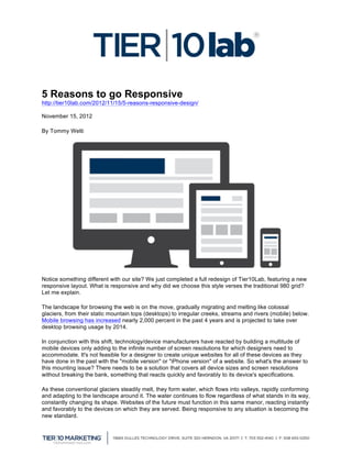
![Responsive web design, or adaptive design, is a methodology that incorporates flexible layouts, images
and CSS media query components. When combined, they create an experience custom tailored to the
viewer's screen size. Through the use of media query "breakpoints," the CSS can detect the current
screen size of the browser and display the corresponding layout. This guarantees the design looks and
functions correctly at any screen size. Microsoft has recently redesigned its website to incorporate this
new process, as well as Jack Daniels, The Boston Globe, Smashing Magazine and Mashable
[http://beta.mashable.com], which recently posted an article introducing its new responsive layout now in
beta. Disney, Nike and Sony have all switched over to responsive layouts, as well.
Many websites still incorporate Flash in their websites, which if you haven't heard, is not supported on
many mobile devices including all Apple products, including iPhone 4S, iPhone 5, iPad with Retina
display and the iPad 2 not to mention many Windows phones and tablets. In order for these companies to
achieve a similar user experience across desktop and mobile their designers and developers have to do
even more work to fulfill this need. Furthermore, there are many websites that also have a 'mobile' version
of their desktop website to serve their mobile clients to not allow for a broken user experience with the
need to pinch and zoom on their mobile devices. The only issue with this is now you have two websites
with mirrored content, which means twice as much maintenance and cost.
If you are not sold yet, here are 5 reasons why responsive design is a must have for your website:
1. Consistent User Experience: Viewers get a great looking website on their desktop, laptop,
tablet AND smartphone
2. Less Work: With only one website to update, your designer and developer have more time to do
other things
3. Better SEO: Google recommends a responsively designed website because it is more efficient
for its link algorithm crawlers to work with than traditional or mobile sites.
4. No More Apps: You can now serve all your content to viewers and it no longer needs to be
modified into a mobile version or even an expensive app.
5. Future Proof: As mentioned previously, the mobile and tablet market is exploding with new
devices everyday. With a responsive layout, you no longer have to worry about creating a new
version to accommodate for the newest, most popular device.
So what's next? Thinking beyond HTML5, CSS3 and even responsive layouts, what does the future hold
for us? With more and more devices being introduced to the market every day, we as a society are going
to become accustomed to viewing correctly formatted content on our devices. In a few years, if you
haven't adopted the responsive way of life, you are falling behind. We are headed toward a more content
driven society. Everyone will have a cool-looking, functional site, but the new line in the sand will be the
depth, detail and truth to the content that is being served on your website. Rich, dynamic content is the
future of the web, and a designer's goal is to serve the best-looking and functional experience to viewers
in any and every situation. Through the use of responsive design, viewers will be assured they are
receiving the best experience possible.
http://www.Tier10Lab.com
http://www.twitter.com/Tier10Lab
http://www.facebook.com/Tier10Marketing
http://www.Tier10Marketing.com](https://image.slidesharecdn.com/105-5reasonstogoresponsive-121116140803-phpapp01/85/5-Reasons-to-go-Responsive-2-320.jpg)

The document discusses the importance of responsive web design in an increasingly mobile-focused digital landscape, illustrating its advantages over traditional web design. Key reasons for adopting responsive design include consistent user experience across devices, reduced workload for designers, improved SEO, elimination of separate mobile apps, and future-proofing against the influx of new devices. It emphasizes that embracing responsive design is crucial for businesses to stay competitive and enhance content delivery quality.


![Exit Sandman: The Life and Career of Mariano Rivera [INFOGRAPHIC]](https://cdn.slidesharecdn.com/ss_thumbnails/239-exitsandman-marianoinfographic-131230150126-phpapp02-thumbnail.jpg?width=640&height=640&fit=bounds)


