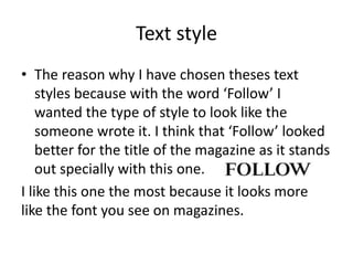
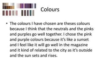
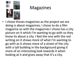
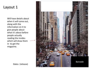
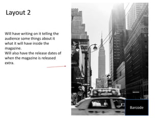
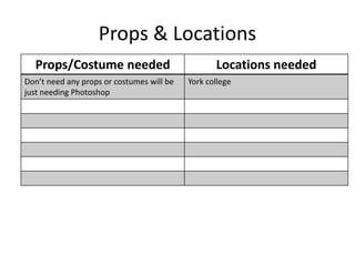
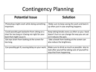
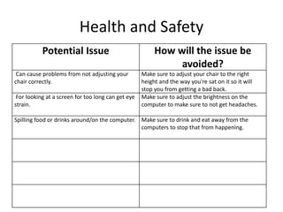
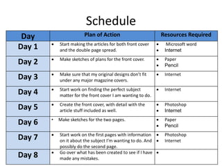
This document outlines Imogen Minto's pre-production plans for a magazine project. It includes details on text styles, colors, magazine references, layout designs, props and locations needed, contingency planning, health and safety considerations, and an 8-day schedule. The style chosen was meant to look handwritten like a magazine title. Colors of neutrals, pinks, and purples were selected to evoke a sunset scene related to the city theme. Reference magazines with city street photos were analyzed. Layout designs included barcodes and release dates. No props were needed beyond Photoshop. Potential issues like software crashes, injuries, or illness were addressed with backup plans.