
Recommended
More Related Content
What's hot
What's hot (19)
Viewers also liked
Viewers also liked (20)
Similar to Lily allen double page spread
Similar to Lily allen double page spread (20)
More from domhayes03
More from domhayes03 (20)
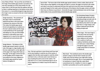
Lily allen double page spread
- 1. Use of Rule of Thirds – The use of the rule of thirds on House Style – The house style of this double page spread contains 3 colours; white, black and red. the image of the double page spread is successful as the These colours all go together on this page and make it a success, the pages are formal to the reader stars face and body are in the centre thirds of it, this and make it very easy to understand and have Lily’s point put across this means the double page means that it is the first part that the audience will look spread will appeal to the reader quite well because of the balance that the pages contain and make at there is nothing important in the bottom corner thirds them have an influence to purchase it. Generally the page is balanced between text and the image this means It is a successfully designed image placement, which makes it very successful being a formal double page spread. the image is seen as unusual as the star is leant towards the camera. The Guttenberg Design Principle – Design Symmetry – The symmetry of This double page spread suits the this page is that it is horizontally Guttenberg design principle well. As balanced and there is the same space the left page is more text and is in between the columns of the text. controlled by that which to the right This makes the double page spread page there is a huge image so the formal and appealing to an audience as design is balanced and suits this the text is placed neatly and the image design principle well. is well positioned on the second page and taking it up. The use of this design Main Image – The main image is symmetry is used within most music a mid shot of the star leaning magazines as it is easy for the reader to towards the camera giving understand and communicate with. direct address to the camera, this is useful as it will cause audience familiarity and the size of it will cause a viewer flicking Design Balance – The balance of this through the pages to see this double page spread is good, as the left side of the page is a huge headline with image and go back to it because the text underneath it, on the right side it stands out. of the page is the image which takes up Text –The text used here is more formal and if you look that page. So the pages contain the text at the story headline it could be one of the reasons, it Mast Head – The masthead used on this double page on the headline and an image of the suggests that Lily Allen wants people to read this article spread is unique in the fact that it stands out to the star profile for the music magazine so and listen to her, so the text used is more formal as a reader and is the first thing in your sight with it being this double page spread has a good way of putting the point across to the readers. The in the first third of the page. This is a more playful type balance throughout it. style that it is in is a more conventional type to use of of masthead as it doesn’t look like a plain blank music magazines as it makes it easy for the viewer to conventional one for a headline it is more to suggest read it. Lily Allen’s personality and to say this represents it.