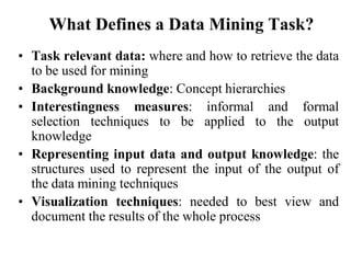
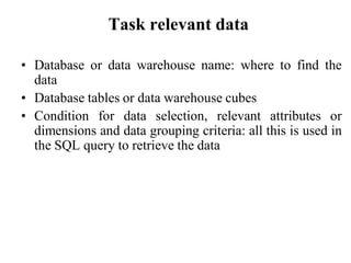
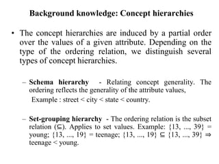
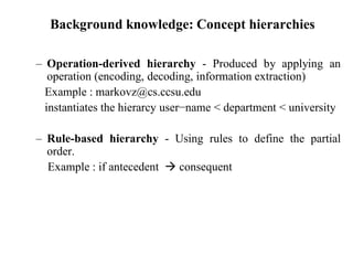
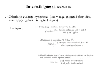
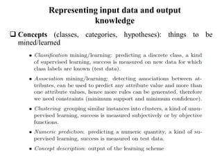
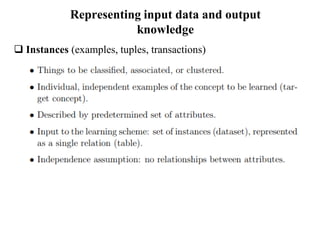
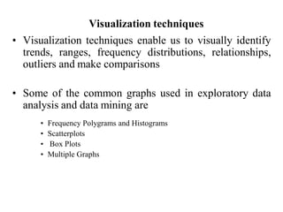
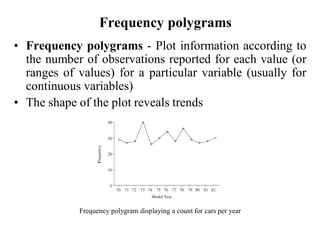
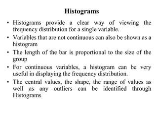
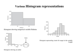
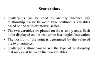
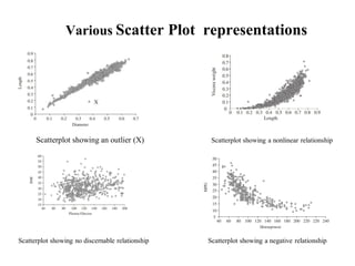
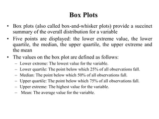
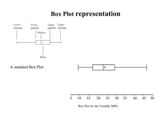
Module - 3
By
Dr.Ramkumar.T
ramkumar.thirunavukarasu@vit.ac.in
Data mining knowledge representation
What Defines a Data Mining Task?
• Task relevant data: where and how to retrieve the data
to be used for mining
• Background knowledge: Concept hierarchies
• Interestingness measures: informal and formal
selection techniques to be applied to the output
knowledge
• Representing input data and output knowledge: the
structures used to represent the input of the output of
the data mining techniques
• Visualization techniques: needed to best view and
document the results of the whole process
Task relevant data
• Database or data warehouse name: where to find the
data
• Database tables or data warehouse cubes
• Condition for data selection, relevant attributes or
dimensions and data grouping criteria: all this is used in
the SQL query to retrieve the data
Background knowledge: Concept hierarchies
• The concept hierarchies are induced by a partial order
over the values of a given attribute. Depending on the
type of the ordering relation, we distinguish several
types of concept hierarchies.
– Schema hierarchy - Relating concept generality. The
ordering reflects the generality of the attribute values,
Example : street < city < state < country.
– Set-grouping hierarchy - The ordering relation is the subset
relation (⊆). Applies to set values. Example: {13, ..., 39} =
young; {13, ..., 19} = teenage; {13, ..., 19} ⊆ {13, ..., 39} ⇒
teenage < young.
Background knowledge: Concept hierarchies
– Operation-derived hierarchy - Produced by applying an
operation (encoding, decoding, information extraction)
Example : markovz@cs.ccsu.edu
instantiates the hierarcy user−name < department < university
– Rule-based hierarchy - Using rules to define the partial
order.
Example : if antecedent  consequent
Interestingness measures
 Criteria to evaluate hypotheses (knowledge extracted from data
when applying data mining techniques).
Example :
Representing input data and output
knowledge
 Concepts (classes, categories, hypotheses): things to be
mined/learned
Representing input data and output
knowledge
 Instances (examples, tuples, transactions)
Representing input data and output
knowledge
 Attributes (Features)
Representing input data and output
knowledge
 Output Knowledge Representations
Visualization techniques
• Visualization techniques enable us to visually identify
trends, ranges, frequency distributions, relationships,
outliers and make comparisons
• Some of the common graphs used in exploratory data
analysis and data mining are
• Frequency Polygrams and Histograms
• Scatterplots
• Box Plots
• Multiple Graphs
Frequency polygrams
• Frequency polygrams - Plot information according to
the number of observations reported for each value (or
ranges of values) for a particular variable (usually for
continuous variables)
• The shape of the plot reveals trends
Frequency polygram displaying a count for cars per year
Histograms
• Histograms provide a clear way of viewing the
frequency distribution for a single variable.
• Variables that are not continuous can also be shown as a
histogram
• The length of the bar is proportional to the size of the
group
• For continuous variables, a histogram can be very
useful in displaying the frequency distribution.
• The central values, the shape, the range of values as
well as any outliers can be identified through
Histograms
Various Histogram representations
Histogram showing categorical variable Diabetes
Histogram representing counts for ranges in the variable
Length
Histogram showing an outlier
Scatterplots
• Scatterplots can be used to identify whether any
relationship exists between two continuous variables
based on the ratio or interval scales
• The two variables are plotted on the x- and y-axes. Each
point displayed on the scatterplot is a single observation
• The position of the point is determined by the value of
the two variables.
• Scatterplots allow you to see the type of relationship
that may exist between the two variables
Various Scatter Plot representations
Scatterplot showing an outlier (X) Scatterplot showing a nonlinear relationship
Scatterplot showing no discernable relationship Scatterplot showing a negative relationship
Box Plots
• Box plots (also called box-and-whisker plots) provide a succinct
summary of the overall distribution for a variable
• Five points are displayed: the lower extreme value, the lower
quartile, the median, the upper quartile, the upper extreme and
the mean
• The values on the box plot are defined as follows:
– Lower extreme: The lowest value for the variable.
– Lower quartile: The point below which 25% of all observations fall.
– Median: The point below which 50% of all observations fall.
– Upper quartile: The point below which 75% of all observations fall.
– Upper extreme: The highest value for the variable.
– Mean: The average value for the variable.
Box Plot representation
A standard Box Plot
Box Plot for the Variable MPG

4 module 3 --

  • 1.
  • 2.
    What Defines aData Mining Task? • Task relevant data: where and how to retrieve the data to be used for mining • Background knowledge: Concept hierarchies • Interestingness measures: informal and formal selection techniques to be applied to the output knowledge • Representing input data and output knowledge: the structures used to represent the input of the output of the data mining techniques • Visualization techniques: needed to best view and document the results of the whole process
  • 3.
    Task relevant data •Database or data warehouse name: where to find the data • Database tables or data warehouse cubes • Condition for data selection, relevant attributes or dimensions and data grouping criteria: all this is used in the SQL query to retrieve the data
  • 4.
    Background knowledge: Concepthierarchies • The concept hierarchies are induced by a partial order over the values of a given attribute. Depending on the type of the ordering relation, we distinguish several types of concept hierarchies. – Schema hierarchy - Relating concept generality. The ordering reflects the generality of the attribute values, Example : street < city < state < country. – Set-grouping hierarchy - The ordering relation is the subset relation (⊆). Applies to set values. Example: {13, ..., 39} = young; {13, ..., 19} = teenage; {13, ..., 19} ⊆ {13, ..., 39} ⇒ teenage < young.
  • 5.
    Background knowledge: Concepthierarchies – Operation-derived hierarchy - Produced by applying an operation (encoding, decoding, information extraction) Example : markovz@cs.ccsu.edu instantiates the hierarcy user−name < department < university – Rule-based hierarchy - Using rules to define the partial order. Example : if antecedent  consequent
  • 6.
    Interestingness measures  Criteriato evaluate hypotheses (knowledge extracted from data when applying data mining techniques). Example :
  • 7.
    Representing input dataand output knowledge  Concepts (classes, categories, hypotheses): things to be mined/learned
  • 8.
    Representing input dataand output knowledge  Instances (examples, tuples, transactions)
  • 9.
    Representing input dataand output knowledge  Attributes (Features)
  • 10.
    Representing input dataand output knowledge  Output Knowledge Representations
  • 11.
    Visualization techniques • Visualizationtechniques enable us to visually identify trends, ranges, frequency distributions, relationships, outliers and make comparisons • Some of the common graphs used in exploratory data analysis and data mining are • Frequency Polygrams and Histograms • Scatterplots • Box Plots • Multiple Graphs
  • 12.
    Frequency polygrams • Frequencypolygrams - Plot information according to the number of observations reported for each value (or ranges of values) for a particular variable (usually for continuous variables) • The shape of the plot reveals trends Frequency polygram displaying a count for cars per year
  • 13.
    Histograms • Histograms providea clear way of viewing the frequency distribution for a single variable. • Variables that are not continuous can also be shown as a histogram • The length of the bar is proportional to the size of the group • For continuous variables, a histogram can be very useful in displaying the frequency distribution. • The central values, the shape, the range of values as well as any outliers can be identified through Histograms
  • 14.
    Various Histogram representations Histogramshowing categorical variable Diabetes Histogram representing counts for ranges in the variable Length Histogram showing an outlier
  • 15.
    Scatterplots • Scatterplots canbe used to identify whether any relationship exists between two continuous variables based on the ratio or interval scales • The two variables are plotted on the x- and y-axes. Each point displayed on the scatterplot is a single observation • The position of the point is determined by the value of the two variables. • Scatterplots allow you to see the type of relationship that may exist between the two variables
  • 16.
    Various Scatter Plotrepresentations Scatterplot showing an outlier (X) Scatterplot showing a nonlinear relationship Scatterplot showing no discernable relationship Scatterplot showing a negative relationship
  • 17.
    Box Plots • Boxplots (also called box-and-whisker plots) provide a succinct summary of the overall distribution for a variable • Five points are displayed: the lower extreme value, the lower quartile, the median, the upper quartile, the upper extreme and the mean • The values on the box plot are defined as follows: – Lower extreme: The lowest value for the variable. – Lower quartile: The point below which 25% of all observations fall. – Median: The point below which 50% of all observations fall. – Upper quartile: The point below which 75% of all observations fall. – Upper extreme: The highest value for the variable. – Mean: The average value for the variable.
  • 18.
    Box Plot representation Astandard Box Plot Box Plot for the Variable MPG