Download as PDF, PPTX


![Standard Deviation Function
Sales Call Example
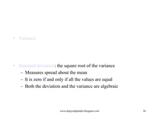
Variance s2: (algebraic, scalable computation)
s
2
n
n
n
1
1
1
2
2
( xi x ) n 1 [ xi n ( xi ) 2 ]
n 1 i 1
i 1
i 1
Standard deviation s is the square root of variance s2](https://image.slidesharecdn.com/excel-20and-20research-140225024214-phpapp02/85/Excel-and-research-25-320.jpg)


![Measuring the Dispersion of Data
•
Quartiles, outliers and boxplots
–
–
Inter-quartile range: IQR = Q3 – Q1
–
Five number summary: min, Q1, M, Q3, max
–
Boxplot: ends of the box are the quartiles, median is marked, whiskers,
and plot outlier individually
–
•
Quartiles: Q1 (25th percentile), Q3 (75th percentile)
Outlier: usually, a value higher/lower than 1.5 x IQR
Variance and standard deviation
–
Variance s2: (algebraic, scalable computation)
s
–
2
n
n
n
1
1
1
2
2
( xi x ) n 1 [ xi n ( xi ) 2 ]
n 1 i 1
i 1
i 1
Standard deviation s is the square root of variance s2
www.drjayeshpatidar.blogspot.com
29](https://image.slidesharecdn.com/excel-20and-20research-140225024214-phpapp02/85/Excel-and-research-29-320.jpg)


This document provides an overview of using various statistical functions and analysis tools in Microsoft Excel for business research methods. It discusses functions like SUM, AVERAGE, MEDIAN, and STANDARD DEVIATION for calculating statistical measures. Additionally, it covers tools for creating histograms, boxplots, and other visualizations to analyze and summarize data distributions and dispersion. The document also introduces concepts of central tendency, variance, outliers, and how to measure data dispersion through calculations and graphical analysis in Excel.