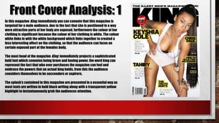
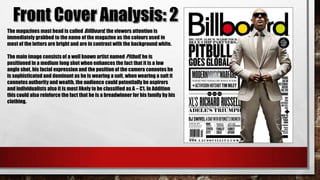
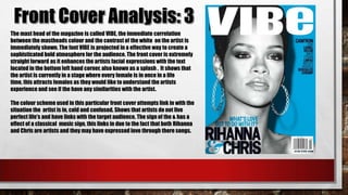
In this magazine King, immediately you can connote that this magazine is
targeted for a male audience, due to the fact that she is positioned in a way
were attractive parts of her body are exposed, furthermore the colour of her
clothing is significant because the colour of her clothing is white. The colour
white links in with the white background which links together to created a
less interesting affect on the clothing, so that the audience can focus on
certain exposed part of the females body.
The mast head of the magazine King immediately projects a sophisticated
bold font which connotes being brave and having power, the word king can
represent the fact that who ever purchases the magazine can feel and
embrace the powers that an actual king holds, from this the audience
considers themselves to be succeeders or aspirers.
The splash’s contained in this magazine are presented in a essential way as
most texts are written in bold black writing along with a transparent yellow
highlight to instantaneously grab the audiences attention.
The magazines mast head is called Billboard, the viewers attention is
immediately grabbed to the name of the magazine as the colours used in
most of the letters are bright and are in contrast with the background white.
The main image consists of a well known artist named Pitbull, he is
positioned in a medium long shot when enhances the fact that it is a low
angle shot, his facial expression and the position of the camera connotes he
is sophisticated and dominant as he is wearing a suit, when wearing a suit it
connotes authority and wealth, the audience could potentially be aspirers
and individualists also it is most likely to be classified as A – C1. In Addition
this could also reinforce the fact that he is a breadwinner for his family by his
clothing.
The mast head of the magazine is called VIBE, the immediate correlation
between the mastheads colour and the contrast of the white on the artist is
immediately shown. The font VIBE is projected in a effective way to create a
sophisticated bold atmosphere for the audience. The front cover is extremely
straight forward as it enhances the artists facial expressions with the text
located in the bottom left hand corner, also known as a splash . It shows that
the artist is currently in a stage where every female is in once in a life
time, this attracts females as they would like to understand the artists
experience and see if the have any similarities with the artist.
The colour scheme used in this particular front cover attempts link in with the
situation the artist is in, cold and confused. Shows that artists do not live
perfect life's and have links with the target audience. The sign of the & has a
effect of a classical music sign, this links in due to the fact that both Rihanna
and Chris are artists and they may have expressed love through there songs.

4) Front cover analysis

  • 2.
    In this magazineKing, immediately you can connote that this magazine is targeted for a male audience, due to the fact that she is positioned in a way were attractive parts of her body are exposed, furthermore the colour of her clothing is significant because the colour of her clothing is white. The colour white links in with the white background which links together to created a less interesting affect on the clothing, so that the audience can focus on certain exposed part of the females body. The mast head of the magazine King immediately projects a sophisticated bold font which connotes being brave and having power, the word king can represent the fact that who ever purchases the magazine can feel and embrace the powers that an actual king holds, from this the audience considers themselves to be succeeders or aspirers. The splash’s contained in this magazine are presented in a essential way as most texts are written in bold black writing along with a transparent yellow highlight to instantaneously grab the audiences attention.
  • 3.
    The magazines masthead is called Billboard, the viewers attention is immediately grabbed to the name of the magazine as the colours used in most of the letters are bright and are in contrast with the background white. The main image consists of a well known artist named Pitbull, he is positioned in a medium long shot when enhances the fact that it is a low angle shot, his facial expression and the position of the camera connotes he is sophisticated and dominant as he is wearing a suit, when wearing a suit it connotes authority and wealth, the audience could potentially be aspirers and individualists also it is most likely to be classified as A – C1. In Addition this could also reinforce the fact that he is a breadwinner for his family by his clothing.
  • 4.
    The mast headof the magazine is called VIBE, the immediate correlation between the mastheads colour and the contrast of the white on the artist is immediately shown. The font VIBE is projected in a effective way to create a sophisticated bold atmosphere for the audience. The front cover is extremely straight forward as it enhances the artists facial expressions with the text located in the bottom left hand corner, also known as a splash . It shows that the artist is currently in a stage where every female is in once in a life time, this attracts females as they would like to understand the artists experience and see if the have any similarities with the artist. The colour scheme used in this particular front cover attempts link in with the situation the artist is in, cold and confused. Shows that artists do not live perfect life's and have links with the target audience. The sign of the & has a effect of a classical music sign, this links in due to the fact that both Rihanna and Chris are artists and they may have expressed love through there songs.