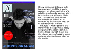
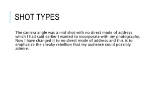
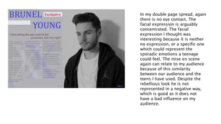
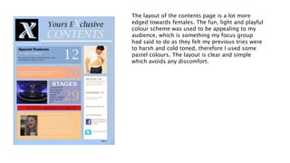
EVALUATION QUESTION 2
How does your media
product represent
particular social groups
In my magazine the social groups that I have represented are white
British teenagers or young adults, this is purposefully similar to my
target audience as I wanted them to be able to relate with the people
in the magazine.
I have used both male and female figures in my magazine but there is
more males. Although it was meant to be more aimed at a female, I
used a male solely which could affect that, however I put out to aim
for both gender and tried to edge it towards females, due to the lack
of female photography I used a lot of colours that were softer aiming
so it was aimed more at females. The age group was of my target
audience which was done so they feel they can relate.
On my front cover it shows a male
teenager which could be arguable
representing a hegemonic view of a
rebellious and sneaky teenager which
is hiding his face. Although this is
not presented in a negative way,
instead creative and will act as
someone my audience can relate to
or admire for their rebellion.
The subject is wearing clothes of a
stereotypical teenager with a hoody
and jeans with a specific common
branded logo on which means that
the mise en scene reflects the target
audience allowing them to relate to
the subject.
SHOT TYPES
The camera angle was a mid shot with no direct mode of address
which I had said earlier I wanted to incorporate with my photography.
Now I have changed it to no direct mode of address and this is to
emphasize the sneaky rebellion that my audience could possibly
admire.
In my double page spread, again
there is no eye contact. The
facial expression is arguably
concentrated. The facial
expression I thought was
interesting because it is neither
no expression, or a specific one
which could represent the
sporadic emotions a teenage
could feel. The mise en scene
again can relate to my audience
because of this similarity
between our audience and the
teens I have used. Despite the
rebellious look he is not
represented in a negative way,
which is good as it does not
have a bad influence on my
audience.
The layout of the contents page is a lot more
edged towards females. The fun, light and playful
colour scheme was used to be appealing to my
audience, which is something my focus group
had said to do as they felt my previous tries were
to harsh and cold toned, therefore I used some
pastel colours. The layout is clear and simple
which avoids any discomfort.
IDEOLOGY
I have prioritised the reception theory which is to relate the audience
and the similar aged artist which allows a relationship to be built.
Billboard does this, where they display things of which the audience
admire and possibly aspire which I tried to do in mine. Although my
shots have no direct mode of address the double page spread is
slightly turned away, but when you look at it you are still faced into
his way, therefore making the reader feel apart of it, therefore
exercising the reception theory.

Evaluation question 2

  • 1.
    EVALUATION QUESTION 2 Howdoes your media product represent particular social groups
  • 2.
    In my magazinethe social groups that I have represented are white British teenagers or young adults, this is purposefully similar to my target audience as I wanted them to be able to relate with the people in the magazine. I have used both male and female figures in my magazine but there is more males. Although it was meant to be more aimed at a female, I used a male solely which could affect that, however I put out to aim for both gender and tried to edge it towards females, due to the lack of female photography I used a lot of colours that were softer aiming so it was aimed more at females. The age group was of my target audience which was done so they feel they can relate.
  • 3.
    On my frontcover it shows a male teenager which could be arguable representing a hegemonic view of a rebellious and sneaky teenager which is hiding his face. Although this is not presented in a negative way, instead creative and will act as someone my audience can relate to or admire for their rebellion. The subject is wearing clothes of a stereotypical teenager with a hoody and jeans with a specific common branded logo on which means that the mise en scene reflects the target audience allowing them to relate to the subject.
  • 4.
    SHOT TYPES The cameraangle was a mid shot with no direct mode of address which I had said earlier I wanted to incorporate with my photography. Now I have changed it to no direct mode of address and this is to emphasize the sneaky rebellion that my audience could possibly admire.
  • 5.
    In my doublepage spread, again there is no eye contact. The facial expression is arguably concentrated. The facial expression I thought was interesting because it is neither no expression, or a specific one which could represent the sporadic emotions a teenage could feel. The mise en scene again can relate to my audience because of this similarity between our audience and the teens I have used. Despite the rebellious look he is not represented in a negative way, which is good as it does not have a bad influence on my audience.
  • 6.
    The layout ofthe contents page is a lot more edged towards females. The fun, light and playful colour scheme was used to be appealing to my audience, which is something my focus group had said to do as they felt my previous tries were to harsh and cold toned, therefore I used some pastel colours. The layout is clear and simple which avoids any discomfort.
  • 7.
    IDEOLOGY I have prioritisedthe reception theory which is to relate the audience and the similar aged artist which allows a relationship to be built. Billboard does this, where they display things of which the audience admire and possibly aspire which I tried to do in mine. Although my shots have no direct mode of address the double page spread is slightly turned away, but when you look at it you are still faced into his way, therefore making the reader feel apart of it, therefore exercising the reception theory.