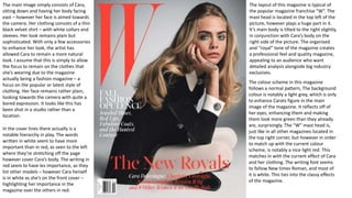
The document summarizes the cover of a fashion magazine featuring model Cara Delevingne. It notes that the magazine's layout and color scheme are typical of the "W" franchise. Cara is featured in a plain but sophisticated black and white outfit, intended to focus attention on the clothes. The light gray background and red masthead enhance Cara's features. Hierarchy is established through the use of different colors for cover text, with Cara's name in white signaling her importance over other models named in red.
Here is my analysis of both the front cover and contents page of the music magazine 'Fader'. This is as part of my research and planning for my media AS coursework. However, I was unable to find a double page spread for 'Fader', therefore, I will comment on the lack of it on my blog, which is klaudiafior.blogspot.com.
Feedback is much appreciated.
Explore our comprehensive data analysis project presentation on predicting product ad campaign performance. Learn how data-driven insights can optimize your marketing strategies and enhance campaign effectiveness. Perfect for professionals and students looking to understand the power of data analysis in advertising. for more details visit: https://bostoninstituteofanalytics.org/data-science-and-artificial-intelligence/
Techniques to optimize the pagerank algorithm usually fall in two categories. One is to try reducing the work per iteration, and the other is to try reducing the number of iterations. These goals are often at odds with one another. Skipping computation on vertices which have already converged has the potential to save iteration time. Skipping in-identical vertices, with the same in-links, helps reduce duplicate computations and thus could help reduce iteration time. Road networks often have chains which can be short-circuited before pagerank computation to improve performance. Final ranks of chain nodes can be easily calculated. This could reduce both the iteration time, and the number of iterations. If a graph has no dangling nodes, pagerank of each strongly connected component can be computed in topological order. This could help reduce the iteration time, no. of iterations, and also enable multi-iteration concurrency in pagerank computation. The combination of all of the above methods is the STICD algorithm. [sticd] For dynamic graphs, unchanged components whose ranks are unaffected can be skipped altogether.
Chatty Kathy - UNC Bootcamp Final Project Presentation - Final Version - 5.23...John Andrews
SlideShare Description for "Chatty Kathy - UNC Bootcamp Final Project Presentation"
Title: Chatty Kathy: Enhancing Physical Activity Among Older Adults
Description:
Discover how Chatty Kathy, an innovative project developed at the UNC Bootcamp, aims to tackle the challenge of low physical activity among older adults. Our AI-driven solution uses peer interaction to boost and sustain exercise levels, significantly improving health outcomes. This presentation covers our problem statement, the rationale behind Chatty Kathy, synthetic data and persona creation, model performance metrics, a visual demonstration of the project, and potential future developments. Join us for an insightful Q&A session to explore the potential of this groundbreaking project.
Project Team: Jay Requarth, Jana Avery, John Andrews, Dr. Dick Davis II, Nee Buntoum, Nam Yeongjin & Mat Nicholas
1. The layout of this magazine is typical of
the popular magazine franchise “W”. The
mast head is located in the top left of the
picture, however plays a huge part in it.
It’s main body is tilted to the right slightly,
in conjunction with Cara’s body on the
right side of the picture. The organised
and “royal” tone of the magazine creates
a professional feel and quality magazine,
appealing to an audience who want
detailed analysis alongside big industry
exclusives.
The main image simply consists of Cara,
sitting down and having her body facing
east – however her face is aimed towards
the camera. Her clothing consists of a thin
black velvet shirt – with white collars and
sleeves. Her look remains plain but
sophisticated. With only a few accessories
to enhance her look, the artist has
allowed Cara to remain a more natural
look. I assume that this is simply to allow
the focus to remain on the clothes that
she’s wearing due to the magazine
actually being a fashion magazine – a
focus on the popular or latest style of
clothing. Her face remains rather plain,
looking towards the camera with quite a
bored expression. It looks like this has
been shot in a studio rather than a
location.
The colour scheme in this magazine
follows a normal pattern, The background
colour is notably a light grey, which is only
to enhance Carats figure in the main
image of the magazine. It reflects off of
her eyes, enhancing them and making
them look more green than they already
are, surprisingly. The “W” mast head is,
just like in all other magazines located in
the top right corner, but however in order
to match up with the current colour
scheme, is notably a nice light red. This
matches in with the current effect of Cara
and her clothing. The writing font seems
to follow New times Roman, and most of
it is white. This ties into the classy effects
of the magazine.
In the cover lines there actually is a
notable hierarchy in play. The words
written in white seem to have more
important than in red, as seen to the left
where they’re stretching off the page
however cover Cara’s body. The writing in
red seem to have les importance, as they
list other models – however Cara herself
is in white as she’s on the front cover –
highlighting her importance in the
magazine over the others in red.
2. Mast Head – The bright colour read ties
in with the rest of the picture, the main
theme of the colours being white, black,
light blue and red. This also ties in with
the record that Alex Turner is grasping in
his hands, notably red with a black shirt
on with a red rose on it. This could
resemble a rather simple structure of the
picture, the red being bright bold and
easy to read in order to further represent
the already well known band name.
Barcode & pricing – In the bottom right
corner of the picture, A small but
noticeable barcode is located. This is
actually rather smaller than other bar
codes however I think this is due to the
price of the actual magazine being £3.40,
which is actually quite expensive.
However this might just only re-iterate
that it’s a magazine of high quality.
Positioning – In this magazine Alex Turner
takes up most of the space of the entire
page, being broadcasted right in the
middle, in order that he’s the main
character of the magazine. Him being in
the middle may also represent his
importance, due to the fact that Alex
Turner doesn’t really star on magazine
covers. However in this magazine, most
of the words in bold cover his body which
may underline his importance, however
the fact that he’s actually smack bang in
the middle may prove his importance
more so ever. The colour’s that he’s
shown to wear may also represent his
image as he’s sporting the colours of the
magazine, red and black, along with the
record in his hand.
As Alex turner is the main person
featured in this magazine, this may also
indicate that the target audience is
actually aimed at men, rather than
women. In the top of the picture, it also
states that there’s an exclusive Drake
interview, which may yet again reiterate
the fact that this magazine was made for
men and not for women. However it isn’t
all sexist, other people may also read the
magazine if they want to.
3. In this magazine the colours that are chosen are
noticeably black and white. This refers to the
simplicity of the magazine, enhancing the quality
and sophistication of it. The mast head, “GQ” Is
placed in the top right corner of the page, each
letter representing a different colour, however the
Q is overshadowed by Kanye West in the middle.
This may indicate that they prioritised him over
the normal features of the magazine. Unlike
normal Magazine covers, they’ve featured Kanye
West directly in the middle, taking up ¾ of the
page or even more. This may indicate that the
magazine was actually made up in his favour and is
about him and how he dresses and how he lives
(refer to four words under mast head).
The way that this magazine was actually made may
lead the reader to think that it’s more of an article
focused on men and what they want to do in life
and how they should dress. He is the biggest and
boldest part of the magazine, maybe even proving
more importance than the mast head, which may
drive the viewer to read the magazine in more
depth. The same colours designated towards this
magazine may focus on the main theme in the
magazine, however due to it not consisting of only
white and black, there’s some grey In there, there
may be a variation further in this magazine.