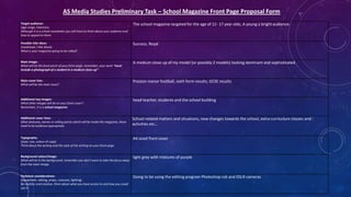
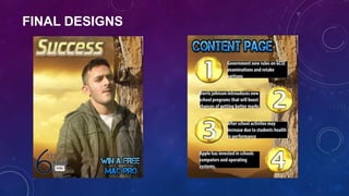
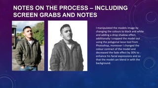
Preliminary School
Magazine Task
WHAT WERE YOU ASKED TO DO, WHAT DID
YOU INTEND TO DO?
• In this preliminary task we were asked to create a school magazine which included primary sourced
pictures, such as the main image, (model), the background image and the fonts chosen, additionally we
were asked to create a content page for the school magazine.
The logo relates to
the old fashioned
building and the
italic font style used
on the information
text.

The well structured
paragraphs and
information shows how
well organised the
school is, therefore they
attempt to link in
everything in order to
send out a good
message for parents
and carers.

Italic style writing
connotes to the
old fashioned
style building,
which in the
olden days these
buildings were
considered very
posh and crucial.

Both images indicate
and give a good
impression that the
school in high class
standard, this is where
parents and carers will
get interested in
taking there sons and
daughters.

The cross
suggested this
may be a
religious school.
Posh building
reinforces to the
sophisticated
students smartly
dressed.
Sophisticated
young adults,
people reading
this article can
relate to people in
various ways.

Students postures
and the style of
sitting shows how
well they’ve
matured and
become young
adults.

The word investor can
relate to the students
sophisticated suits,
due to the fact that
investors are highly
wealthy and wear
suits.

The images below attempt to
show that this school is
appropriate for other people
as well, it also shows how
diverse the school is in terms
of what they offer
This writing is also written in red which links
in to the name of the magazine and the heart
on the teenagers chest, this also highly
indicates that there is a sexual involvement in
this magazine therefore the font is written in
red to reinforce everything else, additionally
the colour of her hair also links in which is red.

The colour of red connotes she may be
sexually active, and her facial expressions
reinforce her choice of clothing, which also
indicates she is sexually active, she is
presented a calm but a thirsty person, they
attempt to make her look very attractive as
this is the key image, they have make her
wear open clothing, make up etc. To make
the opposite sex interested in reading the
magazine.

Relates to teenagers and their interest in
technology and smart phones, attempts to
attract teenagers who are after the iphone 5
and want to give him a untrue hope that they
may win an iphone.

In this generation young adults and
teenagers like the coffee brand Costa, also
of males and females purchase there coffee
and hot drinks from there, and the are
pretty expensive, therefore this could
reinforce wealthy and some average people
can purchase and makes you feel that your
wealthy.
The use of light purple indicates and relates to
the young teenager, due to the fact that
teenagers like light and vibrant colours, this
shows she is a calm teenager due to the light
colours, if colours were strong and sharp it may
reinforce her personality and attitude.

The barcode indicates that this item is
legally registered and is only
appropriate for certain ages.
AS Media Studies Preliminary Task – School Magazine Front Page Proposal Form
Target audience:
(age range, interests)
Although it is a school newsletter you still have to think about your audience and
how to appeal to them.

The school magazine targeted for the age of 11- 17 year olds, A young a bright audience.

Possible title ideas:
(masthead / title block)
What is your magazine going to be called?

Success, Royal

Main image:
What will be the focal point of your front page, remember, your work “must
include a photograph of a student in a medium close-up”

A medium close up of my model (or possibly 2 models) looking dominant and sophisticated.

Main cover line:
What will be the main story?

Preston manor football, sixth form results, GCSE results

Additional key images:
What other images will be on your front cover?
Remember, it is a school magazine.

head teacher, students and the school building

Additional cover lines:
Other features, stories or selling points which will be inside the magazine, these
need to be audience appropriate.

School related matters and situations, new changes towards the school, extra curriculum classes and
activities etc…

Typography:
(style, size, colour of copy)
Think about the writing and the style of the writing on your front page.

A4 sized front cover

Background colour/image:
What will be in the background, remember you don’t want to take the focus away
from the main image.

light grey with mixtures of purple

Technical considerations:
(equipment, setting, props, costume, lighting)
Be realistic and creative, think about what you have access to and how you could
use it.

Going to be using the editing program Photoshop cs6 and DSLR cameras
ROUGH DRAFTS
FINAL DESIGNS
NOTES ON THE PROCESS – INCLUDING
SCREEN GRABS AND NOTES
I manipulated the models image by
changing the colours to black and white
and adding a drop shadow effect,
additionally I cropped the model out
using the polygonal lasso tool from
Photoshop, moreover I changed the
colour contract of the model and
decreased the fade effect by 30% to
enhance his facial expressions and so
that the model can blend in with the
background.
WHAT HAVE I LEARNT?
During the process of creating a school magazine I have managed to consolidate key aspects of
my Photoshop skills, additionally I have managed to refresh all tools and operating buttons so
that I can use them fluently. I have also learn how appealing a school magazine can be to a
specific target audience, this is based on main image and text place on the front cover, this
determines a specific target audience. Overall I feel highly comfortable with the usage of
Photoshop as I have used it many times before for Media Study purposes.

1) Preliminary task

  • 1.
  • 2.
    WHAT WERE YOUASKED TO DO, WHAT DID YOU INTEND TO DO? • In this preliminary task we were asked to create a school magazine which included primary sourced pictures, such as the main image, (model), the background image and the fonts chosen, additionally we were asked to create a content page for the school magazine.
  • 3.
    The logo relatesto the old fashioned building and the italic font style used on the information text. The well structured paragraphs and information shows how well organised the school is, therefore they attempt to link in everything in order to send out a good message for parents and carers. Italic style writing connotes to the old fashioned style building, which in the olden days these buildings were considered very posh and crucial. Both images indicate and give a good impression that the school in high class standard, this is where parents and carers will get interested in taking there sons and daughters. The cross suggested this may be a religious school. Posh building reinforces to the sophisticated students smartly dressed. Sophisticated young adults, people reading this article can relate to people in various ways. Students postures and the style of sitting shows how well they’ve matured and become young adults. The word investor can relate to the students sophisticated suits, due to the fact that investors are highly wealthy and wear suits. The images below attempt to show that this school is appropriate for other people as well, it also shows how diverse the school is in terms of what they offer
  • 4.
    This writing isalso written in red which links in to the name of the magazine and the heart on the teenagers chest, this also highly indicates that there is a sexual involvement in this magazine therefore the font is written in red to reinforce everything else, additionally the colour of her hair also links in which is red. The colour of red connotes she may be sexually active, and her facial expressions reinforce her choice of clothing, which also indicates she is sexually active, she is presented a calm but a thirsty person, they attempt to make her look very attractive as this is the key image, they have make her wear open clothing, make up etc. To make the opposite sex interested in reading the magazine. Relates to teenagers and their interest in technology and smart phones, attempts to attract teenagers who are after the iphone 5 and want to give him a untrue hope that they may win an iphone. In this generation young adults and teenagers like the coffee brand Costa, also of males and females purchase there coffee and hot drinks from there, and the are pretty expensive, therefore this could reinforce wealthy and some average people can purchase and makes you feel that your wealthy. The use of light purple indicates and relates to the young teenager, due to the fact that teenagers like light and vibrant colours, this shows she is a calm teenager due to the light colours, if colours were strong and sharp it may reinforce her personality and attitude. The barcode indicates that this item is legally registered and is only appropriate for certain ages.
  • 5.
    AS Media StudiesPreliminary Task – School Magazine Front Page Proposal Form Target audience: (age range, interests) Although it is a school newsletter you still have to think about your audience and how to appeal to them. The school magazine targeted for the age of 11- 17 year olds, A young a bright audience. Possible title ideas: (masthead / title block) What is your magazine going to be called? Success, Royal Main image: What will be the focal point of your front page, remember, your work “must include a photograph of a student in a medium close-up” A medium close up of my model (or possibly 2 models) looking dominant and sophisticated. Main cover line: What will be the main story? Preston manor football, sixth form results, GCSE results Additional key images: What other images will be on your front cover? Remember, it is a school magazine. head teacher, students and the school building Additional cover lines: Other features, stories or selling points which will be inside the magazine, these need to be audience appropriate. School related matters and situations, new changes towards the school, extra curriculum classes and activities etc… Typography: (style, size, colour of copy) Think about the writing and the style of the writing on your front page. A4 sized front cover Background colour/image: What will be in the background, remember you don’t want to take the focus away from the main image. light grey with mixtures of purple Technical considerations: (equipment, setting, props, costume, lighting) Be realistic and creative, think about what you have access to and how you could use it. Going to be using the editing program Photoshop cs6 and DSLR cameras
  • 6.
  • 7.
  • 8.
    NOTES ON THEPROCESS – INCLUDING SCREEN GRABS AND NOTES I manipulated the models image by changing the colours to black and white and adding a drop shadow effect, additionally I cropped the model out using the polygonal lasso tool from Photoshop, moreover I changed the colour contract of the model and decreased the fade effect by 30% to enhance his facial expressions and so that the model can blend in with the background.
  • 9.
    WHAT HAVE ILEARNT? During the process of creating a school magazine I have managed to consolidate key aspects of my Photoshop skills, additionally I have managed to refresh all tools and operating buttons so that I can use them fluently. I have also learn how appealing a school magazine can be to a specific target audience, this is based on main image and text place on the front cover, this determines a specific target audience. Overall I feel highly comfortable with the usage of Photoshop as I have used it many times before for Media Study purposes.