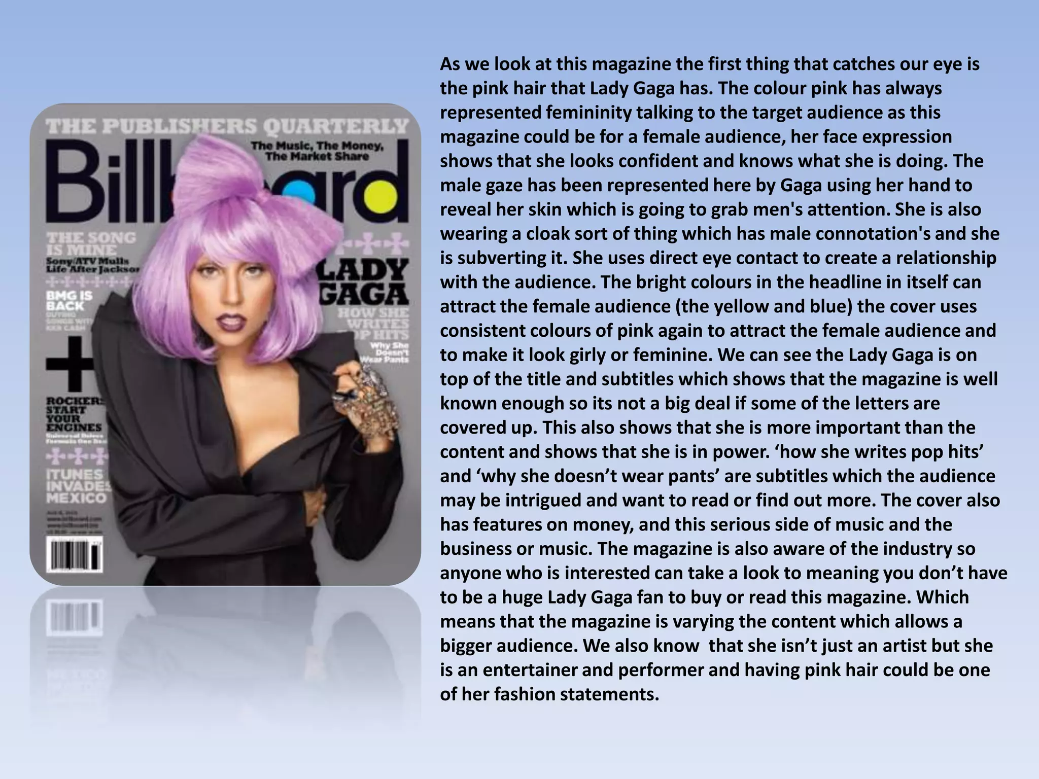
As we look at this magazine the first thing that catches our eye is
the pink hair that Lady Gaga has. The colour pink has always
represented femininity talking to the target audience as this
magazine could be for a female audience, her face expression
shows that she looks confident and knows what she is doing. The
male gaze has been represented here by Gaga using her hand to
reveal her skin which is going to grab men's attention. She is also
wearing a cloak sort of thing which has male connotation's and she
is subverting it. She uses direct eye contact to create a relationship
with the audience. The bright colours in the headline in itself can
attract the female audience (the yellow and blue) the cover uses
consistent colours of pink again to attract the female audience and
to make it look girly or feminine. We can see the Lady Gaga is on
top of the title and subtitles which shows that the magazine is well
known enough so its not a big deal if some of the letters are
covered up. This also shows that she is more important than the
content and shows that she is in power. ‘how she writes pop hits’
and ‘why she doesn’t wear pants’ are subtitles which the audience
may be intrigued and want to read or find out more. The cover also
has features on money, and this serious side of music and the
business or music. The magazine is also aware of the industry so
anyone who is interested can take a look to meaning you don’t have
to be a huge Lady Gaga fan to buy or read this magazine. Which
means that the magazine is varying the content which allows a
bigger audience. We also know that she isn’t just an artist but she
is an entertainer and performer and having pink hair could be one
of her fashion statements.
There are three main colours to
this magazine which are black
pink and white. Katy Perry’s
outfit matches this as the
colours on her clothing are
similar and link with the
headline and text colours.

In the top right hand corner
the pink symbol suggests that
in this issue women are in
power and are going to be
discussed. Katy looks really
confident and the fact that
she is a female emphasizes
that she is ready to overcome
any tasks or obstacles.

The way Katy is positioned is very
provocative. The light reflects off her
thighs which is really sexualised and
can grab male attention very quickly.
This also refers to the male gaze as her
eye contact with the audience defines
that she is really confident. The fact
the she is wearing little clothing also
adds to this, the audience can see that
the back of her legs and her back is
completely revealed which again can
grab attention. This makes her a sex
symbol as she seems really
comfortable in wearing little clothing.

The fact that Katy is covering the
heading of the magazine shows that
the magazine is really well known
and that they don’t need the full
heading to sell it.
Here we can see that the heading is covered by Amy’s hair, this
shows that the magazine is well known and doesn’t need to
advertise the name because everyone is aware of the magazine.
The front cover has aspects of politics in it, which states that it
could be for a more mature audience than the other magazines.
Direct eye contact meaning she is creating a relationship with
the audience. The menu on the side of lots of different bands
which means that if you’re not a fan of Amy, you can read about
all the other bands that have been listed. The colours are linked
in many different way, red white and blue are all the colours of
the American flag, which links with the fact that the magazine is
talking about politics.
Magazine rep
Magazine rep

Magazine rep

  • 1.
    As we lookat this magazine the first thing that catches our eye is the pink hair that Lady Gaga has. The colour pink has always represented femininity talking to the target audience as this magazine could be for a female audience, her face expression shows that she looks confident and knows what she is doing. The male gaze has been represented here by Gaga using her hand to reveal her skin which is going to grab men's attention. She is also wearing a cloak sort of thing which has male connotation's and she is subverting it. She uses direct eye contact to create a relationship with the audience. The bright colours in the headline in itself can attract the female audience (the yellow and blue) the cover uses consistent colours of pink again to attract the female audience and to make it look girly or feminine. We can see the Lady Gaga is on top of the title and subtitles which shows that the magazine is well known enough so its not a big deal if some of the letters are covered up. This also shows that she is more important than the content and shows that she is in power. ‘how she writes pop hits’ and ‘why she doesn’t wear pants’ are subtitles which the audience may be intrigued and want to read or find out more. The cover also has features on money, and this serious side of music and the business or music. The magazine is also aware of the industry so anyone who is interested can take a look to meaning you don’t have to be a huge Lady Gaga fan to buy or read this magazine. Which means that the magazine is varying the content which allows a bigger audience. We also know that she isn’t just an artist but she is an entertainer and performer and having pink hair could be one of her fashion statements.
  • 2.
    There are threemain colours to this magazine which are black pink and white. Katy Perry’s outfit matches this as the colours on her clothing are similar and link with the headline and text colours. In the top right hand corner the pink symbol suggests that in this issue women are in power and are going to be discussed. Katy looks really confident and the fact that she is a female emphasizes that she is ready to overcome any tasks or obstacles. The way Katy is positioned is very provocative. The light reflects off her thighs which is really sexualised and can grab male attention very quickly. This also refers to the male gaze as her eye contact with the audience defines that she is really confident. The fact the she is wearing little clothing also adds to this, the audience can see that the back of her legs and her back is completely revealed which again can grab attention. This makes her a sex symbol as she seems really comfortable in wearing little clothing. The fact that Katy is covering the heading of the magazine shows that the magazine is really well known and that they don’t need the full heading to sell it.
  • 3.
    Here we cansee that the heading is covered by Amy’s hair, this shows that the magazine is well known and doesn’t need to advertise the name because everyone is aware of the magazine. The front cover has aspects of politics in it, which states that it could be for a more mature audience than the other magazines. Direct eye contact meaning she is creating a relationship with the audience. The menu on the side of lots of different bands which means that if you’re not a fan of Amy, you can read about all the other bands that have been listed. The colours are linked in many different way, red white and blue are all the colours of the American flag, which links with the fact that the magazine is talking about politics.