This document discusses frequency distributions and graphical representations of data. It provides the following key points:
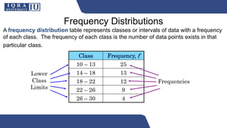
1. A frequency distribution table organizes data into classes with frequencies showing how many data points fall into each class. It includes the class limits, frequencies, class marks, relative frequencies, and cumulative frequencies.
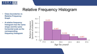
2. Graphical representations of frequency distributions include the frequency histogram, frequency polygon, relative frequency histogram, and cumulative frequency ogive. These graphs provide visual analysis of the distribution of data.
3. An example constructs a frequency distribution for ages of participants with five classes and calculates the relevant values like class width, frequencies, class marks, relative frequencies, and cumulative frequencies.