

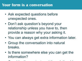
![“ /”A form is a sort of conversation […] without those opportunities to for clarification -Caroline Jarrett](https://image.slidesharecdn.com/killerformdesign-110928103839-phpapp01/85/Killer-form-design-5-320.jpg)


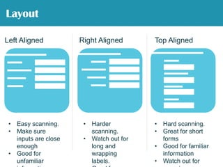
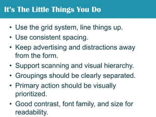


The document presents strategies for effective form design by emphasizing that forms should function like conversations, facilitating user engagement and clarity. Key principles include good layout, logical grouping of information, usability testing, and error prevention strategies to enhance user experience. Visual design elements, such as contrast and spacing, are essential for readability and usability, ensuring that users can complete forms efficiently.