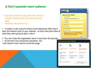
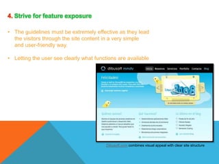
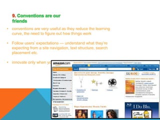
GRAPHICS
Are visual images or designs on some surface, such as a
wall, screen, paper, or stone.
Purpose :To inform, explain or entertain.
EXAMPLES OF GRAPHICS
Drawing is a picture, image, etc., that is made by making lines on a surface with a
pencil, pen, marker, chalk, etc., but usually not with paint
MAPS
Are simplified depiction of a space, a navigational aid which highlights relations between
objects within that space.


Usually, a map is

a two or three
Dimensional spaces.
GRAPHS
Are types of information graphic that represents tabular, numeric data.
Used to make it easier to understand large quantities of data and the
relationships between different parts of the data.
DIAGRAMS

Are simplified and structured visual representation of
concepts, ideas, constructions, relations, statistic
al data, etc.,
used to visualize and clarify the topic.
COMPUTER GRAPHICS
are graphics created using computers and the representation of image data
by a computer specifically with help from specialized graphic hardware
and software.
used to add color, excitement, and visual inspiration to media
REFRENCES
DEFINITION:
Multimedia is a powerful media that
delivers and present content, in an
attractive way.
.
It is are combining images, video,
animations, audio, text, graphics,
sounds, and moving images
in meaningful ways.
ADVANTAGES OF MULTIMEDIA

o Increases learning effectiveness

o Help to deliver the information
in easy way
IMPORTANCE OF MULTIMEDIA:
Multimedia is important in the society for use in
different field

it's adds excitement, appeal for the a
contents and illustrates concepts
It helps for individualized learning and
makes things more interactive and user friendly
DEFINITION
Web design principles are
general rules that include
basic guidelines for
designing a web-based
media of layouts and
interaction design such as
webpage layout, content
production, and graphic
design
1. Don’t make users think
Your website must be :

•
•
•
•

obvious and self-explanatory
clear structure
moderate visual clues
easily recognizable links
2. Don’t squander users’ patience
• Let the visitors to play with the service
without forcing them to share private
data
• Remove all barriers by :
1- Is better to ask users for there email addresses after they’d
seen the feature work of your website , so they had some idea of
what they were going to get in return.
2- You can make the registration done in less than 30 seconds
— as the form has horizontal orientation, the
user doesn’t even need to scroll the page.
3. Manage to focus users’ attention

• You should recognize edges, patterns and
motions
• the less thinking needs to happen behind the
scenes, the better is the user experience
4. Strive for feature exposure
• The guidelines must be extremely effective as they lead
the visitors through the site content in a very simple
and user-friendly way.
• Letting the user see clearly what functions are available

Dibusoft.com combines visual appeal with clear site structure
5. Make use of effective writing
• adjust the writing style to users’ preferences
and browsing habits to be in bold or italics
• Talk business. Avoid cute or clever
names, marketing-induced names, companyspecific names, and unfamiliar technical
• names
An optimal solution for effective writing is to
1- use short and concise phrases
2- use scannable layout (categorize the content, use multiple
heading levels, use visual elements and bulleted lists which break
the flow of uniform text blocks)
3- use plain and objective language
6. keep it simple

• The best site design is a pure text, without any
advertisements or further content blocks
matching exactly the query visitors used or the
content they’ve been looking for
7. Don’t be afraid of the white space
• Not only does it help to reduce the
cognitive load for the visitors, but it makes
it possible to perceive the information
presented on the screen
• Hierarchical structures reduce complexity
8. Communicate effectively with a “visible
language”
• Organize: provide the user with a clear and
consistent conceptual structure

• Economize: do the most with the least amount
of cues and visual elements
• Communicate: match the presentation to the
capabilities of the user
1- Use max. 3 typefaces in a maximum of 3 point sizes
— a maximum of 18 words or 50-80 characters per line
of text.
9. Conventions are our
friends
• conventions are very useful as they reduce the learning
curve, the need to figure out how things work
• Follow users’ expectations — understand what they’re
expecting from a site navigation, text structure, search
placement etc.
• innovate only when you know you really have a better idea
10. Test early, test often
• Tests often provide crucial insights into significant problems
and issues related to a given layout
• One user is 100% better than testing none
• Testing is an iterative process. That means that you design
something, test it, fix it and then test it again. There might be
problems which haven’t been found during the first round as
users were practically blocked by other problems.
• Usability tests always produce useful results
• A developer is unsuited to test his or her code, You know
how your website is built and therefore you know exactly
how it works — you have the wisdom independent testers
and visitors of your site wouldn’t have.
Creative Software

Creative Software

  • 2.
    GRAPHICS Are visual imagesor designs on some surface, such as a wall, screen, paper, or stone. Purpose :To inform, explain or entertain.
  • 3.
    EXAMPLES OF GRAPHICS Drawingis a picture, image, etc., that is made by making lines on a surface with a pencil, pen, marker, chalk, etc., but usually not with paint
  • 4.
    MAPS Are simplified depictionof a space, a navigational aid which highlights relations between objects within that space.  Usually, a map is a two or three Dimensional spaces.
  • 5.
    GRAPHS Are types ofinformation graphic that represents tabular, numeric data. Used to make it easier to understand large quantities of data and the relationships between different parts of the data.
  • 6.
    DIAGRAMS Are simplified andstructured visual representation of concepts, ideas, constructions, relations, statistic al data, etc., used to visualize and clarify the topic.
  • 7.
    COMPUTER GRAPHICS are graphicscreated using computers and the representation of image data by a computer specifically with help from specialized graphic hardware and software. used to add color, excitement, and visual inspiration to media
  • 8.
  • 10.
    DEFINITION: Multimedia is apowerful media that delivers and present content, in an attractive way. .
  • 11.
    It is arecombining images, video, animations, audio, text, graphics, sounds, and moving images in meaningful ways.
  • 12.
    ADVANTAGES OF MULTIMEDIA oIncreases learning effectiveness o Help to deliver the information in easy way
  • 13.
    IMPORTANCE OF MULTIMEDIA: Multimediais important in the society for use in different field it's adds excitement, appeal for the a contents and illustrates concepts It helps for individualized learning and makes things more interactive and user friendly
  • 16.
    DEFINITION Web design principlesare general rules that include basic guidelines for designing a web-based media of layouts and interaction design such as webpage layout, content production, and graphic design
  • 17.
    1. Don’t makeusers think Your website must be : • • • • obvious and self-explanatory clear structure moderate visual clues easily recognizable links
  • 18.
    2. Don’t squanderusers’ patience • Let the visitors to play with the service without forcing them to share private data • Remove all barriers by : 1- Is better to ask users for there email addresses after they’d seen the feature work of your website , so they had some idea of what they were going to get in return. 2- You can make the registration done in less than 30 seconds — as the form has horizontal orientation, the user doesn’t even need to scroll the page.
  • 19.
    3. Manage tofocus users’ attention • You should recognize edges, patterns and motions • the less thinking needs to happen behind the scenes, the better is the user experience
  • 20.
    4. Strive forfeature exposure • The guidelines must be extremely effective as they lead the visitors through the site content in a very simple and user-friendly way. • Letting the user see clearly what functions are available Dibusoft.com combines visual appeal with clear site structure
  • 21.
    5. Make useof effective writing • adjust the writing style to users’ preferences and browsing habits to be in bold or italics • Talk business. Avoid cute or clever names, marketing-induced names, companyspecific names, and unfamiliar technical • names An optimal solution for effective writing is to 1- use short and concise phrases 2- use scannable layout (categorize the content, use multiple heading levels, use visual elements and bulleted lists which break the flow of uniform text blocks) 3- use plain and objective language
  • 22.
    6. keep itsimple • The best site design is a pure text, without any advertisements or further content blocks matching exactly the query visitors used or the content they’ve been looking for
  • 23.
    7. Don’t beafraid of the white space • Not only does it help to reduce the cognitive load for the visitors, but it makes it possible to perceive the information presented on the screen • Hierarchical structures reduce complexity
  • 24.
    8. Communicate effectivelywith a “visible language” • Organize: provide the user with a clear and consistent conceptual structure • Economize: do the most with the least amount of cues and visual elements • Communicate: match the presentation to the capabilities of the user 1- Use max. 3 typefaces in a maximum of 3 point sizes — a maximum of 18 words or 50-80 characters per line of text.
  • 25.
    9. Conventions areour friends • conventions are very useful as they reduce the learning curve, the need to figure out how things work • Follow users’ expectations — understand what they’re expecting from a site navigation, text structure, search placement etc. • innovate only when you know you really have a better idea
  • 26.
    10. Test early,test often • Tests often provide crucial insights into significant problems and issues related to a given layout • One user is 100% better than testing none • Testing is an iterative process. That means that you design something, test it, fix it and then test it again. There might be problems which haven’t been found during the first round as users were practically blocked by other problems. • Usability tests always produce useful results • A developer is unsuited to test his or her code, You know how your website is built and therefore you know exactly how it works — you have the wisdom independent testers and visitors of your site wouldn’t have.