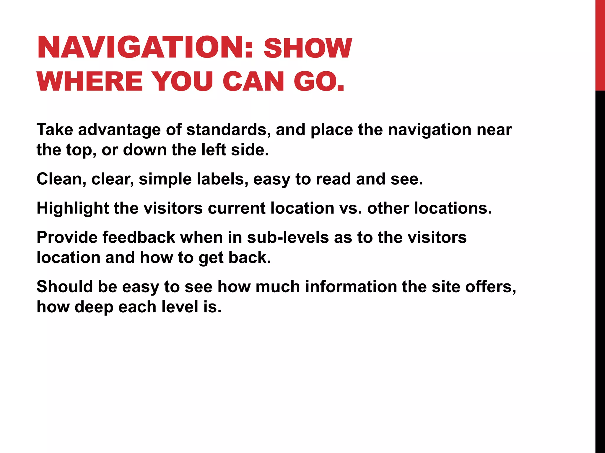
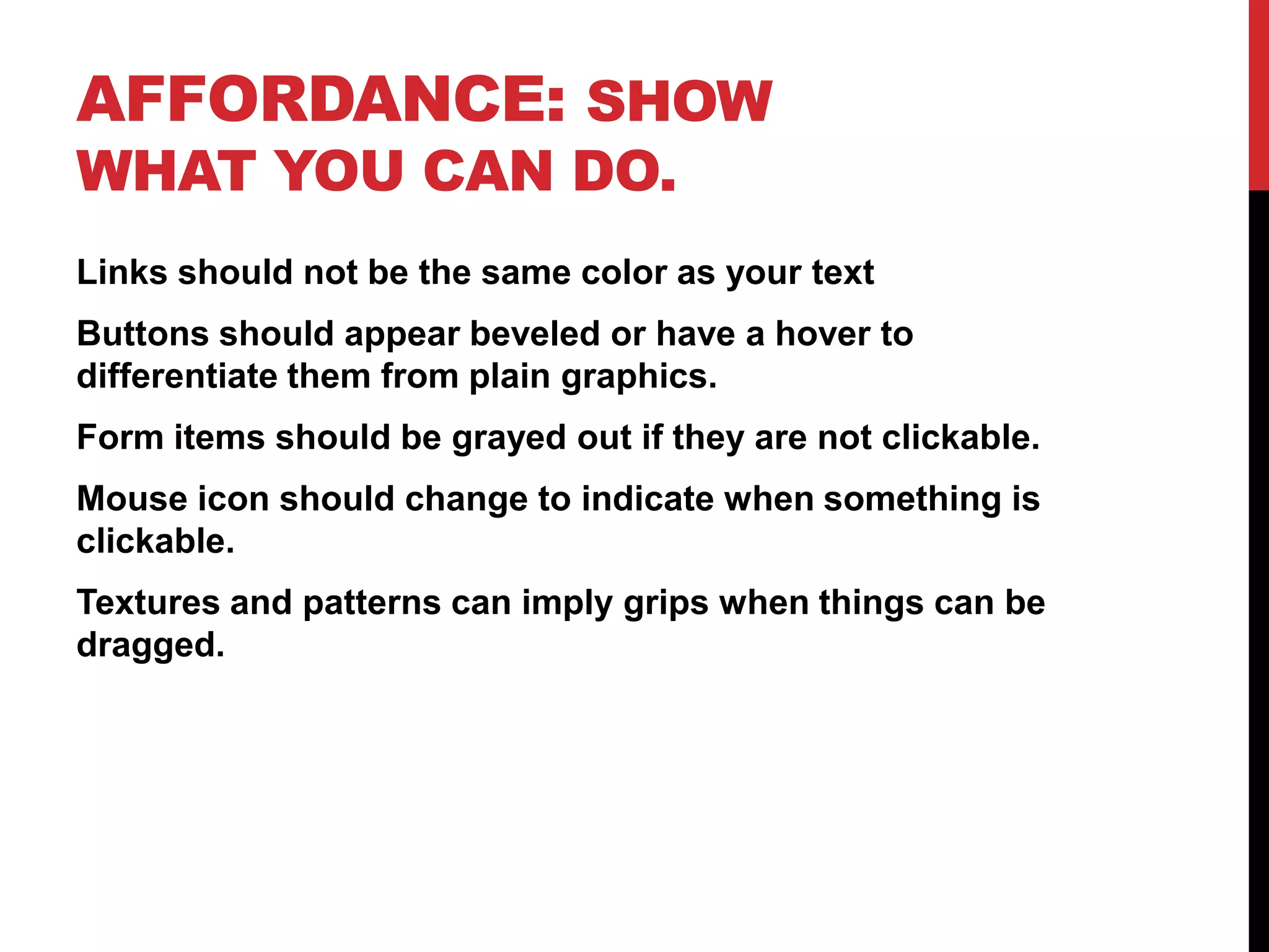
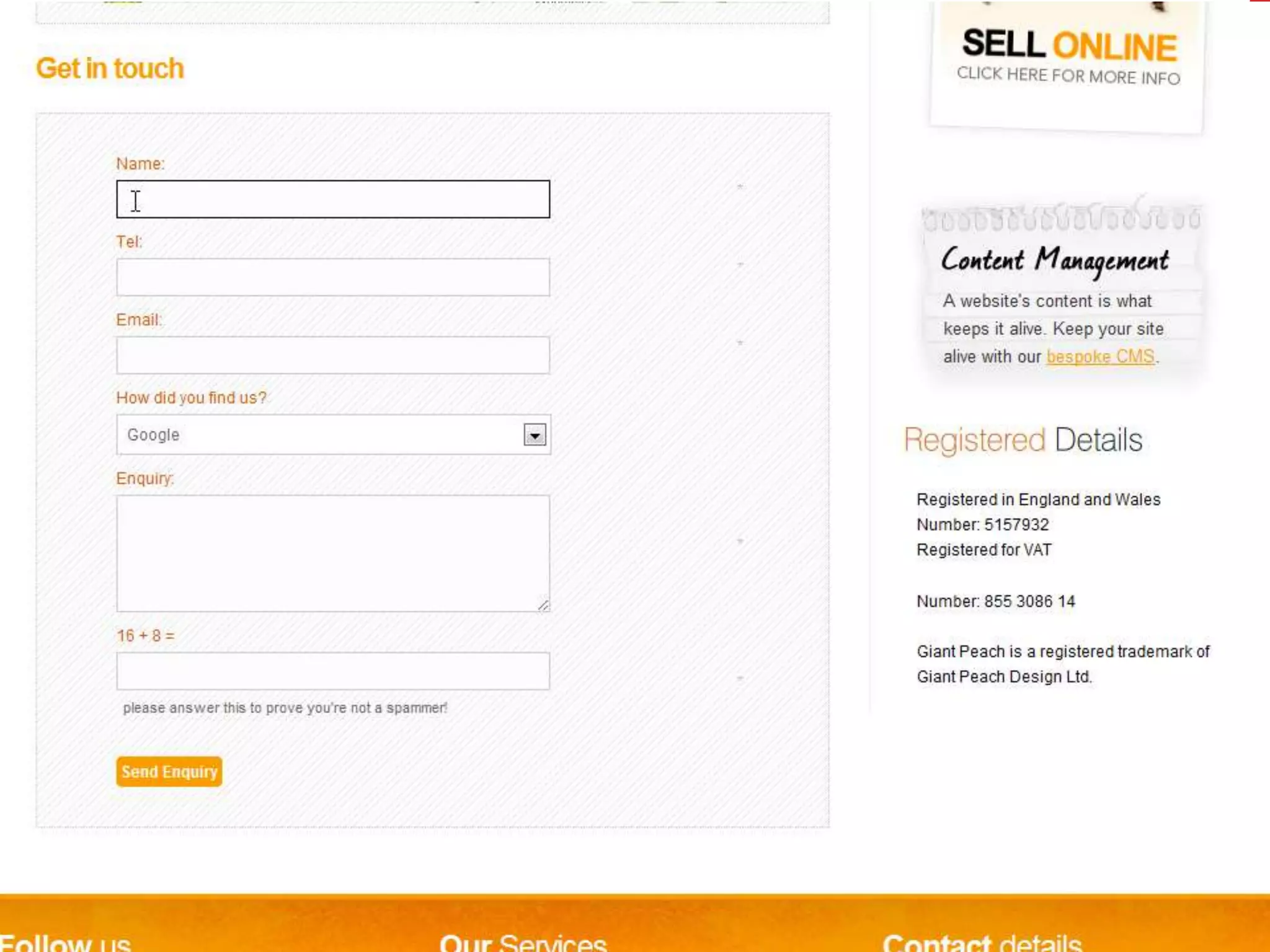
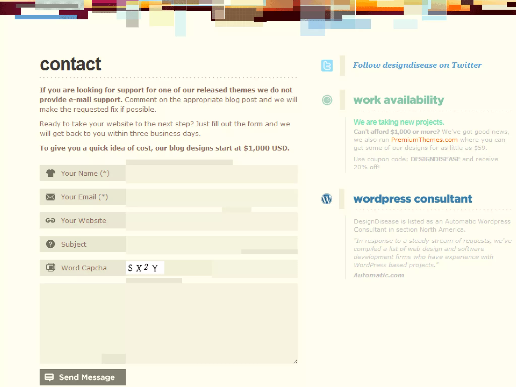
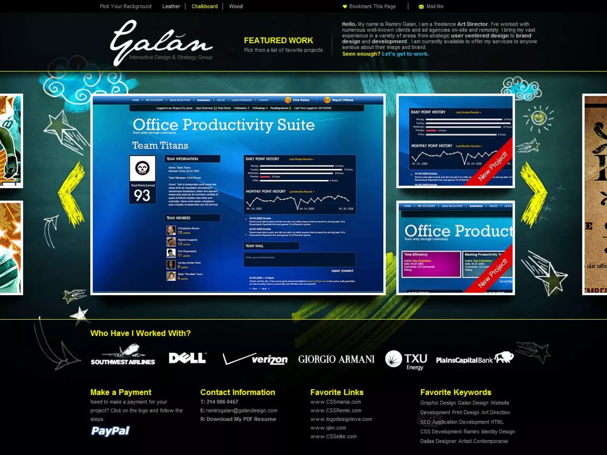
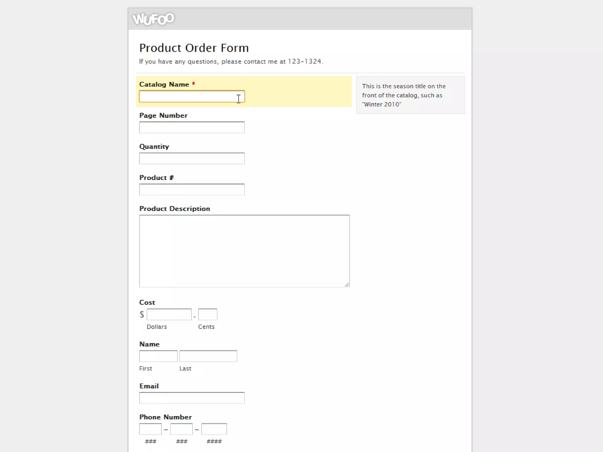
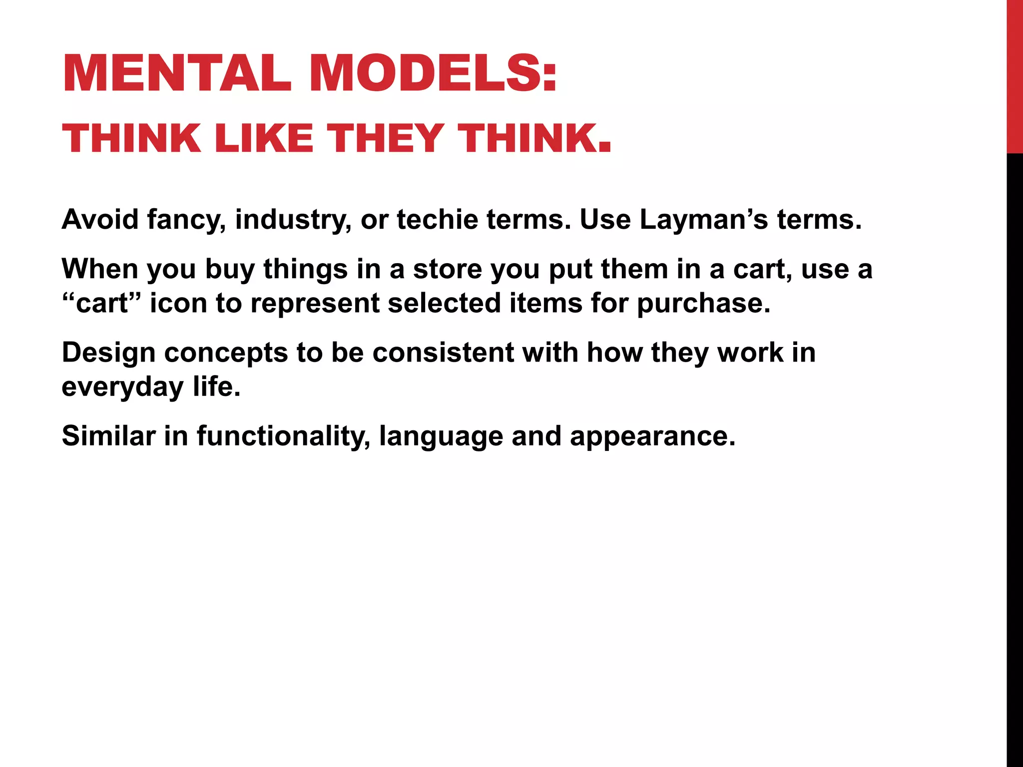
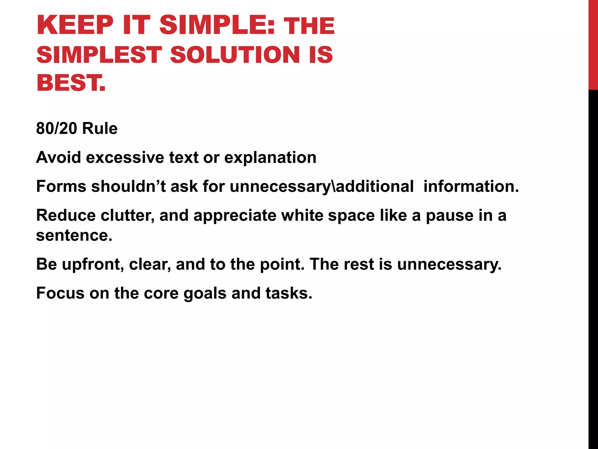
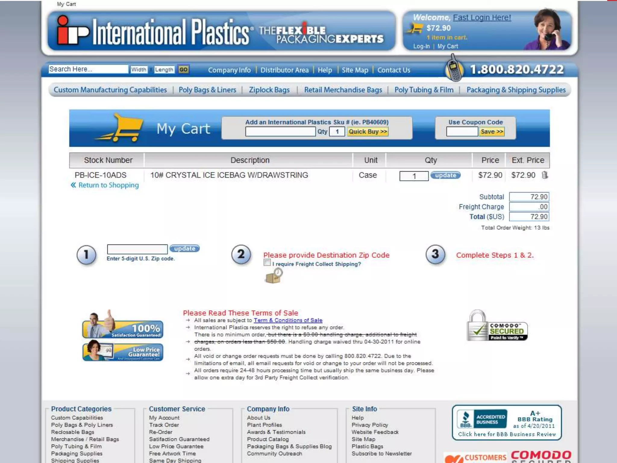
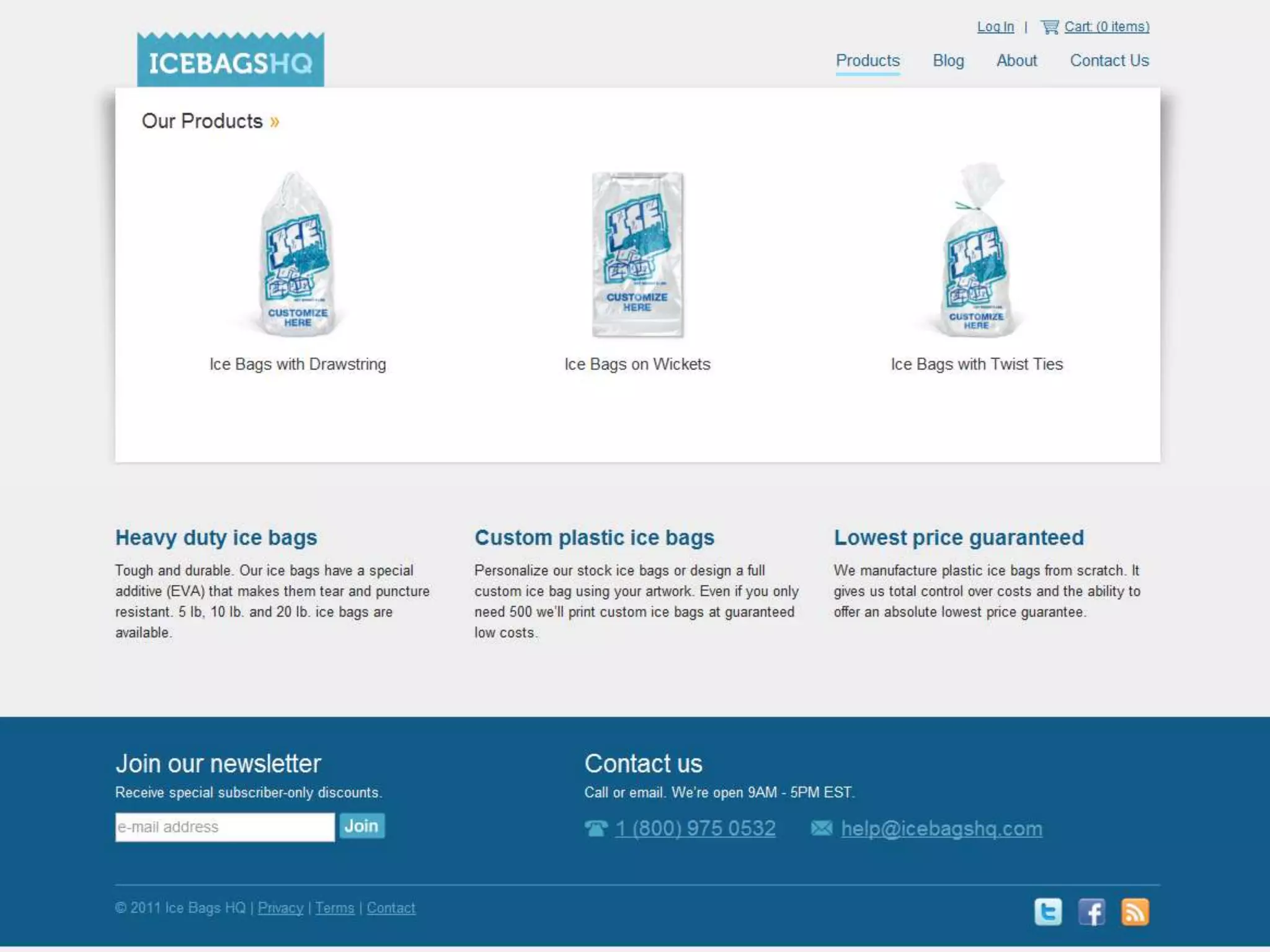
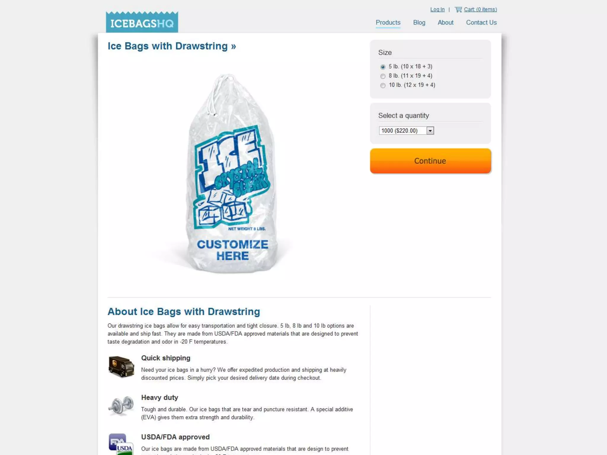
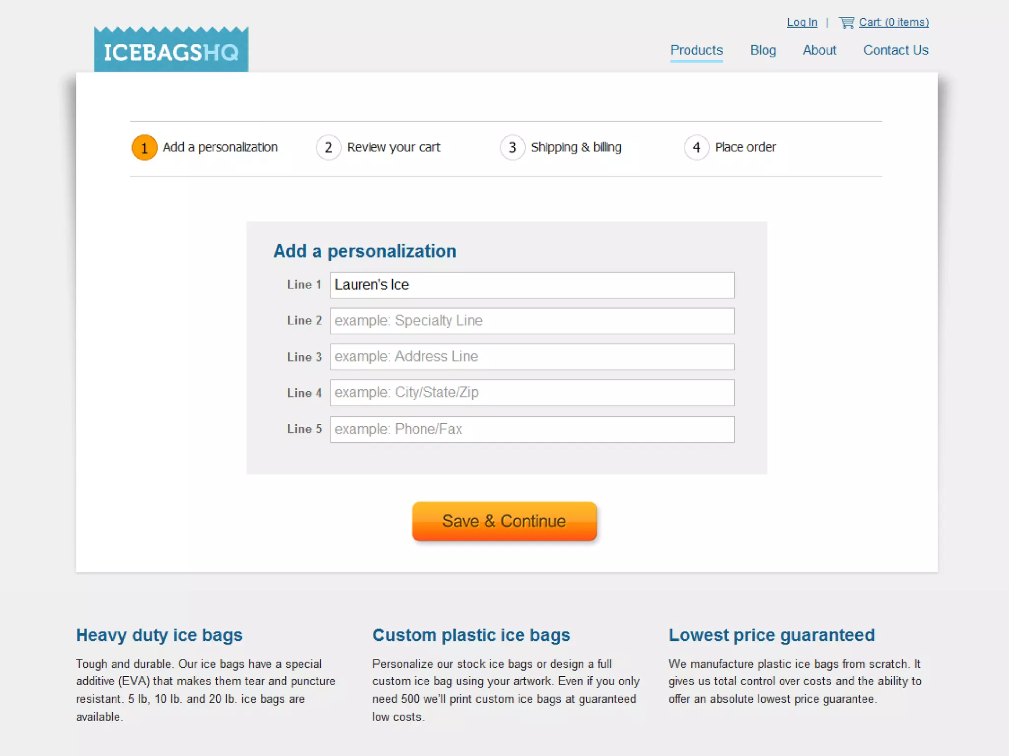
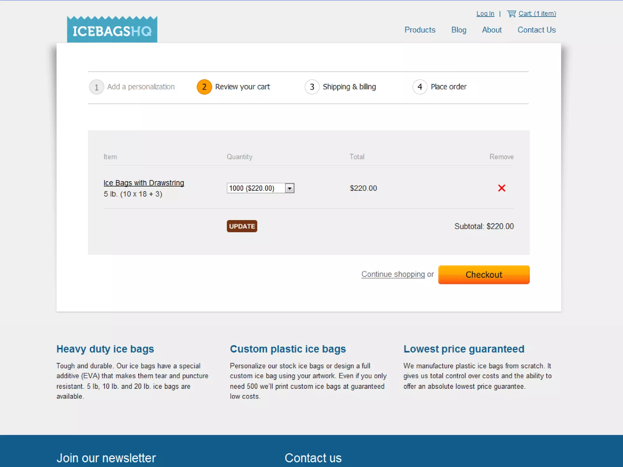
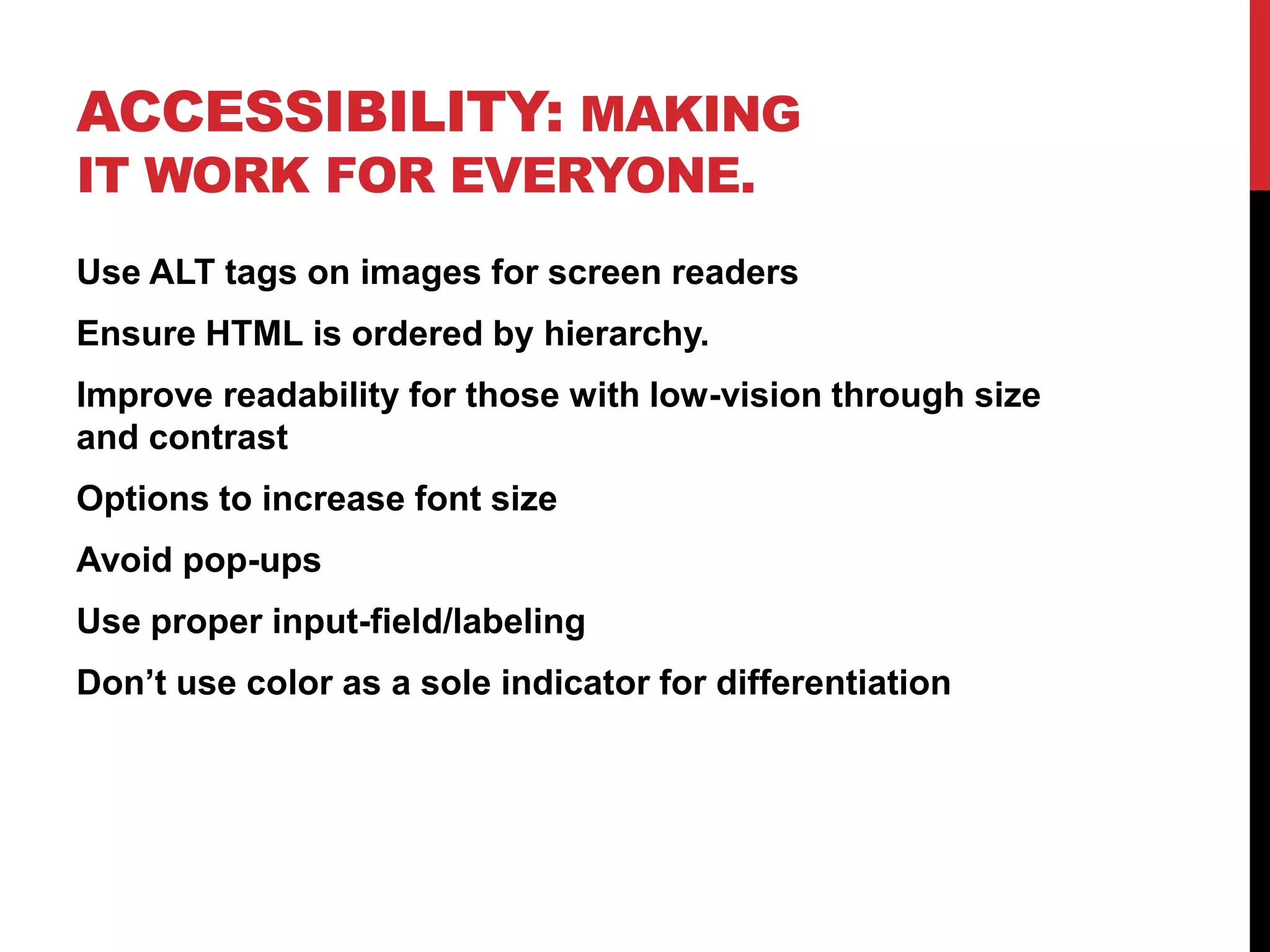
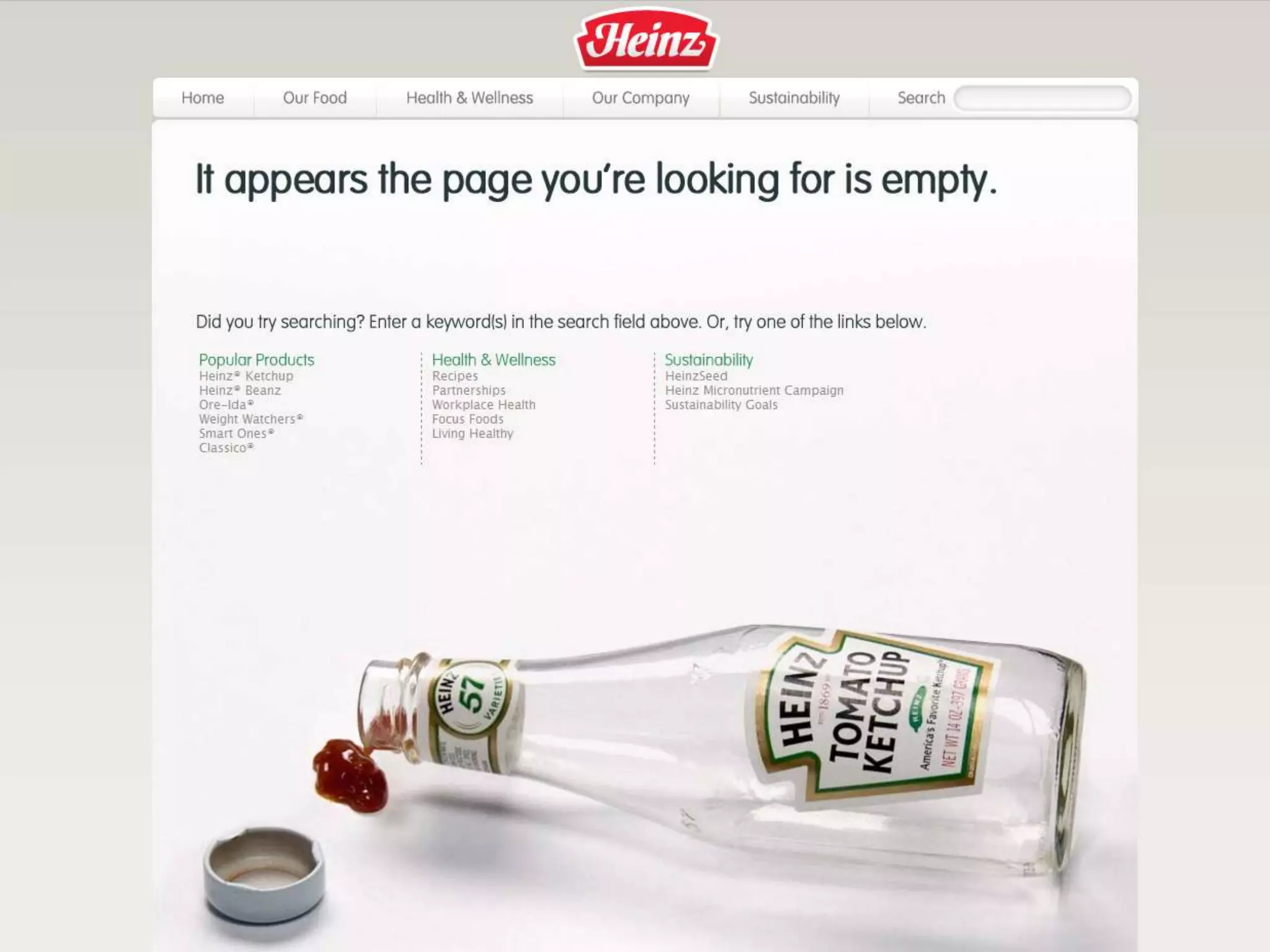
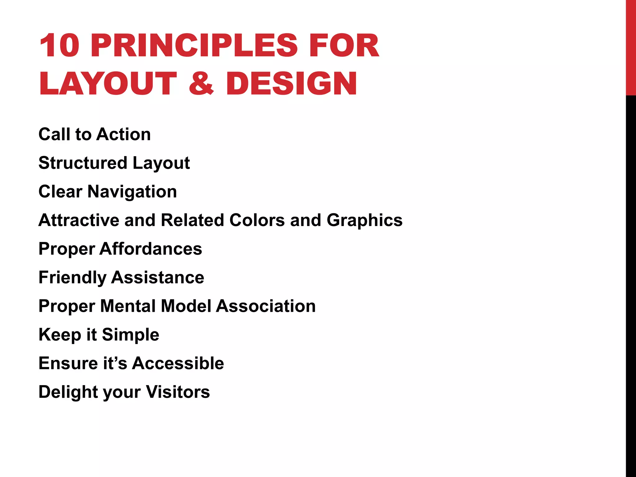
10 Design and Layout Principles Guaranteed to Improve Your WebsiteBy Lauren Martin
Call to Action: Get attention on your website’s goal.Should tie in with the goal of your website. The number one thing you want your visitors to do.Use contrast and size to catch attention.The action text should be clearand obvious.Located near the top of page above the fold.
cc  Thomas Hawk
Layout: Importance based structure and scan-ability.Convey information about what’s important – design your centerpiece.Know how to use a grid and keep your design on a gridLead the user into content there looking for.Improves scan-ability.Use header tags (h1, h2, h3, etc…) appropriately.Provides visual breaks, groups, and chunks.Use alignment, date, subject, etc to create sections.Size and color to convey priority and importance.
cc  Clover_1
cc   birdfarm
cc   trainman74
Navigation: Show where you can go.Take advantage of standards, and place the navigation near the top, or down the left side.Clean, clear, simple labels, easy to read and see.Highlight the visitors current location vs. other locations.Provide feedback when in sub-levels as to the visitors location and how to get back.Should be easy to see how much information the site offers, how deep each level is.
cc   M.Markus
cc   eflon
Color and Graphics: We are attracted to pretty things.Put thought into your graphics. Stick to a color scheme.Avoid overly generic clip art just to add to the page.Every image and graphic should have a specific purpose.Stick to a theme or consistency in appearance. (all sketchy, or all photos etc)Focus on your product or offering.
Affordance: Show what you can do.Links should not be the same color as your textButtons should appear beveled or have a hover to differentiate them from plain graphics.Form items should be grayed out if they are not clickable.Mouse icon should change to indicate when something is clickable.Textures and patterns can imply grips when things can be dragged.
cc   Dave Hoover
Assistance: Don’t leave them hanging.Provide an FAQ or help sectionTry to avoid allowing errors, but when they occur explain:What’s wrongWhat you need from the userHow they need to do itInstructions should be clear, specific and to the point.Provide good defaults and constant feedback.
Mental Models: Think like they think.Avoid fancy, industry, or techie terms. Use Layman’s terms.When you buy things in a store you put them in a cart, use a “cart” icon to represent selected items for purchase.Design concepts to be consistent with how they work in everyday life.Similar in functionality, language and appearance.
cc   Marc Amos
Keep it Simple: The simplest solution is best.80/20 RuleAvoid excessive text or explanationForms shouldn’t ask for unnecessary\additional  information.Reduce clutter, and appreciate white space like a pause in a sentence.Be upfront, clear, and to the point. The rest is unnecessary.Focus on the core goals and tasks.
Accessibility: Making it work for everyone.Use ALT tags on images for screen readersEnsure HTML is ordered by hierarchy.Improve readability for those with low-vision through size and contrastOptions to increase font sizeAvoid pop-upsUse proper input-field/labeling Don’t use color as a sole indicator for differentiation
Delight: Put a smile on my face.Once you have everything else figured out, add a smile.Niceties that are un-expected, a cute line of text, a compliment when a photo is uploaded, etc.Little fun interactions used sparingly.Take the user away from the mundane. Pleasant surprises.
10 Principles for Layout & DesignCall to ActionStructured LayoutClear NavigationAttractive and Related Colors and GraphicsProper AffordancesFriendly AssistanceProper Mental Model AssociationKeep it SimpleEnsure it’s AccessibleDelight your Visitors
Lauren Martinwww.Sitemotif.comTwitter / Slideshare: Lorieluecc   woodleywonderworks

10 Design and Layout Principles Guaranteed to Improve Your Website V2

  • 1.
    10 Design andLayout Principles Guaranteed to Improve Your WebsiteBy Lauren Martin
  • 2.
    Call to Action:Get attention on your website’s goal.Should tie in with the goal of your website. The number one thing you want your visitors to do.Use contrast and size to catch attention.The action text should be clearand obvious.Located near the top of page above the fold.
  • 3.
  • 9.
    Layout: Importance basedstructure and scan-ability.Convey information about what’s important – design your centerpiece.Know how to use a grid and keep your design on a gridLead the user into content there looking for.Improves scan-ability.Use header tags (h1, h2, h3, etc…) appropriately.Provides visual breaks, groups, and chunks.Use alignment, date, subject, etc to create sections.Size and color to convey priority and importance.
  • 10.
  • 11.
    cc birdfarm
  • 12.
    cc trainman74
  • 17.
    Navigation: Show whereyou can go.Take advantage of standards, and place the navigation near the top, or down the left side.Clean, clear, simple labels, easy to read and see.Highlight the visitors current location vs. other locations.Provide feedback when in sub-levels as to the visitors location and how to get back.Should be easy to see how much information the site offers, how deep each level is.
  • 18.
    cc M.Markus
  • 19.
    cc eflon
  • 23.
    Color and Graphics:We are attracted to pretty things.Put thought into your graphics. Stick to a color scheme.Avoid overly generic clip art just to add to the page.Every image and graphic should have a specific purpose.Stick to a theme or consistency in appearance. (all sketchy, or all photos etc)Focus on your product or offering.
  • 28.
    Affordance: Show whatyou can do.Links should not be the same color as your textButtons should appear beveled or have a hover to differentiate them from plain graphics.Form items should be grayed out if they are not clickable.Mouse icon should change to indicate when something is clickable.Textures and patterns can imply grips when things can be dragged.
  • 29.
    cc Dave Hoover
  • 35.
    Assistance: Don’t leavethem hanging.Provide an FAQ or help sectionTry to avoid allowing errors, but when they occur explain:What’s wrongWhat you need from the userHow they need to do itInstructions should be clear, specific and to the point.Provide good defaults and constant feedback.
  • 39.
    Mental Models: Thinklike they think.Avoid fancy, industry, or techie terms. Use Layman’s terms.When you buy things in a store you put them in a cart, use a “cart” icon to represent selected items for purchase.Design concepts to be consistent with how they work in everyday life.Similar in functionality, language and appearance.
  • 40.
    cc Marc Amos
  • 44.
    Keep it Simple:The simplest solution is best.80/20 RuleAvoid excessive text or explanationForms shouldn’t ask for unnecessary\additional information.Reduce clutter, and appreciate white space like a pause in a sentence.Be upfront, clear, and to the point. The rest is unnecessary.Focus on the core goals and tasks.
  • 53.
    Accessibility: Making itwork for everyone.Use ALT tags on images for screen readersEnsure HTML is ordered by hierarchy.Improve readability for those with low-vision through size and contrastOptions to increase font sizeAvoid pop-upsUse proper input-field/labeling Don’t use color as a sole indicator for differentiation
  • 56.
    Delight: Put asmile on my face.Once you have everything else figured out, add a smile.Niceties that are un-expected, a cute line of text, a compliment when a photo is uploaded, etc.Little fun interactions used sparingly.Take the user away from the mundane. Pleasant surprises.
  • 60.
    10 Principles forLayout & DesignCall to ActionStructured LayoutClear NavigationAttractive and Related Colors and GraphicsProper AffordancesFriendly AssistanceProper Mental Model AssociationKeep it SimpleEnsure it’s AccessibleDelight your Visitors
  • 61.
    Lauren Martinwww.Sitemotif.comTwitter /Slideshare: Lorieluecc woodleywonderworks

Editor's Notes

  • #4 What is McDonalds known for?