Download to read offline
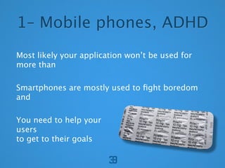

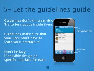
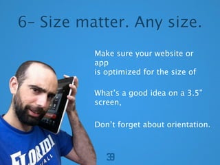
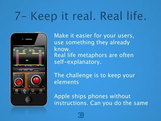
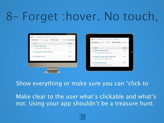

The document provides 8 tips for designing mobile applications and websites. It recommends that designs should be optimized for one-handed use, follow intuitive swipe-based navigation flows, adhere to platform guidelines to provide familiar experiences, be responsive to different screen sizes and orientations, use real-world metaphors that are self-explanatory, and make all interactive elements clearly tappable without requiring hover states. The overall goal is to create intuitive, easy-to-use experiences for mobile that don't require instruction manuals.


![ceramic-art-and-pottery [Autosaved].pptx](https://cdn.slidesharecdn.com/ss_thumbnails/ceramic-art-and-potteryautosaved-260113113456-35c55ddb-thumbnail.jpg?width=640&height=640&fit=bounds)


