SlideShare a Scribd company logo
1 of 34
There is difference in the text
between ''parent'' and ''school''
with the parent text being bigger
its there to draw the attention of
the parent but the school is still
dominant with the bold capital
text, a more formal style.
I feel this photo has been added
in to impress audiences and
specificly the parents. A child
looking smart seen to be working
hard. This makes the parent feel
as though putting there children
into this school was that right
decision.
Another method to impress
parents and the reader, by
making this one of the main
parts of the front page it
immediately reels attention
and the feeling that the
school is economicly green
especially with the green
colour saying ''energy smart
schools.''
By putting the smartly
dressed female teachers in
the background, the parent
will feel the support is there
for the pupil while still being
able to work hard and
independently. Also in todays
society there is a higher ratio
of female teachers and it is
obvious parents feel safer
with female teachers, hence
the gender choice in the
background.
School Magazine
Analysis
This title reads ''kid's
potential at risk'' which
parents might feel is a big
deal especially with the
word ''risk'' it creates a
panic/worry. However they
decide to put empthasis
on how ''green'' their
school is rather than the
kid's being at risk.
I feel this is a great photo as
it gives off impressions of
gender equality and
everyone getting on. They
look happy which again
gives a positive impression
to the reader who is more
than likely going to be a
parent of the child who goes
to the school or one that
might be wanting their child
to join.
Very formal text, also very
bold which makes an
immediate statement. The
choice of font gives off
quite an upper class,
intellectual look.
Great choice of colour
with the background
image, matches the
release date of the
magazine, ''fall 2012,''
autumn is strongly
associated with these
colour schemes.
School Magazine
Analysis
School Magazine -
Draft
Colour Scheme: Blue, Black and
Grey
Programme: GIMP
Image is going to take up the
whole background with the focus
on myself – I have one of me and
another student in the IT suit.
The main headline is going to be
on a open evening for new
students.
The logo is the school logo.
School Magazine -
Final
School Magazine
Contents - Draft
Colour Scheme: Blue and Grey
Programme: GIMP Editing Software
School Magazine
Contents - Final
Music Magazine Influences
NME - Sales Figures
Sales figures (as of 2011) - Figures have
been falling year on year, after being one of
the biggest selling magazines of its genres
when it started its now at an all time low of
just under 30,000. During the 70's it was
Britian's biggest selling magazine.
A report conducted by the Audit Bureau of
Circulations (ABC) showed the magazine's
circulation fell 14.3% compared with the same
time last year.
After a relaunch in 2010 of the cover, logo
and format, sales were expected to increase
however the magazine is now at an all time
low, however still plays a massive role in the
indie genre and the promotion of new music.
A possible explanation for this decline would
be the increase in online use through means
of internet where a lot of music news is
reported and new music released. (YouTube)
Another reason could be the economic
troubles we have been experiencing recently,
there is a lot less disposable income.
Music Magazine Influences
NME – Advertising Types & Rates
Rates as of 2008 for
advertising in the
magazine.
Advertising Online Rates
93% of the NME's readers own a computer while
96% have access to the internet. Therefore benefits
of online advertising include:
- Cheaper
- Speed of response
- Can be edited at any time
Music Magazine Influences
NME – Demographic Profile & Stockists
Its quite apparent NME magazine is aimed at a specific age
group of around 17-30. Although being unisex it is however
dominated with 73% of readers being male. The magazine is
available in most newsagents, major supermarkets such as
Asda, Tesco and Sainsbury's, it is also available online at
nme.co.uk as well as many other leading music sites.
The colourful language and format of the magazine is very
mature hence why I feel the age group is around young adult,
average age is 25, as its old enough to understand the means
for colourful language yet the majority of readers will not be
offended. Bearing this in mind I would say that predominantly
the audience will be of a single marital status however there are
not too many facts to back this point up, just taking magazine
stats into consideration. The audience is too young to be
married but possibly too busy to be in a relationship as this is
mainly aimed towards the generation who are currently in
education, whether it be college or university
NME is definitely a ''working-class'' magazine, in being Britain's
oldest and arguably most successful magazine it has to be
aimed at a majority which is the working class. The price tag of
£2.20 is also very good and affordable which backs this point
up. Also by doing exclusives with artists such as Jake Bugg
(seen left) and the likes of Noel Gallagher, artists who come
from a working class background themselves and therefore
mainly a working class fan base this relates to that specific
audience.
34% of readers are working full time while 18% are part time
and 26% being full time students which backs up my earlier
point of a strong student audience.
Music Magazine Influences
NME – Physcographic info
The National Readerships surveys social grade, which are used in
advertising and market research are used all used by institutions
concerned with audience, therefore I must consider the different
groups which are appropriate to my chosen target audience. These
social grades are largely based on profession and estimated related
income. These 6 Socio-Economic Groups are:
A-Higher managerial, administrative, professional - 3%
B -Intermediate managerial, administrative, professional - 15%
C1-Supervisory, clerical, junior managerial, administrative or
professional - 23%
C2 -Skilled manual workers - 28%
D-Semi-skilled and unskilled manual workers - 18%
E -Casual labourers, pensioners or the unemployed - 13%
Music Magazine Analysis
NME – Front Cover
Probably the most well known member of the
band is in the forefront of the cover while the
others are in the background which could
indicate leads of the band.
All the band on the front have long messy hair
which is a stereotype of the indie music genre
so immediately it is apparent that this issue is
aimed mainly at the indie audience. The facial
expressions are all looking very serious, which
is suggesting a threatening look about them,
they are all looking right into the audience.
The NME logo is nationally known brand
and will be seen as many times as possible,
purposely enforced by the editor. Attention is
always reeled straight into this logo.
NME always use this white and red colour
scheme as they go together very well, the red
especially is very bright and vibrant bringing all
the text straight into the eye of the audience.
Music Magazine Analysis
NME – Contents Page Immediately grabs attention, with it being a
completely different colour scheme to the rest
of the title it draws the reader straight in to
remind you of NME, almost drilling it into you
so you won't forget. A very vibrant red with the
white outline stands out clearly.
A lot of emphasis on the advertising here as
they want audiences to purchase yearly
subscriptions so they can guarantee profit,
hence the offer saving yourself over £45.
Straight away you can tell this is the
main article in that week's issue, it is
the focus of the contents page and
probably what they focused that
specific issue around. Not only do you
get the large photo but also an
introduction, teaser into the article.
Massive band index so they can expand who
they target, with NME they are writing about
more and more genres. It is specifiably indie as
you can see here with the likes of Kasabian
however in an issue a few weeks later the focus
was on grime artist Dizzee Rascal, so this shows
what was earlier mentioned on low sales in
attempts to target a larger audience.
Music Magazine Analysis
NME – Double page spread
Straight away we see the main focus of the double page spread
is the photo of Liam Gallagher, lead vocalist of the band and
one of the biggest artists in the world, its a clever choice of
colour scheme with the black and white as its telling the reader
that Gallagher is old in the music scene and has been there for
many years, portraying his experience in the industry.
We also see him carrying on the 60's - 80's indie mod look with
the long sideburns, straight fringe which is a hairstyle closely
associated with mod culture and in particular Manchester, which
most people are aware he comes from originally. The polo shirt
again is closely associated with this culture, especially with the
brand being fred perry it is an iconic style of the 1980's. The
photo is typical of the Liam Gallagher and in particular
his prime with Oasis, as he influenced a lot of peoples
lives. The black and white old fashioned look creates a
nostalgic feel and supports the ‘mod’ style.This could
suggest that the target audience will be white british as
this is what many of the mod supporters were and how
the subculture originally developed therefore they can
relate to the article as Liam Gallagher is representing
them.
Another point of the image is his facial expression, he is
looking away from the camera taking his focus away
from the audience, giving the enigma that he's not
phased or bothered with the audience, or anyone for that
matter. Liam has always given off that rock stereotype as
though he doesn't really care about anything, will speak
his mind as this photo epitomizes that.
The use of a highlighted pull quote reels audience
attention in so they will read that before the actual
article, then want to read on after. The quote we see
below is very intriguing ''into this other world'' adds
elements of mystery that people want to find out about
Its mainly aimed at the readers who just flick through
rather than always reading the whole thing.
There is also a lot of dead space around the article,
however this is purposely done to add emphasis to the
''Beady Eye'' headline. Again reeling audience attention.
Music Magazine Analysis
Woofah – Front Cover
Woofah is a music magazine based on the Reggae, Grime and
Dubstep genre. It is one of only few in those specific genres and is
only based within the UK. Although a pretty basic front cover it is very
clever, as you can see there is a strapline underneath the title
displaying the genres earlier mentioned, the reason for this is that
these genres have a niche audience, it is not mainstream and people
rely on the likes of Grime and Dubstep information through means of
social media, blogs and word of mouth rather than magazines, TV,
radio etc like other genres.
The background image is also very clever, the character is looking
straight into the camera with wide pupils as though we're seeing
double of him. The dubstep genre in particular has a strong
association with drug use and especially MDMA, this may well be a
reference to this.
It is a simplistic approach as far as magazine covers go, there Is an
immediate headline of ''UNTOLD'' which audiences will be interested
in as though its never been spoken before. The texts down the
bottom are also simple just a list of artists and tracks. However this
simple approach is so effective and it leaves a lot of dead space so
the reader can focus mainly on the image which takes up most of the
cover, its a very trippy picture.
Music Magazine Analysis
Woofah – Contents Page
Woofah isn't a very big or known magazine at all
as it looks at underground music with a smaller
audience to the mainstream genres. It's very
hard to find any details online compared to the
likes of ''Q'' and ''Kerrang'' as its not advertised
well or brought out as often as the others,
therefore I've had to take this image myself of the
contents page.
The whole magazine takes a very formal
approach and the contents page underlies the
message from the cover, loads of dead space
with emphasis on the title. Its been proven that
white space signifies space for more creativity as
well as drawing immediate attention and focus.
Also studies suggest there is normally a positive
attitude towards white space as creates a clean
and relaxing visual effect, exactly what Woofah
do here.
I feel with Woofah its all about whether you want
to read on or not, not trying all they can to reel
you in. As you can see with the major magazines
they're always wanting more and more but with a
magazine with such a niche audience and only
being stocked in a few places its all about just
buying it out of pure admiration of those specific
genres.
Music Magazine Analysis
Woofah – Double Page Spread
This a double page spread of Woofah magazine;
there is no kicker on this double page spread
instead the left hand side is dominated by this
picture of the artist Tony Thorpe, the image itself is a
close up of Tony’s face, he has been placed on the
third which leaves a lot of negative space. In this
picture Tony also has direct address to the audience.
Tony’s mise en scene in this image is quite
conventional ; his glasses are the only thing that
really stands out. The negative space behind tony
reveals this danger of electricution sign, which
connotes this sense of uknowning to the audience
as you dont really know why he is glaring
menacingly at the camera.
.
As you look down the page you see the title ‘Mood Swings’, the kerning on this title is quite compacted this is done by pushing
together the first 3 letters of the word ‘swing’ together and leaving a gap between the last 3 letters, which in turn brings the readers
attention closer to the artists face. The title also relates to the picture of Tony, because Tony’s menacing look at the camera can be
interpreted as him having a ‘Mood Swing’, which may make the audience want to know why.
The stanfirst of text towards the bottom of the page is very close to the footer, which goes against conventions of normal
magazines, in addition to this there is no kicker, which goes against conventions once again. On the right side of the double page
spread is the main body of text, which has been written in this san serif font. The alley spacing between each column on the right
hand side is quite structured, with even spacing between each paragraph of text; overall this connotes a sense of continuity. The
house style for the whole magazine is black and white, whereas the Mixmag magazine I analysed has full colour. The publication of
this magazine in black and white shows that the publishing company Woofah may not have the money to publish in full colour
whereas Mixmag has the funding to do so
Music Magazine Analysis
Logo - Research
The logo is very simple yet effective,
block, bold capitals to draw attention to
the logo while the simplistic approach
makes it easily memorable. Its very
clever in the letters used ''NME''
ryhmes as if to sound like an acronum
of enemy, there are connotations of an
anti press. With this method it shortens
the title so its easy to fit onto the
magazine as many times as
appropriate.
This is the logo for ''Q'' magazine which is very popular worldwide
and looks into all genres of music. The logo as you can see his
again is simple, which is key to it remembered by the reader. Also
a simple design so I feel that simplicity has to be key with my logo.
Q has also become so iconic as a magazine that they can cover
most of the logo and people still recognise it easily, which they do
a lot of their covers so they can make the picture the main focus.
Music Magazine Analysis
Photos - Research
For photos Woofah magazine will be my main influence, as
previously mentioned it was one of only few that specialise in
areas such as Dubstep and Grime. The magazine relates to me
the most and I feel the photos they use fit the genre perfectly and I
will be looking to do similar things, it will require lots of editing and
effort but if they come out as well as some of the ones in Woofah
then I will be very happy. The effects use look very good and there
are a lot of photos associated with rave culture which I am also
interested to follow
Music Magazine Analysis
Final photos
I've edited a lot of my
photos to a similar look
to this one. You can see
the decks and lighting
links well into the
dubstep genre and this
all are associated with
dance culture.
Music Magazine Analysis
Logo - Draft
These are the designs
I have narrowed it
down to.
Music Magazine Analysis
Double page spread - Draft
Here is my basic design for
my double page spread which
will be an interview with a
dubstep artist.
I will be the main focus of the
double page spread and the
text will be wrapped around
the sides and bottom, around
myself.
The text will be white on a
dark background and edited
using GIMP.
Music Magazine Analysis
Double page spread - Final
Music Magazine Analysis
Contents Page - Draft
Pretty simple design for my contents
page, I looked at Woofah's design to
categorize mine. The main event of
the magazine, the double page
spread is highlighted in bold with the
rest of the magazine having a small
introduction into each article.
I have taken my own style in some
ways though by deciding to back out
the contents page with information
rather than lots of dead space. It will
be black writing on a plain white
background.
Music Magazine
Contents Page - Final
Music Magazine
Front Cover - Draft
Music Magazine
Front Cover - Final
In what ways does your media product use, develop or challenge forms and conventions of real mediaIn what ways does your media product use, develop or challenge forms and conventions of real media
products? ·products? ·
How does your media product represent particular social groups?How does your media product represent particular social groups?
What kind of media institution might distribute your media product and why?What kind of media institution might distribute your media product and why?
Who would be the audience for your media product? ·Who would be the audience for your media product? ·
How did you attract/address your audience?How did you attract/address your audience?
What have you learnt about technologies from the process of constructing this product?What have you learnt about technologies from the process of constructing this product?
Looking back at your preliminary task, what do you feel you have learnt in the progression from it to theLooking back at your preliminary task, what do you feel you have learnt in the progression from it to the
full product?full product?
Music Magazine
Audience survey
This first bit of the title gives off a mysterious feel and
the font is very indifferent. The bold 'TRAUMAX'
underneath suggests power and authority as its also in
massive writing,this immediately shows who the article
is about with the headline above showing what it is
about him.
I went for the white font as it is the most easily
visible and looks really good on the dark
background as it establishes focus on the text
aswell as the image still regaining focus in the
middle where there is no text. The white
matches the background really well.
The background as said before establishes
focus as the main part of the spread, the
first thing you look at so it needs to be a
very effective image which I feel it is. It
mainly focuses on the group I am with, the 4
boys in the middle while still being visible of
whats going on behind us.
My magazine states at the start that
all photographs and editing of the
magazine was done by myself so
there was no need for a byline.
Music Magazine
Analysing the DPS
The photo represent the monsters crew
mentioned in the article. This particular photo
offers great variety to the others as it shows
long shot which represents me and my 'crew'
together and what we do in our leisure time. It
also represents my target audience and it
shows teenagers in the picture and possible
others who do this sport.
Here you can just about see myself down the
front. Its a natural over the shoulder shot which is
representing the artist as he is the foreground of
the photo with the edited glowstick adding effect.
A good medium long shot photo of me
representing the inspector dubplate company
which fits my genre of magazine perfectly
therefore a good choice. Again this photo shows
what age group our magazine is aimed at with
teenager being in the foreground
Music Magazine
Evalution – Who am I representing?
The structure of my contents page is plain white with
text introducing the topics that will be discussed in my
magazine.
Its a black and white theme however I decided to use
the blue of 'Traumax' so it stands out to the reader
straight away as he is the focus of my magazine and
in the main article (Double Page Spread.) This links
to the front cover that was mainly an all blue theme.
I wouldn't say any contents pages of
other magazines influenced however I
looked at magazines such as NME and
choose to go for a more basic design
thats easy to understand and gets the
points across easily.
Here on the left we see the NME
contents which provides a list of sub-
headings which helps the reader
navigate around the magazine and find
the information they're most interested
in faster which I've done similarly to at
the bottom while focusing on two main
articles again similar to that of the NME
contents which provides one main
article.
Music Magazine
Evalution – Contents Page
This reels in audiences as it shows this
is a good magazine as its been voted
number 1 for its genre.
The shadow effect I feel is very
creative and fits the colour scheme
really well with the blue and white on
the jumper.
I think if I got the opportunity I got
change this font to one to match the
title or 'Traumax' more.
This image I feel is a perfect fit for the
dubstep genre as you have myself, DJ-
ing as a dubstep artist would do.
Music Magazine
Evalution – Front Cover Analysis

More Related Content

What's hot (14)

Liaar analysis
Liaar analysisLiaar analysis
Liaar analysis
 
Ollie long unit 30 lo1
Ollie long unit 30   lo1Ollie long unit 30   lo1
Ollie long unit 30 lo1
 
Unit 13_
Unit 13_Unit 13_
Unit 13_
 
Preliminary task and planning & research
Preliminary task and planning & research  Preliminary task and planning & research
Preliminary task and planning & research
 
Lucy phillips mock exam question
Lucy phillips   mock exam questionLucy phillips   mock exam question
Lucy phillips mock exam question
 
Unit 13 (LO1) – Understand existing print-based media products and how they a...
Unit 13 (LO1) – Understand existing print-based media products and how they a...Unit 13 (LO1) – Understand existing print-based media products and how they a...
Unit 13 (LO1) – Understand existing print-based media products and how they a...
 
Media evaluation
Media evaluationMedia evaluation
Media evaluation
 
Media evaluation
Media evaluationMedia evaluation
Media evaluation
 
Unit 13 L01
Unit 13  L01Unit 13  L01
Unit 13 L01
 
Media Evaluation
Media EvaluationMedia Evaluation
Media Evaluation
 
Unit 1
Unit 1Unit 1
Unit 1
 
Evaluation draft answers
Evaluation draft answersEvaluation draft answers
Evaluation draft answers
 
Tommy Crossley Unit 13
Tommy Crossley Unit 13Tommy Crossley Unit 13
Tommy Crossley Unit 13
 
Primary research
Primary research Primary research
Primary research
 

Similar to AS Media Blog (20)

Unit 13 - Lo2
Unit 13 - Lo2Unit 13 - Lo2
Unit 13 - Lo2
 
Magazine Assignment Final
Magazine Assignment FinalMagazine Assignment Final
Magazine Assignment Final
 
Evaluation
EvaluationEvaluation
Evaluation
 
Media Evaluation
Media EvaluationMedia Evaluation
Media Evaluation
 
Magazine evaluation
Magazine evaluationMagazine evaluation
Magazine evaluation
 
Evaluation powerpoint final3
Evaluation powerpoint final3Evaluation powerpoint final3
Evaluation powerpoint final3
 
The evaluation (1)
The evaluation (1)The evaluation (1)
The evaluation (1)
 
The evaluation
The evaluationThe evaluation
The evaluation
 
Evaluation question 2(word)
Evaluation question 2(word)Evaluation question 2(word)
Evaluation question 2(word)
 
Results draft
Results draftResults draft
Results draft
 
Unit 13 media final version
Unit 13  media final versionUnit 13  media final version
Unit 13 media final version
 
Evaluation
EvaluationEvaluation
Evaluation
 
I have finished media buzzing
I have finished media buzzingI have finished media buzzing
I have finished media buzzing
 
Written evaluation
Written evaluationWritten evaluation
Written evaluation
 
Magazine Research
Magazine ResearchMagazine Research
Magazine Research
 
Media publisher evaluation - Alanah Wright
Media publisher evaluation - Alanah Wright Media publisher evaluation - Alanah Wright
Media publisher evaluation - Alanah Wright
 
Jessica Media Powerpoint
Jessica Media PowerpointJessica Media Powerpoint
Jessica Media Powerpoint
 
Evaluation question 2
Evaluation question 2Evaluation question 2
Evaluation question 2
 
Research and planning
Research and planningResearch and planning
Research and planning
 
Evaluation Of Music Mag!!
Evaluation Of Music Mag!!Evaluation Of Music Mag!!
Evaluation Of Music Mag!!
 

Recently uploaded

Activity 01 - Artificial Culture (1).pdf
Activity 01 - Artificial Culture (1).pdfActivity 01 - Artificial Culture (1).pdf
Activity 01 - Artificial Culture (1).pdf
ciinovamais
 
Russian Escort Service in Delhi 11k Hotel Foreigner Russian Call Girls in Delhi
Russian Escort Service in Delhi 11k Hotel Foreigner Russian Call Girls in DelhiRussian Escort Service in Delhi 11k Hotel Foreigner Russian Call Girls in Delhi
Russian Escort Service in Delhi 11k Hotel Foreigner Russian Call Girls in Delhi
kauryashika82
 
Gardella_Mateo_IntellectualProperty.pdf.
Gardella_Mateo_IntellectualProperty.pdf.Gardella_Mateo_IntellectualProperty.pdf.
Gardella_Mateo_IntellectualProperty.pdf.
MateoGardella
 
An Overview of Mutual Funds Bcom Project.pdf
An Overview of Mutual Funds Bcom Project.pdfAn Overview of Mutual Funds Bcom Project.pdf
An Overview of Mutual Funds Bcom Project.pdf
SanaAli374401
 

Recently uploaded (20)

Holdier Curriculum Vitae (April 2024).pdf
Holdier Curriculum Vitae (April 2024).pdfHoldier Curriculum Vitae (April 2024).pdf
Holdier Curriculum Vitae (April 2024).pdf
 
Código Creativo y Arte de Software | Unidad 1
Código Creativo y Arte de Software | Unidad 1Código Creativo y Arte de Software | Unidad 1
Código Creativo y Arte de Software | Unidad 1
 
Activity 01 - Artificial Culture (1).pdf
Activity 01 - Artificial Culture (1).pdfActivity 01 - Artificial Culture (1).pdf
Activity 01 - Artificial Culture (1).pdf
 
This PowerPoint helps students to consider the concept of infinity.
This PowerPoint helps students to consider the concept of infinity.This PowerPoint helps students to consider the concept of infinity.
This PowerPoint helps students to consider the concept of infinity.
 
Introduction to Nonprofit Accounting: The Basics
Introduction to Nonprofit Accounting: The BasicsIntroduction to Nonprofit Accounting: The Basics
Introduction to Nonprofit Accounting: The Basics
 
Ecological Succession. ( ECOSYSTEM, B. Pharmacy, 1st Year, Sem-II, Environmen...
Ecological Succession. ( ECOSYSTEM, B. Pharmacy, 1st Year, Sem-II, Environmen...Ecological Succession. ( ECOSYSTEM, B. Pharmacy, 1st Year, Sem-II, Environmen...
Ecological Succession. ( ECOSYSTEM, B. Pharmacy, 1st Year, Sem-II, Environmen...
 
Presentation by Andreas Schleicher Tackling the School Absenteeism Crisis 30 ...
Presentation by Andreas Schleicher Tackling the School Absenteeism Crisis 30 ...Presentation by Andreas Schleicher Tackling the School Absenteeism Crisis 30 ...
Presentation by Andreas Schleicher Tackling the School Absenteeism Crisis 30 ...
 
Russian Escort Service in Delhi 11k Hotel Foreigner Russian Call Girls in Delhi
Russian Escort Service in Delhi 11k Hotel Foreigner Russian Call Girls in DelhiRussian Escort Service in Delhi 11k Hotel Foreigner Russian Call Girls in Delhi
Russian Escort Service in Delhi 11k Hotel Foreigner Russian Call Girls in Delhi
 
Paris 2024 Olympic Geographies - an activity
Paris 2024 Olympic Geographies - an activityParis 2024 Olympic Geographies - an activity
Paris 2024 Olympic Geographies - an activity
 
Mixin Classes in Odoo 17 How to Extend Models Using Mixin Classes
Mixin Classes in Odoo 17  How to Extend Models Using Mixin ClassesMixin Classes in Odoo 17  How to Extend Models Using Mixin Classes
Mixin Classes in Odoo 17 How to Extend Models Using Mixin Classes
 
Basic Civil Engineering first year Notes- Chapter 4 Building.pptx
Basic Civil Engineering first year Notes- Chapter 4 Building.pptxBasic Civil Engineering first year Notes- Chapter 4 Building.pptx
Basic Civil Engineering first year Notes- Chapter 4 Building.pptx
 
Gardella_Mateo_IntellectualProperty.pdf.
Gardella_Mateo_IntellectualProperty.pdf.Gardella_Mateo_IntellectualProperty.pdf.
Gardella_Mateo_IntellectualProperty.pdf.
 
An Overview of Mutual Funds Bcom Project.pdf
An Overview of Mutual Funds Bcom Project.pdfAn Overview of Mutual Funds Bcom Project.pdf
An Overview of Mutual Funds Bcom Project.pdf
 
Unit-IV- Pharma. Marketing Channels.pptx
Unit-IV- Pharma. Marketing Channels.pptxUnit-IV- Pharma. Marketing Channels.pptx
Unit-IV- Pharma. Marketing Channels.pptx
 
SECOND SEMESTER TOPIC COVERAGE SY 2023-2024 Trends, Networks, and Critical Th...
SECOND SEMESTER TOPIC COVERAGE SY 2023-2024 Trends, Networks, and Critical Th...SECOND SEMESTER TOPIC COVERAGE SY 2023-2024 Trends, Networks, and Critical Th...
SECOND SEMESTER TOPIC COVERAGE SY 2023-2024 Trends, Networks, and Critical Th...
 
Mattingly "AI & Prompt Design: The Basics of Prompt Design"
Mattingly "AI & Prompt Design: The Basics of Prompt Design"Mattingly "AI & Prompt Design: The Basics of Prompt Design"
Mattingly "AI & Prompt Design: The Basics of Prompt Design"
 
Unit-IV; Professional Sales Representative (PSR).pptx
Unit-IV; Professional Sales Representative (PSR).pptxUnit-IV; Professional Sales Representative (PSR).pptx
Unit-IV; Professional Sales Representative (PSR).pptx
 
Advance Mobile Application Development class 07
Advance Mobile Application Development class 07Advance Mobile Application Development class 07
Advance Mobile Application Development class 07
 
Class 11th Physics NEET formula sheet pdf
Class 11th Physics NEET formula sheet pdfClass 11th Physics NEET formula sheet pdf
Class 11th Physics NEET formula sheet pdf
 
Measures of Dispersion and Variability: Range, QD, AD and SD
Measures of Dispersion and Variability: Range, QD, AD and SDMeasures of Dispersion and Variability: Range, QD, AD and SD
Measures of Dispersion and Variability: Range, QD, AD and SD
 

AS Media Blog

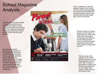
  • 1. There is difference in the text between ''parent'' and ''school'' with the parent text being bigger its there to draw the attention of the parent but the school is still dominant with the bold capital text, a more formal style. I feel this photo has been added in to impress audiences and specificly the parents. A child looking smart seen to be working hard. This makes the parent feel as though putting there children into this school was that right decision. Another method to impress parents and the reader, by making this one of the main parts of the front page it immediately reels attention and the feeling that the school is economicly green especially with the green colour saying ''energy smart schools.'' By putting the smartly dressed female teachers in the background, the parent will feel the support is there for the pupil while still being able to work hard and independently. Also in todays society there is a higher ratio of female teachers and it is obvious parents feel safer with female teachers, hence the gender choice in the background. School Magazine Analysis This title reads ''kid's potential at risk'' which parents might feel is a big deal especially with the word ''risk'' it creates a panic/worry. However they decide to put empthasis on how ''green'' their school is rather than the kid's being at risk.
  • 2. I feel this is a great photo as it gives off impressions of gender equality and everyone getting on. They look happy which again gives a positive impression to the reader who is more than likely going to be a parent of the child who goes to the school or one that might be wanting their child to join. Very formal text, also very bold which makes an immediate statement. The choice of font gives off quite an upper class, intellectual look. Great choice of colour with the background image, matches the release date of the magazine, ''fall 2012,'' autumn is strongly associated with these colour schemes. School Magazine Analysis
  • 3. School Magazine - Draft Colour Scheme: Blue, Black and Grey Programme: GIMP Image is going to take up the whole background with the focus on myself – I have one of me and another student in the IT suit. The main headline is going to be on a open evening for new students. The logo is the school logo.
  • 5. School Magazine Contents - Draft Colour Scheme: Blue and Grey Programme: GIMP Editing Software
  • 7. Music Magazine Influences NME - Sales Figures Sales figures (as of 2011) - Figures have been falling year on year, after being one of the biggest selling magazines of its genres when it started its now at an all time low of just under 30,000. During the 70's it was Britian's biggest selling magazine. A report conducted by the Audit Bureau of Circulations (ABC) showed the magazine's circulation fell 14.3% compared with the same time last year. After a relaunch in 2010 of the cover, logo and format, sales were expected to increase however the magazine is now at an all time low, however still plays a massive role in the indie genre and the promotion of new music. A possible explanation for this decline would be the increase in online use through means of internet where a lot of music news is reported and new music released. (YouTube) Another reason could be the economic troubles we have been experiencing recently, there is a lot less disposable income.
  • 8. Music Magazine Influences NME – Advertising Types & Rates Rates as of 2008 for advertising in the magazine. Advertising Online Rates 93% of the NME's readers own a computer while 96% have access to the internet. Therefore benefits of online advertising include: - Cheaper - Speed of response - Can be edited at any time
  • 9. Music Magazine Influences NME – Demographic Profile & Stockists Its quite apparent NME magazine is aimed at a specific age group of around 17-30. Although being unisex it is however dominated with 73% of readers being male. The magazine is available in most newsagents, major supermarkets such as Asda, Tesco and Sainsbury's, it is also available online at nme.co.uk as well as many other leading music sites. The colourful language and format of the magazine is very mature hence why I feel the age group is around young adult, average age is 25, as its old enough to understand the means for colourful language yet the majority of readers will not be offended. Bearing this in mind I would say that predominantly the audience will be of a single marital status however there are not too many facts to back this point up, just taking magazine stats into consideration. The audience is too young to be married but possibly too busy to be in a relationship as this is mainly aimed towards the generation who are currently in education, whether it be college or university NME is definitely a ''working-class'' magazine, in being Britain's oldest and arguably most successful magazine it has to be aimed at a majority which is the working class. The price tag of £2.20 is also very good and affordable which backs this point up. Also by doing exclusives with artists such as Jake Bugg (seen left) and the likes of Noel Gallagher, artists who come from a working class background themselves and therefore mainly a working class fan base this relates to that specific audience. 34% of readers are working full time while 18% are part time and 26% being full time students which backs up my earlier point of a strong student audience.
  • 10. Music Magazine Influences NME – Physcographic info The National Readerships surveys social grade, which are used in advertising and market research are used all used by institutions concerned with audience, therefore I must consider the different groups which are appropriate to my chosen target audience. These social grades are largely based on profession and estimated related income. These 6 Socio-Economic Groups are: A-Higher managerial, administrative, professional - 3% B -Intermediate managerial, administrative, professional - 15% C1-Supervisory, clerical, junior managerial, administrative or professional - 23% C2 -Skilled manual workers - 28% D-Semi-skilled and unskilled manual workers - 18% E -Casual labourers, pensioners or the unemployed - 13%
  • 11. Music Magazine Analysis NME – Front Cover Probably the most well known member of the band is in the forefront of the cover while the others are in the background which could indicate leads of the band. All the band on the front have long messy hair which is a stereotype of the indie music genre so immediately it is apparent that this issue is aimed mainly at the indie audience. The facial expressions are all looking very serious, which is suggesting a threatening look about them, they are all looking right into the audience. The NME logo is nationally known brand and will be seen as many times as possible, purposely enforced by the editor. Attention is always reeled straight into this logo. NME always use this white and red colour scheme as they go together very well, the red especially is very bright and vibrant bringing all the text straight into the eye of the audience.
  • 12. Music Magazine Analysis NME – Contents Page Immediately grabs attention, with it being a completely different colour scheme to the rest of the title it draws the reader straight in to remind you of NME, almost drilling it into you so you won't forget. A very vibrant red with the white outline stands out clearly. A lot of emphasis on the advertising here as they want audiences to purchase yearly subscriptions so they can guarantee profit, hence the offer saving yourself over £45. Straight away you can tell this is the main article in that week's issue, it is the focus of the contents page and probably what they focused that specific issue around. Not only do you get the large photo but also an introduction, teaser into the article. Massive band index so they can expand who they target, with NME they are writing about more and more genres. It is specifiably indie as you can see here with the likes of Kasabian however in an issue a few weeks later the focus was on grime artist Dizzee Rascal, so this shows what was earlier mentioned on low sales in attempts to target a larger audience.
  • 13. Music Magazine Analysis NME – Double page spread Straight away we see the main focus of the double page spread is the photo of Liam Gallagher, lead vocalist of the band and one of the biggest artists in the world, its a clever choice of colour scheme with the black and white as its telling the reader that Gallagher is old in the music scene and has been there for many years, portraying his experience in the industry. We also see him carrying on the 60's - 80's indie mod look with the long sideburns, straight fringe which is a hairstyle closely associated with mod culture and in particular Manchester, which most people are aware he comes from originally. The polo shirt again is closely associated with this culture, especially with the brand being fred perry it is an iconic style of the 1980's. The photo is typical of the Liam Gallagher and in particular his prime with Oasis, as he influenced a lot of peoples lives. The black and white old fashioned look creates a nostalgic feel and supports the ‘mod’ style.This could suggest that the target audience will be white british as this is what many of the mod supporters were and how the subculture originally developed therefore they can relate to the article as Liam Gallagher is representing them. Another point of the image is his facial expression, he is looking away from the camera taking his focus away from the audience, giving the enigma that he's not phased or bothered with the audience, or anyone for that matter. Liam has always given off that rock stereotype as though he doesn't really care about anything, will speak his mind as this photo epitomizes that. The use of a highlighted pull quote reels audience attention in so they will read that before the actual article, then want to read on after. The quote we see below is very intriguing ''into this other world'' adds elements of mystery that people want to find out about Its mainly aimed at the readers who just flick through rather than always reading the whole thing. There is also a lot of dead space around the article, however this is purposely done to add emphasis to the ''Beady Eye'' headline. Again reeling audience attention.
  • 14. Music Magazine Analysis Woofah – Front Cover Woofah is a music magazine based on the Reggae, Grime and Dubstep genre. It is one of only few in those specific genres and is only based within the UK. Although a pretty basic front cover it is very clever, as you can see there is a strapline underneath the title displaying the genres earlier mentioned, the reason for this is that these genres have a niche audience, it is not mainstream and people rely on the likes of Grime and Dubstep information through means of social media, blogs and word of mouth rather than magazines, TV, radio etc like other genres. The background image is also very clever, the character is looking straight into the camera with wide pupils as though we're seeing double of him. The dubstep genre in particular has a strong association with drug use and especially MDMA, this may well be a reference to this. It is a simplistic approach as far as magazine covers go, there Is an immediate headline of ''UNTOLD'' which audiences will be interested in as though its never been spoken before. The texts down the bottom are also simple just a list of artists and tracks. However this simple approach is so effective and it leaves a lot of dead space so the reader can focus mainly on the image which takes up most of the cover, its a very trippy picture.
  • 15. Music Magazine Analysis Woofah – Contents Page Woofah isn't a very big or known magazine at all as it looks at underground music with a smaller audience to the mainstream genres. It's very hard to find any details online compared to the likes of ''Q'' and ''Kerrang'' as its not advertised well or brought out as often as the others, therefore I've had to take this image myself of the contents page. The whole magazine takes a very formal approach and the contents page underlies the message from the cover, loads of dead space with emphasis on the title. Its been proven that white space signifies space for more creativity as well as drawing immediate attention and focus. Also studies suggest there is normally a positive attitude towards white space as creates a clean and relaxing visual effect, exactly what Woofah do here. I feel with Woofah its all about whether you want to read on or not, not trying all they can to reel you in. As you can see with the major magazines they're always wanting more and more but with a magazine with such a niche audience and only being stocked in a few places its all about just buying it out of pure admiration of those specific genres.
  • 16. Music Magazine Analysis Woofah – Double Page Spread This a double page spread of Woofah magazine; there is no kicker on this double page spread instead the left hand side is dominated by this picture of the artist Tony Thorpe, the image itself is a close up of Tony’s face, he has been placed on the third which leaves a lot of negative space. In this picture Tony also has direct address to the audience. Tony’s mise en scene in this image is quite conventional ; his glasses are the only thing that really stands out. The negative space behind tony reveals this danger of electricution sign, which connotes this sense of uknowning to the audience as you dont really know why he is glaring menacingly at the camera. . As you look down the page you see the title ‘Mood Swings’, the kerning on this title is quite compacted this is done by pushing together the first 3 letters of the word ‘swing’ together and leaving a gap between the last 3 letters, which in turn brings the readers attention closer to the artists face. The title also relates to the picture of Tony, because Tony’s menacing look at the camera can be interpreted as him having a ‘Mood Swing’, which may make the audience want to know why. The stanfirst of text towards the bottom of the page is very close to the footer, which goes against conventions of normal magazines, in addition to this there is no kicker, which goes against conventions once again. On the right side of the double page spread is the main body of text, which has been written in this san serif font. The alley spacing between each column on the right hand side is quite structured, with even spacing between each paragraph of text; overall this connotes a sense of continuity. The house style for the whole magazine is black and white, whereas the Mixmag magazine I analysed has full colour. The publication of this magazine in black and white shows that the publishing company Woofah may not have the money to publish in full colour whereas Mixmag has the funding to do so
  • 17. Music Magazine Analysis Logo - Research The logo is very simple yet effective, block, bold capitals to draw attention to the logo while the simplistic approach makes it easily memorable. Its very clever in the letters used ''NME'' ryhmes as if to sound like an acronum of enemy, there are connotations of an anti press. With this method it shortens the title so its easy to fit onto the magazine as many times as appropriate. This is the logo for ''Q'' magazine which is very popular worldwide and looks into all genres of music. The logo as you can see his again is simple, which is key to it remembered by the reader. Also a simple design so I feel that simplicity has to be key with my logo. Q has also become so iconic as a magazine that they can cover most of the logo and people still recognise it easily, which they do a lot of their covers so they can make the picture the main focus.
  • 18. Music Magazine Analysis Photos - Research For photos Woofah magazine will be my main influence, as previously mentioned it was one of only few that specialise in areas such as Dubstep and Grime. The magazine relates to me the most and I feel the photos they use fit the genre perfectly and I will be looking to do similar things, it will require lots of editing and effort but if they come out as well as some of the ones in Woofah then I will be very happy. The effects use look very good and there are a lot of photos associated with rave culture which I am also interested to follow
  • 19. Music Magazine Analysis Final photos I've edited a lot of my photos to a similar look to this one. You can see the decks and lighting links well into the dubstep genre and this all are associated with dance culture.
  • 20.
  • 21.
  • 22. Music Magazine Analysis Logo - Draft These are the designs I have narrowed it down to.
  • 23. Music Magazine Analysis Double page spread - Draft Here is my basic design for my double page spread which will be an interview with a dubstep artist. I will be the main focus of the double page spread and the text will be wrapped around the sides and bottom, around myself. The text will be white on a dark background and edited using GIMP.
  • 24. Music Magazine Analysis Double page spread - Final
  • 25. Music Magazine Analysis Contents Page - Draft Pretty simple design for my contents page, I looked at Woofah's design to categorize mine. The main event of the magazine, the double page spread is highlighted in bold with the rest of the magazine having a small introduction into each article. I have taken my own style in some ways though by deciding to back out the contents page with information rather than lots of dead space. It will be black writing on a plain white background.
  • 29. In what ways does your media product use, develop or challenge forms and conventions of real mediaIn what ways does your media product use, develop or challenge forms and conventions of real media products? ·products? · How does your media product represent particular social groups?How does your media product represent particular social groups? What kind of media institution might distribute your media product and why?What kind of media institution might distribute your media product and why? Who would be the audience for your media product? ·Who would be the audience for your media product? · How did you attract/address your audience?How did you attract/address your audience? What have you learnt about technologies from the process of constructing this product?What have you learnt about technologies from the process of constructing this product? Looking back at your preliminary task, what do you feel you have learnt in the progression from it to theLooking back at your preliminary task, what do you feel you have learnt in the progression from it to the full product?full product?
  • 31. This first bit of the title gives off a mysterious feel and the font is very indifferent. The bold 'TRAUMAX' underneath suggests power and authority as its also in massive writing,this immediately shows who the article is about with the headline above showing what it is about him. I went for the white font as it is the most easily visible and looks really good on the dark background as it establishes focus on the text aswell as the image still regaining focus in the middle where there is no text. The white matches the background really well. The background as said before establishes focus as the main part of the spread, the first thing you look at so it needs to be a very effective image which I feel it is. It mainly focuses on the group I am with, the 4 boys in the middle while still being visible of whats going on behind us. My magazine states at the start that all photographs and editing of the magazine was done by myself so there was no need for a byline. Music Magazine Analysing the DPS
  • 32. The photo represent the monsters crew mentioned in the article. This particular photo offers great variety to the others as it shows long shot which represents me and my 'crew' together and what we do in our leisure time. It also represents my target audience and it shows teenagers in the picture and possible others who do this sport. Here you can just about see myself down the front. Its a natural over the shoulder shot which is representing the artist as he is the foreground of the photo with the edited glowstick adding effect. A good medium long shot photo of me representing the inspector dubplate company which fits my genre of magazine perfectly therefore a good choice. Again this photo shows what age group our magazine is aimed at with teenager being in the foreground Music Magazine Evalution – Who am I representing?
  • 33. The structure of my contents page is plain white with text introducing the topics that will be discussed in my magazine. Its a black and white theme however I decided to use the blue of 'Traumax' so it stands out to the reader straight away as he is the focus of my magazine and in the main article (Double Page Spread.) This links to the front cover that was mainly an all blue theme. I wouldn't say any contents pages of other magazines influenced however I looked at magazines such as NME and choose to go for a more basic design thats easy to understand and gets the points across easily. Here on the left we see the NME contents which provides a list of sub- headings which helps the reader navigate around the magazine and find the information they're most interested in faster which I've done similarly to at the bottom while focusing on two main articles again similar to that of the NME contents which provides one main article. Music Magazine Evalution – Contents Page
  • 34. This reels in audiences as it shows this is a good magazine as its been voted number 1 for its genre. The shadow effect I feel is very creative and fits the colour scheme really well with the blue and white on the jumper. I think if I got the opportunity I got change this font to one to match the title or 'Traumax' more. This image I feel is a perfect fit for the dubstep genre as you have myself, DJ- ing as a dubstep artist would do. Music Magazine Evalution – Front Cover Analysis