
Recommended
More Related Content
What's hot
Viewers also liked
Viewers also liked (18)
Similar to Comparing My Video to Pop Music Videos
Similar to Comparing My Video to Pop Music Videos (20)
Recently uploaded
Recently uploaded (20)
Comparing My Video to Pop Music Videos
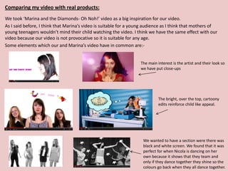
- 1. Comparing my video with real products: We took ‘Marina and the Diamonds- Oh Noh!’ video as a big inspiration for our video. As I said before, I think that Marina’s video is suitable for a young audience as I think that mothers of young teenagers wouldn’t mind their child watching the video. I think we have the same effect with our video because our video is not provocative so it is suitable for any age. Some elements which our and Marina’s video have in common are:- The main interest is the artist and their look so we have put close-ups The bright, over the top, cartoony edits reinforce child like appeal. We wanted to have a section were there was black and white screen. We found that it was perfect for when Nicola is dancing on her own because it shows that they team and only if they dance together they shine so the colours go back when they all dance together.
- 2. Comparing my video with real products: (continue) There is a mixture of staged performance and narration in both videos because it’s a typical aspect for pop music videos to cut between the two. There are aspects of narrative in both videos. For ‘Brittney and the New Generation’ the lyrics say “superman in to it”- which is why we got the girls to do a dance with the Superman move. Instead for ‘Marina and the Diamonds’ the lyrics are “TV taught me how to feel” and Marina is holding a pink television on her head. There is a section which Becky has a stutter on ‘If’ which is why we edited her so that she is repeating in time with the beat. There is also a section in Marina’s video that she repeats a dance move but it edited.
- 3. Comparing my video with real products: (continue) Both the videos are bright, colourful and fun. We wanted to do the same as Marina, with different scenarios and different coloured backgrounds but there were a few complications in the process. We couldn’t get the background in the shoot to go white enough so that we could change it so, instead we decided to have lots of different range of colours on the full screen. This was done with ‘colour corrector’. Stand out/ eye catching text in both videos.
- 4. Other videos we took in consideration whilst developing our video… ‘Belle Amie-Girls Up’ Close-ups Cartoony editing Staged performance ‘Kate Nash- Pumpkin Soup’ We tried to put different make-up on each girl so that it shows each individual but even though we We took put loads of it, it inspiration was really hard to from Belle see in the video. Amie for the edited boxes.
- 5. Andrew Goodwin I also looked at the codes and conventions of Andrew Goodwins theory. Particular ones what relate to our video are:- • There is a relationship between the lyrics and the visuals. We have shown this in multiple shots e.g. The lyrics says: ‘Like McDonalds’ and Debbie is holding a drink from McDonalds whilst lip syncing. The title of our song is ‘Let the Party Start’ and I think that throughout the whole video we portrayed a fun, party style atmosphere with; dances and the girls acting silly. • Demand from record company for close-ups of artist. • Particular music genre have their own music video style and iconography. From the start we said that it was essential that the song that we picked for the girl band would have to be happy, jolly, fun because of the fact that they are a girl band. We did this so that the audience would be instantly attracted to the band and associate them with being happy, bubbly, energetic and friendly. I think that our video fits in well with other stereotypical pop videos because we have tried to add all the essential elements that a girl band video would require. From dancing, to animation, to close-up of band members, to styling but we added something more.* (see- Develop own star iconography part of star image). • Develop own star iconography part of star image. For the band’s icon I decided that I was going to have the bands name always with the same font so that the audience could identify it easily but with different colour for variety. *We also decided that, each girl should have a specific character and style so that different types of target audience could connect with at least one member. E.g. Debbie is the nerdy chick and we gave her a animated light bulb in the video so that it was clear what she represented. Also we gave each girl a specific colour. Debbie- Green, Nicola-Pink, Ellen-Yellow, Becky- Blue so that the audience could distinguish and relate to them even more. • Even though Goodwin said that there should be a ‘reference to voyeurism’, we felt that for our band and target audience it wasn’t suitable.
- 6. Other Theorists… I looked at Diane Railton and Paul Watson- 'Music video and the politics of representation’ and their 4 genre of music videos. Our video comes under Narrative Video and Staged Performance. I think this because we have choreographed dances and there is a link between the visuals and lyrics. Steve Jones identified three ‘narrative forms’ of music videos. I think ours is analogue narrative because it is a non-concert performance and the song intercut with other material. Joan D Lynch also stated that there are three basic music video structure and I think our falls under ‘centred around performance and narrative music video’ because that is exactly what our video is about.
- 7. We made our video appropriate to fit with the style of the track, the image of the band and the genre of music. I think this because the track is poppy, upbeat and the band is supposed to be a pop band so they are supposed to be happy and upbeat. The two elements link together. Also the title of the song and the video compliment each other very well because the video is as if the band is having a mini party with dancing, pillow fights. This shows the humours side of the band for the audience to relate to. Also in the video there are parts were the girls are just messing around which shown that the members aren’t afraid to make a fool of themselves and they are up for anything. This draws the audience in because in general people are attracted to smiley, funny people. I chose to represent the band as happy, fun, friendly girls who came together through friendship but also shine as individuals. I wanted to do this because from the start Katrina and I decided that we were going to make a girl pop band which appealed to 10-15 year old girls. We felt it was appropriate to get a cheery, dancy song rather than a sad song which wouldn’t relate to the band and would make them seem depressing. If we did choose a sad song I feel that the band would appeal to a different type of audience or wouldn’t even fit into any market. I think that because ‘Let the Party Start’ is the first single released from their CD album that it was a good choice of song to attract people. Only when they have a solid fan base would they be able to release a sadder song to show they have variety. We looked at our Youth Culture Research carefully before applying make-up, clothing…etc… on each band member. E.g. for Becky (the Rock Chic) Smokey eye shadow Tomboyish look Red lips (but you can’t Rocky shirt with studs notice that much in video) Ripped tights Long, dark hair Mainly dark clothing
- 8. Comparing my work with real life products:- Digipak Advert
- 9. Comparing Digipak- I took various aspects from the typical CD/ Digipak to use in my Digipak and they are the following:- • Information booklet to gives a little info on the band, including interview. Example 1 • CD of album • DVD with: -music videos -extras -behind the scenes footage So that it draws the audience into buying it and it gives them an insight that a normal CD doesn’t have. • Photography/Posters Fun and colourful which is appealing to target audience. For my Digipak layout I took a lot of I added 4 individual posters (one for each member) so that the buyer inspiration from the ‘You Me At Six’ can chose their favourite member and keep the photo. Digipak. • Limited Edition (so people will be more likely to buy it) Example 2 • Feature the bands logo and a record company logo for audience to recognise. • BBFC certification (12a, 15, 18) to give the audience a warning on what to expect if buying the product. • Bar code • Website address more info on the band if audience want to find out more or want to purchase other products.
- 10. Comparing Digipak Advert Example 1 I took various aspects from the typical Advert to use in my Digipak Advert and they are the following:- • Artist name Stands out and very noticeable because that is what the audience is looking for. • Key information about what the advert is about. E.g. For The Killers is ‘The Brand New Album featuring the new single Human’. • Main single release Because that is what the audience is mainly interested in because it’s what drew them in in the first place. • Picture/ Image Which best suits the artist and his/ her genre. Example 2 • Record label logo Some have it but some don’t but I decided to include it because I felt that this would give the audience a greater knowledge on the artist. • Reviews & ratings To make the artist/ band look/ sound good. • Extra I decided to add the Digipak front cover on the Advert so that the audience know exactly what they are looking for in the shops. Example 3