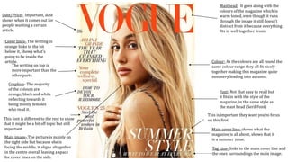
1. Masthead- It goes along with the
colours of the magazine which is
warm toned, even though it runs
through the image it still doesn’t
distract from it because everything
fits in well together. Iconic
Main image- The picture is mainly on
the right side but because she is
facing the middle, it aligns altogether
in the centre overall leaving a space
for cover lines on the side.
Colour- As the colours are all round the
same colour range they all fit nicely
together making this magazine quite
summery leading into autumn.
Date/Price- Important, date
shows when it comes out for
people wanting a certain
article.
Main cover line- shows what the
magazine is all about, shows that it
is a summer issue.
Tag Line- links to the main cover line and
the ones surroundings the main image.
Cover lines- The writing in
orange links to the bit
below it, shows what’s
going to be inside the
article.
Graphics- The majority
of the colours are
orange, black and white
reflecting towards it
being mostly females
who read it.
Font- Not that easy to read but
it fits in with the style of the
magazine, in the same style as
the mast head (Serif Font)
This is important they want you to focus
on this firstThis font is different to the rest to show
that it might be a bit off topic but still
important.
The writing on top is
more important than the
other parts.