CALL ON ➥8923113531 🔝Call Girls Aminabad Lucknow best Night Fun service
Update
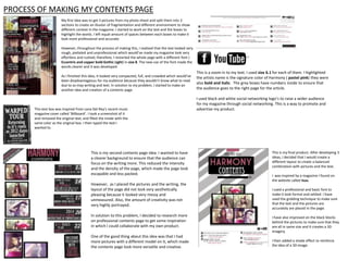
1. PROCESS OF MAKING MY CONTENTS PAGE
My first idea was to get 3 pictures from my photo shoot and split them into 3
sections to create an illusion of fragmentation and different environment to show
different context in the magazine. I started to work on the text and the boxes to
highlight the words. I left equal amount of spaces between each boxes to make it
look more professional and accurate.
However, throughout the process of making this, I realized that the text looked very
rough, pixilated and unprofessional which would’ve made my magazine look very
effortless and rushed; therefore, I restarted the whole page with a different font (
Eccentric and copper bold Gothic Light) in size 8. The new use of the font made the
words clearer and it was developed.
As I finished this idea, it looked very compacted, full, and crowded which would’ve
been disadvantageous for my audience because they wouldn’t know what to read
due to so may writing and text. In solution to my problem, I started to make an
another idea and creation of a contents page.
This text box was inspired from Lana Del Rey’s recent music
magazine cover called ‘Billboard’. I took a screenshot of it
and removed the original text, and filled the inside with the
same color as the original box. I then typed the text I
wanted to.
This is my second contents page idea. I wanted to have
a clearer background to ensure that the audience can
focus on the writing more. This reduced the intensity
and the density of the page, which made the page look
escapable and less packed.
However, as I placed the pictures and the writing, the
layout of the page did not look very aesthetically
pleasing because it looked very messy and
unmeasured. Also, the amount of creativity was not
very highly portrayed.
In solution to this problem, I decided to research more
on professional contents page to get some inspiration
in which I could collaborate with my own product.
One of the good thing about this idea was that I had
more pictures with a different model on it, which made
the contents page look more versatile and creative.
This is a zoom in to my text. I used size 6.1 for each of them. I highlighted
the artists name is the signature color of Harmony ( pastel pink) they were
also bold and italic. The grey boxes have numbers inside to ensure that
the audience goes to the right page for the article.
I used black and white social networking logo’s to raise a wider audience
for my magazine through social networking. This is a way to promote and
advertise my product.
This is my final product. After developing 3
ideas, I decided that I would create a
different layout to create a balanced
combination with pictures and the text.
I was inspired by a magazine I found on
the website called Isuu.
I used a professional and basic font to
make it look formal and settled. I have
used the gridding technique to make sure
that the text and the pictures are
accurately are placed in the page.
I have also improved on the black blocks
behind the pictures to make sure that they
are all in same size and it creates a 3D
imagery.
I then added a shade effect to reinforce
the idea of a 3D image.